
1957 THE JACK HOUSE /RUSSELL JACK
THIS HOUSE IS MODEST AND FUNCTIONAL, IT IS HUMAN AND NURTURING, AND HAS PROVIDED WARMTH AND SHELTER TO JACK AND HIS FAMILY FOR 50 YEARS.
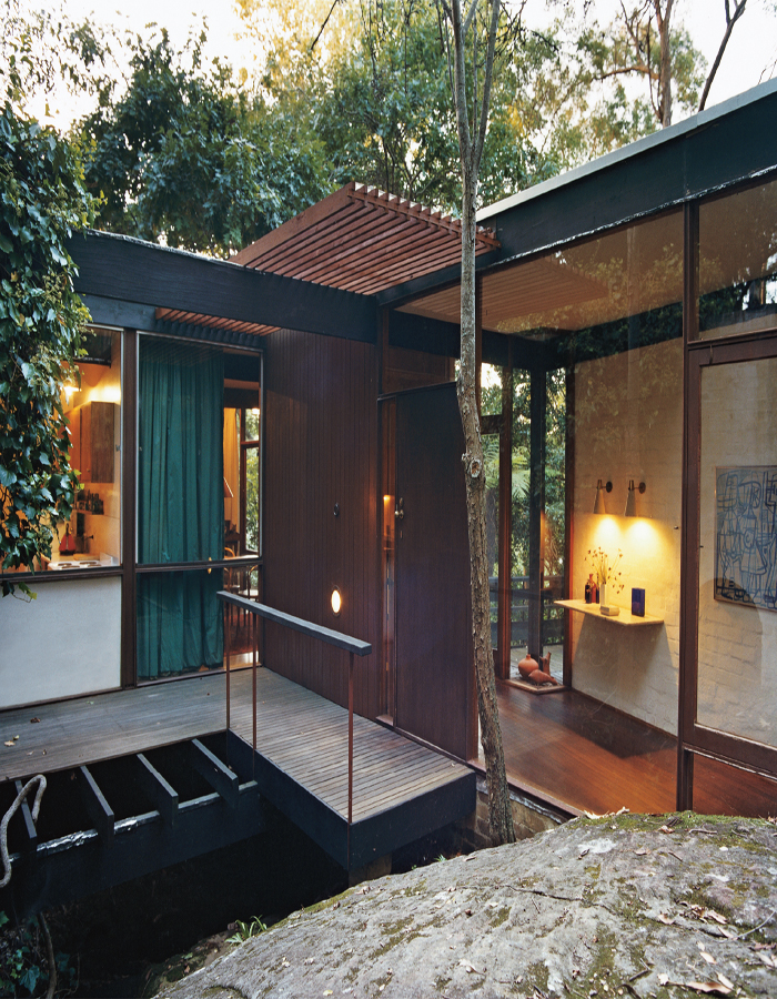
The approach to the house is through an arch in a wall and along a timber walkway to the front door.

The decorative wooden panelling at the end of the broad veranda illustrates the appeal the Japanese aesthetic held for Jack. The dappled light and blossom on the tree further enhance the appeal of this outdoor space.
While watching her seven-year-old grandson playing with his building blocks, Russell Jack’s grandmother commented, ‘That boy will be an architect.’ She was spot on. ‘I never wanted to do anything else. Not so much from the design perspective, I just always loved building things. I went to carpentry classes and closed in the back veranda to make myself a bedroom when I was 14,’ says Jack.
He received a sound education at Scotch College in Melbourne and Knox Grammar in Sydney and, at the age of 18, enlisted in the RAAF. He acknowledges he went from the rather rarefied atmosphere of an upper North Shore boys’ school into the cut and thrust of the forces but managed to stay true to his calling with correspondence courses in several architectural subjects.
In 1946, Jack enrolled at Sydney Technical College, and his time there was important to his career on several counts. ‘The course was certainly practical, and the academic side erudite. One academic tutor, Harry Foskett, was quite brilliant and inspired everybody.’ Jack worked simultaneously in the offices of Rudder, Littlemore & Rudder, gaining practical, hands-on experience. Most importantly, at STC he met and struck up a great friendship with John Allen, with whom he was later to go into partnership. Together they formed what was to become one of Australia’s most significant architectural firms, Allen Jack + Cottier, which has been responsible for a range of high profile projects in Australia and overseas. (Keith Cottier became a principal in 1965.)
But the story of this house is the very opposite of international building contracts and multimillion dollar commissions. This home is modest and functional, it is human and nurturing, and has provided warmth and shelter to Jack and his family for 50 years.
In 1952 Jack won the Byera Hadley Travelling Scholarship; the topic for his studies was, fittingly, related to human expression in contemporary architecture. At this time the rather opposing ideologies of Le Corbusier (the white modernist box) and Frank Lloyd Wright (an organic connection to the site) were the prevailing architectural influences. In London Jack caught the tail end of the Festival of Britain, where he was pleased to see that modernism and decoration could get along perfectly well. He worked for a London architectural firm, Tripe & Wakeham, before returning to Sydney in 1954 with Pamela, his future wife. In 1956, he set up the partnership with John Allen, and built the Jack House the same year. When it won the prestigious architectural prize, the Sulman Award, in 1957, it gave the firm’s reputation for innovative work a great boost.
‘This land was the last undeveloped block on the street. They just couldn’t sell it because of the steepness of the site and the creek running diagonally through it,’ says Jack. While the current siting of the house seems the inevitable choice, the first plan was very different. ‘The original house Pamela and I designed was steel framed and ran down the western boundary, elevated above the ground with the other wing running east-west. It went to tender but was too expensive and had to be abandoned. In despair, sitting in a restaurant one evening, thinking what to do, the idea just materialised on the back of an envelope. My wife said we should think about timber framing and so we did,’ recalls Jack. ‘I don’t think the other design would have had the same human feeling that this has.’
In the Fifties, some councils made attempts to govern aesthetics, and occasionally flat-roofed houses failed to get planning permission. Then there was the division between ‘brick and tile’ areas, deemed to be more upmarket, and less salubrious areas, where fibro and weatherboard were still acceptable. The Jacks were fortunate. While the other side of Boundary Road was ‘brick and tile’, theirs fell into the less rigorously policed category, and so the council had no issue with either the design of the building or the materials used to achieve it.
Interestingly, it is easy to miss the Jack House as you drive by. It doesn’t declare itself obviously as part of the streetscape but, rather, is oriented away from the road and towards the bush. According to Jack, ‘the prevailing style was for little brick boxes with the important rooms – the living room and the main bedroom – at the front irrespective of aspect or privacy. The accepted thinking on living style was very different from our own. We had to convince lots of our clients that it was the right thing to do. We believed passionately that it was, and having built this house, they could see what we were talking about.’

The wallpapered wall divides the dining area from the kitchen.

The tiled area was originally an external space but, as the needs of the family grew, it was enclosed to create another room.

The study combined another wallpaper design with built-in shelving and a strong hit of colour.

The wall that faces the street is surrounded by a strip of glass to lighten its appearance. The bricks have been arranged in a repeating pattern to create decorative interest in what would otherwise have been a large plain surface.
What you do see, set back from the road, is a wall with decorative, bagged and painted brickwork. This wall is one of the things that makes Jack’s quiet independence of thought apparent. The International School would have designed a precise, unadorned white wall of immaculate proportion, while the typical Sydney School architect would have left the bricks self-finished, as the kiln had produced them. Jack did neither, and the result adds texture and interest to a large surface area. The wall is surrounded by a slim band of windows on both sides and along the top under the eaves. This visually lightens the density of the wall, especially at dusk when lights are on inside.
The other contentious decision was the arch opening in the brickwork that forms the entrance to the house. At the time it was considered reactionary by Keith Cottier, amongst others. Modernity demanded right angles. To this day, Jack defends its appropriateness. ‘The logical, natural opening in a brick wall is an arch,’ he says. And there is not only one; a second, small-scale arch sits next to the main one, acting as a passage for the stream to run from one side of the wall to the other.
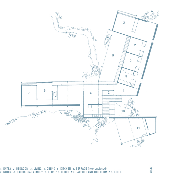
‘The main thing to govern my thinking was that the building had to work – it had to be functional,’ says Jack. It has a simple L-shaped plan; turn left from the front door and you are in the family spaces – the dining room, living room, kitchen and study. Turn right and you are in the bathroom and bedroom wing.
‘It was an economical house, there is nothing extravagant about it,’ says Jack. ‘In the early days, our clients didn’t have a great deal of money either and this house could grow and expand.’
Internal walls were non-structural to allow flexibility in the future. And, indeed, the house has developed with time and a growing family. A veranda between the main living area and the study has been closed in and two bedrooms added. An exterior wall of grey, beautifully weathered timber now forms the interior wall of the main bedroom area.
While the purse strings were tight, the ideas were expansive. ‘The other thing we tried to do was make it as psychologically big as possible – the free-flowing plan and the floor-to-ceiling glass meant the rooms were never boxes. There is privacy to the street and the rooms themselves are open to the bush,’ says Jack.
The space is continuous with no connecting doors but is still broken up into specific rooms. ‘I like to be able to live in different spaces, not one huge space. Initially there was no door on the study – until the children came along.’ Ever practical, Jack remarked of the dining room, ‘It is only used for an hour a day so it makes sense to use it as a thoroughfare.’
Linking the indoor and outdoor spaces was also integral to the scheme. The house was carefully sited, facing north, with minimal vegetation disturbed to accommodate it. The roof and floor planes extend beyond the glass line to increase the sense of space and create unity, while the same materials were used inside and out. As Frank Lloyd Wright, Jack’s hero as a student, wisely said, ‘I knew well that no house should ever be put on a hill or on anything. Belonging to it. Hill and house should live together each the happier for the other.’ This applies very directly to the Jack House and its surrounds.
But it is not so much Wrightian principles that inform the design itself, but rather a mix of influences, from Japanese traditional houses to Alvar Aalto and, closer to home, one of the pioneers of Australian modernism, Sydney Ancher. Sydney Ancher’s beautifully open house in Neutral Bay, and Bill Lucas’s Glass house in Castlecrag were both finalists in the Sulman Award the year the Jack House won.
‘The expression of the structure is important. It is there for all to see,’ says Jack. The exposed post and beam framing and the unpainted woodwork speak of the honesty of the building and also create its enduring appeal. The non-standard windows are generous and proportionally pleasing and allow the outside in.
It is a robust house that has weathered the years well; it is unfussy but, unlike many of his contemporaries, Jack does not shy away from pattern. One of the appealing aspects of this house is the original wallpaper in the study and dining room. Jack is unable to recall whether it was he or Pamela who chose the wallpaper but it serves to emphasise the fact that ‘Pamela and I were so much of the one mind that with any disagreement about what to do in the house, the compromise was always better than what either had originally wanted.’
The publicity in the wake of the Sulman Award created a groundswell of public interest and the Jacks often found people peering in from the courtyard. Their neighbour jovially suggested he set up a lemonade stall for the thirsty onlookers. They were not all fans, and one woman wrote to the press saying that to give an award to a house that looked like ‘a series of hen coops on sticks’ was a disgrace.
Yet the house attracted clients of like mind. Artist Tony Tuckson and his wife, Margaret, commissioned a house in the early Sixties and as Jack says, ‘They didn’t so much choose an architect as a house.’ Margaret Tuckson looked at two of Jack’s houses and knew he was the man for the job. She has been there for nearly 50 years, so her instincts were right, and she continues to acknowledge that it is ‘a truly wonderful house’. It is modest and unassuming, on a battleaxe block, and you need to be invited to know it is there at all. She tells of a visiting curator, a young man who, after an hour there, declared that he loved it more than any house he had been in. But then it is partly because house and owner are so in tune with one another.
In her book, An Australian Identity: Houses for Sydney 1953–63, Jennifer Taylor discusses the work of Russell Jack as creating ‘easy and elegant’ environments. She goes on to qualify ‘easy’ as requiring little maintenance and an ability to accept the demands put upon it. ‘Elegant’ equates with restrained, human and compatible and the result of the use of natural materials. There is then no greater accolade for an architect whose primary aim is that ‘it works superbly’.

Timber-clad walls in red mahogany impart a rich character to the interior spaces. Classic furniture choices mix with ceramics and wallhangings to create a warm, humanising atmosphere characteristic of Jack’s approach to life and architecture.
DETAILS THE JACK HOUSE

ARCHED ENTRANCE In 1956, when the Jack house was built, some architectural devices were not considered appropriate by architects at the vanguard of modernism. The arch was one such form. While considered reactionary by some, Jack found it entirely suitable. It was the logical, truthful way to form an opening in a masonry wall since it needed no overhead support. The house is designed to turn away from the street and face the bush, and the passage through the arch takes the visitor from the public nature of the street into what feels like a secluded, private world.

KITCHEN Jack points to the economy of the house, and the kitchen is a good example of its beautiful, measured quality. Located at the rear of the dining room, it is a very simply designed, functional space. Along the back wall is a row of high cupboards in maple veneer, below which is a slim bench with a stainless steel sink and white Formica benchtop. Underneath, and running the length of the wall, is an open shelf which provides storage for crockery and serving bowls. The spacing of the cabinets and their relative depths is proportionally pleasing.
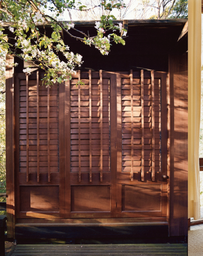
TIMBER SCREEN Jack has cited a number of influences from Alvar Aalto and Frank Lloyd Wright to Japanese traditional buildings and landscape, drawing on different attributes of these architects or architectural styles to suit his needs. He also felt that the contemporary minimalism needed humanising, and restrained decoration was one way of achieving it. The timber screen outside the main bedroom is functional in that it provides privacy, but is also decorative since the battens vary in height and thickness. Foliage and sunlight create a dappled play of light which subtly enhances the link with nature.

KJÆRHOLM CHAIRS Designed in 1955, the PK22 is arguably the most famous of Kjærholm’s creations. Made in satin finished stainless steel and with a one-piece seat of leather, canvas or wicker, the PK22 embodies Kjærholm’s obsession with fine detail and a love of the combination of industrial materials and high end craftsmanship. It revolutionised Danish furniture design partly in that it was made of metal at a time when Denmark was defined by hand-crafted timber furniture. The chair won the Lunning Award in 1958. The Jacks’ PK22s were bought from Artes Studio in Sydney at a hefty discount due to some marks on the leather. According to Jack, Kjærholm’s pieces were so expensive they wouldn’t have been able to afford them otherwise.

SHELVING Designed by Jack, these shelves have a simple graphic quality. They are located in the living room and were a later addition as the house evolved and the needs of the family changed. The brackets are manufactured in steel and painted black, and the shelves are supported on little brass pegs. Deep teak shelves house books and journals, and the ceramics that Pamela Jack, a keen potter, collected. The lining boards to which the shelves are attached are red mahogany (a timber Jack used both inside and out), which have been oiled but are otherwise untreated.

SAFARI CHAIR Based on an old colonial chair used by the English in India, variations of the Safari chair have been manufactured all over the world. The most acknowledged version was designed by Danish designer Kaare Klint in 1933. The main features of this chair are its articulated backrest and knockdown construction – it rolls up to just a bundle of sticks weighing 6.5 kg. Australian versions, like this example by John Duffecy Furniture, were produced throughout the Sixties and Seventies. This version returns to a more nineteenth century leg style and, unlike Klint’s, has no seat cushion. It suits the simplicity of the Jack House, sitting in front of a timber-clad wall under a portrait of Pamela Jack.

From the street there are only glimpses of the house situated behind an enormous pine tree that was on the land when the Boyds bought it in 1957. At the entrance, the door knocker, which combines with the house number, sits alongside a discreet name plaque.