Contrast refers to the degree of difference between the lightest and darkest tones in an image. You do have an alternative if you’re not in complete control of your lighting: you can choose a high contrast setting in-camera to create a more aggressive, dramatic message or a low setting to do the opposite.
In high-contrast images, the blacks are deeper and shadow detail is lost. The edges in photographs that are made with a high contrast setting may appear sharper, and your images may seem in better focus. When you select a low contrast setting, the resulting photo will show preserved shadow detail, and the image will feel softer. If you pay attention to how you feel about your subject matter, you should find it easy to dial in a suitable contrast setting.
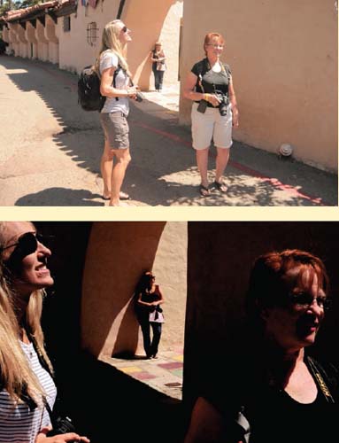
The top photo shows how the day appeared to the eye; the bottom photo shows the result of choosing a high contrast setting and faster (than normal) shutter speed.
Contrast and saturation (the latter topic is covered on pages 36 and 37) are the meat and potatoes of the message-building process. These are the photographic elements people notice first, before they even recognize your subject. These elements speak to your viewer. If you want your image to stand out, you’ll need to learn how to exercise your options.
Photography is all about expression. Your images should reflect your individuality.
We ask our students to think about why they raised their camera. Were they drawn to the graphic elements in a scene, or was there something else, something a bit more primal? Can they categorize that feeling, zero-in on an emotion? How strong or soft was that feeling? We ask them to isolate that emotion and pull it from their camera. A high contrast setting, for example, creates a more dramatic, intense look than a low contrast setting. You can use intense effects to show your strong reaction to a subject.
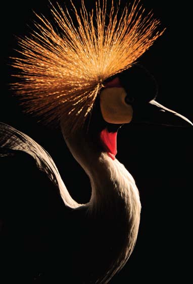
With a high contrast setting, the blacks of this image were allowed to deepen.