Color charts display cold colors (green to purple) and warm colors (pink to yellow).
The colors you surround yourself with at home can influence your mood and sense of well-being. In general, the function and style of a particular room determines whether you choose warm or cold, dark or light and strong or subdued colors.
Different colors have different characteristics. They can give a home a modern or traditional feel and by combining different colors, can add visual interest to a room.
• Bright colors (vibrant shades of green, blue, red, yellow and orange) provide an expansive feeling. These are friendly, happy colors that encourage communication and are therefore especially welcome in the dining area and kitchen.
• Dark colors, such as deep red, purple, and dark shades of blue and green, can have a constricting and gloomy effect. But when applied in the right place or as accent elements, they can help to convey comfort and security.
• Warm colors (orange, yellow and pink hues, for example) raise the perceived temperature of a room. For that reason, they are best used in rooms that receive less sun. They inspire activity, so avoid them in rooms meant for relaxation, such as a bedroom. However, yellow in a bedroom is very good for combating SAD (seasonal affective disorder) and early morning depression.
• Cold colors, such as icy blues and green, have a calming effect. They are especially suitable for bedrooms, helping you to relax in the evening and wake up refreshed the next morning. But they need to be used with care in sunless rooms.
• Navy blue can create a cold atmosphere that discourages conversation; don’t use it in a family room or in dining areas.
• Red raises the energy level of a room, but it may also make people more irritable and hostile—so it is not a good choice for a child’s room. Use it as an accent rather than a base room color.
• Gray should be avoided for the dining area and kitchen—unless you want to dampen your appetite.
The right choice of color can make a room appear bigger or smaller and make ceilings look higher or lower. This visual effect can actually compensate for some of a room’s flaws.
• Use bright, light colors for small rooms; they will make the rooms appear more spacious.
• Choose warm, dark colors, such as deep shades of red, for large rooms to make them feel cosier.
• Use paler colors on low ceilings: The ceiling appears higher when it is painted in a lighter shade than the walls.
• Use darker colors for high ceilings. If you want to reduce the height of a room visually, opt for a dark-colored ceiling. The ceiling will also appear lower if you paint the bottom area of the wall in a lighter shade that gradually darkens as it rises towards the ceiling. If you want the ceiling to appear higher, the color should gradually become lighter as it rises from floor level.
• Opt for lively shades for narrower rooms; using bright colors on the walls makes a room appear wider to the eye.
• Darken wide rooms. If you paint two walls opposite each other in a darker shade, a wide room will look less cavernous.
To ensure a harmonious design for a room, you will also need to choose attractive color combinations for furniture, fabrics and accessories that complement the walls and ceiling.
• First, choose a basic color that you like and make sure it’s appropriate for the room. Use this color for the walls, rugs and curtains, perhaps in varying intensities.
• Choose a consistent secondary color for furniture and accessories. For a unified look, choose a complementary color or design the room in color coordinates (for example, different shades of the same color). Or choose two secondary colors, but in that case the colors should appear next to each other in the color spectrum.
• Be careful when combining two colors of different intensities. For example, placing strong colors next to pastel shades forces the eye to jump back and forth between light and dark. This can create a visually disturbing effect and affect the room’s atmosphere. All pastels mix well together.
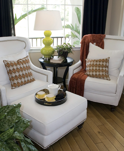
• Pair neutral colors such as white or magnolia with some fresh accents in the form of cushions, artwork, accessories and throws in colors such as red, green, blue and even pink.
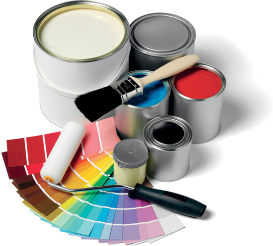
• If you are uncertain what color to choose, ask for advice from a paint store or interior designer. Buy sample jars and experiment before you commit.
GOOD TO KNOW 
The color wheel
The primary colors (red, blue and yellow) form the basis of the color wheel. Secondary colors (green, orange and purple) are the colors formed by mixing the primary colors. Tertiary colors are the different shades formed by mixing a secondary color with a primary color (yellow-orange, red-orange and red-purple). Complementary colors appear opposite each other on the color wheel. Although they are the strongest contrasting colors, they go together well. The colors that appear next to each other on the wheel (analogous colors) are also considered harmonious. Finally, colors that appear together in nature generally go well together regardless of where they appear on the color wheel.
Want to make a few changes to liven up a room? Here are three easy do-it-yourself projects.
• Re-cover a lampshade. Trace and cut out the shape of the shade in wallpaper. Glue the ends with wallpaper paste for a slipcover. Summer calls for a fresh lime green against neutral furnishings. In winter, warm it up with a rich brown or red.
• Create a fabric wall hanging. Sew a hem across the top and bottom of a piece of attractive fabric and insert a wooden dowel at each end.
• Paint the wall behind book and other shelves an accent color that coordinates with the room.