As we've already seen in the previous lesson, using libraries such as scikit-learn and platforms such as Jupyter, predictive models can be trained in just a few lines of code. This is possible by abstracting away the difficult computations involved with optimizing model parameters. In other words, we deal with a black box where the internal operations are hidden instead. With this simplicity also comes the danger of misusing algorithms, for example, by overfitting during training or failing to properly test on unseen data. We'll show how to avoid these pitfalls while training classification models and produce trustworthy results with the use of k-fold cross validation and validation curves.
Recall the two types of supervised machine learning: regression and classification. In regression, we predict a continuous target variable. For example, recall the linear and polynomial models from the first lesson. In this lesson, we focus on the other type of supervised machine learning: classification. Here, the goal is to predict the class of a sample using the available metrics.
In the simplest case, there are only two possible classes, which means we are doing binary classification. This is the case for the example problem in this lesson, where we try to predict whether an employee has left or not. If we have more than two class labels instead, we are doing multi-class classification.
Although there is little difference between binary and multi-class classification when training models with scikit-learn, what's done inside the "black box" is notably different. In particular, multi-class classification models often use the one-versus-rest method. This works as follows for a case with three class labels. When the model is "fit" with the data, three models are trained, and each model predicts whether the sample is part of an individual class or part of some other class. This might bring to mind the one-hot encoding for features that we did earlier. When a prediction is made for a sample, the class label with the highest confidence level is returned.
In this lesson, we'll train three types of classification models: Support Vector Machines, Random Forests, and k-Nearest Neighbors classifiers. Each of these algorithms are quite different. As we will see, however, they are quite similar to train and use for predictions thanks to scikit-learn. Before swapping over to the Jupyter Notebook and implementing these, we'll briefly see how they work.
SVMs attempt to find the best hyperplane to divide classes by. This is done by maximizing the distance between the hyperplane and the closest samples of each class, which are called support vectors.
This linear method can also be used to model nonlinear classes using the kernel trick. This method maps the features into a higher-dimensional space in which the hyperplane is determined. This hyperplane we've been talking about is also referred to as the decision surface, and we'll visualize it when training our models.
k-Nearest Neighbors classification algorithms memorize the training data and make predictions depending on the K nearest samples in the feature space. With three features, this can be visualized as a sphere surrounding the prediction sample. Often, however, we are dealing with more than three features and therefore hyperspheres are drawn to find the closest K samples.
Random Forests are an ensemble of decision trees, where each has been trained on different subsets of the training data.
A decision tree algorithm classifies a sample based on a series of decisions. For example, the first decision might be "if feature x_1 is less than or greater than 0." The data would then be split on this condition and fed into descending branches of the tree. Each step in the decision tree is decided based on the feature split that maximizes the information gain.
Essentially, this term describes the mathematics that attempts to pick the best possible split of the target variable.
Training a Random Forest consists of creating bootstrapped (that is, randomly sampled data with replacement) datasets for a set of decision trees. Predictions are then made based on the majority vote. These have the benefit of less overfitting and better generalizability.
Note
Decision trees can be used to model a mix of continuous and categorical data, which make them very useful. Furthermore, as we will see later in this lesson, the tree depth can be limited to reduce overfitting. For a detailed (but brief) look into the decision tree algorithm, check out this popular StackOverflow answer: https://stackoverflow.com/a/1859910/3511819.
There, the author shows a simple example and discusses concepts such as node purity, information gain, and entropy.
We'll continue working on the employee retention problem that we introduced in the first topic. We previously prepared a dataset for training a classification model, in which we predicted whether an employee has left or not. Now, we'll take that data and use it to train classification models:
- If you have not already done so, start the
NotebookAppand open thelesson-2-workbook.ipynbfile. Scroll down toTopic B: Training classification models. Run the first couple of cells to set the default figure size and load the processed data that we previously saved to a CSV file.For this example, we'll be training classification models on two continuous features:
satisfaction_levelandlast_evaluation. - Draw the bivariate and univariate graphs of the continuous target variables by running the cell with the following code:
sns.jointplot('satisfaction_level', 'last_evaluation',
              data=df, kind='hex')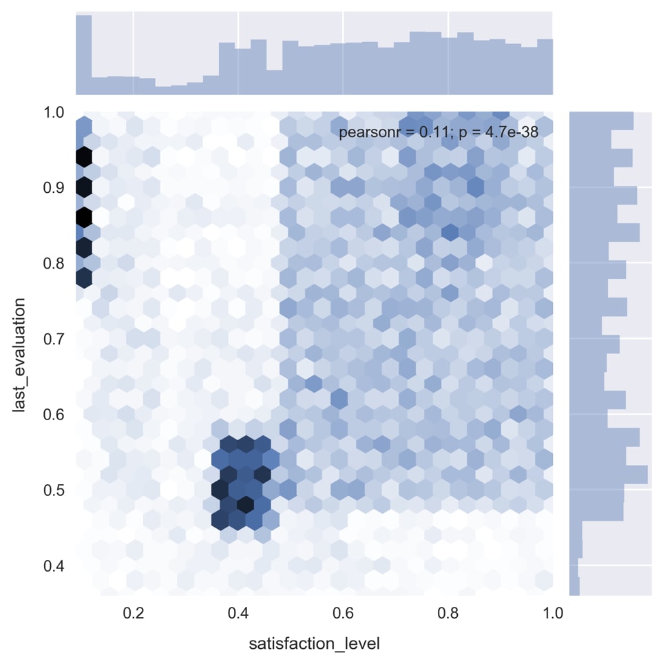
As you can see in the preceding image, there are some very distinct patterns in the data.
- Re-plot the bivariate distribution, segmenting on the target variable, by running the cell containing the following code:
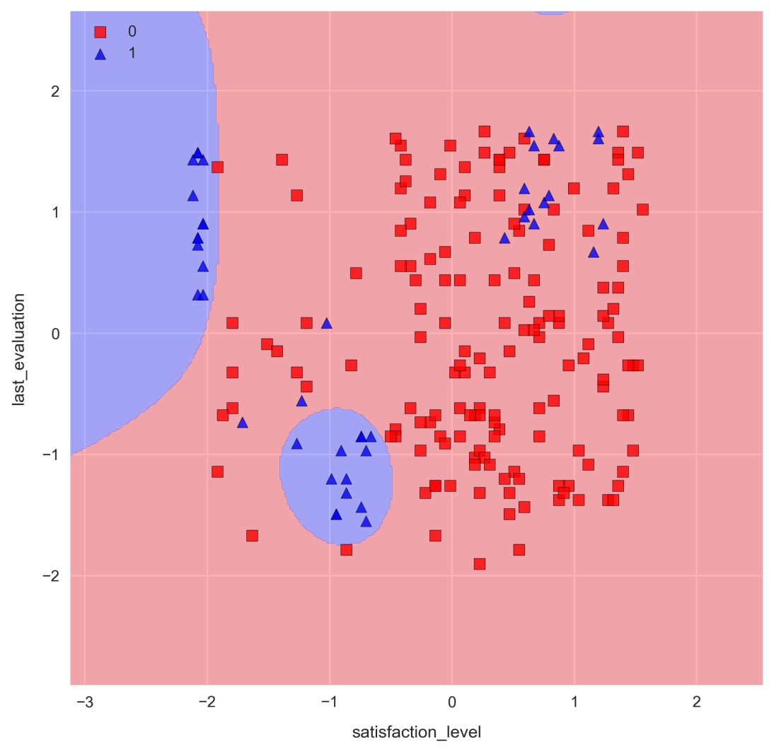
plot_args = dict(shade=True, shade_lowest=False)
for i, c in zip((0, 1), ('Reds', 'Blues')):
    sns.kdeplot(df.loc[df.left==i, 'satisfaction_level'],
                df.loc[df.left==i, 'last_evaluation'],
                cmap=c, **plot_args)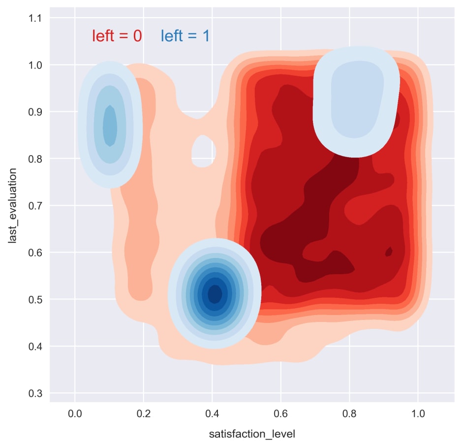
Now, we can see how the patterns are related to the target variable. For the remainder of this section, we'll try to exploit these patterns to train effective classification models.
- Split the data into training and test sets by running the cell containing the following code:
from sklearn.model_selection import train_test_splitfeatures = ['satisfaction_level', 'last_evaluation']X_train, X_test, y_train, y_test = train_test_split(df[features].values, df['left'].values,
    test_size=0.3, random_state=1)
Our first two models, the Support Vector Machine and k-Nearest Neighbors algorithm, are most effective when the input data is scaled so that all of the features are on the same order. We'll accomplish this with scikit-learn's
StandardScaler. - Load
StandardScalerand create a new instance, as referenced by thescalervariable. Fit the scaler on the training set and transform it. Then, transform the test set. Run the cell containing the following code:from sklearn.preprocessing import StandardScalerscaler = StandardScaler() X_train_std = scaler.fit_transform(X_train) X_test_std = scaler.transform(X_test)
Note
An easy mistake to make when doing machine learning is to "fit" the scaler on the whole dataset, when in fact it should only be "fit" to the training data. For example, scaling the data before splitting into training and testing sets is a mistake. We don't want this because the model training should not be influenced in any way by the test data.
- Import the scikit-learn support vector machine class and fit the model on the training data by running the cell containing the following code:
from sklearn.svm import SVCsvm = SVC(kernel='linear', C=1, random_state=1)
svm.fit(X_train_std, y_train)
Then, we train a linear SVM classification model. The
Cparameter controls the penalty for misclassification, allowing the variance and bias of the model to be controlled. - Compute the accuracy of this model on unseen data by running the cell containing the following code:
from sklearn.metrics import accuracy_scorey_pred = svm.predict(X_test_std)acc = accuracy_score(y_test, y_pred)print('accuracy = {:.1f}%'.format(acc*100))
>> accuracy = 75.9%
We predict the targets for our test samples and then use scikit-learn's
accuracy_scorefunction to determine the accuracy. The result looks promising at ~75%! Not bad for our first model. Recall, though, the target is imbalanced. Let's see how accurate the predictions are for each class. - Calculate the confusion matrix and then determine the accuracy within each class by running the cell containing the following code:
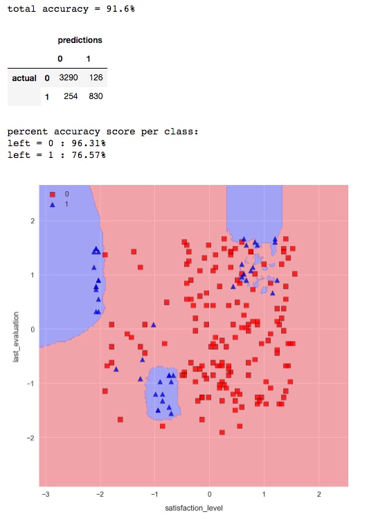
from sklearn.metrics import confusion_matrixcmat = confusion_matrix(y_test, y_pred)scores = cmat.diagonal() / cmat.sum(axis=1) * 100print('left = 0 : {:.2f}%'.format(scores[0]))print('left = 1 : {:.2f}%'.format(scores[1]))
>> left = 0 : 100.00%
>> left = 1 : 0.00%
It looks like the model is simply classifying every sample as
0, which is clearly not helpful at all. Let's use a contour plot to show the predicted class at each point in the feature space. This is commonly known as the decision-regions plot. - Plot the decision regions using a helpful function from the
mlxtendlibrary. Run the cell containing the following code:from mlxtend.plotting import plot_decision_regionsN_samples = 200X, y = X_train_std[:N_samples], y_train[:N_samples] plot_decision_regions(X, y, clf=svm)
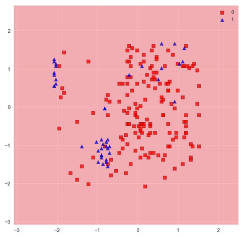
The function plots decision regions along with a set of samples passed as arguments. In order to see the decision regions properly without too many samples obstructing our view, we pass only a 200-sample subset of the test data to the
plot_decision_regionsfunction. In this case, of course, it does not matter. We see the result is entirely red, indicating every point in the feature space would be classified as 0.It shouldn't be surprising that a linear model can't do a good job of describing these nonlinear patterns. Recall earlier we mentioned the kernel trick for using SVMs to classify nonlinear problems. Let's see if doing this can improve the result.
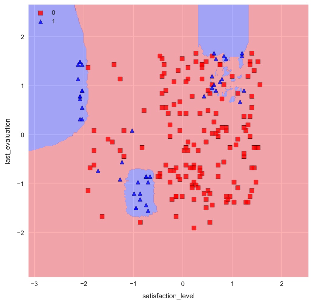
- Print the docstring for scikit-learn's SVM by running the cell containing SVC. Scroll down and check out the parameter descriptions. Notice the
kerneloption, which is actually enabled by default asrbf. Use thiskerneloption to train a new SVM by running the cell containing the following code:svm = SVC(kernel='rbf', C=1, random_state=1) svm.fit(X_train_std, y_train)
- In order to assess this and future model performance more easily, let's define a function called
check_model_fit, which computes various metrics that we can use to compare the models. Run the cell where this function is defined.Each computation done in this function has already been seen in this example; it simply calculates accuracies and plots the decision regions.
- Show the newly trained kernel-SVM results on the training data by running the cell containing the following code:
check_model_fit(svm, X_test_std, y_test)
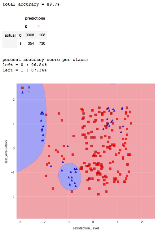
The result is much better. Now, we are able to capture some of the non-linear patterns in the data and correctly classify the majority of the employees who have left.
The plot_decision_regions function is provided by mlxtend, a Python library developed by Sebastian Raschka. It's worth taking a peek at the source code (which is of course written in Python) to understand how these plots are drawn. It's really not too complicated.
In a Jupyter Notebook, import the function with from mlxtend.plotting import plot_decision_regions, and then pull up the help with plot_decision_regions? and scroll to the bottom to see the local file path:
Then, open up the file and check it out! For example, you could run cat in the notebook:
This is okay, but not ideal as there's no color markup for the code. It's better to copy it (so you don't accidentally alter the original) and open it with your favorite text editor.
When drawing attention to the code responsible for mapping the decision regions, we see a contour plot of predictions Z over an array X_predict that spans the feature space.

Let's move on to the next model: k-Nearest Neighbors.
- Load the scikit-learn KNN classification model and print the docstring by running the cell containing the following code:
from sklearn.neighbors import KNeighborsClassifier
KNeighborsClassifier?
The
n_neighborsparameter decides how many samples to use when making a classification. If the weights parameter is set to uniform, then class labels are decided by majority vote. Another useful choice for the weights is distance, where closer samples have a higher weight in the voting. Like most model parameters, the best choice for this depends on the particular dataset. - Train the KNN classifier with
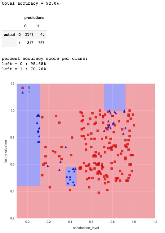
n_neighbors=3, and then compute the accuracy and decision regions. Run the cell containing the following code:knn = KNeighborsClassifier(n_neighbors=3) knn.fit(X_train_std, y_train) check_model_fit(knn, X_test_std, y_test)
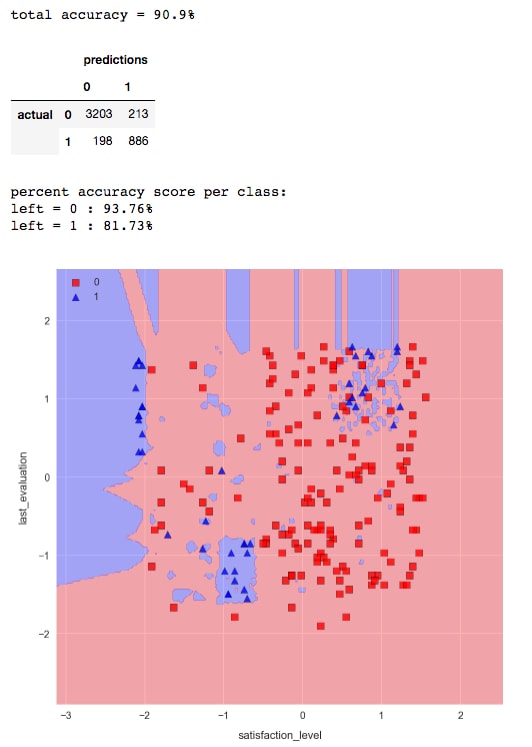

We see an increase in overall accuracy and a significant improvement for class 1 in particular. However, the decision region plot would indicate we are overfitting the data. This is evident by the hard, "choppy" decision boundary, and small pockets of blue everywhere. We can soften the decision boundary and decrease overfitting by increasing the number of nearest neighbors.
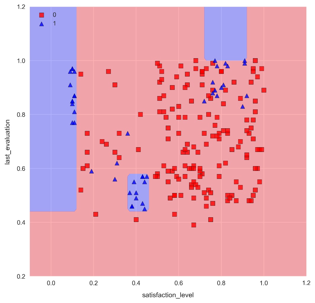
- Train a KNN model with
n_neighbors=25by running the cell containing the following code:knn = KNeighborsClassifier(n_neighbors=25)knn.fit(X_train_std, y_train) check_model_fit(knn, X_test_std, y_test)
As we can see, the decision boundaries are significantly less choppy, and there are far less pockets of blue. The accuracy for class 1 is slightly less, but we would need to use a more comprehensive method such as k-fold cross validation to decide if there's a significant difference between the two models.
Note that increasing
n_neighborshas no effect on training time, as the model is simply memorizing the data. The prediction time, however, will be greatly affected.
Note
When doing machine learning with real-world data, it's important for the algorithms to run quick enough to serve their purposes. For example, a script to predict tomorrow's weather that takes longer than a day to run is completely useless! Memory is also a consideration that should be taken into account when dealing with substantial amounts of data.
- Train a Random Forest classification model composed of 50 decision trees, each with a max depth of 5. Run the cell containing the following code:
from sklearn.ensemble import RandomForestClassifierforest = RandomForestClassifier(n_estimators=50, max_depth=5,random_state=1)
forest.fit(X_train, y_train)
check_model_fit(forest, X_test, y_test)
Note the distinctive axes-parallel decision boundaries produced by decision tree machine learning algorithms.
We can access any of the individual decision trees used to build the Random Forest. These trees are stored in the
estimators_attributeof the model. Let's draw one of these decision trees to get a feel for what's going on. Doing this requires the graphviz dependency, which can sometimes be difficult to install. - Draw one of the decision trees in the Jupyter Notebook by running the cell containing the following code:
from sklearn.tree import export_graphvizimport graphvizdot_data = export_graphviz(forest.estimators_[0],out_file=None, feature_names=features,  class_names=['no', 'yes'],  filled=True, rounded=True,  special_characters=True)graph = graphviz.Source(dot_data)
graph
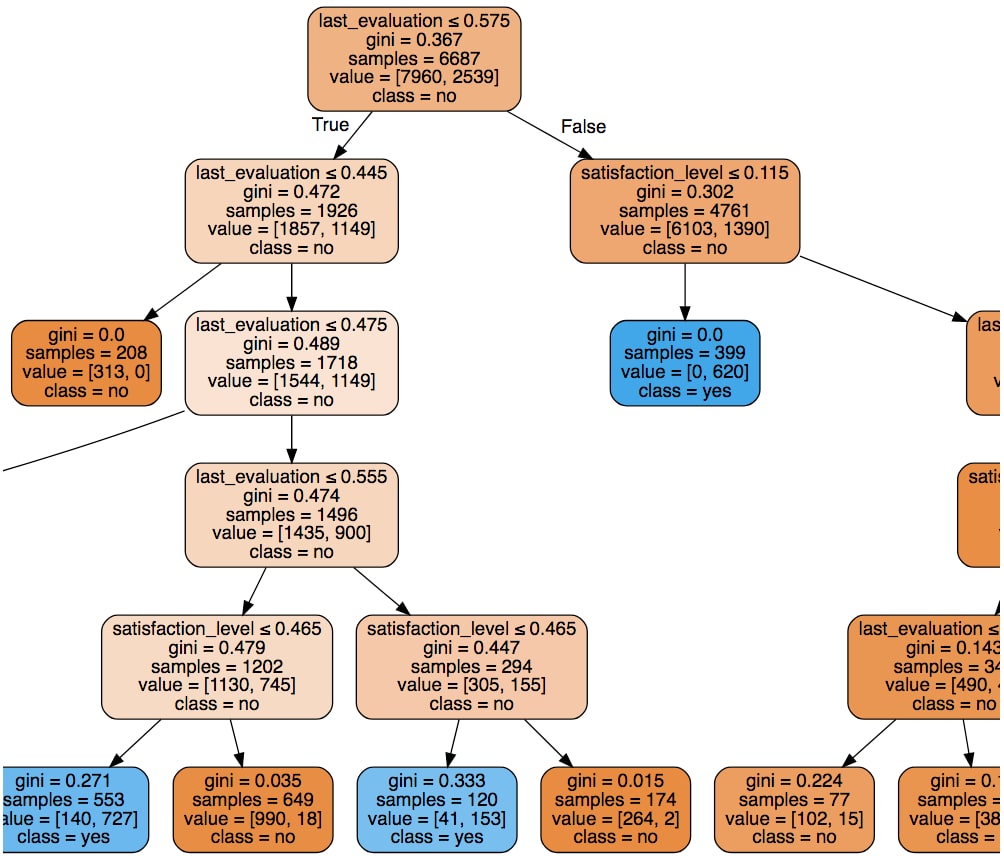
We can see that each path is limited to five nodes as a result of setting
max_depth=5. The orange boxes represent predictions of no (has not left the company), and the blue boxes represent yes (has left the company). The shade of each box (light, dark, and so on) indicates the confidence level, which is related to theginivalue.
To summarize, we have accomplished two of the learning objectives in this section:
- We gained a qualitative understanding of support vector machines (SVMs), k-Nearest Neighbor classifiers (kNNs), and Random Forest
- We are now able to train a variety of models using scikit-learn and Jupyter Notebooks so that we can confidently build and compare predictive models
In particular, we used the preprocessed data from our employee retention problem to train classification models to predict whether an employee has left the company or not. For the purposes of keeping things simple and focusing on the algorithms, we built models to predict this given only two features: the satisfaction level and last evaluation value. This two-dimensional feature space also allowed us to visualize the decision boundaries and identify what overfitting looks like.
In the following section, we will introduce two important topics in machine learning: k-fold cross-validation and validation curves.
Thus far, we have trained models on a subset of the data and then assessed performance on the unseen portion, called the test set. This is good practice because the model performance on training data is not a good indicator of its effectiveness as a predictor. It's very easy to increase accuracy on a training dataset by overfitting a model, which can result in poorer performance on unseen data.
That said, simply training models on data split in this way is not good enough. There is a natural variance in data that causes accuracies to be different (if even slightly) depending on the training and test splits. Furthermore, using only one training/test split to compare models can introduce bias towards certain models and lead to overfitting.
k-fold cross validation offers a solution to this problem and allows the variance to be accounted for by way of an error estimate on each accuracy calculation. This, in turn, naturally leads to the use of validation curves for tuning model parameters. These plot the accuracy as a function of a hyperparameter such as the number of decision trees used in a Random Forest or the max depth.
Note
This is our first time using the term hyperparameter. It references a parameter that is defined when initializing a model, for example, the C parameter of the SVM. This is in contradistinction to a parameter of the trained model, such as the equation of the decision boundary hyperplane for a trained SVM.
The method is illustrated in the following diagram, where we see how the k-folds can be selected from the dataset:

The k-fold cross validation algorithm goes as follows:
- Split data into k "folds" of near-equal size.
- Test and train k models on different fold combinations. Each model will include k - 1 folds of training data and the left-out fold is used for testing. In this method, each fold ends up being used as the validation data exactly once.
- Calculate the model accuracy by taking the mean of the k values. The standard deviation is also calculated to provide error bars on the value.
It's standard to set k = 10, but smaller values for k should be considered if using a big data set.
This validation method can be used to reliably compare model performance with different hyperparameters (for example, the C parameter for an SVM or the number of nearest neighbors in a KNN classifier). It's also suitable for comparing entirely different models.
Once the best model has been identified, it should be re-trained on the entirety of the dataset before being used to predict actual classifications.
When implementing this with scikit-learn, it's common to use a slightly improved variation of the normal k-fold algorithm instead. This is called stratified k-fold. The improvement is that stratified k-fold cross validation maintains roughly even class label populations in the folds. As you can imagine, this reduces the overall variance in the models and decreases the likelihood of highly unbalanced models causing bias.
Validation curves are plots of a training and validation metric as a function of some model parameter. They allow to us to make good model parameter selections. In this book, we will use the accuracy score as our metric for these plots.
Note
The documentation for plot validation curves is available here: http://scikit-learn.org/stable/auto_examples/model_selection/plot_validation_curve.html.
Consider this validation curve, where the accuracy score is plotted as a function of the gamma SVM parameter:
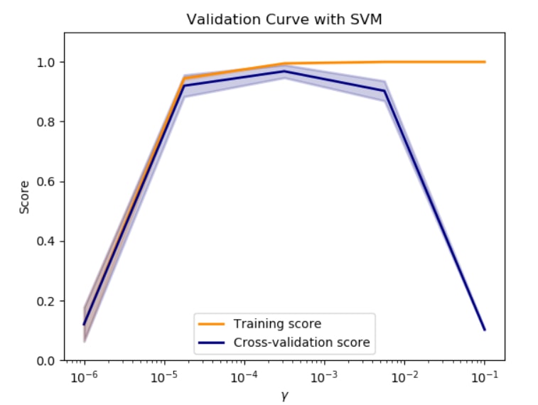
Starting on the left side of the plot, we can see that both sets of data are agreeing on the score, which is good. However, the score is also quite low compared to other gamma values, so therefore we say the model is underfitting the data. Increasing the gamma, we can see a point where the error bars of these two lines no longer overlap. From this point on, we see the classifier overfitting the data as the models behave increasingly well on the training set compared to the validation set. The optimal value for the gamma parameter can be found by looking for a high validation score with overlapping error bars on the two lines.
Keep in mind that a learning curve for some parameter is only valid while the other parameters remain constant. For example, if training the SVM in this plot, we could decide to pick gamma on the order of 10-4. However, we may want to optimize the C parameter as well. With a different value for C, the preceding plot would be different and our selection for gamma may no longer be optimal.
- If you've not already done so, start the
NotebookAppand open thelesson-2-workbook.ipynbfile. Scroll down toSubtopic B: K-fold cross-validation and validation curves.The training data should already be in the notebook's memory, but let's reload it as a reminder of what exactly we're working with.
- Load the data and select the
satisfaction_levelandlast_evaluationfeatures for the training/validation set. We will not use the train-test split this time because we are going to use k-fold validation instead. Run the cell containing the following code:df = pd.read_csv('../data/hr-analytics/hr_data_processed.csv') features = ['satisfaction_level', 'last_evaluation'] X = df[features].values y = df.left.values - Instantiate a Random Forest model by running the cell containing the following code:
clf = RandomForestClassifier(n_estimators=100, max_depth=5)
- To train the model with stratified k-fold cross validation, we'll use the
model_selection.cross_val_scorefunction.Train 10 variations of our model
clfusing stratified k-fold validation. Note that scikit-learn'scross_val_scoredoes this type of validation by default. Run the cell containing the following code:from sklearn.model_selection import cross_val_score np.random.seed(1) scores = cross_val_score( estimator=clf, X=X, y=y, cv=10) print('accuracy = {:.3f} +/- {:.3f}'.format(scores.mean(), scores. std())) >> accuracy = 0.923 +/- 0.005Note how we use
np.random.seedto set the seed for the random number generator, therefore ensuring reproducibility with respect to the randomly selected samples for each fold and decision tree in the Random Forest. - With this method, we calculate the accuracy as the average of each fold. We can also see the individual accuracies for each fold by printing scores. To see these, run
print(scores):>> array([ 0.93404397, 0.91533333, 0.92266667, 0.91866667, 0.92133333, 0.92866667, 0.91933333, 0.92 , 0.92795197, 0.92128085])Using
cross_val_scoreis very convenient, but it doesn't tell us about the accuracies within each class. We can do this manually with themodel_selection.StratifiedKFoldclass. This class takes the number of folds as an initialization parameter, then the split method is used to build randomly sampled "masks" for the data. A mask is simply an array containing indexes of items in another array, where the items can then be returned by doing this:data[mask]. - Define a custom class for calculating k-fold cross validation class accuracies. Run the cell containing the following code:
from sklearn.model_selection import StratifiedKFold… … print('fold: {:d} accuracy: {:s}'.format(k+1, str(class_acc))) return class_accuracy - We can then calculate the class accuracies with code that's very similar to step 4. Do this by running the cell containing the following code:
from sklearn.model_selection import cross_val_scorenp.random.seed(1)…
…
>> fold: 10 accuracy: [ 0.98861646  0.70588235]
>> accuracy = [ 0.98722476  0.71715647] +/- [ 0.00330026  0.02326823]
Now we can see the class accuracies for each fold! Pretty neat, right?
- Let's move on to show how a validation curve can be calculated using
model_selection.validation_curve. This function uses stratified k-fold cross validation to train models for various values of a given parameter.Do the calculations required to plot a validation curve by training Random Forests over a range of
max_depthvalues. Run the cell containing the following code:clf = RandomForestClassifier(n_estimators=10) max_depths = np.arange(3, 16, 3) train_scores, test_scores = validation_curve( estimator=clf, X=X, y=y, param_name='max_depth', param_range=max_depths, cv=10);
This will return arrays with the cross validation scores for each model, where the models have different max depths. In order to visualize the results, we'll leverage a function provided in the scikit-learn documentation.
- Run the cell in which
plot_validation_curveis defined. Then, run the cell containing the following code to draw the plot:plot_validation_curve(train_scores, test_scores, max_depths, xlabel='max_depth')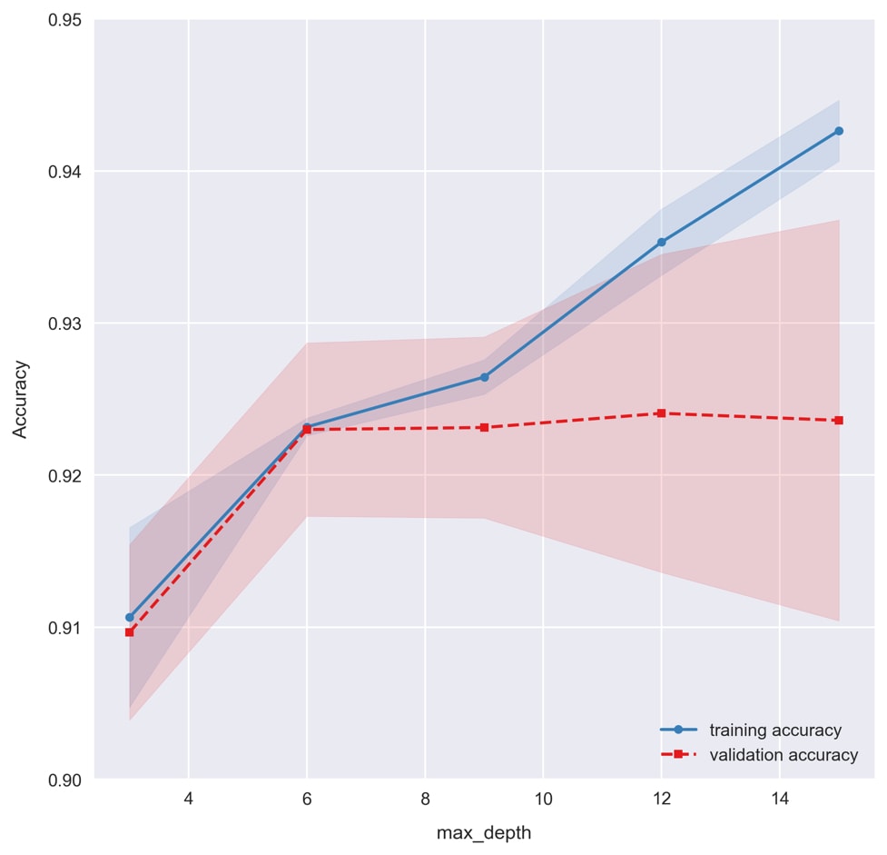
Recall how setting the max depth for decision trees limits the amount of overfitting? This is reflected in the validation curve, where we see overfitting taking place for large max depth values to the right. A good value for
max_depthappears to be6, where we see the training and validation accuracies in agreement. Whenmax_depthis equal to3, we see the model underfitting the data as training and validation accuracies are lower.
To summarize, we have learned and implemented two important techniques for building reliable predictive models. The first such technique was k-fold cross-validation, which is used to split the data into various train/test batches and generate a set accuracy. From this set, we then calculated the average accuracy and the standard deviation as a measure of the error. This is important so that we have a gauge of the variability of our model and we can produce trustworthy accuracy.
We also learned about another such technique to ensure we have trustworthy results: validation curves. These allow us to visualize when our model is overfitting based on comparing training and validation accuracies. By plotting the curve over a range of our selected hyperparameter, we are able to identify its optimal value.
In the final section of this lesson, we take everything we have learned so far and put it together in order to build our final predictive model for the employee retention problem. We seek to improve the accuracy, compared to the models trained thus far, by including all of the features from the dataset in our model. We'll see now-familiar topics such as k-fold cross-validation and validation curves, but we'll also introduce something new: dimensionality reduction techniques.
Dimensionality reduction can simply involve removing unimportant features from the training data, but more exotic methods exist, such as Principal Component Analysis (PCA) and Linear Discriminant Analysis (LDA). These techniques allow for data compression, where the most important information from a large group of features can be encoded in just a few features.
In this subtopic, we'll focus on PCA. This technique transforms the data by projecting it into a new subspace of orthogonal "principal components," where the components with the highest eigenvalues encode the most information for training the model. Then, we can simply select a few of these principal components in place of the original high-dimensional dataset. For example, PCA could be used to encode the information from every pixel in an image. In this case, the original feature space would have dimensions equal to the number of pixels in the image. This high-dimensional space could then be reduced with PCA, where the majority of useful information for training predictive models might be reduced to just a few dimensions. Not only does this save time when training and using models, it allows them to perform better by removing noise in the dataset.
Like the models we've seen, it's not necessary to have a detailed understanding of PCA in order to leverage the benefits. However, we'll dig into the technical details of PCA just a bit further so that we can conceptualize it better. The key insight of PCA is to identify patterns between features based on correlations, so the PCA algorithm calculates the covariance matrix and then decomposes this into eigenvectors and eigenvalues. The vectors are then used to transform the data into a new subspace, from which a fixed number of principal components can be selected.
In the following section, we'll see an example of how PCA can be used to improve our Random Forest model for the employee retention problem we have been working on. This will be done after training a classification model on the full feature space, to see how our accuracy is affected by dimensionality reduction.
We have already spent considerable effort planning a machine learning strategy, preprocessing the data, and building predictive models for the employee retention problem. Recall that our business objective was to help the client prevent employees from leaving. The strategy we decided upon was to build a classification model that would predict the probability of employees leaving. This way, the company can assess the likelihood of current employees leaving and take action to prevent it.
Given our strategy, we can summarize the type of predictive modeling we are doing as follows:
- Supervised learning on labeled training data
- Classification problems with two class labels (binary)
In particular, we are training models to determine whether an employee has left the company, given a set of continuous and categorical features. After preparing the data for machine learning in Activity A, Preparing to Train a Predictive Model for the Employee-Retention Problem, we went on to implement SVM, k-Nearest Neighbors, and Random Forest algorithms using just two features. These models were able to make predictions with over 90% overall accuracy. When looking at the specific class accuracies, however, we found that employees who had left (class-label 1) could only be predicted with 70-80% accuracy. Let's see how much this can be improved by utilizing the full feature space.
- In the
lesson-2-workbook.ipynbnotebook, scroll down to the code for this section. We should already have the preprocessed data loaded from the previous sections, but this can be done again, if desired, by executingdf = pd.read_csv('../data/hr-analytics/hr_data_processed.csv'). Then, print the DataFrame columns withprint(df.columns). - Define a list of all the features by copy and pasting the output from
df.columnsinto a new list (making sure to remove the target variableleft). Then, defineXandYas we have done before. This goes as follows:features = ['satisfaction_level', 'last_evaluation', 'number_project','average_montly_hours', 'time_spend_company', 'work_accident',… … X = df[features].values y = df.left.values
Looking at the feature names, recall what the values look like for each one. Scroll up to the set of histograms we made in the first activity to help jog your memory. The first two features are continuous; these are what we used for training models in the previous two exercises. After that, we have a few discrete features, such as
number_projectandtime_spend_company, followed by some binary fields such aswork_accidentandpromotion_last_5years. We also have a bunch of binary features, such asdepartment_ITanddepartment_accounting, which were created by one-hot encoding.Given a mix of features like this, Random Forests are a very attractive type of model. For one thing, they're compatible with feature sets composed of both continuous and categorical data, but this is not particularly special; for instance, an SVM can be trained on mixed feature types as well (given proper preprocessing).
Note
If you're interested in training an SVM or k-Nearest Neighbors classifier on mixed-type input features, you can use the data-scaling prescription from this StackExchange answer: https://stats.stackexchange.com/questions/82923/mixing-continuous-and-binary-data-with-linear-svm/83086#83086.
A simple approach would be to preprocess data as follows:
- Standardize continuous variables
- One-hot-encode categorical features
- Shift binary values to
-1and1instead of0and1 - Then, the mixed-feature data could be used to train a variety of classification models
- We need to figure out the best parameters for our Random Forest model. Let's start by tuning the
max_depthhyperparameter using a validation curve. Calculate the training and validation accuracies by running the following code:%%time np.random.seed(1) clf = RandomForestClassifier(n_estimators=20) max_depths = [3, 4, 5, 6, 7, 9, 12, 15, 18, 21] train_scores, test_scores = validation_curve( estimator=clf, X=X, y=y, param_name='max_depth', param_range=max_depths, cv=5);
We are testing 10 models with k-fold cross validation. By setting
k = 5, we produce five estimates of the accuracy for each model, from which we extract the mean and standard deviation to plot in the validation curve. In total, we train 50 models, and sincen_estimatorsis set to 20, we are training a total of 1,000 decision trees! All in roughly 10 seconds! - Plot the validation curve using our custom
plot_validation_curvefunction from the last exercise. Run the following code:plot_validation_curve(train_scores, test_scores, max_depths, xlabel='max_depth');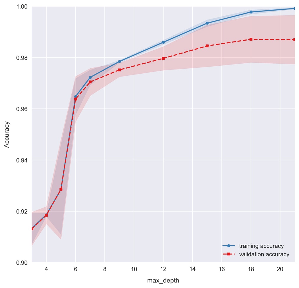
For small max depths, we see the model underfitting the data. Total accuracies dramatically increase by allowing the decision trees to be deeper and encode more complicated patterns in the data. As the max depth is increased further and the accuracy approaches 100%, we find the model overfits the data, causing the training and validation accuracies to grow apart. Based on this figure, let's select a
max_depthof6for our model.We should really do the same for
n_estimators, but in the spirit of saving time, we'll skip it. You are welcome to plot it on your own; you should find agreement between training and validation sets for a large range of values. Usually, it's better to use more decision tree estimators in the Random Forest, but this comes at the cost of increased training times. We'll use 200 estimators to train our model. - Use
cross_val_class_score, the k-fold cross validation by class function we created earlier, to test the selected model, a Random Forest withmax_depth = 6andn_estimators = 200:np.random.seed(1)clf = RandomForestClassifier(n_estimators=200, max_depth=6)scores = cross_val_class_score(clf, X, y)print('accuracy = {} +/- {}'\.format(scores.mean(axis=0), scores.std(axis=0))) >> accuracy = [ 0.99553722 0.85577359] +/- [ 0.00172575 0.02614334]The accuracies are way higher now that we're using the full feature set, compared to before when we only had the two continuous features!
- Visualize the accuracies with a boxplot by running the following code:
fig = plt.figure(figsize=(5, 7))sns.boxplot(data=pd.DataFrame(scores, columns=[0, 1]),palette=sns.color_palette('Set1'))plt.xlabel('Left')
plt.ylabel('Accuracy')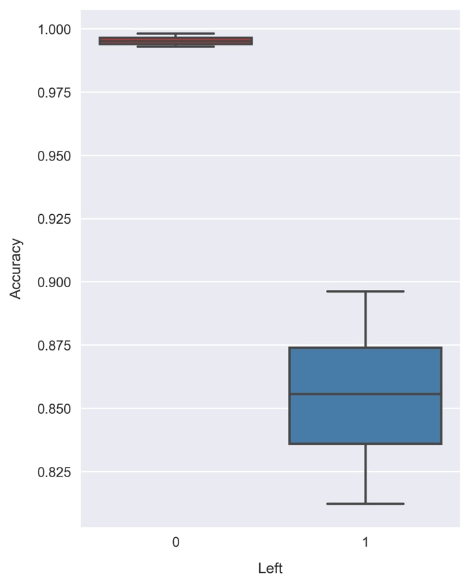
Random Forests can provide an estimate of the feature performances.
Note
The feature importance in scikit-learn is calculated based on how the node impurity changes with respect to each feature. For a more detailed explanation, take a look at the following StackOverflow thread about how feature importance is determined in Random Forest Classifier: https://stackoverflow.com/questions/15810339/how-are-feature-importances-in-randomforestclassifier-determined.
- Plot the feature importance, as stored in the attribute
feature_importances_, by running the following code:pd.Series(clf.feature_importances_, name='Feature importance',index=df[features].columns)\.sort_values()\.plot.barh() plt.xlabel('Feature importance')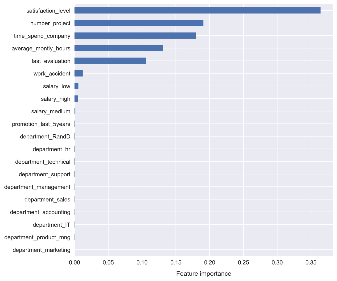
It doesn't look like we're getting much in the way of useful contribution from the one-hot encoded variables:
departmentandsalary. Also, thepromotion_last_5yearsandwork_accidentfeatures don't appear to be very useful.Let's use Principal Component Analysis (PCA) to condense all of these weak features into just a few principal components.
- Import the
PCAclass from scikit-learn and transform the features. Run the following code:from sklearn.decomposition import PCApca_features = \… … pca = PCA(n_components=3) X_pca = pca.fit_transform(X_reduce)
- Look at the string representation of
X_pcaby typing it alone and executing the cell:>> array([[-0.67733089, 0.75837169, -0.10493685], >> [ 0.73616575, 0.77155888, -0.11046422], >> [ 0.73616575, 0.77155888, -0.11046422], >> ..., >> [-0.67157059, -0.3337546 , 0.70975452], >> [-0.67157059, -0.3337546 , 0.70975452], >> [-0.67157059, -0.3337546 , 0.70975452]])
Since we asked for the top three components, we get three vectors returned.
- Add the new features to our DataFrame with the following code:
df['first_principle_component'] = X_pca.T[0]df['second_principle_component'] = X_pca.T[1]
df['third_principle_component'] = X_pca.T[2]
Select our reduced-dimension feature set to train a new Random Forest with. Run the following code:
features = ['satisfaction_level', 'number_project', 'time_spend_
company',
			'average_montly_hours', 'last_evaluation',
			'first_principle_component',
			'second_principle_component',
			'third_principle_component']
X = df[features].values
y = df.left.values
- Assess the new model's accuracy with k-fold cross validation. This can be done by running the same code as before, where
Xnow points to different features. The code is as follows:np.random.seed(1) clf = RandomForestClassifier(n_estimators=200, max_depth=6) scores = cross_val_class_score(clf, X, y) print('accuracy = {} +/- {}'\ .format(scores.mean(axis=0), scores.std(axis=0))) >> accuracy = [ 0.99562463 0.90618594] +/- [ 0.00166047 0.01363927] - Visualize the result in the same way as before, using a box plot. The code is as follows:
fig = plt.figure(figsize=(5, 7))sns.boxplot(data=pd.DataFrame(scores, columns=[0, 1]),
            palette=sns.color_palette('Set1'))plt.xlabel('Left')
plt.ylabel('Accuracy')
Comparing this to the previous result, we find an improvement in the class 1 accuracy! Now, the majority of the validation sets return an accuracy greater than 90%. The average accuracy of 90.6% can be compared to the accuracy of 85.6% prior to dimensionality reduction!
Let's select this as our final model. We'll need to re-train it on the full sample space before using it in production.
- Train the final predictive model by running the following code:
np.random.seed(1)clf = RandomForestClassifier(n_estimators=200, max_depth=6)
clf.fit(X, y)
- Save the trained model to a binary file using
externals.joblib.dump. Run the following code:from sklearn.externals import joblib joblib.dump(clf, 'random-forest-trained.pkl')
- Check that it's saved into the working directory, for example, by running:
!ls *.pkl. Then, test that we can load the model from the file by running the following code:clf = joblib.load('random-forest-trained.pkl')Congratulations! We've trained the final predictive model! Now, let's see an example of how it can be used to provide business insights for the client.
Say we have a particular employee, who we'll call Sandra. Management has noticed she is working very hard and reported low job satisfaction in a recent survey. They would therefore like to know how likely it is that she will quit.
For the sake of simplicity, let's take her feature values as a sample from the training set (but pretend that this is unseen data instead).
- List the feature values for Sandra by running the following code:
sandra = df.iloc[573]X = sandra[features]X
>> satisfaction_level              0.360000
>> number_project                  2.000000
>> time_spend_company              3.000000
>> average_montly_hours          148.000000
>> last_evaluation                 0.470000
>> first_principle_component       0.742801
>> second_principle_component     -0.514568
>> third_principle_component      -0.677421
The next step is to ask the model which group it thinks she should be in.
- Predict the class label for Sandra by running the following code:
clf.predict([X])
>> array([1])
The model classifies her as having already left the company; not a good sign! We can take this a step further and calculate the probabilities of each class label.
- Use
clf.predict_probato predict the probability of our model predicting that Sandra has quit. Run the following code:clf.predict_proba([X]) >> array([[ 0.06576239, 0.93423761]])
We see the model predicting that she has quit with 93% accuracy.
Since this is clearly a red flag for management, they decide on a plan to reduce her number of monthly hours to
100and the time spent at the company to1. - Calculate the new probabilities with Sandra's newly planned metrics. Run the following code:
X.average_montly_hours = 100X.time_spend_company = 1clf.predict_proba([X])
>> array([[ 0.61070329,  0.38929671]])
Excellent! We can now see that the model returns a mere 38% likelihood that she has quit! Instead, it now predicts she will not have left the company.
Our model has allowed management to make a data-driven decision. By reducing her amount of time with the company by this particular amount, the model tells us that she will most likely remain an employee at the company!