Chapter 2: The Art of Design
You’re now familiar with the tools, supplies, and materials used in jewelry making. This is a good time to start thinking about jewelry design. Although the tasks and projects in this book give you some design ideas, you’ll probably want to invent some custom designs as well. This chapter covers the most important elements of design and how you can apply them to your jewelry making and beading.
Weight, Texture, and Proportion
Color Harmony
Some of the first decisions you make about a new design involve color. The colors of beads and other components that you select for a piece of jewelry should have harmony; that is, they should work well together visually. Colors that seem to “clash” do not have harmony; however, neither do colors that look dull or monotonous side-by-side. Here are some tools to help you select colors that harmonize.

The Color Wheel
The traditional color wheel is a circular chart with equally sized sections of color positioned at regular intervals around the chart. It includes three types of colors: primary, secondary, and tertiary.
Primary Colors
Red, yellow, and blue are called primary colors. All other colors are a mixture of these three. Notice that primary colors look very solid and bold. The 3-part color wheel with the primary colors is shown above.
Secondary Colors
Green, orange, and purple are called secondary colors. Each secondary color is a combination of two primary colors:
• Green is a mixture of yellow and blue.
• Orange is a mixture of yellow and red.
• Purple is a mixture of blue and red.
The secondary colors are positioned between their respective primary colors on the color wheel. They have a milder appearance than the primary colors, but they are still relatively bold.

6-part color wheel
Tertiary Colors
A tertiary color is a mixture of one primary color and one secondary color. Tertiary colors have two-part names that indicate which two colors combine to form them. They are:
• Yellow-orange
• Red-orange
• Red-purple
• Blue-purple
• Blue-green
• Yellow-green
The tertiary colors are located between their respective primary and secondary colors on the color wheel. They are noticeably milder than the primary and secondary colors.

12-part color wheel
How to Use the Color Wheel
You can use the color wheel to identify sets of colors that harmonize. The two main categories of harmonizing colors are analogous colors and complementary colors.
Analogous Colors
Analogous colors are sets of two or three colors positioned side-by-side on a 12-part color wheel. To use analogous colors in a design, select components that match, or are various shades of, those colors. Remember that you don’t have to use equal parts of colors in a design. For example, one color may dominate, and another may occur only occasionally as an accent.

Complementary Colors
Complementary colors are positioned directly opposite one another on the color wheel. These color sets show contrast without losing harmony. Consider using them when you’d like to create a bolder look.

Other Color Harmony Relationships
Although analogous and complementary colors are the simplest color combinations, you can also use a 12-part color wheel to find more complicated color sets. Movable color wheel charts from art supply stores are usually marked to show those alternative relationships, which include split complementaries, triads, and tetrads. Try experimenting with them for your most colorful designs. The artist’s color wheel, shown here, is movable; you can spin it to quickly identify harmonious combinations of colors.

Other Ways to Select Colors
You can find inspiration for color just about anywhere. Practice looking for harmonious color sets all around you, and try mimicking them in your designs. Many of the color combinations that you’ll find appear in defined sets on the color wheel, but seeing them in a real-world context can help spark new ideas.
Colors in Nature
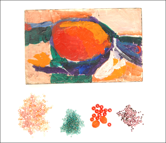
Harmonious color schemes are especially prevalent in nature. You can find interesting color sets in leaves, flowers, stems, bark, wood, stones, and even water. Jewelry designs inspired by natural colors tend to remind people of nature, often subconsciously. They can invoke feelings of happiness and tranquility.

Colors in Artwork
When you notice a painting or other artwork with colors that you love, try incorporating those same colors into a jewelry design. Pay attention to how the colors are used in the artwork. Is one color used more than others? How many different shades of each color are used? Experiment with similar approaches in your designs.

Symbolic Colors
If you’d like a design to communicate a message or represent something important to you, consider using symbolic colors. Color sets that symbolize nations, teams, or holidays are typical examples, but you can also use more subtle symbolic colors. For example, the color blue can symbolize peace or the winter season. You can design jewelry with obvious or subtle color associations to suit your mood and purpose.

Stylistic Colors
Some colors are more appropriate for particular styles of jewelry than others. For example, if you’d like to give your jewelry a strong Victorian feel, you should use colors that were popular during that era (like soft blues, rose pinks, rusts, and grays). If you’d rather make trendy jewelry, use color schemes featured in current fashion or home décor magazines. Take some time to research the styles that interest you, and learn which colors work best for them.

Weight, Texture, and Proportion
A jewelry design’s weight and texture are influenced by the size of components that you use and the materials that those components are made from. Its sense of proportion is affected by the way you arrange different sizes of components within the design.
Weight
Logically, heavier materials and components add more physical weight to jewelry than lighter ones. Heavier materials include metals, gemstone, and many ceramics. Wood, cord, bone, and plastics tend to be much lighter. When you plan a new design, think about how heavy it will be. Weight considerations can be specific to the type of jewelry you make. Here are a few examples.
Necklaces
Weight is especially important for necklaces because it affects how they lay. The lay of a necklace describes how it positions itself on the body when worn. For example, a lightweight pendant on a long necklace chain may not lie properly because it’s not heavy enough to remain centered on the wearer’s chest. Proper lay can be especially crucial for necklaces with fringe, drops, or tiers. With those designs, you may need to experiment with different components and weight distributions.
Bracelets
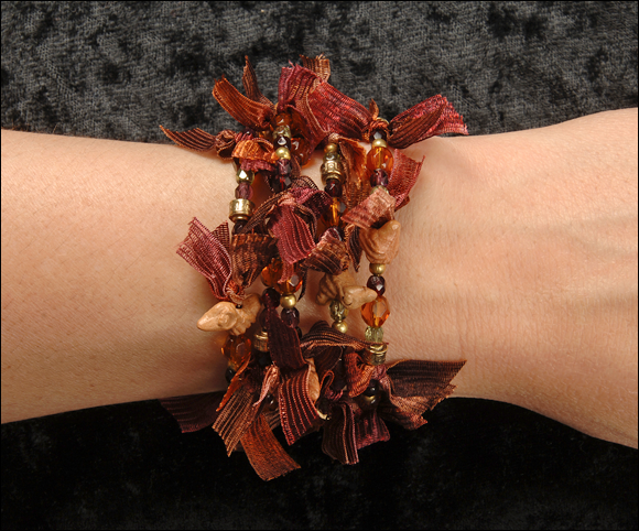
As a general rule, lighter-weight bracelets are more comfortable than heavier ones. Be aware that if one section of a bracelet is heavier than the rest, the heavier part may slide to the underside of the wrist when the bracelet is worn. If you would like the clasp to fall to the underside of the wrist, then you may need to make it slightly heavier than the rest of the bracelet. You can use a heavy, solid metal clasp, or add weight to a lighter clasp by adorning it with a bead drop or charm.
Earrings
Earrings that are too heavy are uncomfortable to wear, and they can even damage earlobes over time. You can control the weight of your earring designs by using smaller-gauge wire and small beads, and by limiting the number of larger beads or drops to one per earring.
Pins and Brooches
Improperly weighted brooches can tip forward and pull or stretch the fabric they’re attached to. As a general rule, try to make your brooches relatively lightweight. For heavier pieces, attach the pin back higher up on the design rather than at its middle.
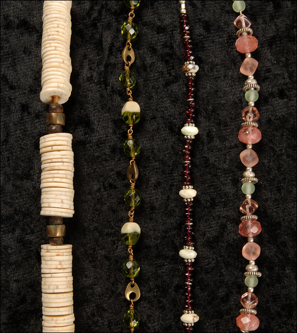
Texture
You can add interest to any design by using varieties of textural components. Beads are especially effective for adding texture. Experiment by combining different types of beads and materials in your designs, especially when you use a limited color palette.

Proportion
Proportion refers to the relationship between individual parts of a design and the design as a whole. Size is a very noticeable element of proportion. For example, when you make a beaded design using different sizes of beads, its look will change depending on how you arrange the beads by size. Proportion can also apply to color; a design that is predominantly one color has a different feel than a design where two or more colors are used in equal amounts.
Try to achieve proportions that are pleasing to the eye. Consider using gradual transitions in size and color rather than sharp contrasts. Step back from a design and look for its visual flow, or how your eye moves along the piece. Are you smoothly drawn to the focal point of the design, or do you get distracted? Also think about a design’s symmetry. Is it balanced, or does it seem somehow out of equilibrium? Don’t worry if you find this challenging at first. Through practice and experimentation, your awareness of proportion will become second nature.
Motif and Pattern
Jewelry designs often contain repetitions of distinct elements or themes. You can achieve this effect by creating motifs and assembling patterns.
A motif is a self-defined element in a design; it has a pleasing and complete look all by itself. In jewelry design, a motif can be a grouping of beads, a setting of stones, or a stylistic piece like an ornate connector. By arranging motifs in a defined order, you create a pattern.
Motifs and patterns can be large or small, and simple or complex. You can repeat a single motif throughout a design or use an arrangement of different motifs. A motif may be defined by colors, textures, sizes, materials, or a combination of design factors. Here are some ideas of how you might use motifs and patterns in your jewelry projects. See if you can think of others as you work through this book and learn new techniques.
• Repeat a grouping of several beads of similar size and harmonious color.
• Repeat a grouping of beads of graduating size and harmonious color.
• Create two or three bead motif groupings and repeat them in the same order.
• Group together materials with certain textures, and repeat them throughout the design.
• Place a connector, accent bead, or drop at defined intervals within a design.
• Repeat the same series of knots between beads.
Keep Track of Ideas
One of the best ways to harness your creativity is to keep an active record of your ideas. When you’re ready to create a new design or shop for supplies, you can refer to your collection of ideas for instant inspiration.
Clippings and Photos
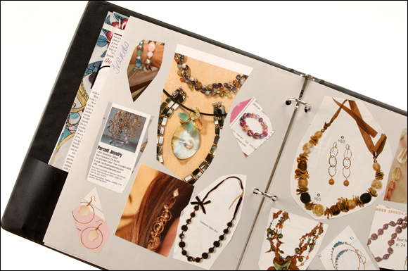
Make a habit of saving images and articles that catch your attention because of their design insight, color schemes, or information. Fashion and home décor magazines can be great sources of inspiration, and publications devoted to jewelry making and beading are full of colorful photos, free projects, and tips. (See the Appendix for a list of popular titles.) Keep some scissors handy to clip images and articles as you find them. You can mount your clippings on photo-album pages or glue them onto paperboard sheets that you keep in a loose-leaf binder. If you use paperboard, you can also use the pages to jot down notes and design ideas related to each clipping.
Design Sketches
Many jewelry artisans keep a sketch book for making rough drawings of designs before attempting to craft them. Sketches allow you to experiment with colors, motifs, and patterns using minimal time and resources. You don’t need to draw well to make useful sketches; your pictures can be very rough, as long as they help you imagine and record your ideas. Try using a soft lead pencil (and a good eraser) for initial sketches. You can add color with colored pencils, pens, or even crayons. Experiment to find out which tools and techniques work best for you.
Library and Web-site Notes
Today there are many books, magazines, and Web sites devoted to jewelry making and beading. As you collect information and design ideas from those sources, it can be challenging to keep them organized. You may want to devise a way to make it easier to find specific resources when you need them. One option is to keep a special journal just for that purpose. Record the titles of books, and list the page numbers of projects or techniques that you found especially interesting. With magazines, record the volume, issue number, or date along with your notes and page numbers. For Web sites, record or bookmark URL addresses. As an alternative, try keeping your notes and references on your computer or in an online blog.