
Choosing Fabric
Color selection is a personal choice. I often select colors that are coincident with the traditional patterns of the tartans, but I have tried to show some projects that move away from the traditional base colors. As modern quilt styles, these patterns lend themselves to many of the modern fabrics that reflect both the urban and masculine influence; however, Civil War and 1930s reproductions, as well as novelty and traditional tone-on-tone fabrics, also make for interesting quilts.
Modern, Ancient, and Reproduction Color Schemes
Traditional tartan colors fall into three categories:
Modern: The colors are dark and strong, with blue barely distinguishable from black.
Ancient: The colors are light and almost pastel, intended to represent the colors that would result by using natural dyes such as bark, berries, or moss.
Reproduction: The colors are muted, meant to represent the colors of a fragment dug up in the peat of Culloden Moor—generally brownish. Reproduction can also mean fabric colors from the early 1800s.
The original tartans were made from the natural colors of the wool—black, brown, and creamy white. Later tartan wools were dyed with berries, leaves, lichens, flowers, and bark, with urine used as a source of ammonia to intensify the color. To set the color, the wool would be washed in iron fixative collected from the black peat bogs.
Base Fabrics and Merge Fabrics
In this book, fabric falls into one of two categories:
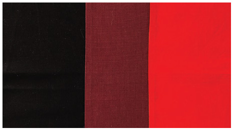
Base fabrics: The colors that form the basis of the tartan. They are usually red, yellow, green, blue, black, or white but are occasionally purple or orange.
Merge fabrics: The colors that form when two base fabrics meet
For base fabrics, I often use solids or tone-on-tone prints. I sometimes like to use fabrics that may have a print in addition to the dominant color to give the final quilt depth, movement, or dimensionality.
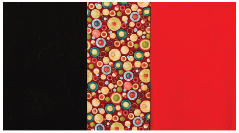
For merge fabrics, you have several options:
Use a fabric that incorporates the two base colors that are being merged, such as a red and black print when the base fabrics are red and black.

Choose a fabric that blends the two colors, such as a dark red when the base fabrics are red and black. In the case of merging yellow and blue, the merge fabric would be green.
Ignore the rules altogether. In this example, I chose a merge fabric with a dark red background, but it barely shows behind the busy multicolor print. Your choices could be even more unusual. My niece Sydney Wright made a quilt in which the merge fabric for the bases of white and purple was lime green! When you choose unusual merge fabrics, you may not achieve the effect of one color being woven into another, but the contrast in colors will create a beautiful design.

Solids or Prints? Using solids or tone-on-tone prints will give you the most traditional look of woven fabric. But if your quilt has some large squares and rectangles, you can use novelty fabrics with fun designs and themes to still achieve a plaid pattern. See the Hannay square lap quilt and the Maxwell square full quilt for examples of quilts that incorporated novelty fabrics.
Color and Value
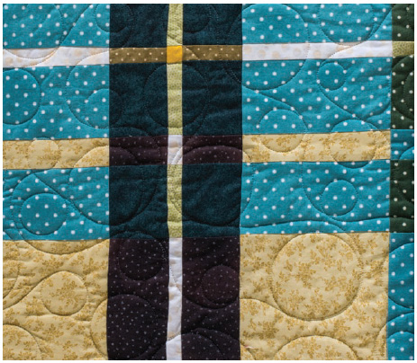
Color is important, but value is more important in these projects. Why? Because it is through value (the lightness or the darkness of a fabric) that the perception of color is presented. It is through value that the design will show itself. In these projects, it is more important that there is a variety of values than a visually pleasing color scheme. You will find that you need to use some low-value colors in your quilts, as they are critical to the success of these designs.
In the Amador square lap quilt, the colors of the adjacent greens range from blue-green to olive green, but they work well together because the differences in value make the pattern stand out.
Fabric with a low value looks dark, sometimes even black; fabric with a high value has a pure, fully saturated color. One is not better than the other. Both are needed in these projects to bring out the design of the quilt. A quilt with only medium-value fabrics will not show off the design, but if fabrics of very low and very high value are added to the mix (even in a small amount), the result is a more powerful representation of the quilt design.
As an example of the importance of value, consider the impact of the thin stripes running through the Maitland quilts. It is the extreme contrast of values that makes this pattern so stunning.

An interesting aspect of value to consider is its relative impact. A medium-value fabric will look dark against a light-value fabric but look light against a dark-value fabric. Keep this in mind as you choose the fabrics for your quilts.
The impact of the light-value stripes running through the darker-value fabric makes a dramatic impact in the Maitland quilts.
Black Fabric
Most tartans have black (or a very, very low-value blue or green) in them, even if it’s just a tiny sliver that runs inconspicuously through one of the main colors. Because black often defines the pattern, different black styles may impact the overall look of the quilt. Many times you may not want an actual black but a very low-value color, such as a blue or green; this is especially true when using hand-dyed fabrics such as batiks. The Elliot king quilt is a good example of this. Sometimes you will want a fabric that is dominantly black but has an additional color or design—or both. These could add motion or depth to the quilt.
Different black fabrics will give different characteristics to your project. That’s because the pigments and dyes specific to the fabrics have different light-absorption properties. Some black fabrics have a shininess to them, making them look more silver gray than black. Other black fabrics look like dark gray when placed next to a darker black. Some black fabrics are cool and some are warm. If the black fabric has a pattern, it will have the effect of adding texture or even movement to the overall design.
When selecting a black fabric for your project, audition it first. Black may be a very small part of the overall quilt, but it makes a strong impact.
Washing Fabric
I am a firm believer in washing fabric before using it—and not just batiks and other hand-dyed fabrics (which tend to leach and can ruin a finished quilt)—but any fabric. The main reason is because of formaldehyde. Formaldehyde is used to bind color to fabric, provide that stiffness we all love, and serve as a fire retardant; it is also used to prevent mildew during shipping. That odor that we all associate with fabric stores is the formaldehyde in the fabric. The problem is that this highly toxic, colorless gas has been linked to skin irritation and allergies in some people. It is also a known carcinogen for those with high and prolonged exposure, which quilters generally are not. Washing the fabric will eliminate some, but not all, of the chemical. This is not meant to scare quilters away from quilting but merely to serve as a sound rationale for washing fabric before using it (and washing clothes before wearing them).
Formaldehyde is not the only chemical in our cotton fabric. The entire process of taking natural cotton from the plant to become fabric is filled with chemicals. N-Propyl Mercaptan (a derivative of sulfur that has a pungent smell) is sprayed on the plants to prevent boll weevil. When the cotton plants are harvested, mercaptans are used again—this time as an exfoliant to make the leaves fall off the plants and to make the harvest of the cotton fiber easier. A chemical stiffener is added during weaving to prevent warp in the yarn. The raw fabric is then bleached to remove all of the chemicals used thus far. Afterward, the fabric is mercerized with caustic soda that makes the yarn swell and then shrink so that the dye will adhere to the fabric better and the final product will have a silken luster. Finally, formaldehyde is added to give the fibers stability.
Maybe this is more information than you wanted to know on the preparation of cotton fabric. But knowing how fabric is prepared benefits quilters because they know how to treat and take care of their quilts, as well as appreciate the overall process. I compare it to knowing about the grape varietal when drinking wine. There are so many factors that influence a final wine product, and the same can be said about fabric.
If you like to work with stiff fabric like I do, wash it first; then put some liquid starch in the rinse cycle. You will get rid of the toxic chemicals but still have a bit of that stiffness that is so pleasant to work with.