![]()
1. Water and Sanitation
2. Food and Agriculture
3. Health and Health Care
4. Energy
5. Education
6. Democracy
7. Population and Urbanization
8. Information and Communications Technology
9. Philanthropy
10. Dematerialization and Demonetization
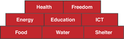
The Abundance Pyramid outlines the increasing levels of needs enabled by technology. This is loosely based on Maslow’s (pyramid) hierarchy of needs.
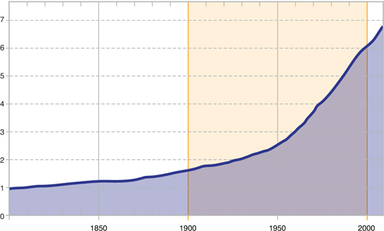
2 Growth of World Population and the History of Technology
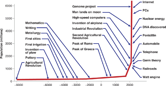
This graph shows how the rate of technological innovation has dramatically increased at the same time that the human population has increased. (Note: Selected technological milestones are subjective.)
Source: Robert Fogel, University of Chicago.
Water and Sanitation
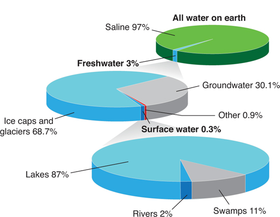
3 Distribution of Water on Earth
The freshwater that humanity depends upon makes up less than 1 percent of the water on Earth. 97 percent is saltwater and 2 percent is locked up in the ice caps and glaciers.
Source: World Fresh Water Resources via USGS.
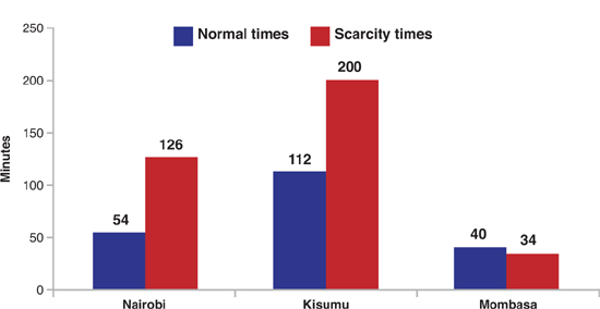
4 Daily Time Spent Fetching Water from Sources Outside the Home
In urban areas, a larger fraction of households have access to piped water, yet many are forced to rely on water kiosks (15 percent in Nairobi; 45 percent in Kisumu and in Mombasa) (CRC 2009). This situation presents a huge burden to households, as fetching water is time consuming. A typical household makes four to six trips daily to fetch water. In Nairobi, a typical household spends 54 minutes going to the kiosk in normal times, and more than twice that (126 minutes) in times of water scarcity.
Source: Citizen Report Card, 2007; www.twaweza.org/uploads/files/Its%20our%20water%20too_English.pdf.
5 Average Price for Water Service in Fifteen Largest Cities, by Type of Provider
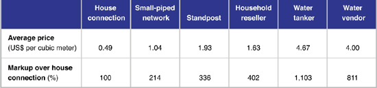
Non-piped water services can cost 200 to 1100 percent of what a house connection would cost (study of fifteen large cities in Africa).
Source: Keener, Luengo, and Banerjee 2009; www.infrastructureafrica.org/system/files/Africa%27s%20Water%20and%20Sanitation%20Infrastructure.pdf.
6 Estimated Annual World Water Use
7 Virtual Water Footprint for Various Products
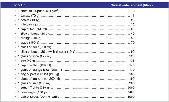
Global average virtual-water content (in liters) for some selected products, per unit of product (in 2007).
Source: http://www.waterfootprint.org/Reports/Hoekstra_and_Chapagain_2007.pdf.
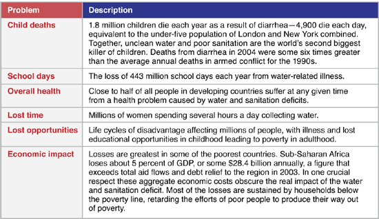
8 Losses Due to Water Scarcity and Poor Sanitation
Source: http://hdr.undp.org/en/media/HDR06-complete.pdf.
9 Use of Improved Sanitation Facilities in Africa and Asia, 2008
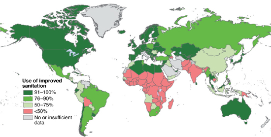
Improved sanitation facilities are used by less than two thirds of the world population; 1.2 billion people still practice open defecation.
Sources: http://www.unicef.org/wash/files/JMP_report_2010.pdf and http://is662ict4sd14.blogspot.com.
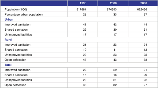
10 Sanitation Coverage in Africa: 1990–2008
Source: http://www.unhabitat.org/pmss/getElectronicVersion.aspx?nr=3074&alt=1;compilation from WHO/UNICEF (2010) Progress on Water and Sanitation: 2010.
Food and Agriculture
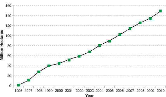
11 Global Area of Biotech Crops, 1996 to 2010 (Million Hectares)
In 2010, the global market value of biotech crops was US$11.2 billion, representing 22 percent of the US$51.8 billion global crop protection market in 2010 and 33 percent of the approximately US$34 billion 2010 global commercial seed market. Of the US$11.2 billion biotech crop market, US$8.9 billion (80 percent) was in the industrial countries and US$2.3 billion (20 percent) was in the developing countries. This graph shows the consistency of global adoption and growth.
Source: Clive James, 2010; http://www.isaaa.org/resources/publications/pocketk/16/default.asp.
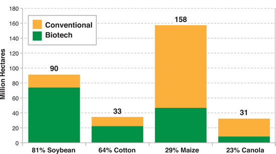
12 Biotech Crop Area as Percentage of Global Area of Principal Crops, 2008 (Million Hectares)
The future of biotech crops looks encouraging. Commercialization of drought-tolerant maize is expected in 2012; golden rice in 2013; and Bt rice before the Millennium Development Goal (MDG) of 2015, which will potentially benefit 1 billion poor people in Asia alone.
Source: http://www.isaaa.org/resources/publications/pocketk/16/default.asp.
13 Past and Projected Trends in Consumption of Meat and Milk in Developed and Developing Countries
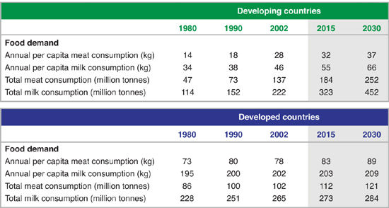
There is a growing demand for both meat and milk in both the developed and the developing world.
Source: FAO 2006, “Livestock’s Long Shadows: Environmental Issues and Options”; ftp://ftp.fao.org/docrep/fao/010/a0701e/a0701e.pdf.
14 Past and Projected Food Consumption of Livestock Products (1960–2050)
There is a growing demand for livestock products worldwide.
Source: FAO 2006, “Livestock’s Long Shadows: Environmental Issues and Options”; ftp://ftp.fao.org/docrep/fao/010/a0701e/a0701e.pdf.
15 Household Food Spending Worldwide
Less than 7 percent of the money Americans spend goes to buy food, the lowest of any country that keeps such data. Each number on the map represents a country and the percentage of people’s total expenditures spent on food in that country.
Sources: http://civileats.com/2011/03/29/mapping-global-food-spending-infographic/data, http://www.ers.usda.gov/briefing/cpifoodandexpenditures/Data/Table_97/2009table97.htm.
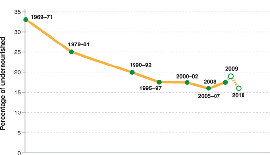
16 Proportion of Undernourished People in the Developing World, 1969–2010
The percentage of undernourished people in the developing world has dropped by over 50 percent since 1969.
Source: http://www.fao.org/docrep/013/i1683e/i1683e00.htm.
17 Undernourished People in the World Today by Region
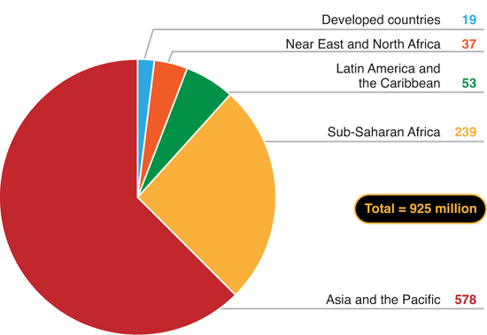
There are 925 million undernourished people in the world today. This means that one out of every seven of us does not get enough food for a healthy, active life.
Source: http://www.fao.org/docrep/012/al390e/al390e00.pdf http://www.wfp.org/hunger.
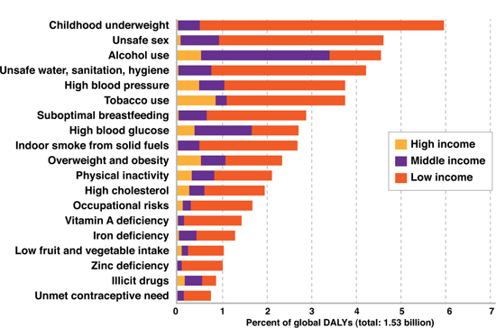
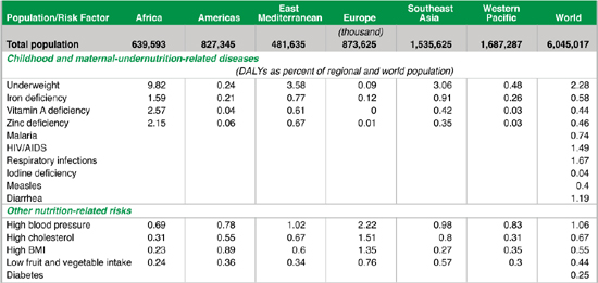
18 Regional and Global Burden of Nutrition-Related Disease Risk Factors
The table shows the estimated disease burden for each risk factor. These risks act on their own and jointly with others. Consequently, the burden due to groups of risk factors will usually be less than the sum of individual risks. The disability-adjusted life year is a measure of the burden of disease. It reflects the total amount of healthy life lost to all causes.
Source: http://www.millenniumassessment.org/documents/document.277.aspx.pdf; adapted from Ezzati et al. 2002; Ollila n.d.; and WHO 2002a.
19 Energy Loss in Food (Field to Fork)
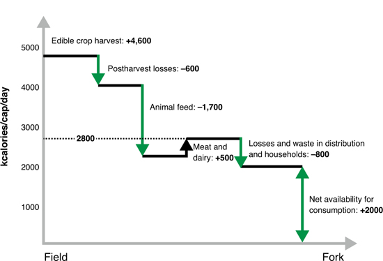
A schematic summary of the amount of food produced globally at field level and estimates of the losses, conversions, and wastage in the food chain. This is part of the argument for the creation of Vertical Farms.
Source: “From Field to Fork: Curbing Losses and Wastage in the Food Chain,” Stockholm International Water Institute; http://www.siwi.org/documents/Resources/Papers/Paper_13_Field_to_Fork.pdf.
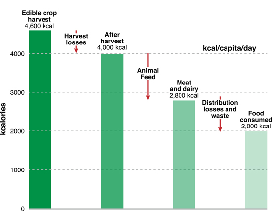
20 Energy Loss in Food (Harvest to Home)
Losses in the food chain from field to household consumption. Over 50 percent of the kcal (energy) of the food harvested in the field is lost by the time it gets to your table. This is part of the argument for the creation of Vertical Farms.
Source: http://maps.grida.no/go/graphic/losses-in-the-food-chain-from-field-to-household-consumption.
21 Vertical Farming

While this image depicts only a few potential vertical farming technologies, it does explore the integration of the system into urban environments.
Source: Vertical Farm Project; http://www.the-edison-lightbulb.com/2011/03/09/vertical-farms-the-21st-century-agricultural-revolution.
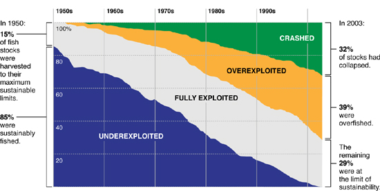
22 Evidence of Overfishing (1950–2003)
The condition of the world’s fisheries has declined drastically because of overfishing. Today’s fisheries are at the breaking point.
Source: http://simondonner.blogspot.com/2008/11/farming-oceans.html.
23 Growth of Seafood Aquaculture vs. Wild Caught, 1950–2008
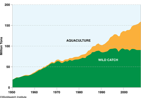
Growth of Seafood Aquaculture between 1950 and 2008 has helped to make up for the decimation of our natural fisheries.
Source: FAO; http://peakwatch.typepad.com/.a/6a00d83452403c69e201538f2305b2970b-pi.
Health and Health Care
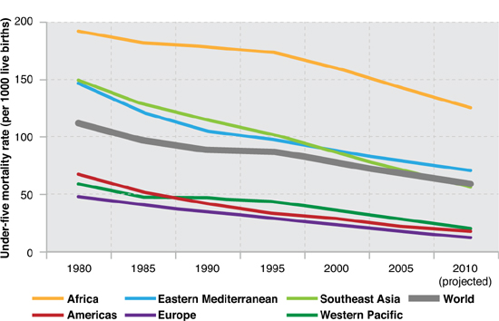
24 Projected Under-Five Mortality Rate (per 1,000 live births) Globally and by WHO Region, 1980–2010
Note that health care improvements have decreased early childhood (under five years) mortality rates by nearly 50 percent in many regions of the world.
Source: http://www.who.int/gho/child_health/mortality/mortality_under_five/en/index.html.
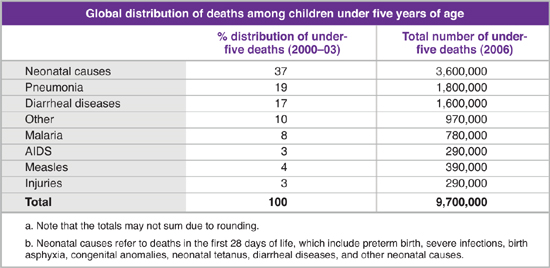
25 Cause of Deaths Among Children Under Five Years of Age
Neonatal causes refer to deaths in the first 28 days of life. These include: preterm birth, severe infections, birth asphyxia, congenital anomalies, neonatal tetanus, and diarrheal diseases. Many of these diseases and conditions are preventable with modern health care technologies.
Source: http://www.unicef.org/media/files/Under_five_deaths_by_cause_2006_estimates3.doc.53%from World Health Organization, The World Health Report 2005: Make Every Mother and Child Count, WHO, Geneva, 2005.
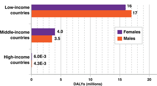
26 Percentage of Disability-Adjusted Life Years (DALYs) by Income Level (2004)
According to this chart the following categories—childhood underweight, unsafe sex, unsafe water, suboptimal breastfeeding, indoor smoke, vitamin A deficiency, iron deficiency, zinc deficiency, and unmet contraceptive needs—are all conditions of poverty. These are primary areas for near-term improvement.
Source: WHO, 2009. Global health risks.
27 Health and Indoor Pollution
This chart shows the disease burden due to indoor air pollution by level of development. In 2004, indoor air pollution from solid fuel use was responsible for almost 2 million deaths and 2.7 percent of the global burden of disease (in disability-adjusted life years, or DALYs). This makes it the second largest contributor to ill health. Acute lower respiratory infections, in particular pneumonia, continue to be the biggest killer of young children, causing more than 2 million annual deaths.
Source: http://www.who.int/indoorair/health_impacts/burden_global/en.
28 Health and Water-Related Disease (1999)

For the year 1999, worldwide disease burden caused by selected water-related diseases other than infectious diarrhea (figures x 1000). Safe water supplies, hygienic sanitation, and good water management are fundamental to global health. Almost one tenth of the global disease burden could be prevented by: (i) increasing access to safe drinking water; (ii) improving sanitation and hygiene; and, (iii) improving water management to reduce risks of waterborne infectious diseases. Annually, safer water could prevent 1.4 million child deaths from diarrhea, 500,000 deaths from malaria, and 860,000 child deaths from malnutrition. In addition, 5 million people can be protected from being seriously incapacitated from lymphatic filariasis and another 5 million from trachoma.
Sources: http://ehp.niehs.nih.gov/realfiles/members/2002/110p537-542pruss/pruss-full.html; http://www.who.int/features/qa/70/en/index.html.
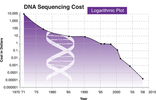
29 Exponential Decrease in DNA Sequencing Costs
Source: Kurzweil, The Singularity Is Near.
30 Worldwide Life Expectancy Growth
Global lengthening of average human life span over the past 190 years.
Source: United Nations Development Program.
Energy
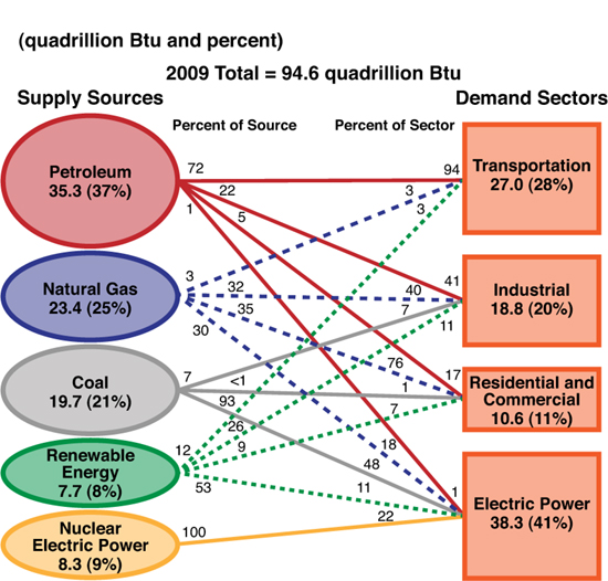
31 Sources and Demand (Uses) of Energy in the United States (2009)
This graphic shows the complex web of energy sources and uses in the United States (in 2009). Numbers along lines indicate percentages.
Source: http://www.eia.gov/totalenergy/data/annual/pecss_diagram2.cfm.
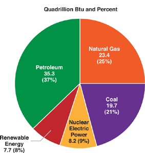
32 U.S. 2009 Sources of Energy
This pie chart indicates the sources of energy powering the United States in 2009. The first number is quadrillion Btu and the second number is percentage.
Source: http://www.eia.gov/energy_in_brief/major_energy_sources_and_users.cfm.
33 GDP per Capita vs. Power Consumption (each dot represents a country)
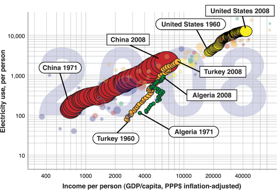
The trend is pretty clear: the wealthier a nation becomes (GDP per capita), the more energy it consumes (KWh per capita). This Gapminder chart shows the progress of a nation between 1960 and 2008 (data for China and Algeria is available only starting in 1971). The size of the circle represents the population size. The four countries chosen are for representation purposes only.
Source: http://www.inference.phy.cam.ac.uk/withouthotair/c30/page_231.shtml.
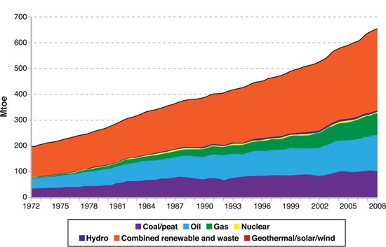
34 Primary Sources of Energy in Africa (2008)
Africa’s primary power supply measured in million of tons of oil equivalent (Mtoe), broken down by source.
Source: http://www.iea.org/stats/pdf_graphs/11TPES.pdf.
35 Average Price of US Electricity over Time ($ per kWh at 1990 prices)
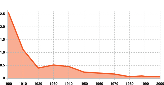
During the past hundred years there has been a constant decrease in the cost of electricity ($ per KWh).
Source: Bill Gates TED Talk, 2010.
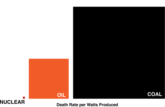
36 Deaths per TWh by Energy Generation Source
Note the tiny dot labeled “Nuclear” to the far left. For every one person killed by nuclear power generation, 4,000 die because of coal.
Sources: Seth Godin at http://sethgodin.typepad.com/seths_blog/2011/03/the-triumph-of-coal-marketing.html. Using Brian Wang’s data: http://nextbigfuture.com/2011/03/deaths-per-twh-by-energy-source.html.
37 Energy Storage: Specific Power vs. Specific Energy
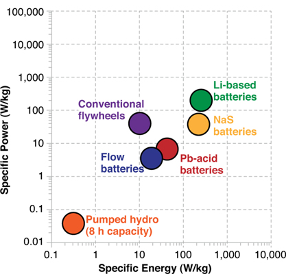
The graph shows the relative specific power (amount of current the battery can deliver) versus specific energy (energy per unit mass).
Source: Professor Don Sadoway, MIT, LMBC.
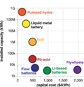
38 Installed Capacity vs. Capital Costs
This figure shows the various energy storage methods plotted on an Installed Capacity versus Capital Cost graph. According to Professor Sadoway, the key metrics required for grid-scale storage are (i) cost (<$150/kWh); life span (>10 years); and energy efficiency (>80 %)—all of which are achievable by liquid metal batteries.
Source: Professor Don Sadoway, MIT, LMBC.
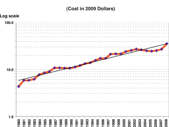
39 Solar PV Cost per Watt (1980–2009)
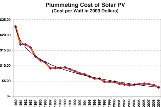
The cost of solar PV cells have been decreasing exponentially.
Source: DOE NREL Solar Technologies Market Report, Jan. 2010. Ramez Naam, “The Exponential Gains in Solar Power per Dollar,” http://unbridledspeculation.com/2011/03/17/the-exponential-gains-in-solar-power-per-dollar.
40 Watts Produced per Constant $100 (1980–2010)
The efficiency of PV (Watts produced per constant $100) has been increasing exponentially. Note that the Y axis is on a log scale.
Sources: DOE NREL Solar Technologies Market Report, Jan. 2010. Ramez Naam, “The Exponential Gains in Solar Power per Dollar,” http://unbridledspeculation.com/2011/03/17/the-exponential-gains-in-solar-power-per-dollar.
41 PV Cost Reduction Road Map (2007–2014)
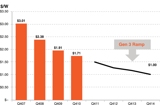
The continued and projected decrease in the cost per watt ($/W) for photovoltaic panels, according to the SunPower Corporation, one of the leading manufacturers of PVs.
Source: © 2010 SunPower Corporation.
42 Learning Curve for Solar Power
The dropping cost of solar and corresponding increase in cumulative production is essentially a graphic representation of the industry’s learning curve.
Source: Presentation by Frank van Mierlo, CEO, and Ely Sachs, CTO, of 1366 Technologies. Data is from Greg Nemet at UC Berkeley.
43 Global Annual Wind Power Capacity vs. Time
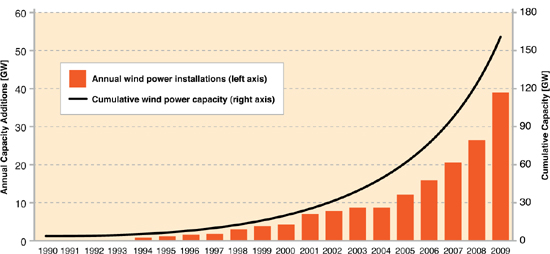
This graph shows global annual wind power capacity additions and cumulative capacity. Despite these trends, wind energy remains a relatively small fraction of worldwide electricity supply. The total wind power capacity installed by the end of 2009 would, in an average year, meet roughly 1.8 percent of worldwide electricity demand.
Source: Special Report on Renewable Energy Sources and Climate Change Mitigation (SRREN). http://srren.ipcc-wg3.de/report/IPCC_SRREN_Ch07.
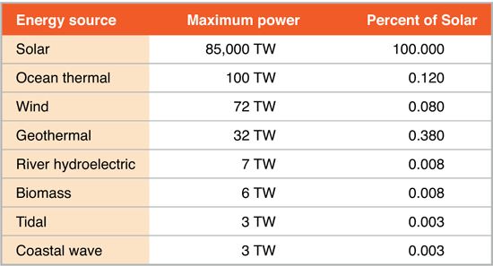
44 Maximum Power Contained in Renewable Sources
No other renewable scales like solar. It has nearly 850 times the potential of ocean thermal, its nearest competitor.
Source: Derek Abbott, Fellow, IEEE, “Keeping the Energy Debate Clean: How Do We Supply the World’s Energy Needs?” Proceedings of the IEEE 98, no. 1 (January 2010).
45 2007 World Energy Consumption
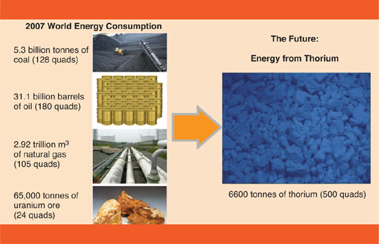
In 2007, just 6,600 tonnes of thorium could have supplied all of the world’s energy.
Source: Bill Gates, TED Talk, 2010.
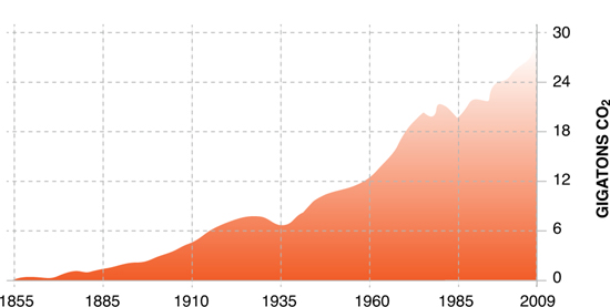
46 Global Carbon Emissions from Energy Production
The growth of global CO2 emissions (gigatons) over the past 150 years.
Source: Bill Gates, TED Talk, 2010.
Education
47 Population of Primary School Age Children and Children Out of School by MDG Region (2007)
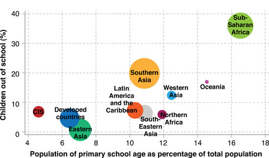
The link between the population structure and the number of children out of school is shown above. Sub-Saharan Africa is the region with the highest percentage of children out of school. At the same time, the population of most countries in sub-Saharan Africa is increasing and children of primary school age constitute a large and growing share of the population. The share of children of primary school age in a region’s population is plotted along the horizontal axis and the share of children out of school along the vertical axis.
Source: Population structure and children out of school. http://huebler.blogspot.com/2009/02/coos.html.
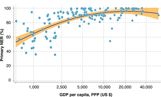
48 Primary School Net Enrollment Ratio and GDP per capita (2002)
The relationship between poverty and education is stark. Most countries with a GDP per capita of $2,500 or less have net enrollment ratios below 80 percent. Almost all countries above this level of GDP have NER values of more than 80 percent.
Source: http://huebler.blogspot.com/2005/09/national-wealth-and-school-enrollment.html.
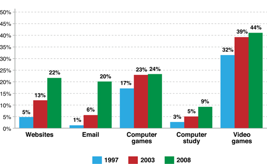
49 Technology Engagement in Children 10–12
Source: http://newsdesk.umd.edu/bigissues/release.cfm?ArticleID=2229; www.popcenter.umd.edu.
Democracy
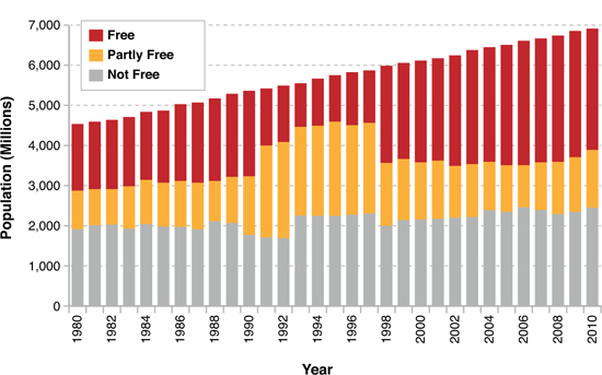
50 Freedom in the World—Population Trends
Source: http://www.freedomhouse.org/images/File/fiw/historical/PopulationTrendsFIW 1980–2011.pdf.
51 The Democracy Index (2010)
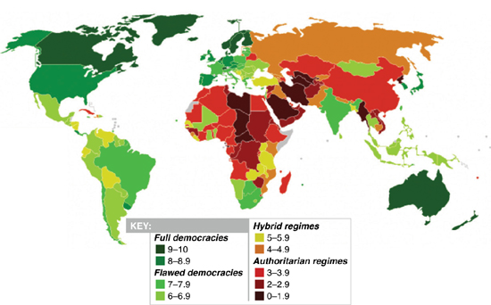
Source: Economist via http://en.wikipedia.org/wiki/File:Democracy_Index_2010_green_and_red.svg. Source: Economist via http://en.wikipedia.org/wiki/file:Democracy_Index_2010_green_and_red.svg.
Population and Urbanization
52 The True Size of Africa
Graphic layout for visualization only (some countries are cut and rotated), but the conclusions are very accurate: refer to table at left for exact data.
In addition to the well-known social issues of illiteracy and innumeracy, there also should be such a concept as “immappancy,” meaning insufficient geographical knowledge.
A survey with random American schoolkids let them guess the population and land area of their country. Not entirely unexpected, but still rather unsettling, the majority chose “1–2 billion” and “largest in the world,” respectively.
Even with Asian and European college students, geographical estimates were often off by factors of 2–3. This is partly due to the highest distorted nature of the predominantly used mapping projections (such as Mercator).
A particularly extreme example is the worldwide misjudgement of the true size of Africa. This single image tries to embody the massive scale, which is larger than the USA, China, India, Japan and all of Europe... combined!
Source: Kai Krause, Creative Commons.
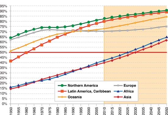
53 World Urbanization Prospects (2009)
By 2050, 70 percent of the world’s population will live in cities.
Source: http://esa.un.org/unpd/wup/Fig_1.htm.
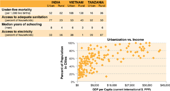
54 Comparison of Urban-Rural Statistics (2003–2007) for India, Vietnam, and Tanzania
In most countries, city dwellers fare better than their rural counterparts. More urbanized countries in the developed world enjoy a higher per capita income. Within many developing countries, urban residents have more access to basic health and educational services.
55 World Population 1800–2009
World population growth over the past 209 years in billions of people.
Source: http://earthtrends.wri.org/updates/node/287; UN (population) and World Bank (GDP).
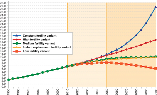
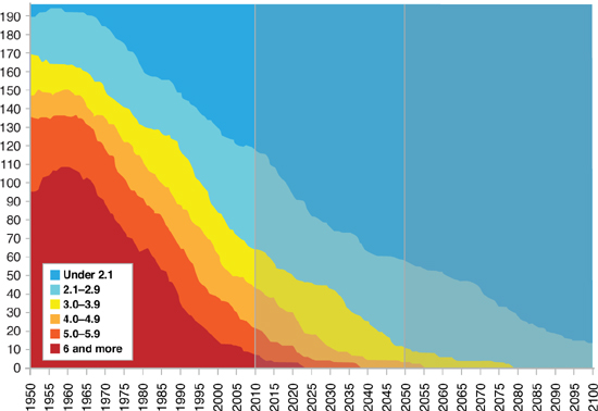
56 Estimated and Projected World Population Variants (1950–2100)
According to the medium variant of the 2010 Revision of World Population Prospects, the world population is expected to increase from 6.9 billion in mid-2011 to 9.3 billion in 2050 and to reach 10.1 billion by 2100. Realization of this projection is contingent on the continued decline of fertility in countries that still have fertility above replacement level (that is, countries where women have, on average, more than one daughter) and an increase of fertility in the countries that have below-replacement fertility. In addition, mortality would have to decline in all countries. If fertility were to remain constant in each country at the level it had in 2005–2010, the world population could reach nearly 27 billion by 2100.
Source: http://esa.un.org/wpp/Analytical-Figures/htm/fig_1.htm.
57 Number of Countries by Total Fertility
In the great majority of countries total fertility will be below 2.1 children per woman in 2100. This figure displays the number of countries by level of total fertility from 1950 to 2100.
Source: http://esa.un.org/unpd/wpp/Analytical-Figures/htm/fig_9.htm.
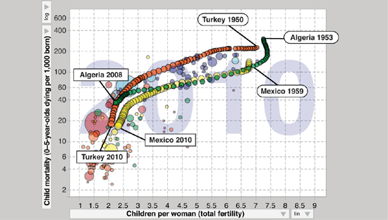
58 Children per Women vs. Child Mortality over Time
This Gapminder chart plots child mortality (age 0–5) against children per woman, demonstrating a direct correlation between the two. Specifically, as the childhood mortality rate decreases, so too does the number of children born to each woman. The chart shows the progress of a nation between 1950’s and 2008. The size of the circle represents the nation’s population size. The three countries chosen are for representation purposes only.
Source: Gapminder, Hans Rosling.
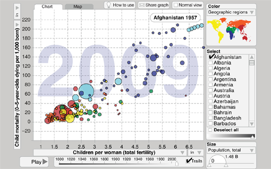
59 Children per Women vs. Child Mortality (2009)
This Gapminder chart plots child mortality (age 0–5) against children per woman, demonstrating a direct correlation between the two. Specifically, as the childhood mortality rate decreases, so too does the number of children born to each woman.
Source: Gapminder, Hans Rosling.
60 Population Change Between 2010 and 2100 by Major Region (millions)
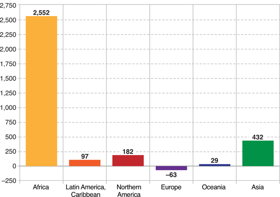
Source: http://esa.un.org/unpd/wpp/Analytical-Figures/htm/fig_13.htm.
Information and Communications Technologies
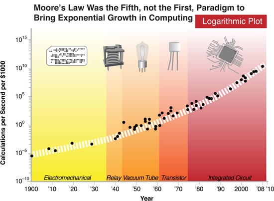
61 Exponential Growth of Computing for 110 Years
Moore’s Law in action. Note how smooth this exponential curve has been over the past hundred years regardless of world wars, depressions, and recessions. Also the curve is actually trending upward (toward vertical), demonstrating the rate of exponential growth itself is increasing over time.
Source: Kurzweil, The Singularity Is Near.
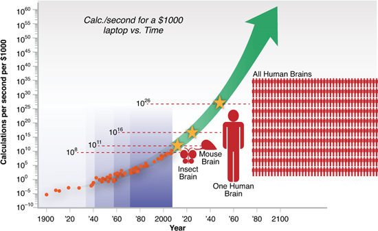
62 The Exponential Growth of Computing on a Logarithmic Plot
This curve from Singularity Is Near projects the continuation of Moore’s Law over the next century. It indicates that by roughly 2023 the average $1,000 laptop will be able to communicate at the rate of the human brain, and another ~25 years later, at the rate of the entire human race.
Source: Kurzweil, The Singularity Is Near.
63 Exponentially Falling Cost of Memory (1950-2008) Dollars per Megabyte
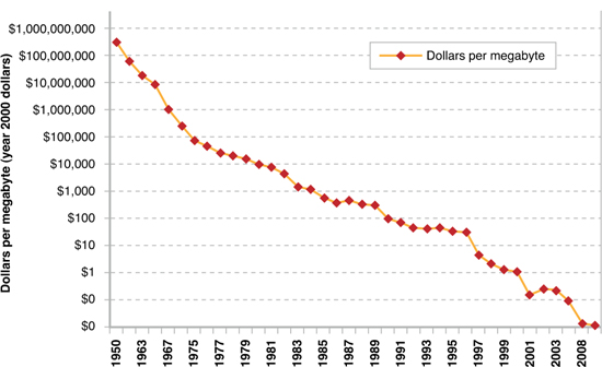
Source: Kurzweil, The Singularity Is Near.
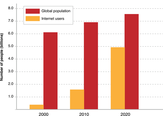
64 Global Population and Internet Users (2000–2020)
Source: http://www.futuretimeline.net/21stcentury/2020-2029.htm#ref3.
65 Hours of YouTube Video Uploaded per Minute
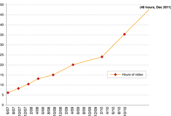
Nothing demonstrates the explosive growth of digital data better than the rise in content on YouTube. By the end of 2011, 48 hours of video content will be uploaded to the site every minute.
Sources: http://www.youtube.com/t/press_statistics; http://youtube-global.blogspot.com/2010/11/great-scott-over-35-hours-of-video.html; http://youtube-global.blogspot.com/2011/05/thanks-youtube-community-for-two-big.html.
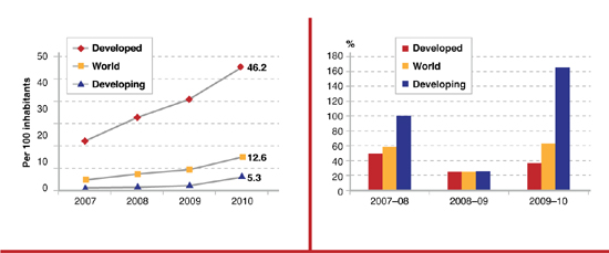
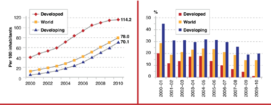
66 Mobile Cellular Subscription Growth 2000–2010
The graph on the left shows the rapid growth of mobile/cellular subscriptions in the developed and developing world. In the developed world, a number greater than 100 indicates individuals have more than one handset. The graph on the right shows annual growth rate over time.
Sources: http://www.itu.int/ITU-D/ict/publications/idi/2011/Material/MIS_2011_without_annex_5.pdf; http://www.itu.int/ITU-D/ict/publications/idi/2010/Material/MIS_2010_without_annex_4-e.pdf.
67 Mobile Broadband Subscription Penetration and Growth (2007–2010) by Level of Development
These charts specifically show the growth in wireless-broadband Internet access, rather than cellular phones. The single, most dynamic ICT development over the past year has been the surge in mobile broadband subscriptions.
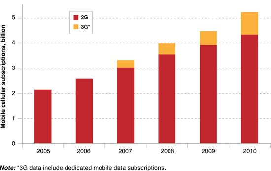
68 Growth in Mobile 2G and 3G Subscriptions
Source: http://www.itu.int/ITU-D/ict/publications/idi/2011/Material/MIS_2011_without_annex_5.pdf.
69 Total International Internet Bandwidth Gbits/sec): 2000-2010
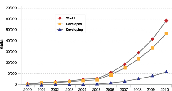
Between 2008 and 2010, Africa has made great progress in international Internet connectivity. Many countries have doubled or tripled their international bandwidth capacity; some have witnessed a tenfold increase. If accompanied by effective policy measures that ensure competitive access to the newly available bandwidth, this increase may have a positive impact on broadband affordability—one of the major issues in the region.
Sources: http://www.itu.int/ITU-D/ict/publications/idi/2011/Material/MIS_2011_without_annex_5.pdf; http://www.itu.int/ITU-D/ict/publications/idi/2010/Material/MIS_2010_without_annex_4-e.pdf.
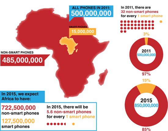
70 2G and 3G Mobile Phone penetration in Africa 2011–2015
Projected five-year growth of 2G and 3G mobile devices. Note the disproportionately high rate of growth for smart phones.
Source: http://afrographique.tumblr.com/post/7087562485/infographic-depicting-smart-and-dumb-mobile.
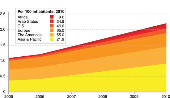
71 Internet Users (2005–2010) and per 100 Inhabitants (2010)
ITU: Internet users in billions (2005–2010) and per 100 Inhabitants (2010)
• The number of Internet users has doubled between 2005 and 2010.
• In 2010, the number of Internet users will surpass the 2 billion mark, of which 1.2 billion will be in developing countries.
• A number of countries (Estonia, Finland, and Spain) have declared access to the Internet as a legal right for citizens.
• With more than 420 million Internet users, China is the largest Internet market in the world.
• While 71 percent of the population in developed countries are online, only 21 percent of the population in developing countries are online. By the end of 2010, Internet user penetration in Africa will reach 9.6 percent, far behind both the world average (30 percent) and the developing country average (21 percent).
Source: http://www.itu.int/ITU-D/ict/material/FactsFigures2010.pdf.
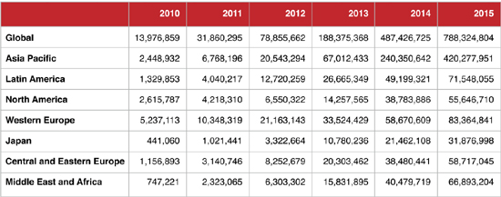
72 Number of Mobile-Only Internet Users
These tables provide details on the projected growth of mobile-only Internet users, meaning those accessing the net over a smart phone.
Source: Cisco VNI Mobile, 2011.
Philanthropy
73 Concentration of High-Net-Worth Individuals per 1,000people, 2010
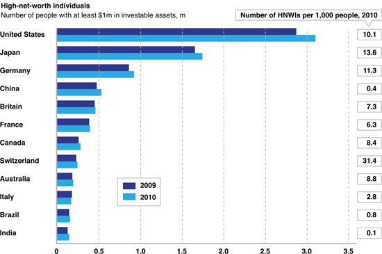
Sources: http://www.economist.com/blogs/dailychart/2011/06/rich from http://www.capgemini.com/services-and-solutions/by-industry/financial-services/solutions/wealth/worldwealthreport.
74 Number of Active Private and Community Foundations
The number of active foundations has almost quadrupled in the past two decades.
Source: US Foundation Center (2010), http://foundationcenter.org/findfunders/statistics; http://foundationcenter.org/gainknowledge/research/pdf/fgge10.pdf.
75 Number of Active Private and Community Foundations
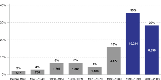
Close to two-thirds of active larger foundations were established after 1989. Based on Foundation Center data on grant-making foundations with assets of at least $1 million.
Sources: US Foundation Center (2010), http://foundationcenter.org/findfunders/statistics; http://foundationcenter.org/gainknowledge/research/pdf/fgge10.pdf.
Dematerialization and Demonetization
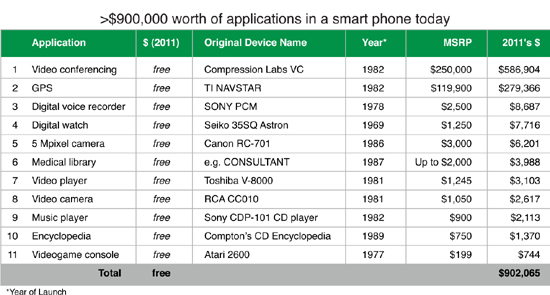
76 Dematerialization
People with a smart phone today can access tools that would have cost thousands a few decades ago.
Sources: (1) http://www.nefsis.com/Best-Video-Conferencing-Software/video-conferencing-history.html
(2) http://www.americanhistory.si.edu/collections/surveying/object.cfm?recordnumber=998407
(3) http://www.videointerchange.com/audio_history.htm
(4) http://www.shvoong.com/humanities/1714780-history-digital-watch
(5) http://www.digicamhistory.com/1986.html
(6) http://www.tnyurl.com/63ljueq
(7) http://www.mrbetamax.com/OtherGuys.htm
(8) http://www.cedmagic.com/museum/press/release-1981-02-12-1.html
(9) http://www.digicamhistory.com/1980_1983.html
(10) http://www.mba.tuck.dartmouth.edu/pdf/2000-2-0007.pdf
(11) http://www.thegameconsole.com/atari-2600/
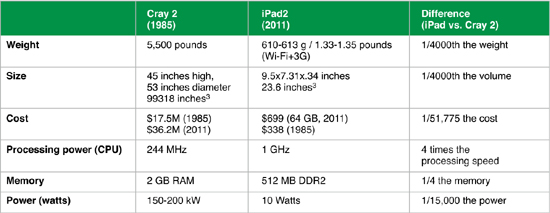
77 iPad 2 as Fast as a Supercomputer in 1985
Sources: http://bits.blogs.nytimes.com/2011/05/09/the-ipad-in-your-hand-as-fast-as-a-supercomputer-of-yore; http://archive.computerhistory.org/resources/text/Cray/Cray.Cray2.1985.102646185.pdf; http://en.wikipedia.org/wiki/Cray-3; 2 GB; RAM; http://www.cs.umass.edu/~weems/CmpSci635A/Lecture16/L16.16.html15,000; http://books.google.com/books?id=LkrTkAa10McC&pg=PA61-IA8; Cray 2 Brochure; http://www.craysupercomputers.com/downloads/Cray2/Cray2_Brochure001.pdf.
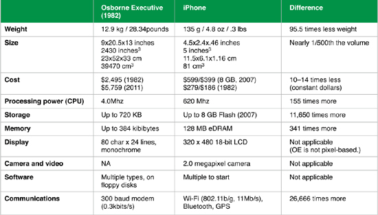
78 iPhone (2007) vs. Osborne Executive (1982)
Sources: http://www.computermuseum.li/Testpage/OsborneExecSpecs.htm; http://en.wikipedia.org/wiki/Osborne_Executive; http://en.wikipedia.org/wiki/IPhone.
Exponential Curves
79 Exponential vs. Linear Curves
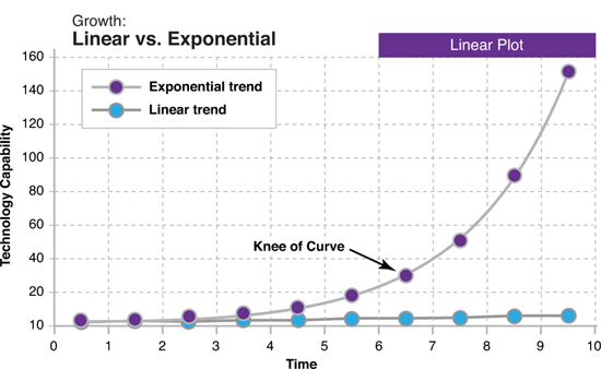
This graph shows the fundamental difference between exponential growth and linear growth. In the early period of exponential doublings, before the front edge of the curve is reached, exponential and linear growth are difficult to distinguish.
Source: Ray Kurzweil, The Singularity Is Near.
80 Exponential Curves
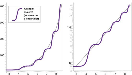
The graph on the left demonstrates an ongoing exponential sequence made up of a cascade of S-curves on a linear plot. The graph on the right demonstrates the same exponential sequence of S-curves on a logarithmic plot.
Source: Ray Kurzweil, The Singularity Is Near.
81 The Gartner Hype Curve
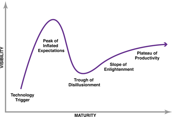
Each hype cycle drills down into the five key phases of a technology’s life cycle. Early in the life cycle of a new technology there is an overestimation of the technology’s potential, which leads to the peak of inflated expectations, followed by a dismissal of its abilities and the trough of disillusionment, and ultimately by the technology’s true fulfillment and its plateau of productivity.


