14
Proportion Data
An important class of problems involves data on proportions:
- studies on percentage mortality
- infection rates of diseases
- proportion responding to clinical treatment
- proportion admitting to particular voting intentions
- sex ratios
- data on proportional response to an experimental treatment
These are count data, but what they have in common is that we know how many of the experimental objects are in one category (dead, insolvent, male or infected) and we also know how many are in another (alive, solvent, female or uninfected). This differs from Poisson count data, where we knew how many times an event occurred, but not how many times it did not occur (Chapter 13).
We model processes involving proportional response variables in R by specifying a generalized linear model (GLM) with family=binomial. The only complication is that whereas with Poisson errors we could simply say family=poisson, with binomial errors we must specify the number of failures as well as the numbers of successes by creating a two-vector response variable. To do this we bind together two vectors using cbind into a single object, y, comprising the numbers of successes and the number of failures. The binomial denominator, n, is the total sample, and
number.of.failures <- binomial.denominator – number.of.successesy <- cbind(number.of.successes, number.of.failures)
The old-fashioned way of modelling this sort of data was to use the percentage mortality as the response variable. There are four problems with this:
- the errors are not normally distributed
- the variance is not constant
- the response is bounded (by 100 above and by 0 below)
- by calculating the percentage, we lose information of the size of the sample, n, from which the proportion was estimated
By using a GLM, we cause R to carry out a weighted regression, with the sample sizes, n, as weights, and employing the logit link function to ensure linearity. There are some kinds of proportion data, such as percentage cover, that are best analysed using conventional linear models (with normal errors and constant variance) following arcsine transformation. In such cases, the response variable, measured in radians, is 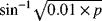 , where p is percentage cover. If, however, the response variable takes the form of a percentage change in some continuous measurement (such as the percentage change in weight on receiving a particular diet), then rather than arcsine transform the data, it is usually better treated by either
- analysis of covariance (see Chapter 9), using final weight as the response variable and initial weight as a covariate, or
- by specifying the response variable as a relative growth rate, measured as log(final weight/initial weight)
both of which can then be analysed with normal errors without further transformation.
Analyses of Data on One and Two Proportions
For comparisons of one binomial proportion with a constant, use binom.test (see p. 98). For comparison of two samples of proportion data, use prop.test (see p. 100). The methods of this chapter are required only for more complex models of proportion data, including regression and contingency tables, where GLMs are used.
Averages of Proportions
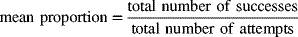
A classic beginner's mistake is to average proportions as you would with any other kind of real number. We have four estimates of the sex ratio: 0.2, 0.17, 0.2 and 0.53. They add up to 1.1, so the mean is 1.1/4 = 0.275. Wrong! This is not how you average proportions. These proportions are based on count data and we should use the counts to determine the average. For proportion data, the mean success rate is given by:
We need to go back and look at the counts on which our four proportions were calculated. It turns out they were 1 out of 5, 1 out of 6, 2 out of 10 and 53 out of 100, respectively. The total number of successes was 1 + 1 + 2 + 53 = 57 and the total number of attempts was 5 + 6 + 10 + 100 = 121. The correct mean proportion is 57/121 = 0.4711. This is nearly double the answer we got by doing it the wrong way. So beware.
Count Data on Proportions
The traditional transformations of proportion data were arcsine and probit. The arcsine transformation took care of the error distribution, while the probit transformation was used to linearize the relationship between percentage mortality and log dose in a bioassay. There is nothing wrong with these transformations, and they are available within R, but a simpler approach is often preferable, and is likely to produce a model that is easier to interpret.
The major difficulty with modelling proportion data is that the responses are strictly bounded. There is no way that the percentage dying can be greater than 100% or less than 0%. But if we use simple techniques such as linear regression or analysis of covariance, then the fitted model could quite easily predict negative values or values greater than 100%, especially if the variance was high and many of the data were close to 0 or close to 100%.
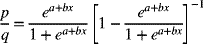
The logistic curve is commonly used to describe data on proportions, because, unlike the straight line model, it asymptotes at 0 and 1 so that negative proportions and responses of more than 100% cannot be predicted. Throughout this discussion we shall use p to describe the proportion of individuals observed to respond in a given way. Because much of their jargon was derived from the theory of gambling, statisticians call these successes, although to a demographer measuring death rates this may seem a little eccentric. The individuals that respond in other ways (the statistician's failures) are therefore 1 − p and we shall call the proportion of failures q (so that p + q = 1). The third variable is the size of the sample, n, from which p was estimated (it is the binomial denominator, and the statistician's number of attempts).
An important point about the binomial distribution is that the variance is not constant. In fact, the variance of a binomial distribution with mean np is:

so that the variance changes with the mean like this:
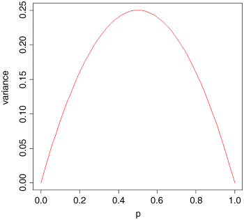
The variance is low when p is very high or very low (when all or most of the outcomes are identical), and the variance is greatest when p = q = 0.5. As p gets smaller, so the binomial distribution gets closer and closer to the Poisson distribution. You can see why this is so by considering the formula for the variance of the binomial (above). Remember that for the Poisson, the variance is equal to the mean,  . Now, as p gets smaller, so q gets closer and closer to 1, so the variance of the binomial converges to the mean:
Odds
The logistic model for p as a function of x looks like this:

and there are no prizes for realizing that the model is not linear. When confronted with a new equation like this, it is a good idea to work out its behaviour at the limits. This involves asking what the value of y is when x = 0, and what the value of y is when x is very large (say, x = infinity)?
When x = 0 then p = exp(a)/(1 + exp(a)), so this is the intercept. There are two results that you should memorize: exp(∞) = ∞ and exp(−∞) = 1/exp(∞) = 0. So when x is a very large positive number, we have p = 1 and when x is a very large negative number, we have p = 0/1 = 0, so the model is strictly bounded.
The trick of linearizing the logistic turns out to involve a very simple transformation. You may have come across the way in which bookmakers specify probabilities by quoting the odds against a particular horse winning a race (they might give odds of 2 to 1 on a reasonably good horse or 25 to 1 on an outsider). What they mean by 2 to 1 is that if there were three races, then our horse would be expected to lose two of them and win one of them (with a built-in margin of error in favour of the bookmaker, needless to say).
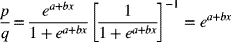
This is a rather different way of presenting information on probabilities than scientists are used to dealing with. Thus, where the scientist might state a proportion as 0.3333 (1 success out of 3), the bookmaker would give odds of 2 to 1. In symbols, this is the difference between the scientist stating the probability p, and the bookmaker stating the odds p/q. Now if we take the odds p/q and substitute this into the formula for the logistic, we get:
which looks awful. But a little algebra shows that:
Now, taking natural logs and recalling that  will simplify matters even further, so that
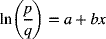
This gives a linear predictor, a + bx, not for p but for the logit transformation of p, namely ln(p/q). In the jargon of R, the logit is the link function relating the linear predictor to the value of p.
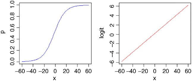
Here is p as a function of x (left panel) and logit(p) as a function of x (right panel) for the logistic with a = 0.2 and b = 0.1:
You might ask at this stage ‘why not simply do a linear regression of ln(p/q) against the explanatory x variable?’ R has three great advantages here:
- it allows for the non-constant binomial variance
- it deals with the fact that logits for ps near 0 or 1 are infinite
- it allows for differences between the sample sizes by weighted regression
Overdispersion and Hypothesis Testing
All the different modelling procedures that we have met in earlier chapters can also be used with data on proportions. Factorial analysis of variance, analysis of covariance and multiple regression can all be carried out using GLMs. The only difference is that we assess the significance of terms on the basis of chi-squared; this is the increase in scaled deviance that results from removal of a term from the current model.
The important point to bear in mind is that hypothesis testing with binomial errors is less clear-cut than with normal errors. While the chi-squared approximation for changes in scaled deviance is reasonable for large samples (i.e. bigger than about 30), it is poorer with small samples. Most worrisome is the fact that the degree to which the approximation is satisfactory is itself unknown. This means that considerable care must be exercised in the interpretation of tests of hypotheses on parameters, especially when the parameters are marginally significant or when they explain a very small fraction of the total deviance. With binomial or Poisson errors we cannot hope to provide exact p values for our tests of hypotheses.
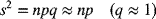
As with Poisson errors, we need to address the question of overdispersion (see Chapter 13). When we have obtained the minimal adequate model, the residual scaled deviance should be roughly equal to the residual degrees of freedom. When the residual deviance is larger than the residual degrees of freedom there are two possibilities: either the model is misspecified, or the probability of success, p, is not constant within a given treatment level. The effect of randomly varying p is to increase the binomial variance from npq to
leading to a larger-than-expected residual deviance. This occurs even for models that would fit well if the random variation were correctly specified.
One simple solution is to assume that the variance is not  but
but  , where s is an unknown scale parameter (s > 1). We obtain an estimate of the scale parameter by dividing the Pearson chi-squared by the degrees of freedom, and use this estimate of s to compare the resulting scaled deviances. To accomplish this, we use family = quasibinomial rather than family = binomial when there is overdispersion.
The most important points to emphasize in modelling with binomial errors are:
- create a two-column object for the response, using cbind to join together the two vectors containing the counts of success and failure
- check for overdispersion (residual deviance greater than residual degrees of freedom), and correct for it by using family=quasibinomial rather than family=binomial if necessary
- remember that you do not obtain exact p values with binomial errors; the chi-squared approximations are sound for large samples, but small samples may present a problem
- the fitted values are counts, like the response variable
- because of this the raw residuals are also in counts
- the linear predictor that you see when you ask for summary(model) is in logits (the log of the odds, ln(p/q))
- you can back-transform from logits (z) to proportions (p) by p = 1/(1 + 1/exp(z))
Applications
You can do as many kinds of modelling in a GLM as in a linear model: here we show examples of:
- regression with binomial errors (continuous explanatory variables)
- analysis of deviance with binomial errors (categorical explanatory variables)
- analysis of covariance with binomial errors (both kinds of explanatory variables)
Logistic Regression with Binomial Errors
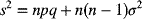
This example concerns sex ratios in insects (the proportion of all individuals that are males). In the species in question, it has been observed that the sex ratio is highly variable, and an experiment was set up to see whether population density was involved in determining the fraction of males.
numbers <- read.csv("c:\\temp\\sexratio.csv")numbersdensity females males1 1 1 02 4 3 13 10 7 34 22 18 45 55 22 336 121 41 807 210 52 1588 444 79 365
It certainly looks as if there are proportionally more males at high density, but we should plot the data as proportions to see this more clearly:
attach(numbers)windows(7,4)par(mfrow=c(1,2))p <- males/(males+females)plot(density,p,ylab="Proportion male")plot(log(density),p,ylab="Proportion male")
Evidently, a logarithmic transformation of the explanatory variable is likely to improve the model fit. We shall see in a moment.
Does increasing population density lead to a significant increase in the proportion of males in the population? Or, more succinctly, is the sex ratio density dependent? It certainly looks from the plot as if it is.
The response variable is a matched pair of counts that we wish to analyse as proportion data using a GLM with binomial errors. First we bind together the vectors of male and female counts into a single object that will be the response in our analysis:
y <- cbind(males,females)
This means that y will be interpreted in the model as the proportion of all individuals that were male. The model is specified like this:
model <- glm(y~density,binomial)
This says that the object called model gets a generalized linear model in which y (the sex ratio) is modelled as a function of a single continuous explanatory variable called density, using an error distribution from the family = binomial. The output looks like this:
summary(model)Coefficients:Estimate Std. Error z value Pr (>|z|)(Intercept) 0.0807368 0.1550376 0.521 0.603density 0.0035101 0.0005116 6.862 6.81e-12 ***(Dispersion parameter for binomial family taken to be 1)Null deviance: 71.159 on 7 degrees of freedomResidual deviance: 22.091 on 6 degrees of freedomAIC: 54.618Number of Fisher Scoring iterations: 4
The model table looks just as it would for a straightforward regression. The first parameter is the intercept and the second is the slope of the graph of sex ratio against population density. The slope is highly significantly steeper than zero (proportionately more males at higher population density; p = 6.81 × 10⁻¹²). We can see if log transformation of the explanatory variable reduces the residual deviance below 22.091:
model <- glm(y~log(density),binomial)summary(model)Coefficients:Estimate Std. Error z value Pr (>|z|)(Intercept) -2.65927 0.48758 -5.454 4.92e-08 ***log(density) 0.69410 0.09056 7.665 1.80e-14 ***(Dispersion parameter for binomial family taken to be 1)Null deviance: 71.1593 on 7 degrees of freedomResidual deviance: 5.6739 on 6 degrees of freedomAIC: 38.201Number of Fisher Scoring iterations: 4
This is a big improvement, so we shall adopt it. There is a technical point here, too. In a GLM like this, it is assumed that the residual deviance is the same as the residual degrees of freedom. If the residual deviance is larger than the residual degrees of freedom, this is called overdispersion. It means that there is extra, unexplained variation, over and above the binomial variance assumed by the model specification. In the model with log(density) there is no evidence of overdispersion (residual deviance = 5.67 on 6 d.f.), whereas the lack of fit introduced by the curvature in our first model caused substantial overdispersion (residual deviance = 22.09 on 6 d.f.) when we had density instead of log(density) as the explanatory variable.
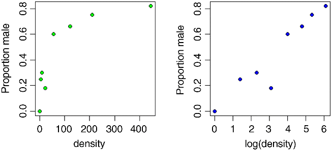
Model checking involves the use of plot(model). As you will see, there is no worryingly great pattern in the residuals against the fitted values, and the normal plot is reasonably linear. Point number 4 is highly influential (it has a big value of Cook's distance), and point number 8 has high leverage (but the model is still significant with this point omitted). We conclude that the proportion of animals that are males increases significantly with increasing density, and that the logistic model is linearized by logarithmic transformation of the explanatory variable (population density). We finish by drawing the fitted line though the scatterplot:
xv <- seq(0,6,0.1)plot(log(density),p,ylab="Proportion male",pch=21,bg="blue")lines(xv,predict(model,list(density=exp(xv)),type="response"),col="brown")
Note the use of type="response" to back-transform from the logit scale to the S-shaped proportion scale and exp(xv) to back-transform the logs from the x axis to densities as required by the model formula (where they are then logged again). As you can see, the model is very poor fit for the lowest density and for log(density) ≈ 3, but a reasonably good fit over the rest of the range. I suspect that the replication was simply too low at very low population densities to get an accurate estimate of the sex ratio. Of course, we should not discount the possibility that the data point is not an outlier, but rather that the model is wrong.
Proportion Data with Categorical Explanatory Variables
This example concerns the germination of seeds of two genotypes of the parasitic plant Orobanche and two extracts from host plants (bean and cucumber) that were used to stimulate germination. It is a two-way factorial analysis of deviance.
germination <- read.csv("c:\\temp\\germination.csv")attach(germination)names(germination)[1] "count" "sample" "Orobanche" "extract"
The response variable count is the number of seeds that germinated out of a batch of size = sample. So the number that didn't germinate is sample – count, and we construct the response vector like this:
y <- cbind(count, sample-count)
Each of the categorical explanatory variables has two levels:
levels(Orobanche)[1] "a73" "a75"levels(extract)[1] "bean" "cucumber"
We want to test the hypothesis that there is no interaction between Orobanche genotype (a73 or a75) and plant extract (bean or cucumber) on the germination rate of the seeds. This requires a factorial analysis using the asterisk * operator like this:
model <- glm(y ~ Orobanche * extract, binomial)summary(model)Coefficients:Estimate Std. Error z value Pr (>|z|)(Intercept) -0.4122 0.1842 -2.238 0.0252 *Orobanchea75 -0.1459 0.2232 -0.654 0.5132extractcucumber 0.5401 0.2498 2.162 0.0306 *Orobanchea75:extractcucumber 0.7781 0.3064 2.539 0.0111 *(Dispersion parameter for binomial family taken to be 1)Null deviance: 98.719 on 20 degrees of freedomResidual deviance: 33.278 on 17 degrees of freedomAIC: 117.87Number of Fisher Scoring iterations: 4
At first glance, it looks as if there is a highly significant interaction (p = 0.0111). But we need to check that the model is sound. The first thing is to check for is overdispersion. The residual deviance is 33.278 on 17 d.f. so the model is quite badly overdispersed:
33.279 / 17[1] 1.957588
The overdispersion factor is almost 2. The simplest way to take this into account is to use what is called an ‘empirical scale parameter’ to reflect the fact that the errors are not binomial as we assumed, but were larger than this (overdispersed) by a factor of 1.9576. We refit the model using quasibinomial to account for the overdispersion:
model <- glm(y ~ Orobanche * extract, quasibinomial)
Then we use update to remove the interaction term in the normal way:
model2 <- update(model, ~ . - Orobanche:extract)
The only difference is that we use an F test instead of a chi-squared test to compare the original and simplified models:
anova(model,model2,test="F")Analysis of Deviance TableModel 1: y ~ Orobanche * extractModel 2: y ~ Orobanche + extractResid. Df Resid. Dev Df Deviance F Pr(>F)1 17 33.2782 18 39.686 -1 -6.408 3.4419 0.08099 .
Now you see that the interaction is not significant (p = 0.081). There is no compelling evidence that different genotypes of Orobanche respond differently to the two plant extracts. The next step is to see if any further model simplification is possible:
anova(model2,test="F")Analysis of Deviance TableModel: quasibinomial, link: logitResponse: yTerms added sequentially (first to last)Df Deviance Resid. Df Resid. Dev F Pr(>F)NULL 20 98.719Orobanche 1 2.544 19 96.175 1.1954 0.2887extract 1 56.489 18 39.686 26.5412 6.692e-05 ***
There is a highly significant difference between the two plant extracts on germination rate, but it is not obvious that we need to keep Orobanche genotype in the model. We try removing it:
model3 <- update(model2, ~ . - Orobanche)anova(model2,model3,test="F")Analysis of Deviance TableModel 1: y ~ Orobanche + extractModel 2: y ~ extractResid. Df Resid. Dev Df Deviance F Pr(>F)1 18 39.6862 19 42.751 -1 -3.065 1.4401 0.2457
There is no justification for retaining Orobanche in the model. So the minimal adequate model contains just two parameters:
coef(model3)(Intercept) extractcucumber-0.5121761 1.0574031
What, exactly, do these two numbers mean? Remember that the coefficients are from the linear predictor. They are on the transformed scale, so because we are using quasi-binomial errors, they are in logits (ln(p/(1 − p)). To turn them into the germination rates for the two plant extracts requires a little calculation. To go from a logit x to a proportion p, you need to do the following sum:

So our first x value is −0.5122 and we calculate
1/(1+1/(exp(-0.5122)))[1] 0.3746779
This says that the mean germination rate of the seeds with the first plant extract was 37%. What about the parameter for cucumber extract (1.057)? Remember that with categorical explanatory variables the parameter values are differences between means. So to get the second germination rate we add 1.057 to the intercept before back-transforming:
1/(1+1/(exp(-0.5122+1.0574)))[1] 0.6330212
This says that the germination rate was nearly twice as great (63%) with the second plant extract (cucumber). Obviously we want to generalize this process, and also to speed up the calculations of the estimated mean proportions. We can use predict to help here, because type="response" makes predictions on the back-transformed scale automatically:
tapply(predict(model3,type="response"),extract,mean)bean cucumber0.3746835 0.6330275
It is interesting to compare these figures with the averages of the raw proportions. First we need to calculate the proportion germinating, p, in each sample:
p <- count/sample
Then we can find the average the germination rates for each extract:
tapply(p,extract,mean)bean cucumber0.3487189 0.6031824
You see that this gives different answers. Not too different in this case, it's true, but different nonetheless. The correct way to average proportion data is to add up the total counts for the different levels of abstract, and only then to turn them into proportions:
tapply(count,extract,sum)bean cucumber148 276
This means that 148 seeds germinated with bean extract and 276 with cucumber. But how many seeds were involved in each case?
tapply(sample,extract,sum)bean cucumber395 436
This means that 395 seeds were treated with bean extract and 436 seeds were treated with cucumber. So the answers we want are 148/395 and 276/436 (i.e. the correct mean proportions). We automate the calculation like this:
as.vector(tapply(count,extract,sum))/as.vector(tapply(sample,extract,sum))[1] 0.3746835 0.6330275
These are the correct mean proportions as produced by the GLM. The moral here is that you calculate the average of proportions by using total counts and total samples and not by averaging the raw proportions.
To summarize this analysis:
- make a two-column response vector containing the successes and failures
- use glm with family=binomial (you don't need to include family=)
- fit the maximal model (in this case it had four parameters)
- test for overdispersion
- if, as here, you find overdispersion then use quasibinomial errors
- begin model simplification by removing the interaction term
- this was non-significant once we had adjusted for overdispersion
- try removing main effects (we didn't need Orobanche genotype in the model)
- use plot to obtain your model-checking diagnostics
- back transform using predict with the option type="response" to obtain means
Analysis of Covariance with Binomial Data
This example concerns flowering in five varieties of perennial plants. Replicated individuals in a fully randomized design were sprayed with one of six doses of a controlled mixture of growth promoters. After 6 weeks, plants were scored as flowering or not flowering. The count of flowering individuals forms the response variable. This is an ANCOVA because we have both continuous (dose) and categorical (variety) explanatory variables. We use logistic regression because the response variable is a count (flowered) that can be expressed as a proportion (flowered/number).
props <- read.csv("c:\\temp\\flowering.csv")attach(props)names(props)[1] "flowered" "number" "dose" "variety"y <- cbind(flowered,number-flowered)pf <- flowered/numberpfc <- split(pf,variety)dc <- split(dose,variety)
With count data like these, it is common for points from different treatments to hide one another. Note the use of jitter to move points left or right and up or down by a small random amount so that all of the symbols at a different point can be seen:
plot(dose,pf,type="n",ylab="Proportion flowered")points(jitter(dc[[1]]),jitter(pfc[[1]]),pch=21,bg="red")points(jitter(dc[[2]]),jitter(pfc[[2]]),pch=22,bg="blue")points(jitter(dc[[3]]),jitter(pfc[[3]]),pch=23,bg="gray")points(jitter(dc[[4]]),jitter(pfc[[4]]),pch=24,bg="green")points(jitter(dc[[5]]),jitter(pfc[[5]]),pch=25,bg="yellow")
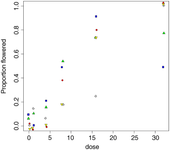
There is clearly a substantial difference between the plant varieties in their response to the flowering stimulant. The modelling proceeds in the normal way. We begin by fitting the maximal model with different slopes and intercepts for each variety (estimating 10 parameters in all):
model1 <- glm(y~dose*variety,binomial)summary(model1)
The model exhibits substantial overdispersion (51.083/20 > 2), so we fit the model again with quasi-binomial errors:
model2 <- glm(y~dose*variety,quasibinomial)summary(model2)Coefficients:Estimate Std. Error t value Pr (>|t|)(Intercept) -4.59165 1.56314 -2.937 0.00814 **dose 0.41262 0.15195 2.716 0.01332 *varietyB 3.06197 1.65555 1.850 0.07922 .varietyC 1.23248 1.79934 0.685 0.50123varietyD 3.17506 1.62828 1.950 0.06534 .varietyE -0.71466 2.34511 -0.305 0.76371dose:varietyB -0.34282 0.15506 -2.211 0.03886 *dose:varietyC -0.23039 0.16201 -1.422 0.17043dose:varietyD -0.30481 0.15534 -1.962 0.06380 .dose:varietyE -0.00649 0.20130 -0.032 0.97460(Dispersion parameter for quasibinomial family taken to be 2.293557)Null deviance: 303.350 on 29 degrees of freedomResidual deviance: 51.083 on 20 degrees of freedomAIC: NANumber of Fisher Scoring iterations: 5
Do we need to retain the interaction term (it appears to be significant in only one case)? We leave it out and compare the two models using anova:
model3 <- glm(y~dose+variety,quasibinomial)anova(model2,model3,test="F")Analysis of Deviance TableModel 1: y ~ dose * varietyModel 2: y ~ dose + varietyResid. Df Resid. Dev Df Deviance F Pr(>F)1 20 51.0832 24 96.769 -4 -45.686 4.9798 0.005969 **
Yes, we do. The interaction term is much more significant than indicated by any one of the t tests (p = 0.005969).
Let us draw the five fitted curves through the scatterplot. The values on the dose axis need to go from 0 to 30:
xv <- seq(0,32,0.25)length(xv)[1] 129
This means we shall need to provide the predict function with 129 repeats of each factor level in turn:
yv <- predict(model3,list(dose=xv,variety=rep("A",129)),type="response")lines(xv,yv,col="red")yv <- predict(model3,list(dose=xv,variety=rep("B",129)),type="response")lines(xv,yv,col="blue")yv <- predict(model3,list(dose=xv,variety=rep("C",129)),type="response")lines(xv,yv,col="gray")yv <- predict(model3,list(dose=xv,variety=rep("D",129)),type="response")lines(xv,yv,col="green")yv <- predict(model3,list(dose=xv,variety=rep("E",129)),type="response")lines(xv,yv,col="yellow")
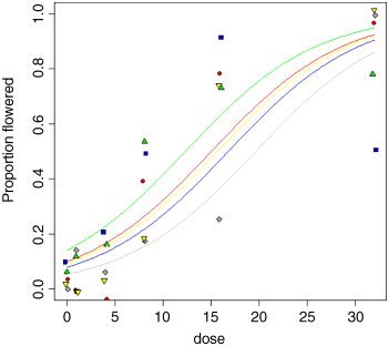
As you can see, the model is a reasonable fit for two of the varieties (A and E, represented red circles and yellow down-triangles, respectively), not bad for one variety (C, grey diamonds) but very poor for two of them: B (blue squares) and D (green up-triangles). For several varieties, the model overestimates the proportion flowering at zero dose, and for variety B there seems to be some inhibition of flowering at the highest dose because the graph falls from 90% flowering at dose 16 to just 50% at dose 32 (the fitted model is assumed to be asymptotic). Variety D appears to be asymptoting at less than 80% flowering. These failures of the model focus attention for future work.
The moral is that just because we have proportion data, that does not mean that the data will necessarily be well described by the logistic. For instance, in order to describe the response of variety B, the model would need to have a hump, rather than to asymptote at p = 1 for large doses, and to model variety D the model would need an extra parameter to estimate an asymptotic value that was less than 100%.
Further Reading
- Hosmer, D.W. and Lemeshow, S. (2000) Applied Logistic Regression, 2nd edn, John Wiley & Sons, New York.