Standard Deviation and Normal Distribution
For questions in the Quantitative Comparison format (“Quantity A” and “Quantity B” given), the answer choices are always as follows:
(A) Quantity A is greater.
(B) Quantity B is greater.
(C) The two quantities are equal.
(D) The relationship cannot be determined from the information given.
For questions followed by a numeric entry box  , you are to enter your own answer in the box. For questions followed by a fraction-style numeric entry box
  , you are to enter your answer in the form of a fraction. You are not required to reduce fractions. For example, if the answer is
  , you may enter
  or any equivalent fraction.
All numbers used are real numbers. All figures are assumed to lie in a plane unless otherwise indicated. Geometric figures are not necessarily drawn to scale. You should assume, however, that lines that appear to be straight are actually straight, points on a line are in the order shown, and all geometric objects are in the relative positions shown. Coordinate systems, such as xy-planes and number lines, as well as graphical data presentations, such as bar charts, circle graphs, and line graphs, are drawn to scale. A symbol that appears more than once in a question has the same meaning throughout the question.
1.Set S: {5, 10, 15}
If the number 15 were removed from set S and replaced with the number 1,000, which of the following values would change?
Indicate all such values.
- The mean of the set
- The median of the set
- The standard deviation of the set
Dataset W: –9, –3, 3, 9
Dataset X: 2, 4, 6, 8
Dataset Y: 100, 101, 102, 103
Dataset Z: 7, 7, 7, 7
2.Which of the following choices lists the four datasets above in order from least standard deviation to greatest standard deviation?
(A)W, X, Y, Z
(B)W, X, Y, Z
(C)W, X, Y, Z
(D)W, X, Y, Z
(E)W, X, Y, Z
Set N is a set of x distinct positive integers where x > 2.
| 3. | Quantity A The standard deviation of set N |
Quantity B The standard deviation of set N if every number in the set were multiplied by –3 |
The 75th percentile on a test corresponded to a score of 700, while the 25th percentile corresponded to a score of 450.
| 4. | Quantity A A 95th percentile score |
Quantity B 800 |
A species of insect has an average mass of 5.2 grams and a standard deviation of 0.6 grams. The mass of the insects follows a normal distribution.
| 5. | Quantity A The percent of the insects that have a mass between 5.2 and 5.8 grams |
Quantity B The percent of the insects that have a mass between 4.9 and 5.5 grams |
The lengths of a certain population of earthworms are normally distributed with a mean length of 30 centimeters and a standard deviation of 3 centimeters. One of the worms is picked at random.
| 6. | Quantity A The probability that the worm is between 24 and 30 centimeters, inclusive |
Quantity B The probability that the worm is between 27 and 33 centimeters, inclusive |
Home values among the 8,000 homeowners of Town X are normally distributed, with a standard deviation of $11,000 and a mean of $90,000.
| 7. | Quantity A The number of homeowners in Town X whose home value is greater than $112,000 |
Quantity B 300 |
Exam grades among the students in Ms. Harshman’s class are normally distributed, and the 50th percentile is equal to a score of 77.
| 8. | Quantity A The number of students who scored less than 80 on the exam |
Quantity B The number of students who scored greater than 74 on the exam |
9.The length of bolts made in factory Z is normally distributed, with a mean length of 0.1630 meters and a standard deviation of 0.0084 meters. The probability that a randomly selected bolt is between 0.1546 meters and 0.1756 meters long is between
(A)54% and 61%.
(B)61% and 68%.
(C)68% and 75%.
(D)75% and 82%.
(E)82% and 89%.
10. Which of the following sets of data applies to this box-and-whisker plot?

(A)–4, –4, –2, 0, 0, 5
(B)–4, 1, 1, 3, 4, 4
(C)–4, –4, –3, 1, 5
(D)–5, 3, 4, 5
(E)–4, –4, –2, –2, 0, 0, 0, 5
11. If a set of data consists of only the first ten positive multiples of 5, what is the interquartile range of the set?
(A)15
(B)25
(C)27.5
(D)40
(E)45
12. On a given math test with a maximum possible score of 100 points, the vast majority of the 149 students in a class scored either a perfect score or a zero, with only one student scoring within 5 points of the mean. Which of the following logically follows about dataset T, made up of the scores on the test?
Indicate all such statements.
- Dataset T is not normally distributed.
- The range of dataset T would be significantly smaller if the scores had been more evenly distributed.
- The mean of dataset T is not equal to the median.
Jane scored in the 68th percentile on a test, and John scored in the 32nd percentile.
| 13. | Quantity A The proportion of the class that received a score less than John’s score |
Quantity B The proportion of the class that scored equal to or greater than Jane’s score |
In a class with 20 students, a test was administered and was scored only in whole numbers from 0 to 10. At least one student got every possible score, and the average score was 7.
| 14. | Quantity A The lowest score that could have been received by more than one student |
Quantity B 4 |
A test is scored out of 100 and the scores are divided into five quintile groups. Students are not told their scores, but only their quintile group.
| 15. | Quantity A The scores of two students in the bottom quintile group, chosen at random and added together. |
Quantity B The score of a student in the top quintile group, chosen at random. |
16. In a set of 10 million numbers, one percentile would represent what percent of the total number of terms?
(A)1,000,000
(B)100,000
(C)10,000
(D)100
(E)1
17. What is the range of the dataset of numbers comprised entirely of {1, 6, x, 17, 20, y} if all terms in the dataset are positive integers and xy = 18?
(A)16
(B)17
(C)18
(D)19
(E)It cannot be determined from the information given.
18. On a particular test whose scores are distributed normally, the 2nd percentile is 1,720, while the 84th percentile is 1,990. What score, rounded to the nearest 10, most closely corresponds to the 16th percentile?
(A)1,750
(B)1,770
(C)1,790
(D)1,810
(E)1,830
A dataset contains at least two different integers.
| 19. | Quantity A The range of the dataset |
Quantity B The interquartile range of the dataset |
Some rock samples are weighed, and their weights are determined to be normally distributed. One standard deviation below the mean is 250 grams and one standard deviation above the mean is 420 grams.
| 20. | Quantity A The median weight, in grams |
Quantity B 335 grams |
In a normally distributed set of data, the mean is 12 and the standard deviation is less than 3.
| 21. | Quantity A The number of data points in the set between 9 and 15 |
Quantity B 60% of the total number of data points |
| 22. | Quantity A The standard deviation of the dataset 10, 20, 30 |
Quantity B The standard deviation of the dataset 10, 20, 20, 20, 20, 20, 30 |
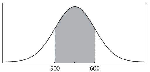
The graph represents the normally distributed scores on a test. The shaded area represents approximately 68% of the scores.
| 23. | Quantity A The mean score on the test |
Quantity B 550 |
24.
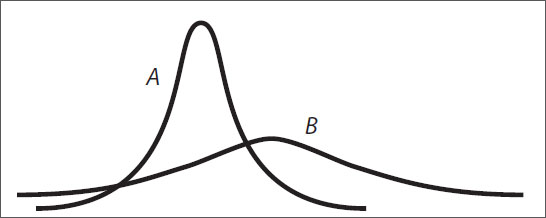
A and B are graphical representations of normally distributed random variables X and Y, respectively, with relative positions, shapes, and sizes as shown. Which of the following must be true?
Indicate all such statements.
- Y has a greater standard deviation than X.
- The probability that Y falls within 2 standard deviations of its mean is greater than the probability that X falls within 2 standard deviations of its mean.
- Y has a greater mean than X.
The outcome of a standardized test is an integer between 151 and 200, inclusive. The percentiles of 400 test scores are calculated, and the scores are divided into corresponding percentile groups.
| 25. | Quantity A The minimum number of integers between 151 and 200, inclusive, that include more than one percentile group |
Quantity B The minimum number of percentile groups that correspond to a score of 200 |

26. Which of the following would the data pattern shown above best describe?
(A)The number of grams of sugar in a selection of drinks is normally distributed.
(B)A number of male high school principals and a larger number of female high school principals have normally distributed salaries, distributed around the same mean.
(C)A number of students have normally distributed heights and a smaller number of taller, adult teachers also have normally distributed heights.
(D)The salary distribution for biologists skews to the left of the median.
(E)The maximum-weight bench presses for a number of male athletes are normally distributed and the maximum-weight bench presses for a smaller number of female athletes are also normally distributed, although around a smaller mean.
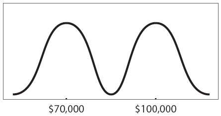
27. A number of scientists’ salaries were reported; physicists’ salaries clustered around a mean of $100,000 and biologists’ clustered around a mean of $70,000. Which of the following statements could be true, according to the graph above?
Indicate all such statements.
- Some biologists earn more than some physicists.
- Both biologists’ and physicists’ salaries are normally distributed.
- The range of salaries is greater than $150,000.

28. The graph on the left above represents the number of family members per family in Town X, while the graph on the right above represents the number of family members per family in Town Y. The median family size for Town X is equal to the median family size for Town Y. The horizontal and vertical dimensions of the boxes above are identical and correspond to the same measurements. Which of the following statements must be true?
Indicate all such statements.
- The range of family sizes measured as the number of family members is larger in Town X than in Town Y.
- Families in Town Y are more likely to have sizes within 1 family member of the mean than are families in Town X.
- The data for Town X has a larger standard deviation than the data for Town Y.

29. The box-and-whisker plot shown above could be a representation of which of the following sets?
(A)–2, 0, 2, 4
(B)3, 3, 3, 3, 3, 3
(C)1, 25, 100
(D)2, 4, 8, 16, 32
(E)1, 13, 14, 17

30. Which of the following statements must be true about the data described by the box-and-whisker plot above?
Indicate all such statements.
- The median of the whole set is closer to the median of the lower half of the data than it is to the median of the upper half of the data.
- The data is normally distributed.
- The set has a standard deviation greater than zero.
31. The earthworms in sample A have an average length of 2.4 inches, and the earthworms in sample B have an average length of 3.8 inches. The average length of the earthworms in the combined samples is 3.0 inches. Which of the following must be true?
Indicate all such statements.
- There are more earthworms in sample A than in sample B.
- The median length of the earthworms is 3.2 inches.
- The range of lengths of the earthworms is 1.4.
Standard Deviation and Normal Distribution Answers
1. “The mean of the set” and “The standard deviation of the set”. The word mean is a synonym for the average. Because an average is calculated by taking the sum of the terms in the set and dividing by the number of numbers in the set, changing any one number in a set (without adjusting the others) will change the sum and, therefore, the average. The median is the middle number in a set, so making the biggest number even bigger won’t change that (the middle number is still 10). Standard deviation is a measure of how spread out the numbers in a set are—the more spread out the numbers, the larger the standard deviation—so making the biggest number really far away from the others would greatly increase the standard deviation.
2. (D). Standard deviation is a measure of how “spread out” the numbers in a set are—in other words, how far are the individual data points from the average of all of the data points? The GRE will not ask you to calculate standard deviation—in problems like this one, you will be able to eyeball which sets are more spread out and which are less spread out.
Since dataset Z’s members are identical, the standard deviation is zero. Zero is the smallest possible standard deviation for any set, so it must be the smallest here. You can eliminate answer choices (A), (B), and (C). Dataset Y’s members have a spread of 1 between each number, dataset X’s members are 2 away from each other, and dataset W’s members are 6 away from each other, so dataset Y has the next-smallest standard deviation (note that this is enough to eliminate answer choice (E) and choose answer choice (D)). The correct answer is (D) Z, Y, X, W.
3. (B). “Set N is a set of x distinct positive integers where x > 2” just means that the members of the set are all positive integers different from each other, and that there are at least 3 of them. Nothing is given about the standard deviation of the set other than that it is not zero. (Because the numbers are different from each other, they are at least a little spread out, which means the standard deviation must be greater than zero. The only way to have a standard deviation of zero is to have a “set” of identical numbers, which would be referred to as a list or a dataset because all of the elements of a proper set (in math) must be different).
In Quantity B, multiplying each of the distinct integers by –3 would definitely spread out the numbers and thus increase the standard deviation. For instance, if the set had been 1, 2, 3, it would become –3, –6, –9. The negatives are irrelevant—multiplying any set of different integers by 3 will spread them out more.
Thus, whatever the standard deviation is for the set in Quantity A, Quantity B must represent a larger standard deviation because the numbers in that set are more spread out.
4. (D). Scoring scales on a test are not necessarily linear, so do not line up the difference in percentiles with the difference in score; it is not possible to make any predictions about other percentiles. For all you know, 750 could be the 95th percentile score—or 963 could be. All that is certain is that 25% of the scores are ≤ 450, while 50% of the scores are > 450 and ≤ 700, and 25% of the scores are > 700.
5. (B). Whenever the words “Normal distribution” appear on the GRE, draw a bell-curve diagram that approximates the one below. Memorize the numbers 34 : 14 : 2.

The middle of the bell curve is the average, or mean, so place 5.2 underneath the 0 in the center; 34%, 14%, and 2% represent the approximate percentages that fall between the standard deviation lines. For instance, 14% of the population falls between 1 and 2 standard deviations below the mean. Now, use the standard deviation of 0.6 grams to figure out the exact dividing lines between the marked regions of the normal curve. The mass of an insect that is exactly 1 standard deviation above the mean is 5.2 + 0.6 = 5.8, and the mass of one that is 1 standard deviation below the mean is 5.2 – 0.6 = 4.6. Similarly, the mass at exactly 2 standard deviations above the mean is 6.4 and at 2 below is 4.0.
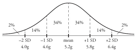
Quantity A, the percent between 5.2 and 5.8 grams, is 34%.
However, Quantity B will require some estimating. Note that 4.9 is halfway between 4.6 and 5.2, while 5.5 is halfway between 5.2 and 5.8. Therefore, the area between 4.9 and 5.5, while still a range of 0.6, is under the bigger part of the bell curve in the center. Since the area under the center is bigger than the area between 0 and 1 standard deviations, the percentage of the area under the center must also be greater. Therefore, Quantity B is greater.
6. (B). Normal distributions are always centered on and symmetrical around the mean, so the chance that the worm’s length will be within a certain 6-centimeter range (or any specific range) is highest when that range is centered on the mean, which in this case is 30 centimeters.
More specifically, Quantity A equals the area between –2 standard deviations and the mean of the distribution. In a normal distribution, roughly 34 + 34 + 14 + 14 = 96% of the sample will fall within 2 standard deviations above or below the mean. Limit yourself only to the 2 standard deviations below the mean, then half of that, or 96%÷2 = 48%, falls in this range. In contrast, Quantity B equals the area between –1 standard deviation and +1 standard deviation. In a normal distribution, roughly 34 + 34 = 68% of the sample falls within 1 standard deviation above or below the mean. Since 68% is greater than 48%, Quantity B is greater.
Note that exact figures are not required to answer this question! Picture any bell curve—the area under the “hump” (that is, centered around the middle) is bigger! Thus, it has more members of the dataset (in this case, worms) in it.
7. (B). How many standard deviations above $90,000 is $112,000? The difference between the two numbers is $22,000, which is two times the standard deviation of $11,000. So Quantity A is really the number of home values greater than 2 standard deviations above the mean.
In any normal distribution, roughly 2% will fall more than 2 standard deviations above the mean (this is something to memorize). The value of Quantity A is roughly 8,000 × 0.02 = 160, so Quantity B is greater.
8. (C). The normal distribution is symmetrical around the mean. For any symmetrical distribution, the mean equals the median (also known as the 50th percentile). Thus, the number of students who scored less than 3 points above the mean (77 + 3 = 80) must be the same as the number of students who scored greater than 3 points below the mean (77 – 3 = 74). As long as the boundary scores (80 and 74) are placed symmetrically around the mean, the distribution will have equal proportions. Draw the normal distribution plot if it is at all confusing:
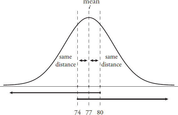
Notice that the two conditions overlap and are perfectly symmetrical. Each number consists of a short segment between it and the 50th percentile mark, as well as half of the students (either above or below the 50th percentile mark). That is, the “less than 80” category consists of the segment between 80 and 77, as well as all students below the 50th percentile mark (below 77). The “greater than 74” category consists of the segment between 74 and 77, as well as all students above the 50th percentile mark (above 77). Therefore, the quantities are equal.
9. (D). First, make the numbers easier to use. Either multiply every number by the same constant or move the decimal the same number of places for each number. In the case of moving the decimal four places, the mean becomes 1,630, the standard deviation becomes 84, and the two other numbers become 1,546 and 1,756.
Next, “normalize” the boundaries. That is, take 1,546 meters (the lower boundary) and 1,756 meters (the upper boundary) and convert each of them to a number of standard deviations away from the mean. To do so, subtract the mean. Then divide by the standard deviation.
Lower boundary: 1546 – 1630 = –84
–84 ÷ 84 = –1
So the lower boundary is –1 standard deviation (that is, 1 standard deviation less than the mean).
Upper boundary: 1756 – 1630 = 126
126 ÷ 84 = 1.5
So the upper boundary is 1.5 standard deviations above the mean.
You need to find the probability that a random variable distributed according to the standard normal distribution falls between –1 and 1.5.
Use the approximate areas under the normal curve. Approximately 34 + 34 = 68% falls within 1 standard deviation above or below the mean, so 68% accounts for the –1 to 1 portion of the standard normal distribution. What about the portion from 1 to 1.5?
Approximately 14% of the bolts fall between 1 and 2 standard deviations above the mean. You are not expected to know the exact area between 1 and 1.5; however, since a normal distribution has its hump around 0, more than half of the area between 1 and 2 must fall closer to 0 (between 1 and 1.5). So the area under the normal curve between 1 and 1.5 must be greater than half of the area, or greater than 7%, but less than the full area, 14%.
Put it all together. The area under the normal curve between –1 and 1.5 is approximately 68% + (something between 7% and 14%). The lower estimate is 68% + 7% = 75% and the upper estimate is 68% + 14% = 82%.
10. (E). In a box-and-whisker plot, the middle line in the box represents the median, or middle, of the dataset. The outsides of the box are the medians of the data below and above the median, respectively, which mark the first and third quartile boundaries, or Q1 and Q3.
The median is –1; now check the medians of the answer choices. The median of (A) is the average of 0 and –2, which is –1; (A) could be the right answer. The median of (B) is 2, of (C) is –3, and of (D) is 3.5, so none of these are the correct answers. The median of (E) is between –2 and 0, which is –1; (E) could also be the right answer.
Q1 is –3; check Q1 for both (A) and (E). The median of the smaller three numbers (–4, –4, –2) for (A) is –4, which is wrong; you want Q1 to be –3. Choice (E) is the only answer choice left; choose it without checking if you’re confident in your previous work. Here’s the actual proof: the median of the smaller four numbers (–4, –4, –2, –2) is –3.
11. (B). The interquartile range of a dataset is the distance between Q1 (quartile marker 1, the median of the first half of the dataset) and Q3 (quartile marker 3, the median of the second half of the dataset).
The first ten positive multiples of 5 are: 5, 10, 15, 20, 25, 30, 35, 40, 45, 50. Q1 is the median of the first five terms, or 15. Q3 is the median of the last five terms, or 40.
Take the difference between Q3 and Q1: 40 – 15 = 25.
12. “Dataset T is not normally distributed” only. The definition of “normally distributed” is that about two-thirds of the data falls within 1 standard deviation of the mean. If only one person scored close to the mean (and most people were at the top or bottom of the curve), that dataset is not normally distributed, so the first statement is true. The second statement is false—the range of the data would not necessarily change if the dataset were more evenly distributed. For instance, as long as one person still had a zero and one person still had a score of 100, the other scores could fall anywhere without changing the range.
The third statement is also false. The mean of dataset T might or might not be equal to the median. For instance, the one student within 5 points of the mean could have a score equal to the mean; of the remaining 148 students, half could have scores of 0 and half could have scores of 100. In this case, the mean would equal the median. However, the same scenario with unequal numbers of students scoring 0 and 100 would result in the mean not equaling the median.
13. (C). Percentiles define the proportion of a group that scores below a particular benchmark. Since John scored in the 32nd percentile, by definition, 32% of the class scored worse than John. Quantity A is equal to 32%.
Jane scored in the 68th percentile, so 68% of the class scored worse than she did. Since 100 – 68 = 32, 32% of the class scored equal to or greater than Jane. Quantity B is also equal to 32%.
14. (A). Since the average is 7, use the average formula to find the sum of the scores in the class:
| Average | = | Sum ÷ (# of terms) |
| 7 | = | Sum ÷ 20 |
| Sum | = | 140 |
At least one student got every possible score. There are eleven possible scores: 0 + 1 + 2 + 3 + 4 + 5 + 6 + 7 + 8 + 9 + 10. This is an evenly spaced set, so calculate the sum by multiplying the average of the set by the number of terms in the set. The average is (10 + 0)/2 = 5 and the number of terms is 11, so the sum of the set is 5 × 11 = 55. Subtract this from the earlier sum; the remaining 9 students had to score 140 – 55 = 85 points.
Quantity A is the lowest score that could have been received by more than one student. If 9 students scored a total of 85 points, and any one student could not score more than 10 points, then what is the lowest possible score that one of these 9 students could have received? In order to minimize that number, maximize the numbers for the other students. If 8 students scored 10 points each, for a total of 80 points, then the 9th student must have scored exactly 5. Quantity A must be greater than Quantity B. Notice that the average score of 7 forces a lot of the scores to be 10 in order to to balance out the very low scores of 0, 1, 2, etc., that are required in the class (at least one of each). The lowest score that could have been received by 2 students is 5, so Quantity A is 5.
15. (D). Quintiles (“fifths” of the data) define relative scores, not absolute scores. Imagine two possible score distributions:
Example 1: The class’s scores are 1, 2, 3, 4, 5 (20% of the class scored each of these). In this case, adding up the two lowest quintile students would be 1 + 1 = 2, which is less than 5, the score of a top quintile student.
Example 2: The class’s scores are 10, 11, 12, 13, 14 (20% of the class scored each of these). In this case, adding up the two lowest quintile students would be 10 + 10 = 20, which is greater than 14, the score of a top quintile student.
The relationship cannot be determined from the information given.
16. (E). A percentile always represents 1% of a set of data. If the question had asked how many terms one percentile represented, that would be a different question (with a different answer).
17. (D). The values of x or y are unknown, but since they are both positive integers, they can only be 1 and 18, 2 and 9, or 3 and 6 (because they have a product of 18). So the smallest number in the set is 1 and the greatest is 20. Since 20 – 1 = 19, the range is 19.
18. (D). The diagram below shows the standard distribution curve for any normally distributed variable. The percent figures correspond roughly to the standard percentiles both 1 and 2 standard deviations (SD) away from the mean:

The 2nd percentile is 1,720, roughly corresponding to two standard deviations below the mean. Therefore, the mean –2 standard deviations = 1,720.
Likewise, the 84th percentile is 1,990: 84% of a normally distributed set of data falls below the mean + 1 standard deviation, so the mean + 1 standard deviation = 1,990.
Call the mean M and the standard deviation S. Solve for these variables:
| M – 2S | = | 1,720 |
| M + S | = | 1,990 |
Subtract the first equation from the second equation:
| 3S | = | 270 |
| S | = | 90 |
The question asks for the 16th percentile, which is the mean – 1 standard deviation or M – S. (It’s a fact to memorize that approximately 2% of normally distributed data falls below M – 2S, and approximately 14% of normally distributed data falls between M – 2S and M – S.)
Since M – 2S = 1,720, add another S to get M – S:
(M – 2S) + S = 1,720 + 90 = 1,810
Notice that the percentiles are not linearly spaced. The normal distribution is hump-shaped, so percentiles are bunched up around the hump and spread out farther away.
19. (D). In most datasets, the range is larger than the interquartile range because the interquartile range ignores the smallest and largest data points. That’s actually the purpose of interquartile range—to get a good picture of where most of the data is (think of the “big hump” on a bell curve). For instance:
Example set A: 1, 2, 3, 4, 5, 6, 7, 100
Here, the range is 100 – 1 = 99.
The interquartile range is Q3 – Q1, or the median of the upper half of the data minus the median of the lower half of the data: 6.5 – 2.5 = 4.
In this example, the range is much larger. However, consider this set:
Example set B: 4, 4, 4, 4, 5, 5, 5, 5
In this set, the range is 5 – 4 = 1. The interquartile range is also 5 – 4 = 1. While the interquartile range can never be greater than the range, they can certainly be equal.
20. (C). Since 1 standard deviation below the mean is 250 and 1 standard deviation above the mean is 420, the mean/median must be halfway in between. Since 420 – 250 = 170 and half of 170 is 85, add 85 to 250 (or subtract it from 420) to get the mean/median of 335. (Note that in a normal distribution, the mean is equal to the median, so the two terms can be used interchangeably.)
21. (A). If the standard deviation is 3, then 1 standard deviation below the mean is 9 and 1 standard deviation above the mean is 15, so about 68% of the data is between 9 and 15 (in a normal distribution, it is always the case that about 68% of the data is within 1 standard deviation of the mean).
Since the actual standard deviation is less than 3, about 68% of the data is found within an even smaller range than 9 to 15. For instance, the standard deviation could be 1, and then about 68% of the data would be between 11 and 13. Or the standard deviation could be 2.5, and then about 68% of all the data would be found between 9.5 and 14.5.
Since 68% of the data is found within an even smaller range than 9 to 15, the range from 9 to 15 contains more than 68% of the data, so it definitely contains more than 60% of all the data points.
Don’t be confused by the use of “number of data points.” While the actual total number of data points is still unknown, it is definitely true that Quantity A is equal to a larger percent of that total than is Quantity B.
22. (A). Standard deviation is a measure of the data’s spread from the mean. While the two sets have the same range (30 – 10 = 20), they do not have the same spread. The four extra terms in Quantity B are identical to the mean, meaning that, on average, the data in Quantity B is closer to the mean than the data in Quantity A. Thus, Quantity A is more spread out, on average, and has the larger standard deviation. Do not compute the actual standard deviations to find the answer here.
23. (D). While the shaded area may appear to be evenly located on either side of the mean, it isn’t necessarily. For example, the 68% could be more lopsided, like so:

This area could still represent 68% of the scores, even if it’s not 1 standard deviation to either side of the mean. In order to determine that the mean is 550, the problem would need to state explicitly that 500 and 600 each represent 1 standard deviation from the mean (or at least that 500 and 600 are equally far from the mean).
The fact that 68% of the data is located between 500 and 600 is a trick implying that 500 and 600 are –1 and +1 standard deviation from the mean, but this is not necessarily true. While it is always true that, in a normal distribution, about 68% (some people memorize the approximation as two-thirds) of the data is within 1 standard deviation of the mean, the reverse is not true: do not assume that any chunk of data that is about 68% of the whole is therefore within 1 standard deviation of the mean.
24. 1st and 3rd only.
The first statement is true. Standard deviation describes how much a set of data diverges from the mean. Curve B is more widely spread than curve A, and thus Y has a greater standard deviation than X.
The second statement is not true. The probability that any normally distributed variable falls within 2 standard deviations of its mean is the same, approximately 0.14 + 0.34 + 0.34 + 0.14 = 0.96, or 96%. Memorize this value for the GRE.
The third statement is true. The mean of a normal curve is the point along the horizontal axis below the “peak” of the curve. The highest point of curve B is clearly to the right of the highest point of curve A, so the mean of Y is larger than the mean of X. Notice that the mean has nothing to do with the height of the normal curve, which only corresponds to how tightly the variable is gathered around the mean (i.e., how small the standard deviation is).
25. (A). There are 400 test scores distributed among 50 possible outcomes (integers between 151 and 200, inclusive, which number 200 – 151 + 1 = 50 integers). There is an average of 400 ÷ 50 = 8 scores per integer outcome, and there are 400 ÷ 100 = 4 scores in each percentile. So, if all the scores were completely evenly distributed with exactly 8 scores per integer, there would be two percentile groups per integer outcome (0th and 1st percentiles at 151, 2nd and 3rd percentiles at 152, etc.). In that case, all 50 integers from 151 to 200 would correspond to more than one percentile group.
Reduce the number of integers corresponding to more than one percentile group by bunching up the scores. Imagine that everyone gets a 157. Then that integer is the only one that corresponds to more than one percentile group (it corresponds to all 100 groups, in fact). However, don’t reduce further this way. This gives exactly 1 integer, so the minimum number of integers corresponding to more than one percentile group is 1, which is Quantity A.
As for Quantity B, though, a particular integer may have no percentile groups corresponding to it. In the previous example, if everyone gets a 157, then no one gets a 158, or a 200 for that matter. So the minimum number of percentile groups corresponding to a score of 200 (or to any other particular score) is 0, which is Quantity B.
26. (C). A two-humped shape could come from two overlapping normal distributions with different averages. Since the hump on the right is smaller, the distribution with a higher average should contain less data. Of the possible answer choices, only (C) describes such a scenario.
27. 1st, 2nd, and 3rd.
The first statement could be true. Although biologists’ salaries cluster around a lower number than physicists’ salaries do, do not assume that every biologist’s salary is lower than every physicist’s salary. Some biologists’ salaries can be high, and some physicists’ salaries can be low. The graph shows a small area of overlap between the two means.
The second statement could be true. Normal distributions are consistent with the hump shapes you see in the graph. While it’s not possible to prove that they’re normal, it’s also not possible to prove that they’re definitely not—they certainly could be normal.
The third statement could be true. From real-world normal distributions of an unknown amount of data, there’s no way to tell the maximum or minimum values of the data. So the range certainly could be more than $150,000.
28. 2nd and 3rd only.
The first statement is not necessarily true. Range is calculated this way: Largest value – Smallest value. From the graphs as shown (assuming that they do not continue “off screen” left and right), it is possible that the two distributions have the same range, because the distributions are above zero on both the far left and the far right. (In the real world, the graphs might even continue off screen, leading to even less confidence about the range of each distribution.)
The second statement is true. The graph on the right (Town Y) has a smaller standard deviation (it is less spread out around its mean). So families in Town Y are more likely to be within 1 family member of the mean than families in Town X are.
The third statement is true. The graph on the left is more spread out, so it has a larger standard deviation.
29. (A). The plot is symmetrical, so you can eliminate any non-symmetrical datasets (such as (C), (D), and (E)). In (B), all the data points are the same, so there would be no width to the box-and-whisker plot. Choice (A) is the only remaining possibility: the data is evenly spaced, leading to equal widths for each segment of the plot, as shown.
30. 3rd only.
The first statement is not true. The median of the whole set is the line in the middle of the box. As shown, it is closer to the right side of the box (the median of the upper half of the data) than to the left side of the box (the median of the lower half of the data)—the opposite of what this statement claims.
The second statement is not true. This non-symmetrical plot could never represent a symmetrical distribution such as the normal distribution. In fact, a true normal distribution cannot be represented by a box-and-whisker plot at all, because such a distribution stretches infinitely to the right and to the left, in theory.
The third statement is true. Any set represented by a box-and-whisker plot has a standard deviation greater than zero, because the plot displays some spread in the data. The only set that has a zero standard deviation is a set containing identical data points with zero spread between them, such as {3, 3, 3, 3}.
31. 1st only. Since the overall average length of all the earthworms is closer to the average length of earthworms in sample A than to the average for sample B, there are more earthworms in sample A.
However, without individual values, the mean and the range of the dataset are still unknown. For instance, the lengths of all the worms in sample A could be exactly 2.4, or they could be spread out quite a bit from 2.4. Similarly, the worms in sample B could measure exactly 3.0, or they could have a variety of different lengths that average to 3.0. Thus, the median and range could vary quite a bit.