Modular Alphabet
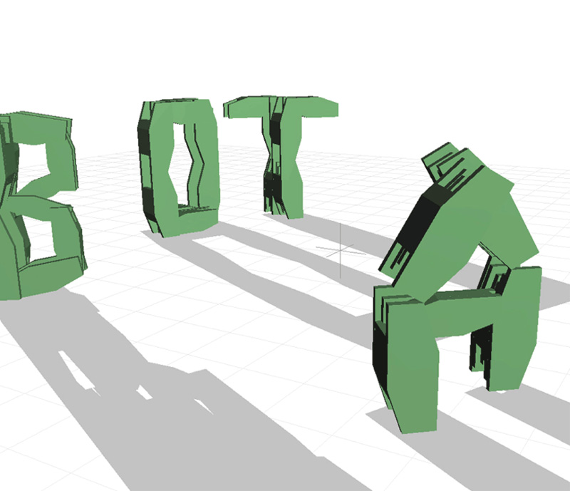
46. Nikita Pashenkov's Alphabot (2000) is a Transformer-like virtual robot “that communicates with humans by changing its shape to form characters of the English alphabet.” The 3D robot is constructed from eight hinged segments, and can smoothly re-fold its shape into any letterform.
Brief
Design a typeface (using any graphic primitives you prefer) so that all of the letters of the alphabet are structured by the same software parameters and graphic logic. For example, you might design an alphabet in which every letter is exclusively constructed from three arcs, or from four rectangles, or from a small grid of squares. After you have designed all of your letters, typeset the entire alphabet in a single image so that it can be seen at a glance.
An essential technical goal is for you to store descriptive parameters for your letters in some kind of array or object-oriented data structure, and then create a single function that renders any requested letter from this data. If you're writing individual functions to draw each letter, you're doing something wrong.
Learning Objectives
- Conceive and appraise graphical concepts for dynamic typography
- Use parameters to manipulate and/or animate letterforms
- Apply principles of metadesign to font design
- Use arrays to store geometric data
Variations
- Typeset a carefully chosen word that has a special relationship to your letterforms’ design.
- Give your letters inherently unstable properties. Animate them by deflecting their control points with a sinusoidal wiggle, Perlin noise, or real-time interactivity.
- Create a system to animate the transitions between letterforms, allowing any letter to smoothly morph into any other. Pressing a key should initiate an animated transition (of approximately a second's duration) from the previous letter to the next desired letter. Instructors: for introductory students, it may be helpful to provide a template for transitioning between letterforms.
- Consider a design in which letters are traces deposited by moving particles—whose paths are affected by forces from different spatial configurations of attractors and repulsors.
- A “forced aligner” is a computer program that takes audio files and their transcripts and returns extremely precise timing information. Using your typeface and a “forced aligner” (such as Gentle by Ochshorn & Hawkins), create time-synced dynamic typography that not only synchronizes perfectly with a speech file, but also responds parametrically to the sound of the speaker's voice.
Making It Meaningful
Extending from Adrian Frutiger's Univers (1954), Donald Knuth's computational METAFONT (1977), and Adobe's “Multiple Master” fonts (1994), it has become increasingly common practice to design highly adaptable type systems that go far beyond the rigid limits of static typefaces. Peter Biľak writes: “Prior to Univers, type designers concerned themselves with the relationships between letters of the same set, how an ’A’ is different from a ’B’. Univers goes beyond the quest to design individual letters, attempting instead to create a system of relationships between different sets of shapes which share distinctive parameters.” i
This prompt prioritizes the creative value of constraints. Restricted to designing letterforms with shared parameters, it requires modularity, economy, and an ingenuity about shapes whose variety and complexity students often take for granted. The expressive potential for contingent, interactive, and subtly time-varying form systems should not be overlooked. Take a moment to reflect on your resultant type system. For which letters does the structuring pattern succeed best or fail hardest?
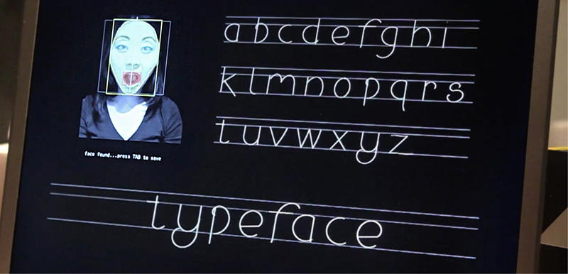
47. Mary Huang's Typeface: A Typographic Photobooth (2010) is a font whose parameters (such as slant, x-height, etc.) are governed by signals from a real-time face tracker.
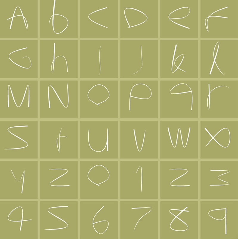
48. David Lu's Letter 3 (2002) presents an interactive alphabet whose letters are formed by manipulating the control points of a single, compound Bézier curve. Each letter can fluidly transform into any other.

49. In Peter Cho's classic Type Me, Type Me Not (1997), each letter is constructed from two “Pac-Man” filled arcs and is represented by just ten numbers.
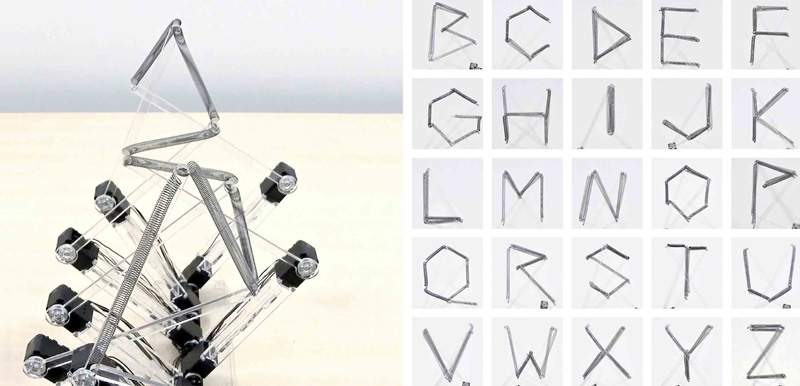
50. In Yuichiro Katsumoto's Mojigen & Sujigen (2016), six interconnected electromechanical elements form the letters of the alphabet by moving into different positions.
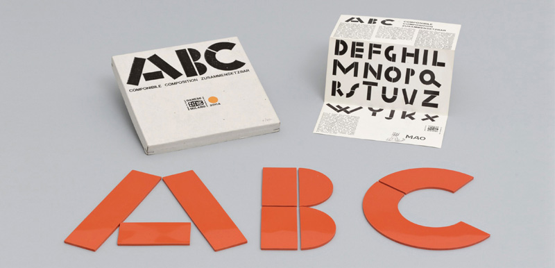
51. Bruno Munari's ABC with Imagination (1960), a children's alphabet book, included a set of modular pieces for typographic play.

52. In 1878, amidst widespread use of the calligraphic Fraktur blackletter, inventor Friedrich Soennecken sought to modernize and rationalize German typography and penmanship. Soennecken developed Schriftsystem, a method for constructing glyphs exclusively from arcs and straight lines. Decades later, his system influenced the design of the German Institute for Standardization's DIN 1451 Engschrift typeface, now used throughout Germany for many purposes.

53. Fregio Mecano (“mechanic ornament”) is a set of 20 modular, geometric shapes for constructing letters and images in highly flexible ways. Devised in Italy by Giulio da Milano in the early 1930s, it was released by the Nebiolo typefoundry.
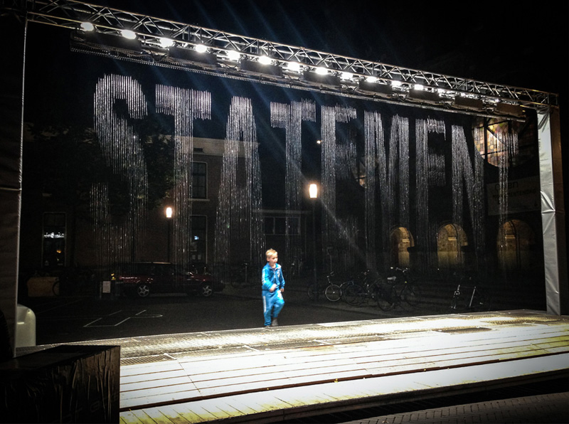
54. Julius Popp's bit.fall (2001–2016) produces ephemeral texts by releasing droplets of water through a series of precisely timed, computer-controlled solenoid valves.
Additional Projects
- Agyei Archer, Crispy, 2017, variable font.
- Erik Bernhardsson, Analyzing 50K Fonts Using Deep Neural Networks, 2016, machine-learning font.
- Michael Flückiger and Nicolas Kunz, LAIKA: A Dynamic Typeface, 2009, interactive font.
- Christoph Knoth, Computed Type, 2011, interactive typographic system.
- Donald Knuth, METAFONT, 1977–1984, font design system.
- Urs Lehni, Jürg Lehni, and Rafael Koch, Lego Font Creator, 2001, font.
- John Maeda, Tangram Font, 1993, font.
- JT Nimoy, Robotic Type, 2004, robotic typographic system.
- Michael Schmitz, genoTyp, 2004, genetic typography tool.
- Kyuha (Q) Shim, Code & Type, 2013, book and website.
- Joan Trochut, Supertipo Veloz, 1942, modular type system digitized by Andreu Balius and Àlex Trochut in 2004.
- Julieta Ulanovsky, Montserrat, 2019, variable font.
- Flavia Zimbardi, Lygia, 2020, variable font.
Readings
- Johanna Drucker, The Alphabetic Labyrinth: The Letters in History and Imagination (London: Thames and Hudson, 1995).
- C. S. Jones, “What Is Algorithmic Typography?,” Creative Market (blog), May 2, 2016.
- Christoph Knoth, “Computed Type Design” (master's thesis, École Cantonal d’Art de Lausanne, 2011).
- Donald Knuth, “The Concept of a Meta-Font,” Visible Language 16, no. 1 (1982): 3–27.
- Jürg Lehni, “Typeface as Programme,” Typotheque.
- Ellen Lupton, Thinking with Type: A Critical Guide for Designers, Writers, Editors, and Students (New York: Princeton Architectural Press, 2010).
- Rune Madsen, “Typography,” lecture for Programming Design Systems (NYU).
- “Modular Typography,” Tumblr.
- François Rappo and Jürg Lehni, Typeface as Programme (Lausanne, France: École Cantonal d’Art de Lausanne, 2009).
- Dexter Sinister, “Letter & Spirit,” Bulletins of the Serving Library 3 (2012).
- Alexander Tochilovsky, “Super-Veloz: Modular Modern” (lecture, San Francisco Public Library, March 13, 2018).