Data Self-Portrait

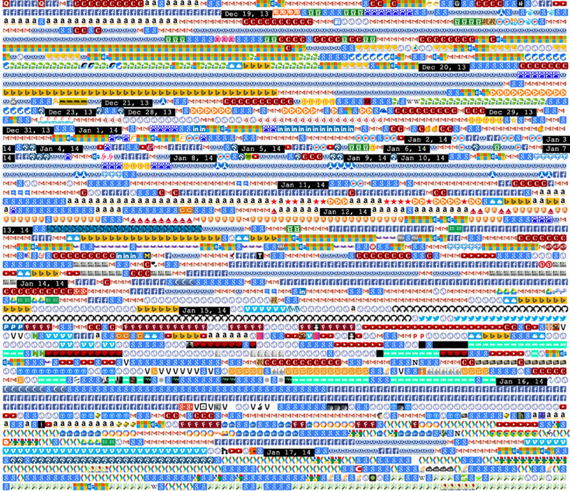
55. Shan Huang's Favicon Diary (2014), developed while she was a student at Carnegie Mellon, is a chronologically ordered compilation of the favicons from every website that she visited over the course of several months. In addition to producing her own data self-portrait, Huang also released a Google Chrome browser extension so that others could do the same.
Brief
Create a visualization that presents insights from a dataset about yourself. You may use pre-existing data (such as your email archive, fitness tracker data, etc.) or create a new system specifically for collecting data about an aspect of your life. The data you collect need not be temporal; for example, you might reimagine your wardrobe as a database of interrelated items. Can you collect data about phenomena that nobody has seen or thought of before?
Your visualization is a tool you're building to help you answer a question about yourself. You can use existing measurement technologies, or devise new manual or automatic data collection techniques. You're encouraged (but not required) to combine multiple sources of data, to make interesting comparisons.
Learning Objectives
- Implement the complete pipeline of information visualization: from data acquisition, parsing, and cleaning to representation, distillation, and interaction
- Identify and use fundamental data structures
- Carry out an in-depth consideration of information aesthetics
Variations
- Give yourself permission to be specific. Sometimes focusing your investigation on a subset of your data is not only simpler, but can be much more interesting. For example, instead of visualizing all of your text messages (a study of your texting behavior), what if you only examine the ones you exchanged with a certain person (a study of your relationship)?
- Take time-stamped data and present it in a way that does not use a timeline. Consider your email: While you can certainly visualize it as a timeline (e.g., the number of emails you process per day), you could also view it as a graph (e.g., the social network of your contacts), or as a histogram (e.g., the words you use most often).
- Build a custom device to capture data about yourself, using a novel sensor, or by mounting a sensor in an unexpected place.
- Give your data-capture system to your friends. Ask them to collect data for two weeks. Produce a set of what Edward Tufte calls “small multiples”: uniform visualizations that allow your friends’ data to be easily compared.
- Create an interactive visualization. Consider how your project can allow operations like zooming, sorting, filtering, and/or querying.
Making It Meaningful
Databases are amassed from our digital communications, search histories, transactions, step counts, sleep patterns, and journeys. How do we make sense of this “data exhaust” and how does this change our understanding of ourselves? What data is collected and what is not? What sorts of activities resist quantification and measurement and why? This task invites a deep exploration of portraiture and self-representation in the age of quantification.
Corporate and governmental surveillance is changing our lives on both personal and societal scales. How does the knowledge that our lives are being recorded change them? Consider how fitness tracking, initially celebrated by the quantified self community for its promise of new insight, was later aggressively promoted by the insurance industry and, in some cases, became required by employers. Likewise, consider the data collected by major social media platforms, and how this data feeds targeted advertising, structures the algorithmic presentation of online content, and produces contemporary phenomena like filter bubbles.

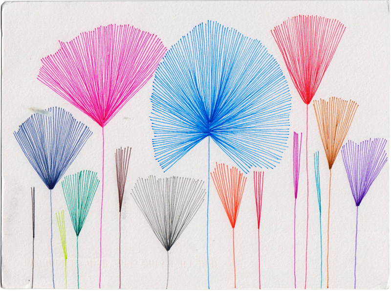
56. In Dear Data (2016), a year-long project, Giorgia Lupi and Stephanie Posavec mailed weekly hand-drawn postcards to each other that visualized some (quantified) aspect of their lives, such as the number of doors they entered, or how many times they laughed.

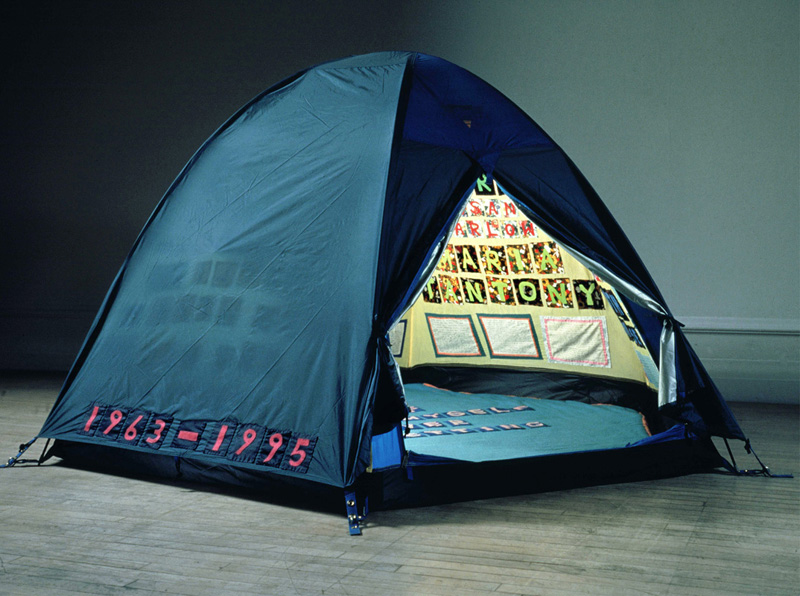
57. Tracey Emin's Everyone I Have Ever Slept With 1963–1995 (1995) is a tent with the names of Emin's lovers embroidered on the inside.

58. Fernanda Viégas's Themail (2006) analyzes the contents of email correspondence, showing the significant words that characterize each relationship.

59. Responding to a late-1970s surge in interest in the body's natural circadian rhythms, Sonya Rapoport's Biorhythm Audience Participation Performance (1981) used a commercial kit to predict her daily biorhythms, then compared her own experience with the computerized predictions.

60. Stay (2011) is an example of Hasan Elahi's ongoing “self-surveillance” work, in which he collects photographs of his daily life and preemptively sends them to the FBI.
Additional Projects
- Rachel Binx, Wi-Fi Diary, 2014, image capture software.
- Beatriz da Costa, Jamie Schulte, and Brooke Singer, Swipe, 2004, performance and installation.
- Hang Do Thi Duc and Regina Flores Mir, Data Selfie, 2017, browser extension.
- W. E. B. Du Bois, charts prepared for the Negro Exhibit of the American Section at the Paris Exposition Universelle, 1900, ink on posterboard.
- Luke DuBois, Hindsight Is Always 20/20, 2008, light boxes, software, and presidential speech transcripts.
- Takehito Etani, Masticator, 2005, electronic wearable with audiovisual feedback.
- Nick Felton, Annual Reports, 2005–2014, letterpress and lithograph.
- Laurie Frick, Time Blocks Series, 2014–2015, wood-based data visualization.
- Brian House, Quotidian Record, 2012, vinyl record.
- Jen Lowe, One Human HeartBeat, 2014, online biometrics visualization.
- Katie McCurdy, Pictal Health: Health History Visualization, 2014, health data software.
- Lam Thuy Vo, Quantified Breakup (blog), Tumblr, October 23, 2013–September 25, 2015.
- Stephen Wolfram, “The Personal Analytics of My Life,” Stephen Wolfram: Writings (blog), March 8, 2012.
Readings
- Witney Battle-Baptiste and Britt Rusert, eds., W. E. B. Du Bois's Data Portraits: Visualizing Black America (San Francisco: Chronicle Books, 2018).
- Robert Crease, “Measurement and Its Discontents,” New York Times, October 22, 2011.
- Judith Donath et al., “Data Portraits,” in Proceedings of SIGGRAPH 2010 (New York: Association for Computing Machinery, 2010), 375–83.
- Ben Fry, Visualizing Data: Exploring and Explaining Data with the Processing Environment (Sebastopol, CA: O’Reilly Media, Inc., 2008).
- Giorgia Lupi, “Data Humanism: The Revolutionary Future of Data Visualization,” Printmag, January 30, 2017.
- Chris McDowall and Tim Denee, We Are Here: An Atlas of Aotearoa (Auckland, NZ: Massey University Press, 2019).
- Scott Murray, Creative Coding and Data Visualization with p5.js: Drawing on the Web with JavaScript (Sebastopol, CA: O’Reilly Media, Inc., 2017).
- Gina Neff and Dawn Nafus, Self-Tracking (Cambridge, MA: MIT Press, 2016).
- Maureen O’Connor, “Heartbreak and the Quantified Selfie,” NY Magazine, December 2, 2013.
- Brooke Singer, “A Chronology of Tactics: Art Tackles Big Data and the Environment,” Big Data and Society 3, no. 2 (December 2016).
- Edward R. Tufte, The Visual Display of Quantitative Information (Cheshire, CT: Graphics Press, 2001).
- Jacoba Urist, “From Paint to Pixels,” The Atlantic, May 14, 2015.