Visualization
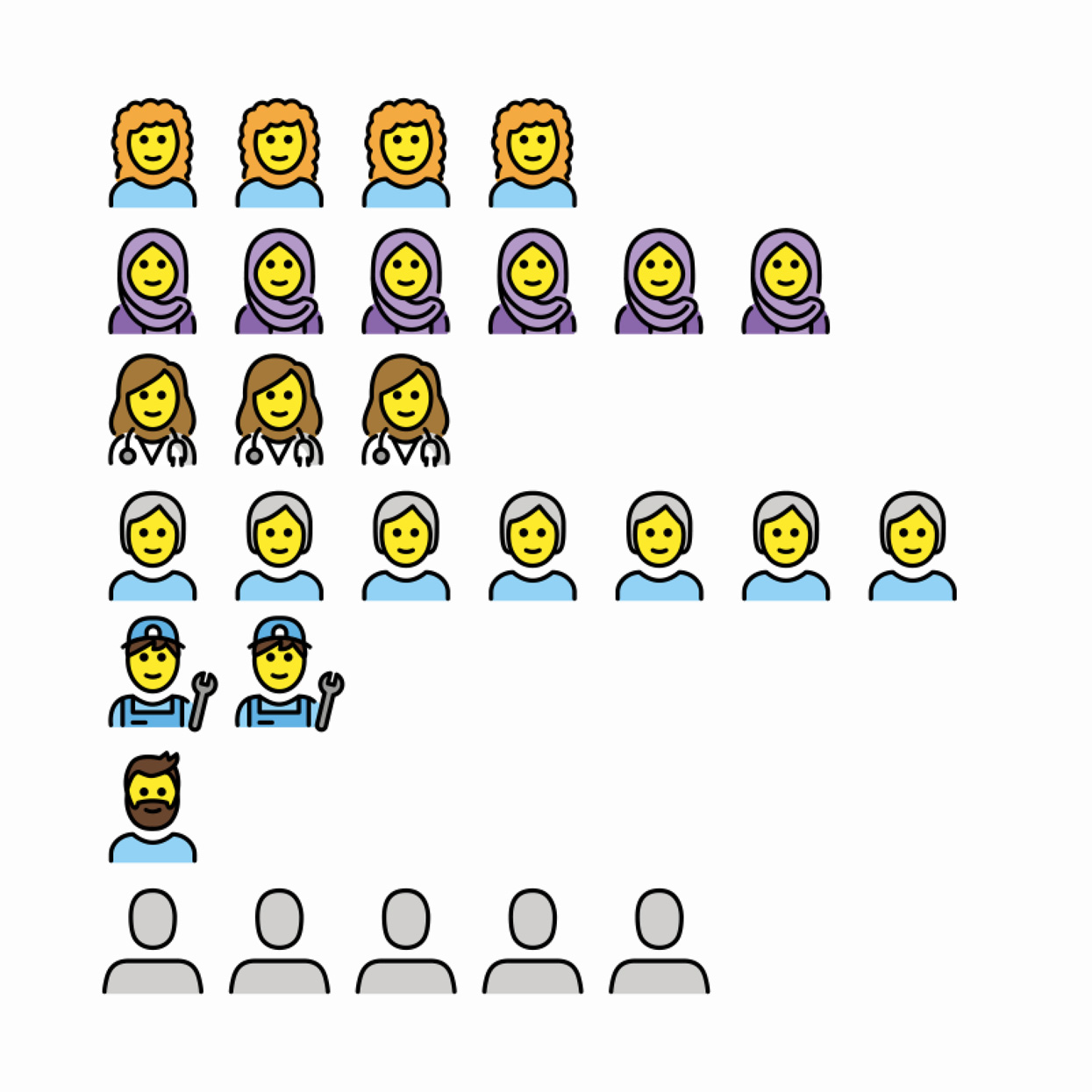
Collect the text messages that you sent and received over the past week. Count and categorize these messages according to person, topic, or mood. Create an isotype visualization to represent this data pictorially.1
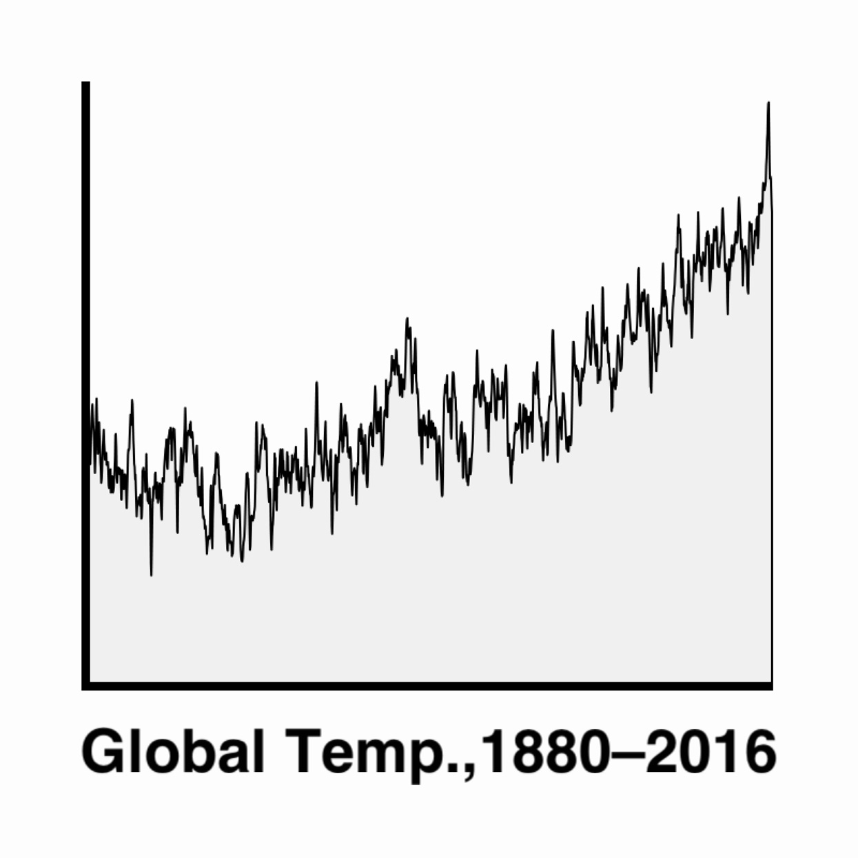
Download a dataset of the average monthly temperatures where you live. Visualize this data in a chart showing time on the x-axis and temperature on the y-axis. Make three versions of the graph, showing the data as points, as vertical bars, and as data points connected with a curved line.2
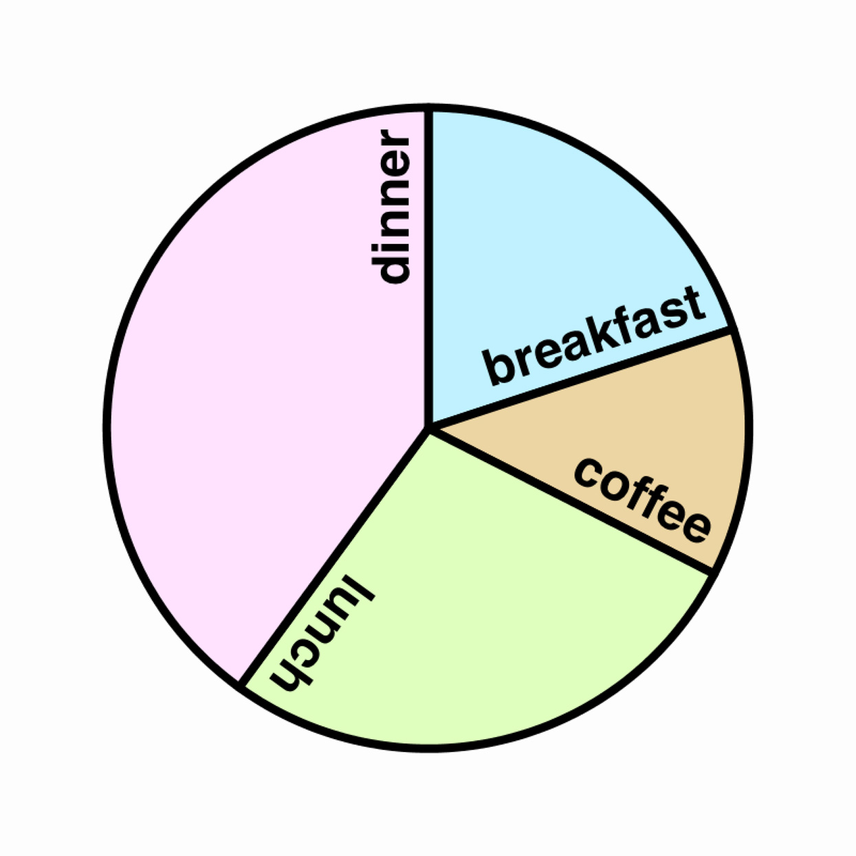
Write code to generate a pie chart that displays what you spent on breakfast, lunch, dinner, and coffee yesterday. You will need to use a function that renders a filled arc. Load the data from an external file in a well-structured format like JSON or CSV. Make sure your chart has a key.
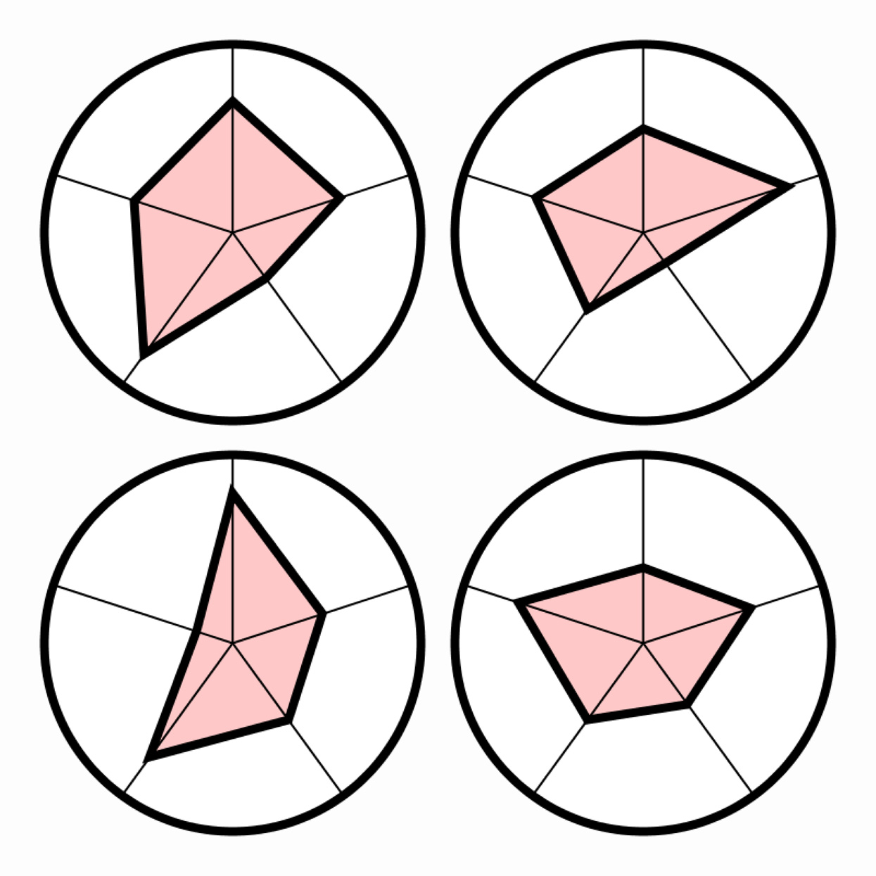
Small Multiple of Radar Charts
Take a “Big Five” personality quiz to (ostensibly) quantify your conscientiousness, agreeableness, neuroticism, openness, and extraversion.3 Generate a radar chart to visualize this multivariate data. Ask some friends to take the quiz, and create a trellis plot (or “small multiple”) that presents their personality charts side by side.

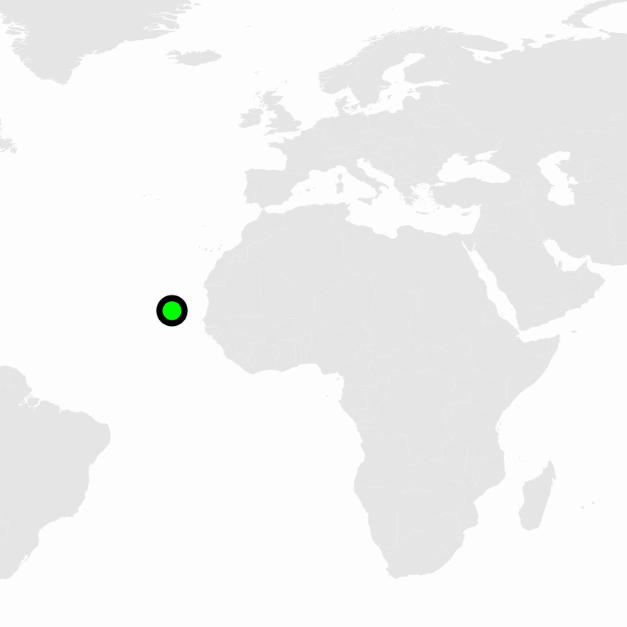
Using a smartphone app such as OpenPaths or SensorLog, record your GPS location data for a duration of at least one week. Export the latitude and longitude data to a CSV file. Write code to load and visualize the paths of your daily journeys. What observations can you make?
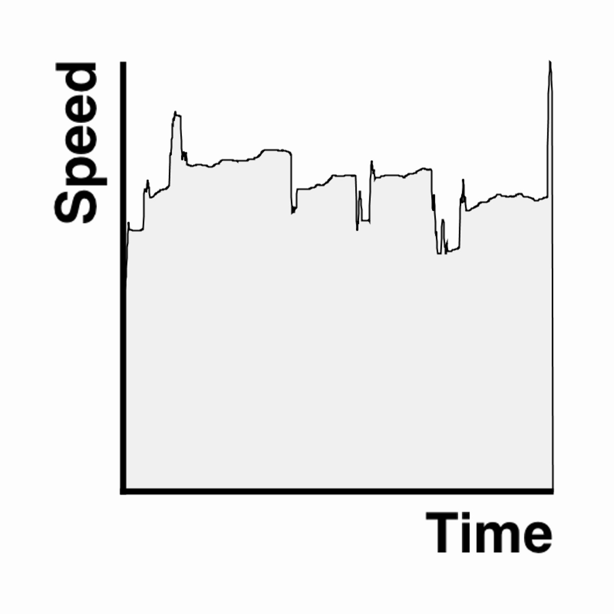
Reuse the location dataset from the previous exercise and visualize it in a way that is not a map. Consider displaying information such as path lengths or speed, frequency of visits to a particular location, distance traveled per day, etc.

The “Rat Sightings” dataset from NYC OpenData lists all of the complaints about rats made to New York City's 311 response center since 2010. Write a program to map this geolocated data by representing each complaint as a single dot.4
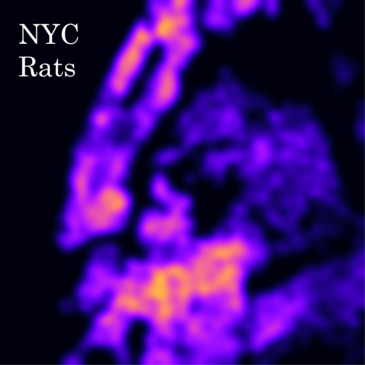
Write a program to display the Rat Sightings data as a spatial heat map. This presents two challenges, as you will need to: design a density function that represents the density of dots in a map as a continuous field, and select a color palette that represents the intensity of this field.
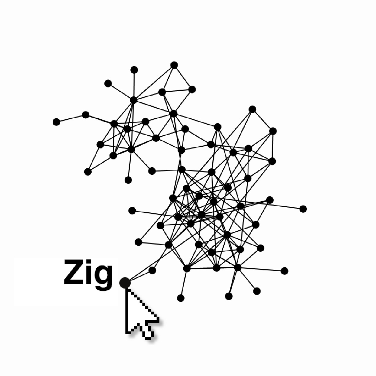
Develop a “force directed graph” to visualize a social network, in which individuals are represented as nodes and their relations as links, and the layout is governed by a simulated particle system. Use this to visualize the community of 62 bottlenose dolphins living off Doubtful Sound, New Zealand, as compiled by Lusseau et al.
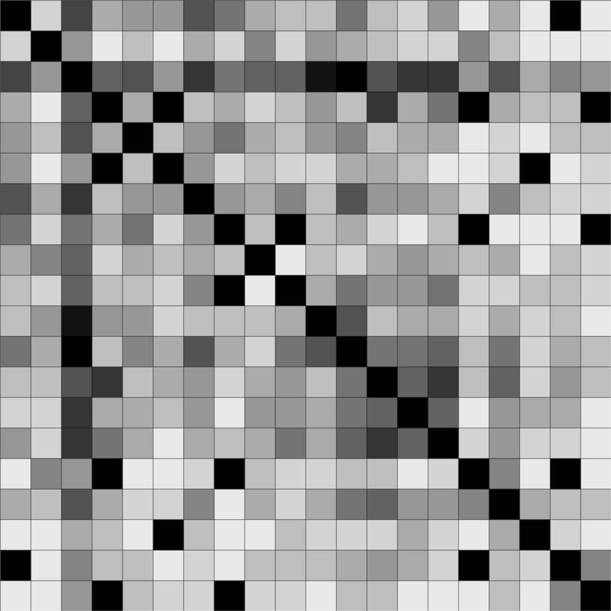
A symmetric adjacency matrix visualizes social interactions in a group. Individuals are listed along a table's rows and columns, and interactions between each pair are quantified in the cells. Create such a visualization for the family of wild monkeys observed by Linda Wolfe as they sported by a river in Ocala, Florida.
Locate a real-time Internet data stream such as that published by a sensor or an API (weather, stock prices, satellite locations). Create a program that displays this data in an evocative way. The example here shows the location of the International Space Station, available from open-notify.org.5
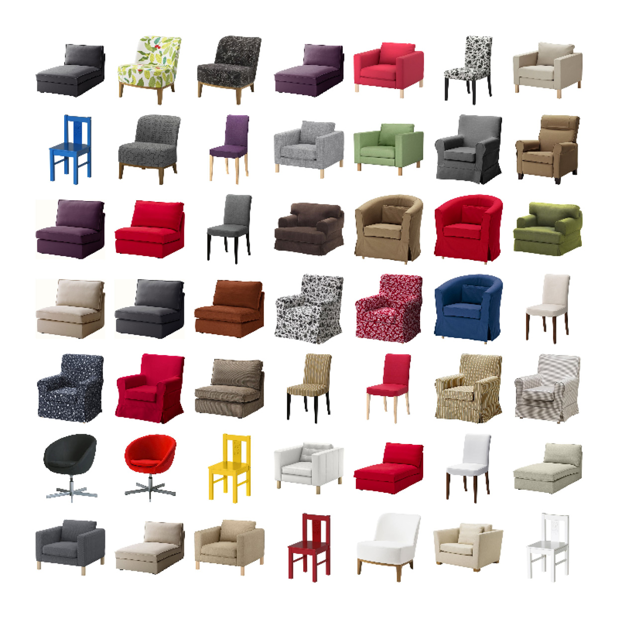
Write a program to exhaustively “scrape” a collection of online images. For example, you might automate a process to download images of every product offered by a certain vendor. Write a second program to display your images in a grid. How else could you organize the collection?6
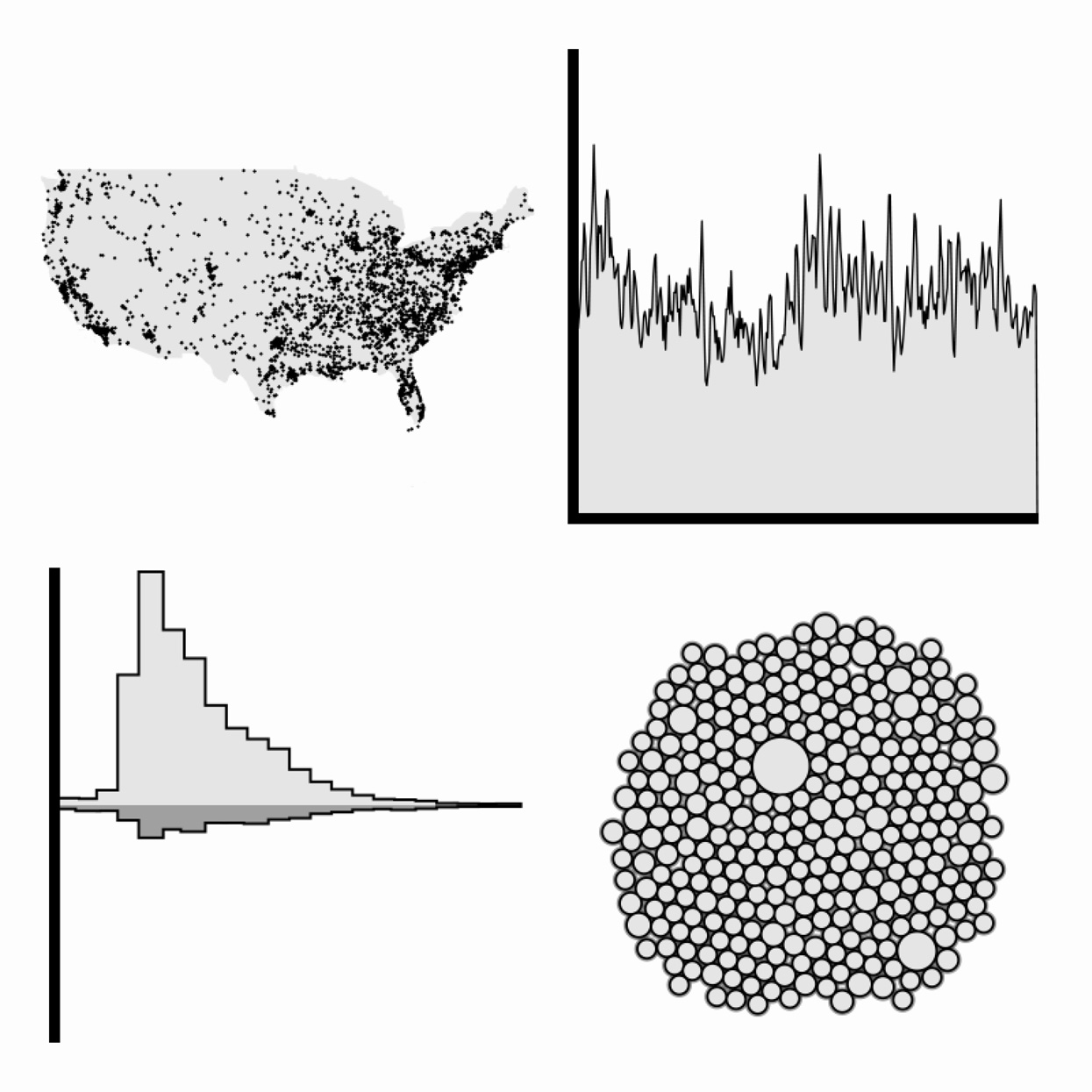
Visualize the Slate USA Gun Deaths dataset (2013) in four different ways: a map, a timeline, a bar chart based on age, and a fourth method of your choice. If you can, provide an interaction that allows a user to zoom, sort, filter, or query the data. Write about how the different displays provide different insights.7