The goal, of course, is to move beyond anatomy charts so that you can draw the body in a variety of cool poses. To achieve this goal, it helps to also have a simplified method for drawing the human figure. To this end, we’re going to start thinking about the body in sections, similar to a wooden artist’s mannequin. No professional artist draws the foundation of the body by first building a complete skeleton, with its attendant muscles. It would be too time-consuming. It’s quicker and more effective to think of the body in sections as a first step toward learning to visualize the figure as a three-dimensional form moving in space. The limbs, therefore, are represented by cylinders and the major areas of the body are solid blocks. Using this type of mannequin as your foundation, you can proceed to round out the outline of the figure.

There are classic arm poses—such as arms on hips, hands over the heart, waving, and even patting down one’s hair—that make a character look active while standing. Avoid drawing a character with the arms straight down by the sides of the body. It shows a lack of inventiveness.
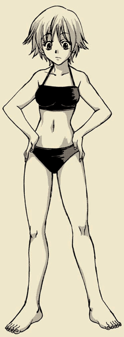
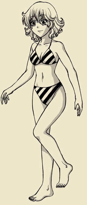
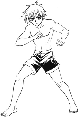
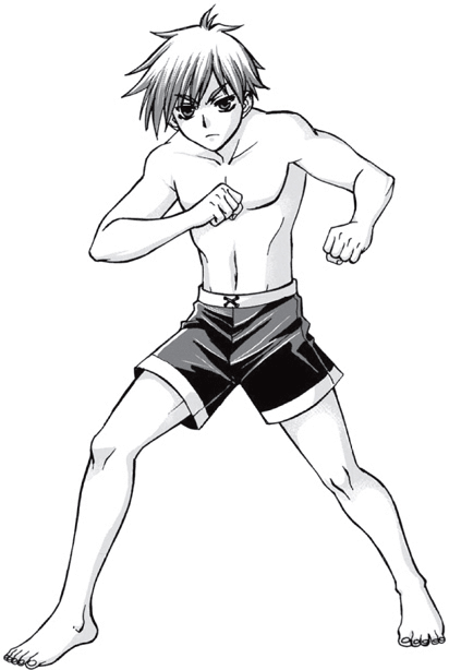
Here’s a “must-know” for when you’re drawing standing figures: If most of a figure’s body weight is on one leg, the heel of that leg will usually be placed directly under the neck to maintain balance. You can see that in the pose below.


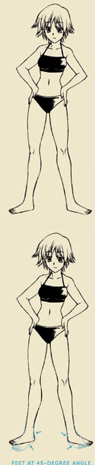
Beginners often try to avoid drawing the feet in the 3/4 view, as it requires foreshortening. So they turn the feet outward into a complete side view. This is wrong and makes the character look as if she were waddling like a duck. Feet don’t aim out like this in a natural stance. It appears as though the character is balancing on a tightrope! Instead, the feet should point outward at a 45-degree angle. And here’s a little-known fact to go along with this info: The knees likewise should point out at the same 45-degree angle.
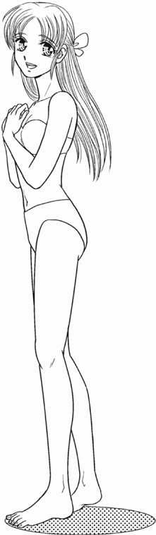
In a strict side view, you wouldn’t see the far arm or leg. They would be hidden from view. But for our purposes, this would look odd—as if her limbs just disappeared. So to rectify the situation, use what’s called an artist’s “cheat.” Turn the character ever so slightly toward you—not in a 3/4 view, not nearly that much, but just enough to see a touch of the rear arm and leg. The figure will look less like a two-dimensional image and more like a real body.

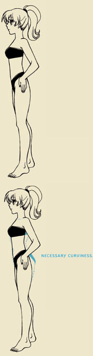
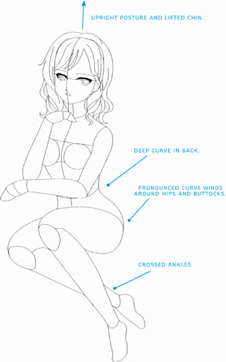
Many artists give short shrift to the curviness of the back. It’s an easy thing to miss—and an even easier thing to fix! The back is the curviest area of the female form. It’s a long line possessed of several in-and-out curves. This serpentine line travels all the way from the upper back down to the buttocks. It creates a slinky, attractive appearance.

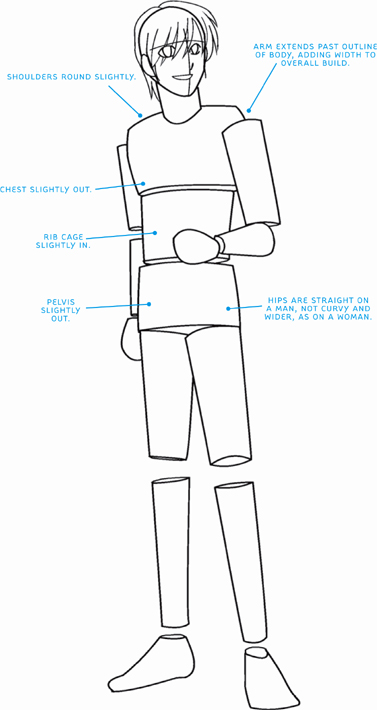
When you use the mannequin construction to think of the body in distinct sections (below, left), you can see that the top mass overlaps the midsection. This overlapping line will ultimately transition into the bottom of the pectoralis major. The examples in this section leave spaces for the joints, such as the shoulders, elbows, knees, and ankles, but some artists like to draw circles to represent them.
Also note that the ends of the cylinders here are not circles but ovals. This is because we are seeing the effects of perspective on them, and a circle that’s “squashed” to be shown in perspective (rather then in a front view) will appear as an oval.
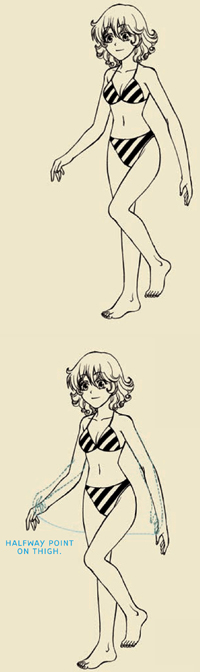
The fingertips should appear to hang about halfway down the thigh, and in this picture, it appears that they do. But wait … the arms still look too long. So what’s the problem? Actually, this is a common error. The fingertips should dangle at the halfway point of the upper leg when the arm is hanging straight. But these arms are bent. If you were to straighten them out, you’d add extra length, and then, the fingertips would fall well below the halfway point on the thigh. That means that the arms in the left-hand drawings are too long. They need to be shortened to the right length.

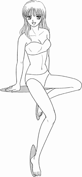
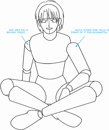
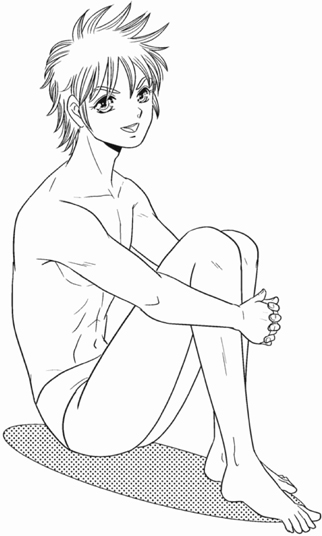
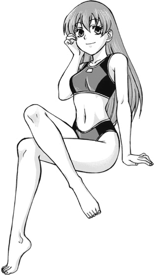
There are a variety of sitting poses, so we’ll look at three popular ones on these next few pages. Note that regardless of pose, the figures hold our interest because they all are asymmetrical, even if it’s only in subtle ways.
The stool isn’t represented here, but you don’t need it, because it’s clearly implied by the pose and the circular areas under the hips and beneath the feet. The torso here displays a dynamic posture. Each section of the upper body is positioned at a slightly different angle. By looking at the figure’s back, you can see that the rib cage angles up, the midsection remains straight, and the pelvis tilts slightly forward. In addition, the technique of overlapping one shape in front of another creates a sense of depth: The torso overlaps the arm on the far side of the body, and the near leg overlaps the far one. It makes the figure look three-dimensional.

To add asymmetry to this otherwise symmetrical pose, vary the arm placement. Adding asymmetry makes for a more interesting pose. Also, don’t be fooled by the common misconception that male hips should be very small; they have sizable mass.
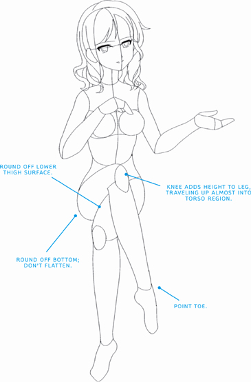
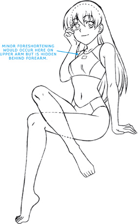
In addition, this pose uses foreshortening to make certain parts of the body appear to be coming at us. The upper legs are a good example of this. By drawing those, and all the limbs, as cylinders in the initial constructions, it’s easy to map out foreshortened poses.

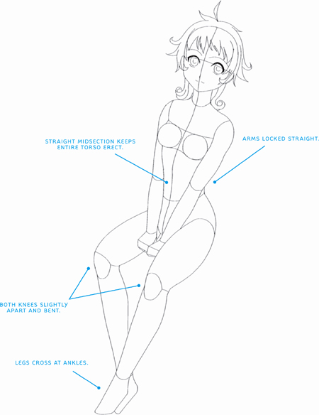
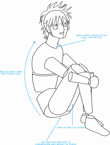
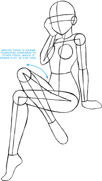
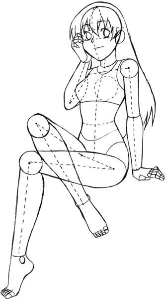
There are a few important points that become clear when you analyze the figure in sections in this pose: First, even in the side view, the neck originates inside of the rib cage, not on top of it. Second, even though it’s in sections, the back aligns along a single, curved line. And third, the far leg shouldn’t be hidden behind the near one, otherwise the figure will look flat and stiff.
CORRECT MANGA HEAD SIZE FOR OLDER TEENS
Youthful teens, or “tweens,” are generally drawn in the shoujo style, with giant eyes and large heads. Older teens, including the bishounen- and bishoujo-style characters, are drawn with smaller heads on long bodies—even when sitting! This makes the characters look more mature. But often, artists reduce the head size a bit too much. Tiny head sizes on regular bodies make characters look giant. It also looks wrong on a gut level. Be careful to avoid this error in judgment, and adjust if it occurs. Note the difference in the two examples given, and use the guide of four head lengths to make up the torso and head section.


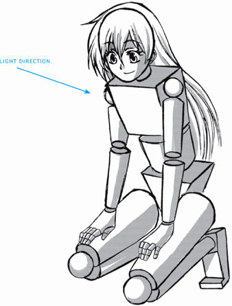
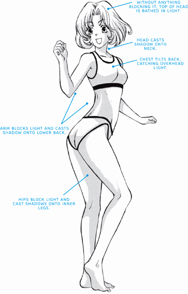
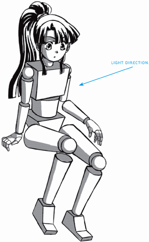
“Just add some shading,” some artists will advise you (as if it were only that simple), to which I respond, “Just add it where?” Yes, to fully bring the human form to life, you need to add a few hints of shadow, even if it’s just a few touches here and there. But there needs to be a method to your madness. Shadows should not occur randomly (except in a few extreme cases, which we’ll discuss at the end of this section). Light and shadows are logical. Light causes shadows to occur. Shadows do not just appear out of nowhere because they happen to look good. Things that block the light will cast shadows onto other things. Let’s look at a few examples to see how it works.
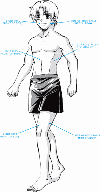
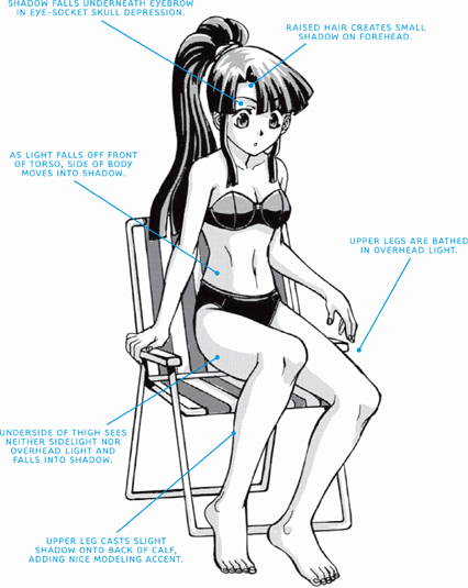
Since all bodies are built in more or less the same way, light hits us all in a similar fashion, creating the same types of shadows. Most often, we’re affected by overhead lighting, which takes the form of either indoor ceiling lights, sunlight, or moonlight. So once you familiarize yourself with the cast shadows caused by overhead light, you can use it effectively in pose after pose, on any character, as your general form of lighting.

Sidelight hits the subject from the side, rather than from above. Outdoors, sidelight most commonly occurs in early morning or late afternoon, when the sun is low in the sky. Sidelight creates a different set of shadows than overhead light. An indoor lamp on an end table can also create sidelighting and side shadows.
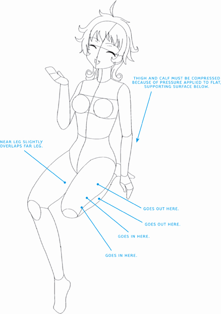
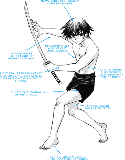
To create shadows from sidelight, first consider the human form. Think of the torso as having not just a front and a back but also sides. In other words, the body is sort of a rectangle—a box. When one side of the box is hit by light, the other side of the box will fall into shadow. This side shading brings out the depth in a figure, making the form look three-dimensional. Also note that when one body part touches or overlaps another, a cast shadow falls on the underlying body part. Similarly, when a small area that’s farther back is framed by a nearer element, the framed area appears entirely in shadow. (This happens with the legs in this pose.)
Most commonly, a figure is rarely seen in overhead light alone; the effects of sidelight are also usually in evidence, even if it takes the form of ambient lighting. So in this section, we’ll cover a variety of poses and actions in sidelight to get a comprehensive idea of how the shadows work on the body.


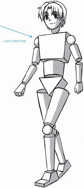
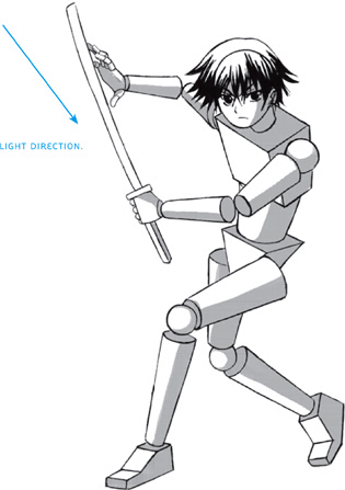
The 3/4 view of a walking pose works well in sidelighting, because as you’ve just learned, the shading on the side of the figure gives the form depth. And the 3/4 view, when drawn properly, reveals the side plane of the body in a prominent way. Many beginning artists leave out the shaded side area when drawing this 3/4 walking pose, which results in a flat-looking character.
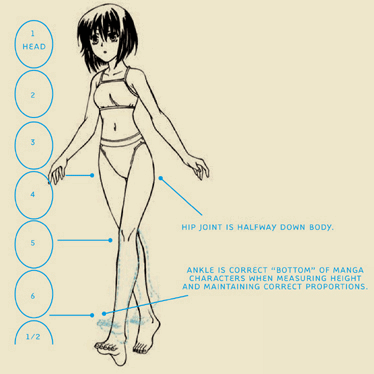
KEEPING CORRECT MANGA PROPORTIONS
If you measure the average person from the top of the head to the bottom of the foot, the crotch would mark the halfway point of the body. It’s an easy way to eyeball the proportions and, if they’re off, make an adjustment.
However, manga characters are not average. They’re often drawn slightly taller to create an idealized look. But be careful how you add the extra height. You don’t do this by “growing” the figure slightly taller all over. In fact, the head/neck/torso unit should remain the same proportion as on an average person. You only add extra length to the legs. So the average manga character’s crotch ends up as the halfway point between the top of the head and the ankles.

Too much additional height has been piled on. Clearly, her legs are oversized, which occurs sometimes when adding height. Don’t go overboard and throw the proportions out of whack.
Let’s recalibrate and see how that suits the overall look of the character.
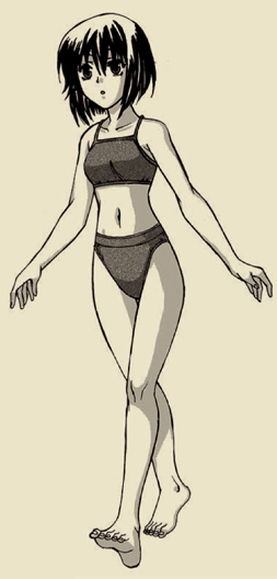
The ideal leg size is a much more comfortable fit and the overall manga proportions remain correct.
Notice how natural the shadows look on this figure. That’s because they are logically planned and applied. In each instance, the direction of the light source has been considered before adding shadow. Therefore, all of the shadows fall in the same general direction. It looks right—because it is right.
Adding shadows to the eye sockets gives an appealing, feminine look to the eyes. You can omit these shadows on male characters.

Any time an object makes contact with the ground, a shadow appears on the object at the contact point.
Here’s a creative 3/4-view action pose that puts the body through unique twists and turns. It shifts the shoulders and hips, creating unusual opportunities for shading. It will challenge you to think about the effects that light has on shadows on the figure. Remember, shadows aren’t random; they are logically created as a result of the way light hits an object.
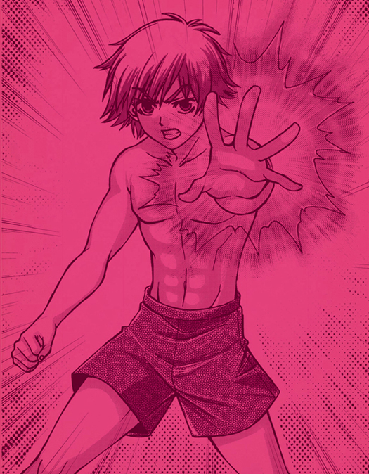
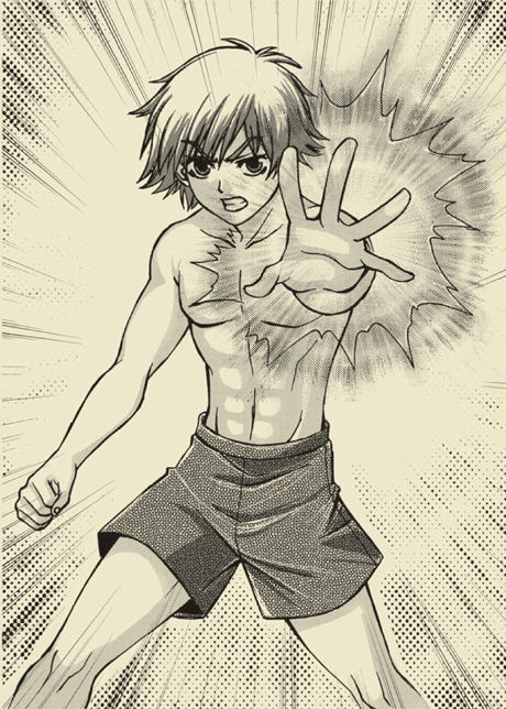
Occasionally, you may have the opportunity to set aside the rules, using light and shadow solely for the purpose of creating mood. Perhaps it’s a moonlit night in the woods, and the branches and leaves allow you to put shadows wherever you want them—without regard to realism. Or maybe you’re setting the stage in a haunted castle, and light is pouring in through the cracks in the walls and broken windows. Then there are instances when shadows can be used to reflect a character’s mental anguish. Here, the shadows serve to add intensity to the character’s determination to fight.

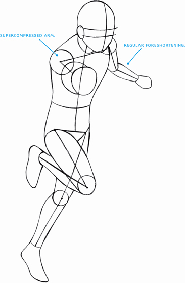
When you use foreshortening you compact or contract parts of the body depthwise so that you get the illusion of projection or extension in space. A foreshortened limb appears either enlarged as it comes toward you or reduced as it recedes from you.
Not every drawing of a figure requires perspective, but most have some. How much varies greatly. But usually, we’re not even aware of the perspective in play—it’s that subtle. Perspective can be used realistically to make the figure simply look real instead of flat and two-dimensional. Or perspective can be applied dramatically. This is called forced perspective and is a stylistic tool of exaggeration used to create impact. We’ll examine several poses that display varying degrees of perspective, starting with mild perspective and working up to extreme perspective. But whatever degree perspective is used, keep in mind this general principle: Perspective only affects things that travel from the foreground to the background or from the background to the foreground—in other words, things that appear to have depth.
This character doesn’t show much in the way of perspective; however, the arms present a good example of when perspective is called for and when it’s not. The forearm on our right travels back in space, conveying some depth. Because of this, it will show the effects of perspective. And, indeed, to accomplish this, it has been compressed, or foreshortened slightly. In fact, it is drawn shorter than the forearm on the other side of the body, which is not traveling back or forward in space but rather is traveling left to right, parallel to the viewer. That forearm appears flat and, therefore, unaffected by perspective and should be drawn at its full length, as it is.


The sitting pose is accented by crossed legs instead of two parallel legs, which would be symmetrical and repetitive. Note that only the crossed leg travels toward us. Therefore, that limb must be shown in perspective and, as a consequence, is foreshortened. The lower leg is not affected by perspective and is therefore drawn full length.
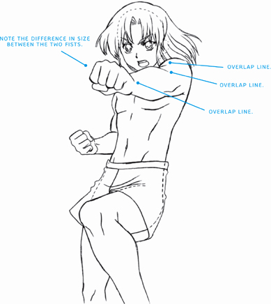
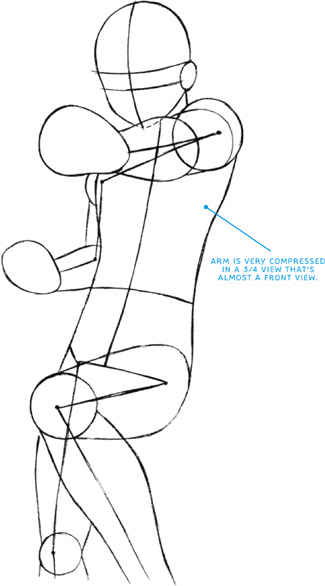
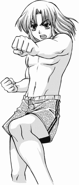
Also called forced perspective, maximum perspective is a graphic-novel fan favorite. Just don’t overuse it. It’s like a spice. An occasional use adds zing. Too much causes what’s known as “eye fatigue.” Remember this rule: The closer the figure is to a front view, the more compressed the perspective will be. Conversely, the more the figure is in profile, the flatter the drawing will be. Here, we’re getting awfully close to a full front view of that arm and fist, and consequently, the arm and fist are severely compressed.
How does one show significant compression? By flattening the object and using overlapping shapes. Dividing up the overlapping body parts into sections creates the illusion of depth. In this example, distinct areas of the fist, forearm, upper arm, and shoulder (to our right) are overlapped. In addition, for forced perspective, the mass that’s closest to us should be the largest, followed by progressively smaller masses as parts recede sharply into the background. So that near fist is drawn large.

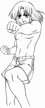

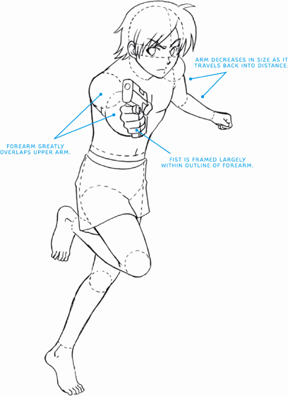
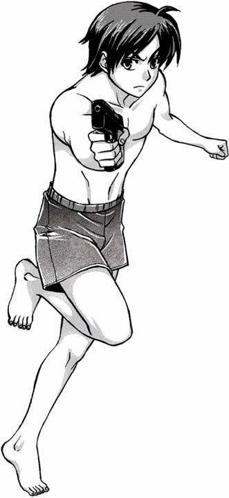
Perspective helps greatly in depicting a character running toward the viewer. The arms, in particular, are key in this type of pose. Note how both arms show the effects of perspective. One is coming at you and, therefore, increases in size, while the other travels away from you and, therefore, diminishes in size.
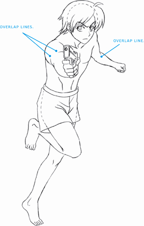
The gun-holding fist is virtually encircled by the outline of the forearm, due to the extreme foreshortening. Note that it is almost seen head-on, which is why it looks so compressed. Remember, the closer the angle is to a front view, the more compressed the object will be. This makes the overlapping of sections of this arm very important in maintaining the arm’s recognizability here. The other arm is angled more to the side than the gun-toting arm and displays a smaller amount of foreshortening, especially in the forearm.
The legs are both moving to the side, not toward us, therefore not much perspective is happening there.
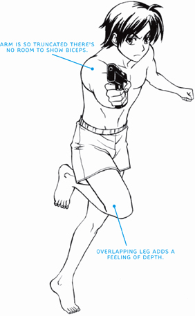
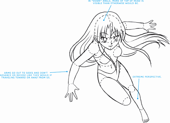
When the entire figure appears to be coming straight at us, the entire torso, the hips, and both legs are all drawn to show the effects of perspective. This is extreme perspective at work. The head becomes the biggest element and leads the charge. It tilts down somewhat, showing more of its top than would otherwise be visible if the figure weren’t drawn in perspective. In addition, the neck cannot be seen from this angle. This is due to the “down” angle in which the character is drawn. Remember to overlap: The head overlaps the torso, which overlaps the hips.
Also important to notice is what’s not being affected so much by perspective: the arms. Instead of traveling toward or away from us, the arms travel sideways in a direction that’s more parallel to us, with only slight advancing and receding. As such, they retain most of their true length.
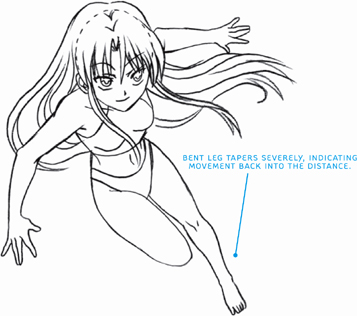
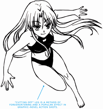
The extended leg is a good example of forced perspective, a stylistic choice in which something increases or diminishes in size at an unusually rapid pace to enhance the drama of the moment. Here, that extended leg shrinks in size in an extreme way as it recedes into the distance.


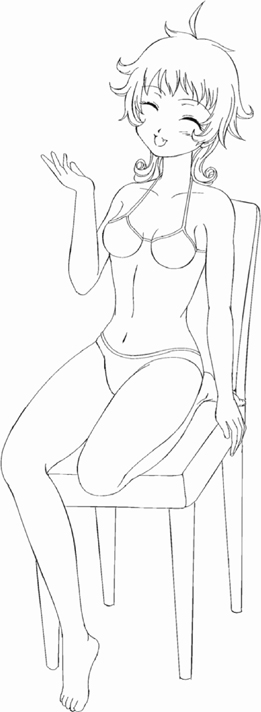
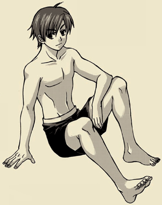
Sitting poses are some of the more challenging for artists. So a few examples and hints for popular seated poses are included here. Just as the standing figure suffers when drawn in a stiff manner, so, too, should the seated figure avoid having a rigid posture. A seated figure can look natural and relaxed—and, for certain moods, even energetic. Simply because a character is seated doesn’t mean that the torso becomes immobile, which is a common misconception; the torso remains dynamic due to the curve of the spine, just as in a good standing pose.
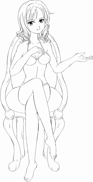
Placing both legs to one side makes for a popular, feminine, and decidedly attractive seated pose.

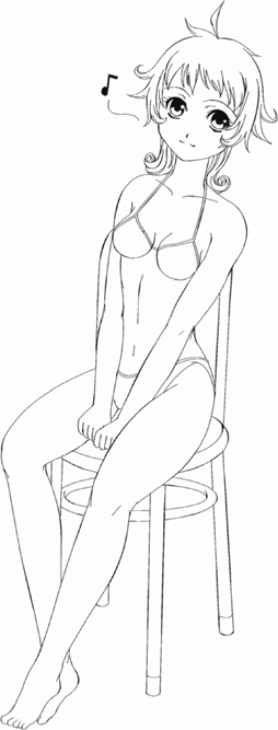
Crossed legs create a popular, casual pose. Note that even though the head and upper torso are in a 3/4 view, the legs are in a front view and, therefore, are foreshortened, due to the effects of perspective.
This is a popular, informal pose with the knees slightly apart and the hands gripping the edge of the chair between them.
Tucking one leg under the body, in any position, is a playful pose. It’s a typical “high school” or “college roommate” look. It appears easy to draw but can be tricky; plot it out first with a simplified construction.