While we can greatly vary the look of each control using styles alone, there are occasionally situations when we need to alter their template to achieve our goal. For example, there is no direct way to change the background color of a button through styles alone. In these situations, we need to alter the control's default template.
All UI elements that extend the Control class provide access to its Template property. This property is of type ControlTemplate and enables us to completely replace the originally declared template that defines the normal look of the control. We saw a simple example in the Chapter 4, Becoming Proficient with Data Binding, but let's now have a look at another example:
<Button Content="Go" Width="100" HorizontalAlignment="Center">
  <Button.Template>
    <ControlTemplate TargetType="{x:Type Button}">
      <Grid>
        <Ellipse Fill="Orange" Stroke="Black" StrokeThickness="3"
          Height="{Binding ActualWidth,
          RelativeSource={RelativeSource Self}}" />
        <ContentPresenter HorizontalAlignment="Center"
          VerticalAlignment="Center" TextElement.FontSize="18"
          TextElement.FontWeight="Bold" />
      </Grid>
    </ControlTemplate>
  </Button.Template>
</Button>
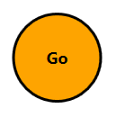
Here, we have a button that we have altered to look like a circle. It is very basic, as we have not bothered to define any mouseover or click effects, but it shows that there is nothing scary about overriding the default template of a control and that it is simple to achieve:

Note that the ContentPresenter element is declared after the Ellipse element because the ellipse is not a content control and cannot have another element set as its content. This results in the content being drawn on top of the ellipse. A side effect of this is that we therefore need to add a panel inside the template, to enable us to provide more than a single piece of content.
Also note that as with styles, we need to specify the TargetType property of the template. To clarify this a little, we need to specify it if we want to data bind to any properties of the control, or if the template contains a ContentPresenter element. Omitting this declaration will not raise a compilation error in the latter case, but the content will simply not appear in our templated control. It is therefore good practice to always set this property to the appropriate type.
However, unlike styles, if we declared a ControlTemplate and set its TargetType property in a Resources collection without specifying the x:Key directive, it would not be implicitly applied to all buttons in the application. In this case, we would receive a compilation error:
Each dictionary entry must have an associated key.
Instead, we need to set the x:Key directive and explicitly apply the template to the Template property of the control. If we want our template to be applied to every control of that type then we need to set it in the default style for that type. In this case, we need to not set the x:Key directive of the style, so that it will be implicitly applied:
<ControlTemplate x:Key="ButtonTemplate" TargetType="{x:Type Button}">
  ...
</ControlTemplate>
<Style TargetType="{x:Type Button}">
  <Setter Property="Template" Value="{StaticResource ButtonTemplate}" />
</Style>
Note that we would not typically hard code property values as we did in this template example, unless we did not want the users of our framework to be able to set their own colors on our templated controls. More often than not, we would make proper use of the TemplateBinding class to apply the values set from outside the control to the inner controls defined within our template:
<Button Content="Go" Width="100" HorizontalAlignment="Center"
  Background="Orange" HorizontalContentAlignment="Center"
  VerticalContentAlignment="Center" FontSize="18">
  <Button.Template>
    <ControlTemplate TargetType="{x:Type Button}">
      <Grid>
        <Ellipse Fill="{TemplateBinding Background}"
          Stroke="{TemplateBinding Foreground}" StrokeThickness="3"
          Height="{Binding ActualWidth,
          RelativeSource={RelativeSource Self}}" />
        <ContentPresenter HorizontalAlignment="{TemplateBinding
          HorizontalContentAlignment}"
          VerticalAlignment="{TemplateBinding
          VerticalContentAlignment}"
          TextElement.FontWeight="{TemplateBinding FontWeight}"
          TextElement.FontSize="{TemplateBinding FontSize}" />
      </Grid>
    </ControlTemplate>
  </Button.Template>
</Button>
While this example is now far more verbose, it is also more practical and would enable users to set their own button properties. Setting this template in a default style would make the templated control far more reusable. Note that now, the hard coded values are made on the button control itself, with the exception of the StrokeThickness property.
There is no suitable property on the Button class that we could use to expose this inner control property. If this was a problem for us, we could expose the value of that property in a custom Attached Property and data bind to it on the button as follows:
<Button Attached:ButtonProperties.StrokeThickness="3" ... />
And we could do the following inside the control template:
<Ellipse StrokeThickness=
  "{Binding (Attached:ButtonProperties.StrokeThickness)}" ... />
However, even though we have improved our template, there are certain elements defined in the default templates that affect the way their containing controls look or work. If we remove these elements, as we have done in the preceding example, we will break that default functionality. For example, our example button no longer has focusing or interaction effects.
Sometimes, we may only need to slightly adjust the original template, in which case, we would typically start with the default ControlTemplate and then make our slight adjustment to it. If we had done this with our button example and simply replaced the visual aspects, then we could have retained the original interactivity with it.
In days gone by, it could be quite difficult to find the default control templates for the various controls. We would previously need to try and track them down on the docs.microsoft.com website, or use Blend; now, however, we can use Visual Studio to provide it for us.
In the WPF designer, select the relevant control, or click on it with the mouse in a XAML file. With the relevant control selected or focused, press the F4 key on your keyboard to open the Properties window. Next, open the Miscellaneous category to find the Template property, or type Template in the search field at the top of the Properties window.
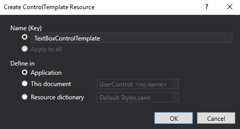
Click on the little square to the right of the Template value field and select the Convert to New Resource... item in the template options tooltip. In the popup dialog window that appears, name the new ControlTemplate to be added and decide where you want it to be defined:

Once you have entered the required details, click the OK button to create a copy of the default template of your selected control in your desired location. As an example, let's take a look at the default control template of the TextBox control:
<ControlTemplate TargetType="{x:Type TextBox}">
  <Border Name="border" BorderBrush="{TemplateBinding BorderBrush}"
    BorderThickness="{TemplateBinding BorderThickness}"
    Background="{TemplateBinding Background}"
    SnapsToDevicePixels="True">
    <ScrollViewer Name="PART_ContentHost" Focusable="False"
      HorizontalScrollBarVisibility="Hidden"
      VerticalScrollBarVisibility="Hidden" />
  </Border>
  <ControlTemplate.Triggers>
    <Trigger Property="IsEnabled" Value="False">
      <Setter Property="Opacity" TargetName="border" Value="0.56" />
    </Trigger>
    <Trigger Property="IsMouseOver" Value="True">
      <Setter Property="BorderBrush" TargetName="border"
        Value="#FF7EB4EA" />
    </Trigger>
    <Trigger Property="IsKeyboardFocused" Value="True">
      <Setter Property="BorderBrush" TargetName="border"
        Value="#FF569DE5" />
    </Trigger>
  </ControlTemplate.Triggers>
</ControlTemplate>
As we can see, most of the properties set on the inner controls have been exposed to the TextBox control through the use of the TemplateBinding class. At the end of the template are the triggers that react to various states, such as focus, mouseover, and enabled states.
However, inside the Border element, we see a ScrollViewer named PART_ContentHost. The fact that this is named with the PART_ prefix specifies that this control is required within this template. All named parts of each UI element will be listed on the [ControlType] Styles and Templates pages on docs.microsoft.com.
This named part control is required in the textbox because when the textbox is initialized, it programmatically adds the TextBoxView and CaretElement objects into the ScrollViewer object and these are the predominant elements that make up the textbox's functionality.
These specially named elements also need to be registered within the declaring class and we'll find out more about that later in the chapter as well. It is therefore important that we include these named controls in our custom templates if we want to keep the existing functionality.
Note that we will not receive any compilation errors or even trace warnings if we do not include these named controls, and we are free to leave them out if we do not require their relevant functionality. This following example, while hardly functional, it still perfectly valid:
<TextBox Text="Hidden Text Box">
  <TextBox.Template>
    <ControlTemplate TargetType="{x:Type TextBox}">
      <ContentPresenter Content="{TemplateBinding Text}" />
    </ControlTemplate>
  </TextBox.Template>
</TextBox>
Although this TextBox control will indeed display the specified text value, it will have no containing box like a normal TextBox element would. What will happen when this template is rendered is that the ContentPresenter element will see a string and default to displaying it in a TextBlock element.
Its Text property will still be data bound to the Text property of our TextBox control and so, when focused, it will still behave like a normal TextBox element and enable us to enter text. Of course, we won't see when it's focused because we didn't add any triggers to make that happen, and there won't be a caret as the CaretElement object will no longer be added.
Instead, if we simply supply the required named control, even without anything else, we'll still regain most of the original functionality:
<TextBox Name="Text" Text="Does this work?">
  <TextBox.Template>
    <ControlTemplate TargetType="{x:Type TextBox}">
      <ScrollViewer Margin="0" Name="PART_ContentHost" />
    </ControlTemplate>
  </TextBox.Template>
</TextBox>
Now, when we run our application, we have the caret and text cursor when the mouse is over the TextBox control, and so we have regained more of the functionality, but not the look. However usually, the best option is to keep as much of the original template as we can and only change the parts that we really need to.