
10. CAN FOOTPRINTS PREDICT THE FUTURE?
This has been a great decade for Research on Wall Street. Every firm, or nearly every firm, has a Research Department. (I say nearly every firm because in some firms the Research Department is one seventeen-year-old wearing gym shoes who has dropped out of not only Cardinal Hayes High School but out of everything the Office of Economic Opportunity could think up. The duties of this gum-chewing apprentice of capitalism are to go for sandwiches, to deliver stock certificates, and to stamp “Research Department, Donner, Blitzen and Company, Members New York Stock Exchange” on reports that come in from Argus Research and Equity Research Associates and the other independent purveyors of Research. Donner, Blitzen and Company sends these out with a little note saying, “We thought you would be interested in our latest check on the Chemical Industry, which our Team of Analysts has just examined thoroughly.”)
Research is all to the good, but the tide of it has now become so high that no one anywhere can escape knowing that the output of the Trucial Sheikdom of Amrah increased in the second quarter to 11,674,322 barrels per day, while at the same time manufacturers’ inventories of medium-priced television sets were down 5.3 percent from the year before but up .6 percent from the preceding quarter.
Unfortunately, as we have seen, the playing of the Game is not entirely a rational affair. If it were, the most impeccable fact-finding would soon dominate the market, and many of the players would be bored to death and would invent some other Game. Since part of the Game is the anticipation of how the other players will behave, it is not surprising that Systems have grown up devoted to answering the question: What is everybody else doing? In its most primitive form, What is everybody else doing? makes up part of the daily volume of the Telephone Company. Wall Street, as you already know, is part of Marshall McLuhan’s vision of the world in the Electric Age, that is, a global village dependent on oral-aural communication.
To some extent, the global villagers in their tribal rites do pick up the telephone and say, “Our oil analysts have just returned from the Trucial Sheikdom of Amrah, and production in the second quarter increased to 11,674,322 barrels per day, except the part siphoned off to the Russians, and we aren’t sure how big that part is because the Minister of the Interior, Fawzi el Schnurr, wants something put into his account at the Union Bank of Switzerland before he tells us.” To some extent this is the content. But more often than not, that kind of communication is limited to print, and the oral-aural communication is more on the lines of the following:
Global Villager #1: “Say, our oil analysts have just come back from the Trucial Sheikdom of Amrah …”
Global Villager #2: “Hot as hell there, isn’t it? We sent an oil analyst there once but be came back with some weird gut disease. Poor guy. We had to put him in the Back Room.”
Global Villager #1: “Gee, our oil analysts have been complaining of gut trouble ever since they got back.”
Global Villager #2: “Say, did you see where Fawzi Oil closed yesterday? Thirty-one, up one and one half. Pretty good volume, too. You got any idea why?”
Global Villager #1: “Well, I just had lunch with a guy who said the boys on the coast at Continental Growth are buying it.”
Global Villager #2: “Continental Growth is buying? You sure?”
Global Villager #1: “That’s what he said.”
The trouble with the telephone as an attempt to find out What is everybody else doing? is that the amount of information processed is limited by the time available.
This may help to explain some of the popularity of charts. Charts are a tangible, visible way of finding out, if not What is everybody else doing?, at least What has everybody else done?
Historically speaking, Charting actually preceded Research, for Charting was rampant when Research consisted of eavesdropping on Daniel Drew and Jay Gould. This may come as a surprise to recent arrivals, since Charting has taken on an air of sophistication.
“There is an incredibly large number of traders,” wrote Thomas Gibson in The Pitfalls of Speculation, “who pin their faith to the so-called ‘chart system’ of speculation which recommends the study of past movements and prices, and bases operations thereon. So popular is this plan that concerns which make a business of preparing and issuing such charts do a thriving business.”
Mr. Gibson’s book was published in 1906 by Moody’s. Plus ça change, plus c’est la même chose. If you stop to think that Mr. Gibson’s book was published only a few years after the specialist in Northern Pacific literally had the shirt torn off his back on the Exchange floor by frantic short sellers, and a year before J.P. Morgan personally bailed out the Treasury of the United States, and that a dozen oysters cost eight cents at Oscars, you can see that in our vast, myriad, and changing world, some things are constant. Mr. Gibson, not an impartial observer, went on to say, “There are various offshoots and modifications of the system, but the basic plan is founded wholly on repetition, regardless of actual conditions. The idea is untrustworthy, absolutely fatuous, and highly dangerous.” That, as you can see, is some years before Moody’s went into the chart business.
What is the whole thing about? Well, without going into collateral lines, such as the charting of the sun and moon, we can determine from anthropologists and spelunkers that about the time of Australopithecus, a caveman made a wall drawing thus:

You can see that the vertical bar represents the range of the stock for that day, and the little lateral line is where it closed for the day. The next day the caveman did the same thing. After a couple of weeks, the cave wall looked like this:
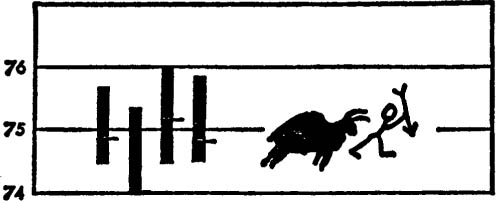
Thus was born the first “bar” chart, named after the vertical lines.* However, this first chart was trendless, which is to say nobody could make anything of it.
Then one week the cave wall looked like this:
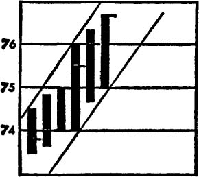
* The figures on the light include a prehistoric buffalo, and are not related.
The caveman drew a line connecting the tops and bottoms, thus creating a Channel, and the first Trend was born. In the future would come such scientific advances as line bottoms, saucer bottoms, head and shoulders tops, head and shoulders failures, true Vs, inverted extended Vs, measured moves, triangles, wedges, flags, diamonds, gaps, reversals, islands, boxes, spinners, flankers, cornerback fakes, running guards, lonely ends, and tackles eligible.
But in order to put it all into a Conceptual Scheme, Isaac Newton had first to be born. Isaac Newton was not actually a Chartist, though they claim him as their own. One day after the apple incident, Isaac Newton said, “A body in motion tends to stay in motion, and a body at rest tends to stay at rest.” Or so the Chartists say.
Without Isaac Newton, the pictures on the cave wall would have been simply that: pictures. After Isaac Newton, the idea that these patterns could represent motion became acceptable. Once it is accepted that the patterns can represent motion, it follows that a Trend is a Trend is a Trend until it stops being a Trend. In other words, if something is going like this:
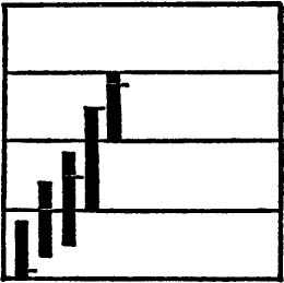
it will keep going like that until it goes like this:
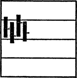
unless it goes like this:
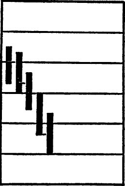
The worst problem arrives when it goes like this:
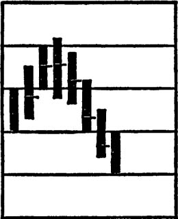
which would seem to indicate that it was about to go:
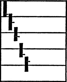
but then it turns around and goes:
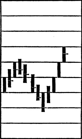
This is called a Trap, or the Exception That Proves the Rule.
You can even put the volume of shares traded along the bottom of the chart, like this:
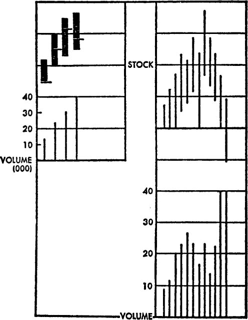
and thus you can see whether this price movement was accompanied by a lot of trading or whether it happened to be a thin stock moved by two bored backgammon players who just felt an impulse to trade.
Now you have learned some of the basic rudiments of charting. So far, there is little dispute. A chart can be a handy way of looking at what has happened; it can tell you what the price range has been, and what the volume has been.
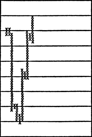
These “bars” showed you the range, but by the definition of a bar they must be all straight-line vertical. There is a variation called point-and-figure, which is not a Regency dance but a complete map of all the footprints a stock has made. Each price movement is delineated by an x in a square on the logarithm paper. Thus a stock which has barely moved might look like this after three months:
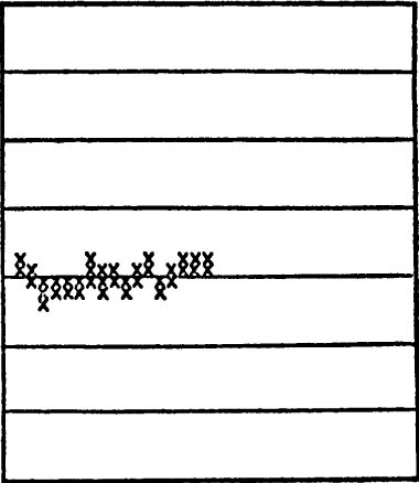
And one which has been swinging wildly could look like this after only a week or so:
It is an informal thesis of charting that there are roughly four stages of stock movement. These four are:
1) Accumulation. To make a perfect case, let us say the stock has been asleep for a long time, inactively traded. Then the volume picks up and probably so does the price.

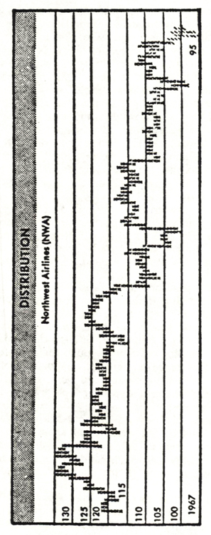
CHARTS COURTESY OF PAPLLES
© CHART BOOK
2) Mark-up. At the stage of accumulation, there were still enough sellers around who were glad to unload the old dog finally to any fool willing to buy it. Now the supply may be a bit thinner, and the stock is more avidly pursued by more buyers, so it moves up more steeply.
3) Distribution. The Smart People who bought the stock early are busy selling it to the Dumb People who are buying it late, and the result is more or less a standoff, depending on whose enthusiasm is greater.
4) Panic Liquidation. Everybody gets the hell out, Smart People, Dumb People, “everybody.” Since there is “no one” left to buy, the stock goes down. (Of course, “someone” has to buy the stock on the way down, or it would go to zero overnight.)
Now we come to trickier ground. When the stock doesn’t get anywhere after a rise, but churns around at the same price level, the Chartists call it an Area of Resistance. When a stock drops to a point where it doesn’t drop any more, and churns around, they call this an Area of Support.
If one could depend on these charts, it would be a very neat world indeed. But if things were really this cut and dried, all the twenty-two million active investors would simply load up with charts and the Game would be over. Stocks have a way of blitzing right through the Resistance or the Support, pausing only long enough for chart followers to sell (at Resistance) or buy (at Support). And while the Chartists can then look back and point this out as a Trap, that doesn’t make the poor people caught in the Trap feel much better.
If charts were only pictures of what has already happened, there would be little excitement about them. They would simply be used as adjuncts to statistical manuals like Moody’s and Standard and Poor’s. It is the idea that charts can indicate some future course that is so controversial.
The Fundamentalists maintain that stock prices will follow the course of business: sales, earnings, profit margins, and what have you. The Chartists maintain that all these factors have been discounted; they already exist in the price of the stock. What has not been discounted will show up in the movement of the stock.
Take another look at the idea of support and resistance. The chart will show, let us say, that Digital Datawhack churned around between 19 and 21 for a while. Then, in a marvelous spree, it zipped up to 36–38 and churned around there, and then retreated. The Chartists would say that there was support at 20. Presumably they would be willing to buy more if it got back there. Or there are people who were watching the stock, and it “got away from them”; they were unwilling to chase it to higher prices but they will buy it if it comes back to the point at which they were interested. Conversely, there are people who sold it at 38. Now the stock has backed off; presumably they will be willing to sell more at 38, or those who missed selling the first time will be willing to sell at 38.
If Digital Datawhack retreats and then goes barreling through 38, the old resistance level becomes the new support level, and the whole process is repeated.
You can see that there is an underlying assumption in charting, and that is that what was true yesterday will also be true tomorrow. Time as a factor is ignored, except time past. If there are new factors which must be reflected in time future, they will appear when Digital Datawhack breaks through either the resistance or the support, and then, the theory goes, you will know that something else is going on.
Chartists have, over the years, probably had more pressure on them than Fundamentalists. The Fundamentalist is able to report to you the news of the company, together with generalizations that provide an adequate cop-out. The Fundamentalist can say something like this:
Recent weakness in the stock of Zilch Consolidated has prompted inquiries from investors. Production difficulties in the packaging of the new Zilchpaw Dog Food resulted in higher-than-budgeted expenses. While sales increased 4 percent, margins dropped 7 percent, and the net of this division is likely to drop 10 percent. Sales of other Zilch divisions have reflected the slowdown in the economy, and consequently net is likely to be only slightly better than last year. While short-term considerations may determine near-term price action, we continue to feel that Zilch Consolidated offers long-term value for the patient investor.
Thus the analyst has reported what was going on, after the stock has already been bombed, but if you are patient long term, you may do all right. That phrase “long term” is the key phrase. It is used probably for 80 percent of all stocks that are not headed for bankruptcy at any given moment. Never mind that the long term is a series of short terms, or that in the long run we are all dead. The phrases “patient investor” and “long-term appreciation” ring with the virtues of capitalist ethos. The assumption of most Wall Street report writers is that their audience consists of millionaires with their own railroad cars who move from Saratoga to Palm Springs amid the muffled sounds of silent servants and distantly ticking clocks. What they really want is to be in the company of other millionaires: They are the true, patient, long-term investors, and, in short, they have so much money they don’t want to be bothered with any more. The Research Departments, of course, don’t really assume that their audience is railroad-car millionaires, if you get them at home on a quiet night. But the language they choose and the conclusions they reach would lead you to think that; such is the ambiguity of the cop-out. It is much easier to say, “While the near term is uncertain, long-term holdings need not be disturbed,” than to say, “Dump this one.”
The Chartist has less material to report, and furthermore he does not have the Free Zone of the Long Term to escape into. His thesis is that past patterns tell future patterns; therefore he must say whether the market (a set of Averages) or a particular stock is going to go up or down, and it is very easy to check up on his prediction. So he must say something like this:
We expect no furious advance unless the market is able to break through the overhanging resistance at the 920 level. Recent weakness in oils and strength in aerospace issues indicates leadership is rotating. Support exists at the 885 level, and unless that is pierced on some volume, we would expect it to hold near term. A trading range is indicated.
In short, the market will not go up unless it goes up, nor will it go down unless it goes down, and it will stay the same unless it does either.
This may not be quite so useless as it seems. The mystery and incantation do get to be rather funny sometimes, especially when Chartists are publishing opposite conclusions from the same chart. But a chart can show you what has been going on, and if this differs from what you think ought to be going on, maybe you ought to think again, even if the future is not there in the tea leaves. The assumption of the chart is that you ought to pay attention to it because the people who have already acted, and therefore created the chart, are smarter than you, or know something you don’t know. You may reject the assumption, but it’s a good check.
Can the footprints of price movements really predict the future?
If truly and universally they could, they soon would not. When everyone knows something, then no one knows anything; the market would soon become too “efficient”; that is, the gap between present and future value would quickly be closed by the predicting device. Yet a Chartist must, like the oracle of Delphi, be constantly on call with predictive aphorisms, which does produce cult and cant.
Does this mean that charts can be ignored? Perhaps charts can be a useful tool even without inherent predictive qualities. A chart can give you an instant portrait of the character of a stock, whether it follows a minuet, a waltz, a twist, or the latest rock gyration. The chart can also sometimes tell you whether the character of the dancer seems to have changed. There is even some mathematical support developing for the thesis that trends persist; a recently published Ph.D. thesis, The Relative Strength Concept of Common Stock Price Forecasting by Robert Levy, explores this. The first sixty pages of this book are perhaps the clearest exposition anywhere of what “technical” market work is. The rest of the book is a controversial and provocative examination of sequences in stock prices, but since the examination makes considerable use of computer-based statistics and higher mathematics, it will do little for the ink-stained Chartists whose work it would sometimes seem to support.
Finally, even though charts may not do what the Chartists and chart sellers claim, the action of accumulation and distribution which they attempt to describe—not very accurately—is part of the vocabulary of the Street, and this vocabulary is widespread enough so that it is even applied to other things. I can remember one lunch when, in a discussion of human relationships, one gentleman said, “A spike formation is basically a bad thing in a marriage,” and someone else said, “There are always bound to be islands and reversals,” and no one was particularly self-conscious about these descriptions. In a chart vocabulary, one of the exciting moments is when a stock takes a sudden, strong move after a long base at the same price level. One day a friend and I were having lunch when we saw a colleague across the room who was flushed, beaming, and happy. “No, it’s not the market,” my friend said. “He has a new girl, and yesterday they both said I love you to each other for the first time. Remember that wonderful feeling when you’re coming off the base?”
Totems may be superstition, but if superstition is part of the scene and the exercise is to anticipate the actions of the crowd, then knowing the totems must become part of the anticipation.
There is one thesis that runs through all of charting which we can isolate and examine. Past patterns help determine future patterns; momentum can be shown on the charts. All Chartists, to extrapolate and visibly to determine motion, must draw some sort of a line between the prices at various times. It may be a mean line, it may be a line connecting the tops or the bottoms or both. Then the thesis is that the stock (or group) is more likely than not to continue along that line. Never mind whether that “more likely” is 51 percent or 99 percent; that is the point at which the enemy attacks. And the enemy is dead serious. There are all kinds of charts, and so far, we have only flipped through the Primer. Let us, for a moment, watch the enemy attack.