Chapter 1. What is Design?
Making Visuals & Type Play Nice in Space
 |
You live in a visual culture. All day every day, you read the messages of visual culture, from the logo on your shirt to traffic signals. Unless you're blind or visually impaired, you hardly give it a thought—until you come across a visual message you don't understand.
Visual culture is a language, and, like any language, visual culture has rules that make communication possible. Like English grammar, you may not be able to say exactly what the rules are, but you know when breaks someone them.
The rules of design are equivalent to visual culture's grammar. This book gives you some basic rules of graphic design and layout so you can begin to speak the visual language that you already read. Think of this book as your primer for graphic design. Don't worry. This grammar is the fun stuff, and, hopefully, we'll whet your appetite to learn even more about visual culture and design.
Before we get started on the rules, though, let's cover a little background on design, visual culture, visual communication and graphic design.
Form Follows Function in Design
Chances are, right now, you're surrounded by the work of designers from fashion to furniture to architecture. There are interior designers and landscape designers, product designers and product packaging designers, and, of course, graphic designers. Believe it or not, there are even font designers and color designers. Today, Web designers are the new media technology test pilots. The list could go on, but the point is you live with design.
Despite its variety, all design is related through the expression, “Form follows function.” Good design results from a partnership between “form” as art and “function” as utility.
“Form” refers to material artistry—what something looks like. Design, triggered by the industrial revolution and mass production capitalism (function), grew out of and continues to be inspired by the visual and even performing arts (form). Most designers have some background or training in art. Knowing something about art can improve your eye for design. But what people consider aesthetically beautiful, or even interesting, changes across history, cultures and individuals. “Aesthetics,” a branch of philosophy, deals with the expression and perception of beauty. Your personal aesthetic dictates what you like in terms of style.
Unlike fine artists, however, designers don't have the luxury of creating art for art's sake or wholly yielding to personal taste. Design always has a job to do, and that job influences the design's form. Design has to be practical.
 |
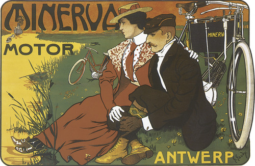
| Time warp. If you have a good eye, you can make a game of matching any kind of design to the historical period that produced it. |
The “function” in “form follows function” refers to the usefulness of the design, whether it's an ergonomic dashboard in your car or your car manufacturer's Web site.
Design Drives Visual Culture
Beyond form and function, all design is related by style trends, too. To a great degree, designers engineer visual culture. If you have a good eye, you can make a game of matching any kind of design to the historical period that produced it.
Think about how you can date a movie by hundreds of visual clues, including cars, décor, fashion and superimposed typography during the credits. Though all these things have different functions, they generally share a similarity of form if they were designed at roughly the same time.
Changing technology also influences design. Refrigerators in the 1950s and '60s sported just as much chrome as cars from the same period because they both emerged from the same technological and design era. Think about how the designs of televisions, computers and cellular phones have changed in your lifetime.
Some designs don't stand the test of time. They go out of style to become old-fashioned, “old school” or even the objects of jokes. Maybe you've heard the expression, “The ′80s called, and they want their shoulder pads back.” Some designs are said to be timeless or classic, such as the Parthenon and the Taj Mahal. Other designs become universal, such as international symbols. Yet other design trends recycle earlier styles, usually with modifications or updates. Cooper Black typeface took the U.S. advertising world by storm in the 1920s, fell out of favor and then became stylish again in the 1970s.
All this is to say that visual culture changes as a result of design's changing forms and functions, both related to technology and social trends. This is equally true of graphic design.
 |
Graphic Design Communicates
While the forms of graphic design, like all design, change with the winds of visual culture and technology, the specific function of graphic design remains constant: to communicate messages visually. Graphic designers have to be professional communicators. They understand that, for better or worse, in visual culture we judge and are judged by appearances. In fact, everyone can benefit from knowing something about the mostly unspoken rules of visual communication. That's called media literacy.
Computers Democratized Graphic Design
Once upon a time, only professionals produced graphic design. Graphic designers spent years learning the art and craft of visual communication (and still do, by the way). Today, however, anyone with a computer has access to the tools for producing visual communication.
Unfortunately, not everyone knows the design rules for using technology tools. The result is a lot of bad graphic design in a visual culture already on overload. While ugly design may offend your good taste, it can lead to a more serious functional problem: poor communication. Learning some fundamentals will dramatically improve your visual messages, whether it's your resume, a multimedia Web site or slides for a presentation.
Graphic Design is Planned
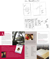
Technically, “graphic design” refers to a plan for organizing visual objects in space. Generally, that space is a two-dimensional plane, meaning some kind of flat surface such as paper or an electronic screen. The key ideas are “plan” and “organize” for the purpose of “communication.” If you were writing a speech or research report, you would make an outline to organize your ideas in a logical and effective order. In graphic design, you organize all your elements from copy (text) to visuals (pictures) in a logical and effective order.
Good graphic design does four things: It captures attention, controls the eye's movement across the page or screen, conveys information and evokes emotion.
So graphic design refers to your plan for capturing the audience's attention from among everything else competing for its interest. Once you have the audience looking at your design, its arrangement or layout should control the audience's eyes to move in a particular sequence from one thing to the next on the page or screen. The whole point of guiding the eye is to convey information. Think eye-catching, flowing, interesting and evocative.
Make Pictures & Words Work Together in Space
Now you need some building blocks for capturing, controlling, conveying and evoking. In the simplest sense, effective design and layout teams up pictures and words to communicate a unified message, regardless of the visual medium or vehicle. At the risk of oversimplifying, you really have only three building blocks: visuals, typography and space.
Visuals—symbols, icons, drawings, illustrations, photographs, film and video, etc.—are self-explanatory, literally. But there are rules for using them in graphic design. We'll be talking more about those rules later.
About type, we generally represent copy graphically with typography, a visual form of language. There are rules for typography, too, which you'll be learning. But words may be represented with handwriting, such as calligraphy, or even pictures. And type treatments can make beautiful visuals. Additionally, some kinds of visuals, such as logos and information graphics, require text. We'll be covering that, too.
Imagine space as the sandbox that encourages visuals and typography to play well together. Beginners often make the mistake of forgetting to account for space. Too much space, and visuals and type get lost or don't talk to each other. Not enough space, and they start to fight with each other.
The idea is to arrange visuals and type harmoniously in space. Don't think of space as immaterial or invisible. Nor is space a vacuum to be filled. Space is real, even when we call it “white space” or, more properly, “negative space” (since not all white space is white). Negative space always has weight and structure in graphic design. There's an old saying: “White space is nice.” Amateurs tend to pack every nook and cranny of space with visuals and type. Don't. White space is not your enemy.
Our best advice for improving your visual communication is to practice looking. Pay attention to the layout of visuals and typography in space. Think about what you're seeing.
Know the Rules. Break the Rules if You Have a Reason
Our students like to find exceptions to the rules of design we teach them. That tickles us because it means our students are tuning in to design. Often the exceptions to the rules of design that students show us are good examples of bad design. But sometimes the exceptions are good examples of good design. Then we have to explain how breaking the rules can produce good design that communicates. Usually, our explanations fall into two categories: professional license and changing design trends.
About professional license, professional designers know what they're doing. By training and experience, they have mastered both fundamental and advanced rules of design. They know how to use creative license with the rules without forfeiting visual communication. This book concentrates on fundamentals. But, as you learn the fundamentals, you also may discover opportunities to employ creative license. At least we hope so.
Taking creative license with the rules of design can lead to innovation, which leads us to changing design trends. Design, like visual culture and English language, is not static. “It's alive!” That's what keeps things interesting. Times change. Styles shift. So we adapt the rules.
Bottom line: Don't break the rules of design out of ignorance. Learn the rules. Then break the rules if you have a reason to. Hey, if it works, it works. Just keep reminding yourself that you have a job to do. It's called visual communication.
Try This
1. Choose one of your favorite possessions from among the material objects you own. Try to imagine what the object's designer had in mind.
Write a few sentences to describe its form or what it looks like. Be specific and list the details of the object's appearance. Quickly sketch a small picture of the object's appearance. Try to include all the details you see.
Then write a sentence or two to describe the object's function, or what it does. Draw a diagram explaining how the object works. How does this diagram differ—or not—from the earlier picture you drew?
Last, write a couple more sentences to describe the relationship between the object's form and function. How do you think the object's function influences or limits its form? Does the object's form assist in its function?
2. Locate an object that has gone out of style. How do you know it has gone out of style? What clues does the object communicate that date it? Explain why the object is outdated. Has the object become dated because of its form? Its function? Or both?
3. Find an example of graphic design that you believe communicates well.
First, explain how the design captures your attention. What part of the design do you look at first? What draws your eye to look there first?
Second, explain how the design controls the eye's flow through its layout. In what order does your eye move from one thing to the next across the space of the layout? Make a numbered list of the order in which your eye travels around the layout.
Third, what kind of information does the design convey? Make a list. Describe how the design conveys this information.
What, if any, emotion(s) does the design evoke? How? Why?


