Chapter 3. I Need to Design this Today
The Works-Every-Time Layout
 |
Here we are in Chapter 3. The clock is ticking, and your computer beckons. You're thinking: “I don't have time to read a book. I have to get this project done today.”
Okay, we'll play along. You're on deadline. Now what?
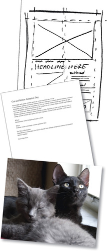
This chapter introduces the works-every-time layout because it does work every time. Its layout is foolproof and reader-friendly for simple projects such as a single ad or flyer. Even a complex project such as an entire page or screen of news stories ultimately breaks down into individual stories using variations on the works-every-time layout theme.
Mastering the works-every-time layout will perk up your desktop professionalism even if you learn nothing else about design and layout. So put it in your design toolbox, and don't apologize for using it.
 |
Why the Works-Every-Time Layout Works
The works-every-time layout works because of the way Westerners read: from left to right and from top to bottom. As readers, we enter a layout in the upper-left corner and exit in the lower-right corner. Since one of the functions of good design is to control the eye's movement across the layout, the direction and order in which we read dictates the order of things on the works-every-time layout.
Parts of the Works-Every-Time Layout
The seven parts of the works-every-time layout—in order— include:
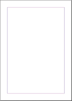
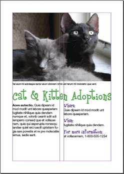
1. Margins. Lay in generous margins on all four sides.
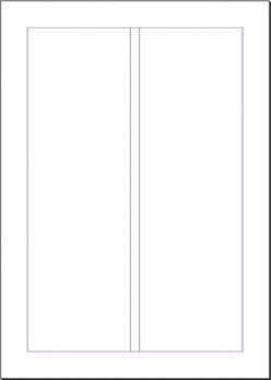
2. Columns. Establish columns guides. The number of columns depends on the size of your layout.
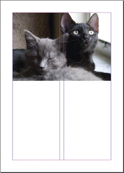
3. Visual. Position the visual at the top of the layout.
4. Cutline. Snuggle the cutline, if necessary, under the visual.
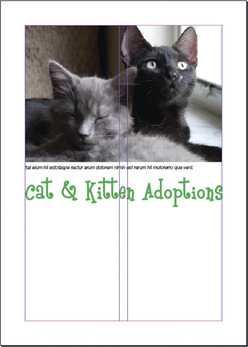
5. Headline. Position the headline under the cutline.
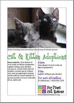
7. Tags. If applicable, place tags (logo, contact information, etc.) in the bottom right corner.
Now let's look at each step in more detail.
Step 1: Margins
Before you do anything else, lay generous margins inside the boundary of your layout—on all four sides. By generous, we mean a minimum of half-inch margins on a small ad or flyer. The size of your margins should grow in proportion to the size of your layout. The larger the layout, the bigger the margins. Think of your margins as a big negative-space border or frame that says, “Everything inside here goes together.”
Sometimes margins are called thumb space because, if you were holding a hardcopy, margins leave enough negative space at the edges of the layout to accommodate your thumb without covering any visual information.
Step 2: Columns
Now, inside your margins, divide your layout into vertical columns. Designing with columns not only helps you arrange items neatly on the layout but also makes your copy more inviting to read.
People tend to be lazy readers. They will avoid reading long horizontal lines of type and big chunks of text. Because columns present type in shorter lines and narrower chunks, columns become a kind of trompe l'oeil (French for “trick of the eye”) that says, “Come on, reading this won't take long.”
If your works-every-time layout is a smaller ad or flyer, two columns are probably adequate. You may need more columns if your layout is larger. Be sure the alley of negative space separating your columns isn't too small or too big. Your goal is enough space to keep columns visually separate but still cohesive.
Step 3: Visual
Next, position the visual. The visual is your tool for capturing the audience's attention. On the works-every-time layout, the visual goes at the top of the layout because people tend to look at pictures first. The visual becomes the eye entry point into your layout and is the starting point of a viewing flow that takes the audience from top to bottom. Make your visual the welcome sign for your layout. Hang your visual from the top margin.
Step 4: Cutline
In a news situation, photos and most visuals require captions called cutlines. In many non-news layouts, however, visuals speak for themselves and need no cutlines. In fact, for advertising, if you have to explain your visual with a caption, then your visual probably is not the best choice. But, if you do need a cutline, run it flush left and ragged right directly underneath the visual. While you're at it, make the width of your cutline the same as the width of your visual, assuming, of course, your cutline is long enough to do this.
Now that you have some text in place, it's time to make some typography decisions. For a cutline, use the same font you choose for either your headline or your body copy. Set the cutline somewhere between 9 and 11 points. Eight points is getting a little hard to read, and 12 points is getting a bit too big or horsey, as some designers might say.
(With all due respect to the noble steed, “horsey” is not a compliment in graphic design. “Horsey” means awkwardly large and lacking grace.)
Step 5: Headline
After your visual, your headline should have the most impact on the layout. Place the header under the visual, not over it, because of the order in which people look at things. First they look at the picture, and then they scan the headline.
Often people will look only at the picture and headline. So make your headline count. Give it visual weight, which generally means make it big. Sometimes a layout won't even have a visual, in which case the headline becomes the eye entry point into the layout. In any event, make your headline way bigger than 11 points.
Returning to typographic decisions, you only get to use two fonts on a works-every-time layout. You get one font for the headline and a second font for the body copy. Period. That's it. Don't go font crazy. For your headline, choose a font that symbolically goes with your design concept. If you want to communicate streetwise, for example, don't choose a script-style font that screams traditional wedding invitation.
A final caution about headlines: If you can't get the whole headline onto one line, then let the copy tell you where to break the line. Read the copy. It will guide you toward the least painful place to break up the headline into two or more lines of type. The ends of thoughts, clauses and phrases are the best places to break a line. Never allow hyphenated words to break headlines into two lines. Never strand a single word all by itself in an additional line of a headline, either.
Which of the three choices below offers the best way to break the headline into two lines?
Poor planning on your part does not constitute a crisis on my part.
Poor planning on your part does not constitute a crisis on my part.
Poor planning on your part does not constitute a crisis on my part.
Hint: The second choice is the best choice.
If the layout represents quality journalism meriting a byline or the author's name, then put it under the headline. But don't make it nearly as big as the headline.
Step 6: Copy
You or someone else has written some excellent copy to go with your layout. So treat it with respect.
1. Keep the headline and the lead together. A lead is the first paragraph of body copy. Never let anything except a byline come between a headline and its lead. That means don't let anything physically separate the headline and lead. The eye should finish scanning the headline and flow directly into the lead.
2. Put your copy into nice inviting columns that say, “Read me.” If your copy is too short to fill every column, then fill a column with negative space. It's okay to leave a column empty. White space is not your enemy.
Short paragraphs, by the way, also say, “This won't take long.” As do short legs of type. A column of copy is called a “leg” so two columns is two legs. You can entice people to read several short legs of copy when they will skip reading exactly the same thing in one very long leg. Don't go too short, however. Columns that are too short make for choppy reading. Aim for legs somewhere between 2 and 10 inches long.
3. Set your copy between 9 and 11 points using a transparent font. Transparent fonts are easy to read (not see-through). The eye can focus on reading for content without being distracted with thoughts such as, “Hey, this is an interesting font,” or “Wow, this font is giving me a headache.” Times New Roman is today's ubiquitous transparent font. For that very reason, we're not endorsing it. But do choose a readable font for your body copy, even if that seems boring. Also make sure your body copy font doesn't fight with your headline font. Let your headline font be the showoff.
4. Shoot for an average of six to 12 words per line. First, don't justify your text. Flush left, ragged right is your best bet. Next, the width of your column and the point size of your type will determine how many words fit on one line. If you're only getting three to five words per line—and you're getting a heap of hyphenated words jettisoned to the next line—then you have options: Reduce your point size or make your columns wider, or both.
5. Some advice on paragraph and column breaks: Regarding paragraphs, don't indent the lead under a headline. Beyond the lead, if you plan to use indents to mark paragraph breaks, then size your automatic indents at roughly the equivalent of four to five letter spaces of your body copy's point size. A ½-inch tab, for example, is probably too much. If you plan to skip a line between every paragraph, don't indent at all.
Regarding columns, make sure that the top and bottom of each leg looks elegant. Really. Look at them. Do the bottoms of your legs break sentences or paragraphs awkwardly? Do the tops of your legs begin with the last word of the previous sentence? In both cases, try not to. Does each leg of type have to be the same length? Nope.
Step 7: Tags
Tags is an advertising term referring to all the information typically found at the bottom of an advertisement, such as the logo, themeline or slogan, URL, physical address and map, phone number and sometimes, unfortunately, disclaimer and legalese. Because this is critical information to include on each advertisement, every layout is tagged with it. Hence, the word “tags.”
1. Don't forget to include tags if you need them. If nothing else, include the logo and the URL.
2. Place tags in the lower right corner. Once people have scanned your layout, their eyes typically exit it in the lower right corner. Tags, if you need them, are the final things you want viewers to see.
3. Use one of your two fonts, and make sure it's readable at a small point size. You can make tags pretty small—as long as they remain legible. Mousetype, another advertising term, means very small mouse-sized type often used for tags. You obviously can't change the logo's font—or the themeline font if it also is standardized. But do size them both large enough to be readable on your layout.
Final Thoughts
You now have the basics for a no-brainer layout that never fails to communicate. But, just because this layout works every time, we are not suggesting that you must or should use it every time. Use it when you need it.
Additionally, are you allowed to break some of these rules? Absolutely—with good reasons. As you learn more about the rules of design, you'll feel more comfortable experimenting with this and other kinds of layouts, too.
Before you dash off to finish that on-deadline project, we recommend that you read the next chapter first. Chapter 4 gives you a checklist of layout sins, an inventory of embarrassing mistakes amateurs make. Our point: Please don't embarrass yourself.
Try This
1. Get started on the project that's distracting you. Do some thumbnail sketches using the works-every-time layout. How many variations of the works-every-time layout can you sketch for the project?
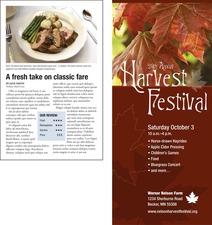
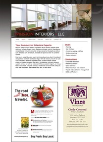
2. Find both news and advertising examples of the works-every-time layout. Can you find an example on the Web? Identify and label the parts on each. How are the layouts alike or not?
3. Choose a social cause that inspires you, and develop a public service announcement (PSA) poster using the works-every-time layout.
♦ Do some research.
♦ Develop a concept and write the copy, including appropriate tags.
♦ Look for appropriate visuals.
♦ Experiment with pairing up fonts until you find a couple that work well together for your concept.
♦ Using the works-every-time layout, thumbnail your ideas.
♦ Execute a comp of the poster.
