4
RULE
Everything on a scrapbook page needs to be straight and perfect
Somewhere along the way you picked up the idea that straight, parallel lines equal the right way to scrapbook. You scrap with your trusty ruler close at hand. After all, straight means perfect and perfect, equals a good page, right? Wrong! It’s time to put your rulers away. Creating without this tool allows you more freedom to let your creativity take you where it wants to go. But don’t panic. Try tilting just one photo to start. Then work your way up to an entirely tilted page. You really can think outside the box and create beautiful, successful pages.

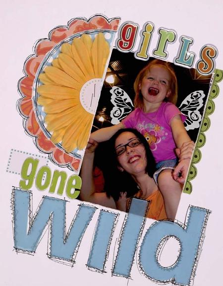
Artwork by Jeniece Tackett
If the idea of breaking this rule makes you cringe, then this design is the place to start. On this layout, all the elements are on an angle, but on the same angle, allowing for a bit of order on the page. To re-create this look, start by placing your focal point photo on an angle, and then place all the remaining pieces around the photo on the same angle.
Supplies: Cardstock; patterned paper (Chatterbox, My Mind’s Eye); chipboard letters (American Crafts); letter stickers (SEI); transparent letters, flower (Heidi Swapp); chipboard circle (Jenni Bowlin); label stickers (Martha Stewart); rub-ons (Hambly); Misc: adhesive, pen
YOUR CHALLENGE
Create a layout with all the page elements placed on the same angle.
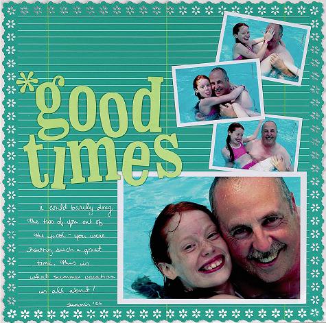
This layout is full of subtle contrast: Some items are placed on an angle and some are parallel to the page edges. Placing the supporting photos on angles leads the eye to the solidly placed focal point photo. I gave the same treatment to the title and journaling, creating repetition and unifying the page. Notice that the background pattern is linear. Try using a more free-flowing pattern for a different look.
Supplies: Patterned paper (Creative Imaginations); chipboard letters (K&Co.); Misc: adhesive, pen, staples
YOUR CHALLENGE
Create a page with the journaling and focal point photo placed parallel to the page’s edges. Then add supporting photos and a title placed on angles.
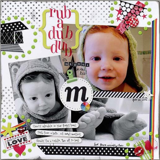
Make a bold statement by placing everything on your page at different angles. On this layout, nearly every embellishment, photo and piece of text is tilted. These simple, varying angles give the page a playful nature, highlighting the layout’s theme. To re-create a page like this, place the photos first and then position additional items at angles different from those of the photos.
Supplies: Cardstock; chipboard letters, clip, snaps (Making Memories): chipboard shapes, clear tag (Heidi Swapp); epoxy shape (KI Memories); ribbon (Michaels, Offray, Wrights); rub-ons (American Crafts, American Traditional); stamp (Technique Tuesday); Misc: adhesive, buttons, labels, paint, pen, staples, thread, wooden sticks
YOUR CHALLENGE
Create a layout with all the elements at different angles.

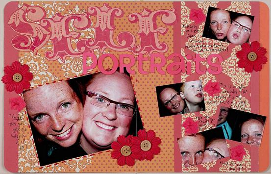
Following the Rules
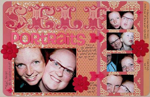
While the page that follows the rules is nice, it lacks what the page that breaks the rules has—a sense of freedom and fun that is innate to the story. The self-portraits are not framed properly anyway, so angling them makes the imperfection look intentional. Notice that the background design is linear, providing a structured base for the page. This is a great way to combine angles with the perpendicular lines you love.
Supplies: Patterned paper (SEI); die-cut letters (My Mind’s Eye); felt arrow, letter stickers (American Crafts); button (Dollarstore); flowers (Blueye Dezines); Misc: adhesive, floss, pen
YOUR CHALLENGE
Create a page with a linear background and elements at various angles.

Breaking the Rules
