11
RULE
Photos should be cropped tightly around the subject
When taking photos, you probably try to fill your camera frame with your subject. Or afterward, you crop your photos so the subject is front and center. After all, close-up photos capture detail, and a centered subject provides balance. But detail and symmetry don’t always make for the best photos. Photos cropped tightly around a subject can lose their context, and can make for boring pages. Using creative framing in a photo, whether your subject is off to one side or in the distance, provides perspective, plus a little drama for a layout.
With digital photography, this rule is a fairly simple one to break. Take a photo from far away and then you can play around and use it as you like. Keep the photo wide for an interesting perspective; crop it off-center for a creative shot.

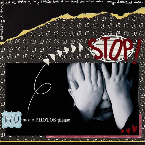
This page is a great example of how empty space in a photo serves a purpose on a layout.
Here, the dark areas created by keeping the subject off-center help draw the eye to my son’s hands and face. And because I converted the photo to black and white, the dark space provides a wonderful contrast to his pale skin.
Supplies: Cardstock; patterned paper (Crate Paper, Scenic Route); chipboard letters and heart (Heidi Grace); rub-ons (CherryArte); stamp (Purple Onion); tag (Every Jot & Tittle); Misc: adhesive, ink, paint, pen, photo corners
YOUR CHALLENGE
Photograph (or crop) your subject in the left or right third of the frame and use the photo on a page.
Artwork by Janine Langer
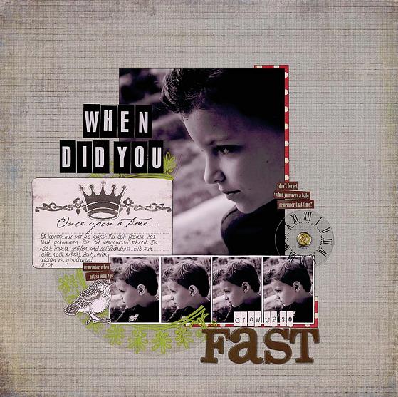
When cropping the large photo on this layout, Janine cut closely and purposefully off-center around her son’s face, making an interesting frame. Creatively framing your subject with your camera is not always possible in the moment, but the beauty of digital photography is that you can crop it after the fact, opening up artistic possibilities for nearly any photo.
Supplies: Cardstock; patterned paper (My Mind’s Eye, Sassafras Lass); chipboard letters, clock accent, letter stickers (Heidi Swapp); journal card, sticker accents (My Mind’s Eye); transparency (Hambly); word stickers (Making Memories); brad, stamp (7gypsies); Misc: adhesive, ink, pen
YOUR CHALLENGE
Crop a photo to create off-center framing around the subject.
Journaling Translation
It often feels as if you were born
only yesterday. Time goes on so
fast, you are getting older and
more and more independent
each day. Please give me
some more time to become
accustomed to it.
Artwork by Michelle Guray
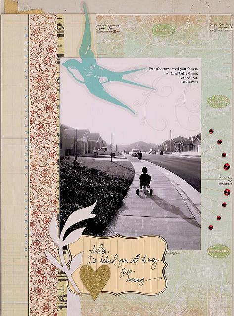
Michelle’s picture is not the standard close-up photo scrapbookers often favor. This one shows her son in silhouette, cycling off into the distance with most of the photo showing the background. Michelle could have easily cropped out all of the “extra” background. Instead, she kept it to lend the photo a sense of atmosphere and context, which adds to the message of her page.
Supplies: Cardstock; patterned paper (7gypsies, Autumn Leaves, My Mind’s Eye); chipboard accents (CherryArte, Junkitz); die-cut transparency (My Mind’s Eye); digital brush by Rhonna Farrer (Two Peas in a Bucket); tag (Jenni Bowlin); measuring tape (7gypsies); rhinestones (Doodlebug); Misc: adhesive
YOUR CHALLENGE
Photograph your subject from a distance, and use the whole photo on a layout.

Following the Rules
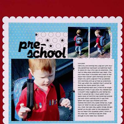
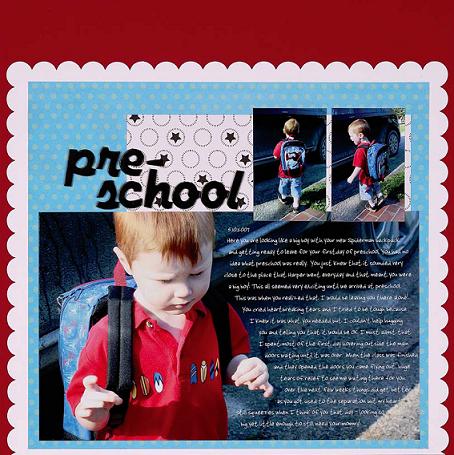
Comparing these two layouts makes it easy to see the positive difference that leaving a photo un-cropped makes. By layering the journaling over the photo on the layout that breaks the rules, I created a connection between the two, making a more unified page. Before deciding if you should crop a photo, look for ways to utilize the space for other elements in your design.
Supplies: Cardstock; patterned paper (CherryArte); chipboard letters (American Crafts); Misc: adhesive

Breaking the Rules
YOUR CHALLENGE
Use the “extra” space in a photo to write your journaling.