using color
Your use of color will define the mood of the painting. Think about how you relate to color. Blues and cool greens usually evoke feelings of tranquility; reds, magentas and oranges often indicate excitement. You can approach the use of color in an intuitive way—painting what you see and what you feel as you look at your subject—or you can approach it more systematically, choosing a color scheme in advance. Both approaches are valid; try each and see which suits your style.
The Color Wheel
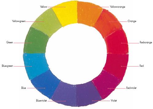
Primary colors are the three basic colors which cannot be made from any other colors: red, yellow and blue. Secondary colors are the colors that can be mixed from two of the primaries—orange, purple and green—and tertiary colors are mixed from a combination of primaries and secondaries (such as yellow-green or red-violet).
You can use the color wheel to identify complements and analogous colors. Complementary colors are the colors opposite each other on the color wheel. Most people think of the complements of primary and secondary colors when they think of complements: yellow and violet, blue and orange, red and green. But don’t neglect the tertiary colors—try using complements like yellow-green and red-violet, or blue-green and red-orange. These pairs may be a little less obvious, but they are still strong.
If a pair of complements is too strong for your composition (and they can be very strong—complements placed next to each other will stand out, while complements mixed together will result in gray), consider another option. Instead of yellow and violet, which are true complements, try yellow and the two tertiary colors next to violet, blue-violet and red-violet.
Harmonious triads are created using any three colors whose position on the color wheel forms an equilateral triangle. The primary colors of red, blue and yellow are one combination, but consider less obvious groups such as red-orange, blue-violet and yellow-green.
Analogous colors are colors adjacent on the color wheel. Pick any two or three colors next to each other on the wheel and the hue they have in common will create harmony. For example, if you use violet, blue-violet and blue, they have blue in common, and though each is a separate color, they will be harmonious.

the color wheel
The color wheel, with twelve colors showing primary, secondary and tertiary colors.