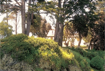
DEMONSTRATION underpainting sunlight and shadow
When you look at a photo, it can be hard to tell the difference between a dark-colored object and a dark shadow. I’ve developed an underpainting method that will not only help you clarify these differences, but add light and life to your paintings done from photo references.
As a general rule, on a sunny day, colors in sunlight are lighter in value than colors in shadow. The darkest color in full sunlight will appear lighter in value than the lightest color in full shadow. This simple method helps you analyze areas of sunlight and shadow, and keep your values (light and dark) and temperature (warm and cool) clear throughout the painting.
materials list
White Professional Grade Wallis Sanded Pastel Paper
Turpenoid™
No. 8 filbert brush
pastel pencils
middle-value or dark yellow-orange, light brown, dark brown
pastels
light-value yellow, middle-value yellow, middle-value yellow-orange, middle-value peachy orange, middle-value orange, very light cool blue, light cool blue, middle-value cool blue, dark cool blue, light brown, middle-value brown, dark warm brown, mauve-brown, dark purple-brown, light blue-gray, light yellow-gray, middle-value beige-gray, light yellow-green, middle-value yellow-green, bright middle-value green, middle-value green, dark green, dark blue-green, bright red

analyzing the reference photo
This photograph has a distinct sunlight and shadow pattern. It could be confusing to establish values without an underpainting, as there is light-colored foliage in full shadow, and dark-colored foliage in sunlight. Use your under-painting to establish the value structure of the piece.
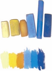
1 Choose Six Pastels
The three lightest values should be in the yellow/orange family and the three darkest values in the blue family. The values move from the lightest yellow to the darkest blue. Note that even the lightest blue is darker than the darkest yellow. To confirm that your value progression is accurate, make swatches of the colors you’ve chosen adjoining each other on white paper. If you can see a difference in light/dark relationships, then there is a value difference.
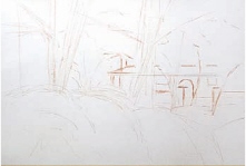
2 Lightly Sketch Your Subject
Using a yellow or orange pastel pencil, sketch the major lines and positions of the subject. Use the minimum number of lines necessary, as everything you sketch will be covered by the underpainting. Indicate only the largest shapes and critical items, such as tree trunks. Don’t worry about small shapes like small branches at this point.
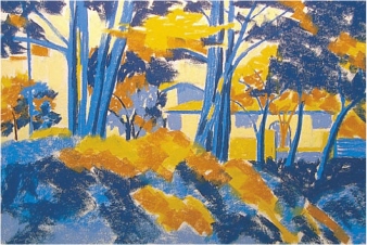
3 Make the Initial Block-In
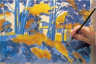
With your six pastels, block in the big shapes of the painting using the sides of the pastels. Use a light touch. Begin with the sunlight (yellow and orange) colors. All areas in sunlight will be in one of the three values of yellow/ orange. Even though your photo may show the sky as blue, for example, it should be blocked in with the lightest yellow since it is the source of sunlight. All areas in shadow will be in one of the three values of blue. Keep your shapes large—if a mass of shadow is broken by small areas of sunlight, ignore the small areas of sunlight for now and just block in the large shadow mass.
Normally, you’ll work dark to light in pastels. For this particular underpainting method, though, starting with the yellows will allow you to make corrections.
Remember that the local color, the actual color of these objects, is unimportant at this stage. Think sunlight or shadow—which of the three values of sunlight or shadow you will use—and keep your shapes big.
4 Wash the Painting with Turpenoid™
When the initial block-in is complete, brush the pastel into the surface of the paper with a brush and Turpenoid™. Use a fairly small flat or round inexpensive synthetic brush, or an old brush you don’t care about, since the sanded surface will wear out a brush very quickly. Keep your brush clean, wiping frequently on a paper towel; if you wipe the brush after every stroke, you’ll keep from inadvertently mixing colors. Start with the lightest light yellow, then move to the next value of yellow and continue through each darker value, keeping your brush as clean as possible. If runs occur, dab them off with a paper towel. When all areas have been washed with the Turpenoid™, dry the piece with a hair dryer or set it aside until it’s completely dry.
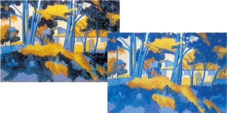
from darker to lighter
When the Turpenoid™ wash is completely applied, the colors of the pastel will appear darker than when they were dry (left). They will lighten as they dry (right).
Set your painting aside to dry. You can speed this up by setting it in sunlight, or dry the under-painting with a hair dryer. Use low or medium heat, holding it at an angle several inches from the surface and drying the painting evenly. You’ll see the color lighten as it dries. Depending on how much Turpenoid™ you used, it should take only a few minutes to dry. Touch the surface with your finger, and if the paper feels damp or oily, it’s not dry yet.
5 Begin Adding Local Color
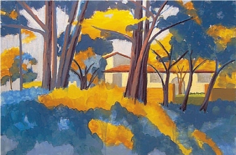
Begin to add realistic color. Working from the background (distance) forward allows you to lay objects or shapes in the foreground atop background objects. For this reason, and because the value of the sky helps you establish other values in relation to it, I like to begin with the large shapes in the sky. Then, because the building is in the background behind the trees, block in the building. Establishing the basic colors of the building and the tree trunks early on allows you to lay foliage on top of them. If you’re using a light touch you won’t over-fill the tooth of the paper.
6 Start with the Darks
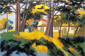
As a general rule when working in pastel, it’s a good idea to lay in darks first. You can apply a light color over a dark successfully, but placing a dark color over a light one results in a lighter-value dark color or even a muddy color. So, once the background elements of sky and distant building are in place, select the darkest greens of the foliage and put them in place.
7 Refine the Shapes, Add Finishing Touches
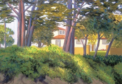
Begin defining smaller shapes, paying attention to values and temperature. Areas that were blocked in as one large value mass may now be broken down into several closely-related values, as in the foliage. The warm sunlight colors and cool shadow colors of the underpainting give you a guide to the temperature of each area. Look for mistakes that might need to be corrected—for example, note the roof-line on the second story of the building and the added windows. Final touches include the deep blue-green shadows around the white flowers and the flowers themselves (which are painted a light blue-gray, not white). Red flowers in front of the building add interest.

San Simeon Bluff
11" × 14" (28cm × 36cm)
8 The Finished Painting
The finished painting retains a strong feeling of sunlight and shadow. The painting is simplified in comparison to the photo, resulting in a more painterly appearance while still retaining the mystery of the half-hidden house.