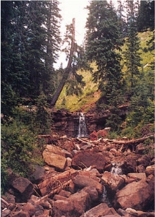
make the painting better than the photo
Analyze your reference photograph for what you like and don’t like and consider changes to emphasize the idea behind the painting. In some cases you may combine more than one photo, or even rely on memory or imagination to make up a new portion of the photo. Don’t be afraid to experiment—the goal is to make a painting that’s better than the photo.

distracting foreground
What’s interesting about this photograph is the leaning tree and the little waterfall. But the mass of rocks in the foreground detracts from the center of interest.
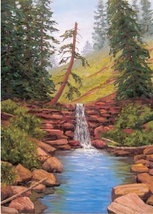
Mountain Waterfall
14" × 11" (36cm × 28cm)
rework the composition
The solution to the foreground problem? Eliminate it and paint an inviting pool of water from memory. You could also use another photo as reference if you don’t have a strong memory of streams you’ve painted previously. Be sure to pay attention to details such as the hint of reflected greens in the water on the right.
evening photos
Sunsets and evening light are attractive subjects but difficult to paint on the spot because they are so fleeting. Relying on photographs presents problems, however, because land masses are generally too dark. Because you’re focusing the camera on the brilliantly lit sky, the foreground will appear black or nearly black in the photo, even if the values were lighter in reality. One solution is to take two photos, one focusing on the sky and the other on the land mass, and then combine them.
Another solution is to lighten those values and then paint shadow areas with interesting color. Using broken color in the shadows is very effective, as is the careful use of reflected light.
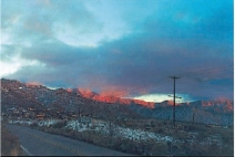
dark land mass
This dramatic sky is an inviting subject, but the foreground is significantly darker in the photo than it would appear if you were standing at the site.
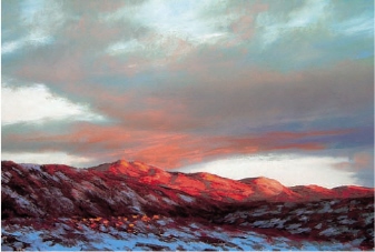
Sandia Sunset
11" × 17" (28cm × 43cm)
deleting and imagining
Cropping unnecessary elements and bringing some interesting colors into the shadows dramatically improve the subject. The road in the original photo would not have added interest to the scene, and, in fact, the strong diagonal took the viewer’s eye out of the photo. Items like telephone poles and signs are best omitted unless they add a strong design element or interest to the composition.