THEORY AT WORK
1980–2000
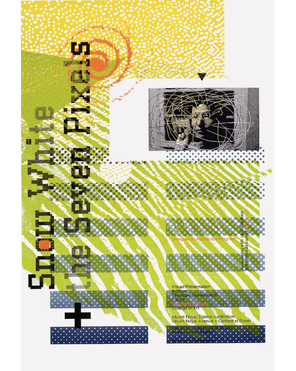
APRIL GREIMAN Snow White + the Seven Pixels, An Evening with April Greiman, 1986, poster for a presentation at the Maryland Institute College of Art in Baltimore. Greiman studied under Armin Hofmann and Wolfgang Weingart at the Schule für Gestaltung Basel in Switzerland. Her work in the 1980s is synonymous with New Wave design in the United States. She enthusiastically used computers during a time when many designers either dismissed such technology as useless or were frightened by what it would mean for design craft.
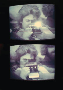
MURIEL COOPER Self-portrait with Polaroid SX-70, video imaged and printed at the Visible Language Workshop, MIT, ca. 1982.
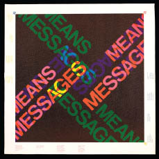
MURIEL COOPER AND RON MACNEIL Messages and Means course poster, designed and printed at the Visible Language Workshop, MIT, ca. 1974.
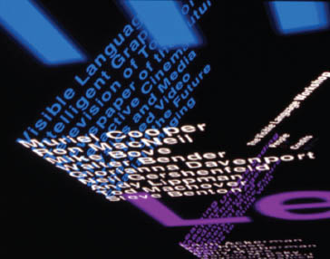
MURIEL COOPER WITH DAVID SMALL, SUGURU ISHIZAKI, AND LISA STRAUSFELD Still from Information Landscapes, 1994.
Influenced by avant-garde workshop structures and Bauhaus luminaries—Walter Gropius and György Kepes were in Cambridge at the time—Cooper thoroughly explored and resisted methodologies born of mass production and mass communication. In a rumpled sweater, old glasses, and bare feet, she swept into the male-dominated MIT Media Lab and redefined the screen as a nonlinear information environment.
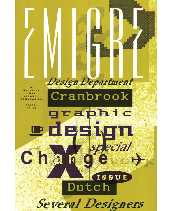
GRADUATE STUDENTS AT CRANBROOK ACADEMY OF ART Emigre 10, 1988. This student-designed issue of Emigre explores an exchange program between Cranbrook students and Dutch graphic design studios. Under the leadership of Katherine McCoy, Cranbrook was at the time a hotbed of postmodern thinking.
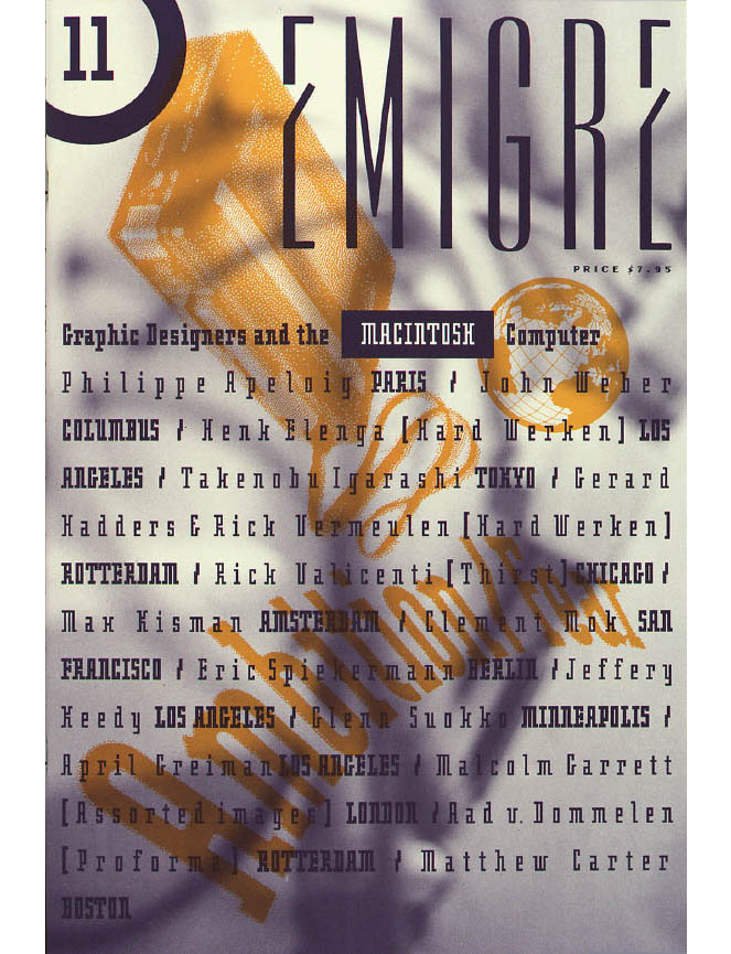
RUDY VANDERLANS Emigre 11, “Ambition/Fear,” 1989. This issue of Emigre gathers responses from graphic designers to the newly introduced Macintosh. In the layout, VanderLans, inspired by the pairing of typefaces with characters in Warren Lehrer’s book French Fries, assigns a unique typeface to each interview. The resulting dense, interwoven layout suggests the excitement then felt by the design world about the personal computer.
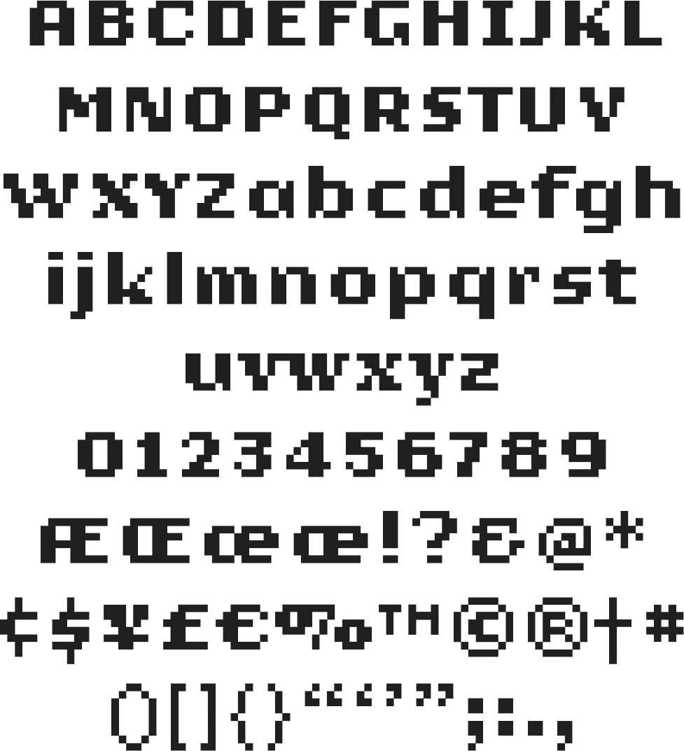
ZUZANA LICKO Oakland, 1985. Licko created the bitmap type designs Emperor, Oakland, and Emigre for the coarse resolutions of 1980s computer screens and the dot-matrix printer. Rather than resisting the computer’s limitations, she used them to generate unexpected forms appropriate to the technology. Licko first used her typefaces in Emigre 2 and began running ads for them in issue 3. In 1985 Licko and Rudy VanderLans launched Emigre Fonts.
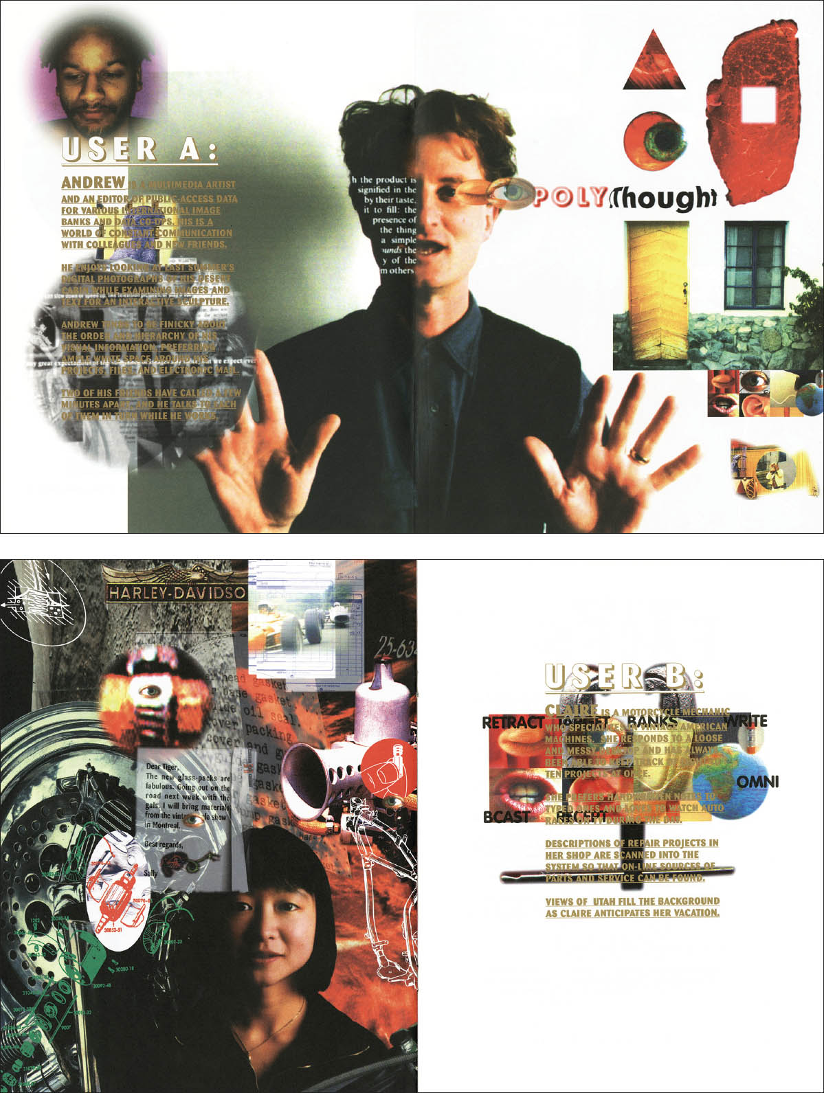
P. SCOTT MAKELA Illustrations from “Redefining Display,” 1993, showing a parish priest, an artist, a motorcycle mechanic, and a plumber: Here, Makela urges his audience to move away from boxes and grids to a wild, chaotic place of overlapping planes where everything happens simultaneously.
ERIK VAN BLOKLAND AND JUST VAN ROSSUM OF LETTERROR Beowolf, 1989. Van Blokland and van Rossum initially proposed the concept of Random-Fonts in their first and only issue of LettError magazine. The idea came out of their experiments with then-cutting-edge PostScript technology. RandomFonts morphed into Beowolf as the two designers played around with programmed randomness to add imperfection to slick computer imagery.