2
STYLE
Graffiti is an object existing only via its style. Style is what makes graffiti discernible among a sea of other urban artifacts, what enables it to attract and fascinate, to circulate and produce effects in the world. While site defines graffiti's how, the “how” of its emergence through and with the medium of the city, style is here positioned as its what: the “what” that makes up graffiti's necessary graphic qualities and compositional characteristics, the “what” that comes to create a visually apprehensible and demarcated form. The city may be that which turns an image into graffiti, but style is what dictates the appearance of that image itself. Unpacking the “what” that makes graffiti graffiti, this chapter will delineate the textual and figural foundations, the ornamental and monumental elements that turn one of a thousand public inscriptions into something perceptible as graffiti itself.
First addressing the way in which graffiti style developed as a cohesive visual canon, the chapter will then focus on what this canonical status comes to provoke as these images move through the city. Doing this via the three key themes that graffiti stylistically engages—agency, animation, and distribution—the chapter will thus lean heavily on the work of anthropologist Alfred Gell, whose seminal writing on style will be used to unravel the visual affordances of this image world. As such, examining what the image is as much as what it does, this chapter will unpack the equally visual and relational ways graffiti functions. Style will hence be seen not only as the indispensable tool through which graffiti artifacts become perceptible and create effects, but, as the chapter will conclude, as a way individual capability and group commitment are revealed and resolved, as a way value is created and consolidated in public and monumental ways.
STYLE AND GRAFFITI OR THE CANONICAL
A term often used yet rarely defined, style, as Margaret Conkey has explained, can be understood as the particular “formal attributes” and specific “design conventions” (Conkey 2006: 358) that together create the boundaries of a visual system. A technique ensuring that “common difference” is established and that some graphic principles are “cultivated” while “others are suppressed” (p. 361), style is hence a mechanism through which coherence is formed and idiosyncrasy formally demarcated. As such, style forms a structure through which a set of grouped artifacts can remain comprehensible while often undergoing radical transformation. The structural logics that style forms, as Susanne Küchler and Timothy Carroll suggest, thus generate a “set of immediately recognisable images that measure (or ‘rule’) the aligned set” (Küchler and Carroll 2021: 86), a canon that can be “spread across genres of artefacts” (p. 86) because the artifacts themselves all remain within the wider canonical style. So, what determines graffiti's common differences and, as Gell termed it, its “axes of coherence” (Gell 1998: 167)? What is canonical style within graffiti and how did this canon emerge?
The first appearance of graffiti in the late 1960s materialized through the name-plus-street number signature formulation such as inscribed by the early writer1 Taki183 (Taki a diminution of his given name, Dimitraki, 183 indicating his 183rd Street city address), as seen in figure 2.1. Witnessed mainly on urban walls and produced using the most basic of writing implements, name-writing at this early point was a game, a children's game like tag or hopscotch (Birzin 2019) in which visibility was the overarching goal. One wrote to be seen. One wrote to spread one's personhood over the world. But how one wrote was still a broadly undefined quality of the game, the practice being grounded by the visible quantity of one's epigraphs and practitioners using only rare and minimal embellishments such as the still omnipresent three-pointed crown and five-pointed stars seen in figure 2.2 (in the former case embedded in the letter form itself). As the number of graffiti practitioners themselves began to escalate, however, thanks in part to the 1971 New York Times article “‘Taki 183’ Spawns Pen Pals,” 2 the players of the burgeoning game began to search for new techniques of gaining prominence beyond the stripped-back purity of the name, or increasingly the chosen pseudonym, alone. At the same time, with the movement of the focal graffiti surface from the city's public walls to its subway carriages (in which one's output was often seen only at speed and from a distance), as well as the increasing utilization of more specialized tools3 such as spray cans and modified homemade markers (in which one's work could both be produced at speed and made visually prominent from a distance), the scope of the writers’ productions began to develop in increasingly elaborate ways. As seen in Gordon Matta-Clark's hand-tinted and hand-colored photographs in figures 2.3 and 2.4, the three- to six-letter name, the artistic pseudonym4 that soon became completely interchangeable with the writer's own birth name,5 still remained at the center of the practice. Yet the necessity for visual apprehensibility, to follow the fundamental tenet of graffiti style—of being seen—led toward the pursuit of the progressively elaborate principles and increasingly formalized structure that graffiti soon obtained.

FIGURE 2.1
Taki183, 2011. Photo: Underdestruction. Attribution-NoDerivs 2.0 Generic (CC BY-ND 2.0).

FIGURE 2.2
Petro, 2013, London. Photo: David Stuart.

FIGURE 2.3
Gordon Matta-Clark, Graffiti: Leon, 1973. Gelatin silver print with hand coloring. © Estate of Gordon Matta-Clark, ARSNY.com, and DavidZwirner.com.

FIGURE 2.4
Gordon Matta-Clark, Graffiti, 1975. Gelatin silver print with hand coloring. © Estate of Gordon Matta-Clark, ARSNY.com, and DavidZwirner.com.
By the mid-1970s, then, the small-scale, embryonic signatures had metamorphosed not only into more intricate calligraphic directions but likewise into large-scale, incredibly complex “masterpieces” that depicted the chosen name in multiple colors and embellished them with manifold ornaments and decorative forms, amplifying a work's visibility while exhibiting a practitioner's skills and techniques. Utilizing new graphic techniques (such as high contrast, shading, three-dimensional illusions, and complex textures), new typographic influences (taken from public signage, corporate advertising, TV shows, and underground comics, for example), as well as taking on a horizontal, strip-like formal structure (that both followed the natural shape of the railway vehicles they were designed to be written upon while also following the natural proportions of the body, which could cover more space laterally than vertically), the innovations that were cultivated during this early era led to the creation of a series of ground-breaking alphabetical orders that were as technically sophisticated as they were structurally consistent. As detailed by Anssi Arte in his graphical dissection of classic graffiti typography (2015), they led toward a series of named, codified, locally categorized writing systems—techniques such as Broadway Elegant, Platform, Soft Letters, and Hi-Tech, seen in figure 2.5—that moved far beyond the letter form alone: the virtuoso figures that formed the creative vanguard of the culture codified a range of stylistic alternates (such as the cuts and cracks, the humps and feet that Arte illustrates in figure 2.6), decorative fills (from the early polka dots and candy stripes to an increasingly abstracted and technical use of color), graphic backdrops (the block colors and fluffy clouds, the fire-scapes and star-scapes that the names would sit upon), attendant characters (the Disney icons, the cartoon B-Boys, and the Vaughn Bode characters who would flank the names), as well as supplemental texts (the crew acronyms, the calendar year, and the tagged maxims and messages that each piece would also incorporate), which together came to form the foundational elements sustaining the canon. The young writers of the 1970s thus created a baseline typographical structure—a clearly defined understanding of balance, hierarchy, proportion, contrast, and unity—as much as the critical criterion of where one should reproduce this structure, which future writers were then able to twist and turn into a set of infinitely mutable arrangements, changing the key and the rhythm of a piece while still remaining within the harmonic configurations of the overarching style.

FIGURE 2.5
Anssi Arte, Graffiti ABC, 2015. From Forms of Rockin’ by Anssi Arte (author/designer), published by Dokument Press.
It was through the dissemination of two critical graffiti documents that these conventions become officially canonized, however. Henry Chalfant and Martha Cooper's legendary book Subway Art (1984), colloquially called the “bible” within the graffiti scene, alongside the equally celebrated documentary film Style Wars (1983), co-produced by Chalfant and directed by Tony Silver, together transformed graffiti from a marginal subcultural practice to a major global aesthetic. These two documents (alongside a range of others that followed them)6 spread and circulated the stylistic stipulations and technical traditions of this early era to aficionados across the entire world. It helped to move graffiti beyond the traditions of pen pals and writers’ benches,7 beyond word of mouth and in-person witnessing, and into a sphere of mass production that enabled the images to travel on a previously unimaginable scale. The key stylistic techniques and graphic templates, the key artists and collective principles of “New York” graffiti (of just a few hundred key practitioners in just over a ten-year period of intense aesthetic creativity), thus became disseminated throughout the world via these critical canonical artifacts. Style Wars was thus not simply a film nor Subway Art a book. They were manuals, how-to guides for both a visual and a cultural world.
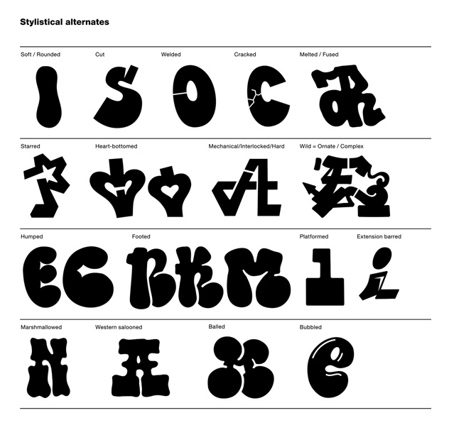
FIGURE 2.6
Anssi Arte, Stylistical Alternates, 2015. From Forms of Rockin’ by Anssi Arte (author/designer) published by Dokument Press.
The British artist Duncan Weston's project The World's Most Stolen Book, a series of original paintings reworking the entirety of Subway Art page for page (the front cover of which can be seen in figure 2.7), begins to show the painstaking way the book was seen by its adherents. Every single image, no matter how small or apparently marginal, was examined in microscopic detail by its readers, every single image a guide to a world of alphabetical possibilities. Weston's “reproductions” thus not only become a monument to both Subway Art and the canon-defining works produced during this era, but also try to recreate the energy and feeling that each of these images themselves contained, the explosive creativity and explosive performance held inside every photographic reproduction. The New York group Slavery Collective, however, has shown the importance of these same works through a project in which the original pieces became templates for odes to historical figure (from Gandhi to Spinoza and Laozi). Their work Joan of Arc (as seen in figure 2.8), for example, is an homage to “Hand of Doom,” a piece produced by the renowned writer Seen in 1980. Reproducing Seen's letter shapes and shading, his backdrop and imagery, as well as the famous central dagger and fist, but transforming the letters to proclaim the eponymous name of the martyred saint, the final piece acts as tribute to both Seen's canonical work and the famous “Maid of Orleans” herself. Not only revealing the manner in which the works featured in Subway Art have become sanctified in a way entirely unanticipated by the original producers, the piece—alongside other productions such as Know Thyself (a Delphic maxim), seen in figure 2.9, a reproduction of a classic work by Kell and Futura 2000—comes to reveal the basic structure of every canonical graffiti masterpiece: the signature name, the letter extensions, the backdrops, characters, and supplements that a fully-fledged masterpiece would contain, the customary hierarchies and balance of a canonical work.

FIGURE 2.7
Duncan Weston, The World's Most Stolen Book (cover), 2021. Oil on paper. Courtesy of the artist.

FIGURE 2.8
Slavery Collective, Joan of Arc (Hand of Doom), New York, 2010. Courtesy of the artists.

FIGURE 2.9
Slavery Collective, Know Thyself, New York, 2010. Courtesy of the artists.
Still, while Subway Art and Style Wars consecrated the graphic conventions of the aligned set, the veneration of quantity and the goal of becoming “all-city” (of being present on every subway line or in every borough) remained a clear stylistic prerequisite in these documents too. Whether one focused on stylistic quality—on a form of graphical embellishment vernacularly termed “style”—or stylistic quantity—a focus on mass8 vernacularly termed “bombing”—the key in both cases was perceptibility and captivation. Style must therefore be understood as a twofold term here: as a technical notion indicating the basic structure that enabled an image's recognition as one participating in the graffiti game and as a vernacular label that indicates an image developing beyond these fundamentals in formal terms. Whichever specific technique a writer chose to focus on, however, the goal was still to bring the name to the viewer's attention. The denominational options outlined in the canonical documents thus followed the core graffiti principle of maximum visibility, the need to be seen amid the mass of surrounding images (graffiti and nongraffiti alike); both quality and quantity were hence stylistic choices, even if the latter approach can be seen to forsake traditional aesthetic conventions of “style” in itself. The key here was a technique enabling a practitioner to take part in the visual system, to become known by their fellow participants (and thus to become in many senses alive). The key was to distribute the name within the community and the commons alike, to get up and to be seen.
The stylistic regulations formed within the emergent graffiti canon thus created a very clear palette of potential actions, a clear boundary of what could be produced and how improvisation could occur while an image still remained recognizable to the genre. True masters of the practice could thus link and cohere not only the letters of their own name but the letters and names of others; could create coherent, harmonic compositions and demonstrate unforeseen, unexpected linkages; could exhibit new solutions to ever-present alphabetical and architectural conundrums, all the while remaining true to the fundamentals of the canon itself. Within the basic stylistic framework we thus find artifacts that remain the same while being entirely distinctive, images set genealogically within the ancestral form while still pushing at the edge of common difference. As in all creative practices, style in graffiti thus remains implicitly derivative (the weight of the canon, as depicted in Escif's work in figure 2.10, often hanging heavily on a participant), yet within these canonical derivations lies an almost infinite improvisatory potential, an endless mediation between restrictions and possibilities. The basic rules of graffiti that developed in this early era were thus very simple (as they remain so today): one needed visibility to be publicly recognized (in both the spatial and social realm). One needed visibility to move from the social position of “toy” (a neophyte) to “king” (an expert). One needed visibility to move from the surface of the city to the surface of people's minds. And how did one obtain this? Through both the saturation and animation of the image alike.
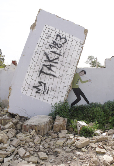
FIGURE 2.10
Escif, Untitled, Valencia, 2010. Acrylic paint on wall. Courtesy of the artist.
So what does this brief sketch of the stylistic conventions of graffiti begin to reveal? I have so far elucidated the basis of graffiti's common difference, unpacking a decorative system in which the search for discernibility (molded by specific virtuoso figures and regulated by specific canonical documents) led to a graphic development of the image from an initially minimal text to a wildly complex and/or widely disseminated one, to a practice in which visual coherence remains clear (for insiders at the very least) even when stretched to its outermost limits. Yet, and critically for us here, style must be seen as something that does more than just “classifying objects as sharing, or not sharing, stylistic attributes with one another” (Gell 1998: 155). Rather, a specifically anthropological approach to style aims to unpack the way the internal structure of an image can come to echo the “unity of thought which binds members of social groups together” (p. 163). Style, what Gell terms as the “harmonic principle which unites works of art into groups, into collectivities,” can thus be understood to contain a direct relation to the core anthropological concept of culture as a particular “configuration of intersubjective understandings” (p. 156). As such, beyond purely iconographic explanations, material form will here be understood to “thematize and make cognitively salient essential cultural parameters” (p. 159). A stylistic analysis of graffiti can thus tell us much more than what it looks like. It can explain the relationship between the visual and the social, between aesthetic and cultural patterns. It can explain how the production of the name (enacted via a decorative and agentive signature) and the desire for visibility (enacted through a mode of animation and distribution) connect us to the relationship between the individualized tags and the communal environment in which these culturally regulated styles are later circulated (and judged, ignored, or revered). The basics of the graffiti image thus link us to a set of classical anthropological themes, to issues of agency, objectification, distribution, captivation, animation, ambiguity, and fame, to issues the image graphically articulates through stylistic means.
PERSONHOOD AND AGENCY OR THE DOUBLE SIGNATURE
Let's return again to the fundamental basis of all graffiti, the name, the unique name put up, the unique name emerging from the unique individual inscribed in a unique space at a unique time. This is what style in graffiti is ultimately about: the selection of the name, the placement of that chosen name onto an urban surface, the scripting of that name utilizing the typographical and ornamental foundations of the graffiti canon. From the single color tag (as seen in figure 2.11) to the two color throw-up (as seen in figure 2.12) to the multicolor masterpiece (as seen in figure 2.13), this signature-signature is fundamental to graffiti, no matter how spare or how embellished it may be. Graffiti style thus is this signature, a signature artifact that, like all signatures, acts both as a material remnant of the absent writer and a material verification of their agency too. While all signatures are alike, then, they must also be understood to be irrevocably unique, their recognizable uniqueness being that which enables the signature to successfully function. The signature in its classical form thus acts as a marker and authorization of identity, an inscription securing an irrevocable identity claim. In a parallel manner, the artistic signature—first recognized in the movement from collective to individual authorship seen within post-Renaissance art—can likewise be seen to both confirm and corroborate the artist's prior presence. As Horst Bredekamp argued, the signature is here understood as a “witness to the self” (Bredekamp 2018: 45), a form of inscription that authenticates itself through the “first person singular” (p. 51). It is hence an image that is both created by and speaks for the artist, that speaks through the “I” of the “maker who speaks of his product” as much as the “me” of the object “that speaks of its maker” (p. 62). In this way, then, the artistic signature—as seen in the works of Jan Van Eyck that Bredekamp analyzes—both proclaims the name of its producer while simultaneously announcing itself to us in the first person; it asserts “Remio Me Pinxit” (Remio Painted Me) while likewise declaring “I Remio” at the same time (as seen in figure 2.14). Each tag a writer forms thus becomes more than just text, more than just image. It affirms the existence of a work that is “both created object and autonomous subject” (Bredekamp 2018: 58–59), of a set of works that consist of “anorganic material and yet function as if they were alive” (p. 53).

FIGURE 2.11
Wombat, 2023, London. Photo: Alex Ellison.

FIGURE 2.12
Fatso, 2014, East London. Photo: Alex Ellison.
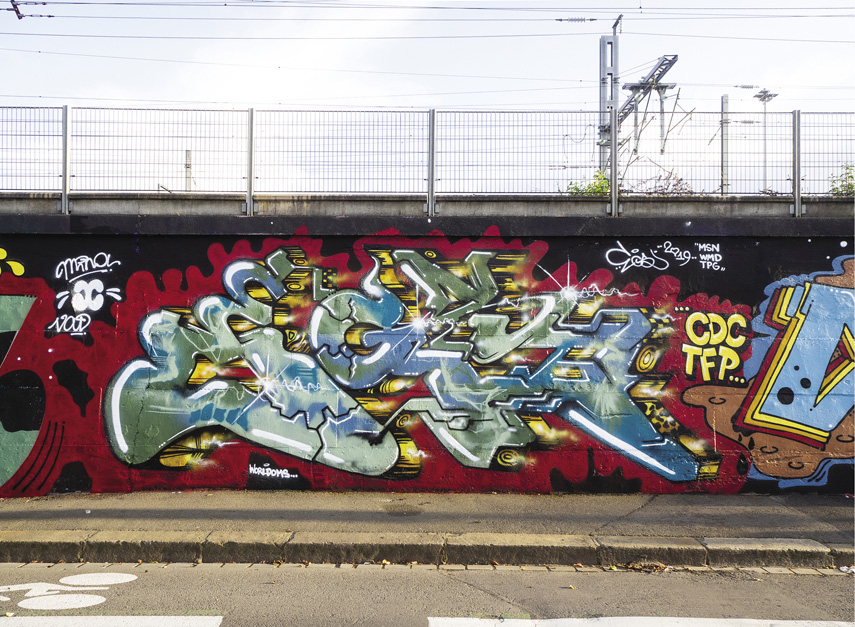
FIGURE 2.13
Egs, 2019, Rennes, France. Courtesy of the artist.

FIGURE 2.14
Untitled (Remio), 2022, Paris. Photo: Gökhan S.
This concept of artifactual personhood (Gell 1998)—an idea giving selfhood and agency to artifacts, not just people—may at first appear to be entirely at odds with the “rational” distinction between subject and object/active and passive that exists within “modern” societies. Yet this way of regarding the graffiti image is entirely dominant among its practitioners, a truism so true it remains taken for granted. As the legendary New York graffiti writer Lee explained to cultural historian Ivor Miller, the “letters” he and his fellow writers produced were “actually images of people” (Miller 1994: 165). Moreover, as style developed, Lee continued, the images went beyond mere letters, became “not words . . . not a name anymore” but “more of a living thing that you have created” (p. 166).9 Lee thus here outlines Bredekamp's argument precisely. He sketches out the “me”/“I” paradox in which the image both is the artist and is an agentic object in its own right, is both portrait and living creation simultaneously. We thus have a set of works that, like Jackson Pollock's drip paintings discussed by Gell, both act as a set of “(non-representational) self-portraits” (Gell 1998: 17), while also coming to act as a “person, or at least a partial person,” in their own right, a “congealed residue of performance and agency in object-form” (p. 68). Here, then, we have a set of works that are not only commonly anthropomorphized—as in Remio's grimacing and giggling letter Rs in figure 2.14 and Veks's beaming tag in figure 2.16—but commonly understood to imitate body forms too. The anatomy10 of each letter—its links and loops let alone their shoulders and spines—can thus come to replicate the movement of a (break)dancing body with its arms twisted and legs splayed. The body of the writer and the body of the letterform thus intertwine and mirror one another, the text manifesting as a form that has been caught by a photograph in the tenth of the second as they bend on the spot, sway from left to right, pop and lock like a living breathing body. From the hard and angular texts to the soft and bubbled ones, the graffiti image can thus be seen to carry a bodily energy, a cartoonish feeling of flesh and blood (as seen in Honet's characterful piece in figure 2.17, for example). Graffiti thus not only comes to stand out (in a gestalt figure/ground reversal) as something artifactual, three-dimensional, but here takes on a lifelike character itself, acting as a still life of the writer while also taking on a unique life and agency of its own.


FIGURE 2.16
Veks and Evict (KYT), Untitled (Red Shrimp), 2022. Las Vegas, Nevada. Courtesy of the artists.

FIGURE 2.17
Honet, Paris, 2020. Courtesy of the artist.
Not only containing the visceral remnant of their producers, however, the classical signature also contains the residue of their actions and objectives too. It functions not only as a marker of personhood but as a functional tool that, when placed in the correct location, acts both for us and as us. The signature thus carries not only identity but intent. It can legally evidence intent, in fact, authorizing that within which it is set, declaring it as true and original, as that which we sanction and approve. The signature thus does not just say something but does something in the world (containing, as an illocutionary act, the power to authorize marriage, divorce, even death). As such, the graffiti signature must be understood to contain an agency founded on the presumption of this intent, an agency able to then impress or disgust us, to compel exaltation or destruction, to enjoin us to replicate or digitally capture it. Much more than just “I was here,” then, it is “I committed here” that the signature also affirms, verifying its commitment to the action in which it was produced. The “meaning” of graffiti is this commitment to action in itself, its affirmation of the very act through which it comes to life. The canonical graffiti image thus not only traces the movement of an unseen person, leaving a part of that person on the material surface, but so specifies their material intent, a pledge turned from flesh into stone. It authorizes the self and their intentions. It acts as witness not just to the presence of the writer but so too their promise.
Just like our doubly powerful signature, graffiti likewise reveals a dual mode of artifactual attachment, a mode in which the producers of the image first attach themselves to the things that they decorate (a bond between marker and site), before which these objects attach themselves onto further actors in the social field (a bond between site and spectator). The initial mode of objectification (from person to object) is thus transferred onward in the social chain (from object to viewer). Like the ornamental art Gell describes, the graffiti signature can thus be understood as a social technology through which “access to other persons can be attained” (Gell 1998: 68), a technology that forms an “attachment between persons and things . . . mediated by surface decoration” (p. 74). Just as with painting, as Christopher Tilley has explained, the viewing of the graffiti signature can be understood not simply as “an act of pure vision” but rather as one that establishes “bodily contact between the painter . . . and the painted” (Tilley 2004: 18). The marker of identity present in the signature image clings to those who witness it, coming to “diffuse out into the ambience” before being “incorporated by the onlooker in the process of perception” (Gell 1998: 223). Like a name penciled on the inside of a book, let alone the scribbled marginalia that adorns and embellishes it, the handwritten marking turns the mass-produced into the personal (engaging some people, disturbing others). It places a remnant of the human actor directly onto the space in which the image now resides, alarming as much as it delights, excluding as much as it includes. The agency held within the graffiti signature thus attracts and absorbs us, willingly or not. It compels a relationship between viewer and artifact, dispersing agency amid both cultural and material environments. It acts as an intermediary set in the space between producer, artifact, and viewer, an image tethered to the unique personhood of its producer luring the beholder into its relational form.
ANIMATION TO AMBIGUITY OR VISUAL DELIGHT
The graffiti image can thus be understood as a sign of personhood and agency, as a signature marking intent and promise, and an intermediary attaching the body to the city and the image to the viewer. Yet what is missing in this discussion so far is the crucial factor of what will be called animation (following Gell once more), the affective power of the image to captivate via the generation of visual delight (or disgust). While, as we will see in our next section, the saturated image can stylistically captivate using the most rudimentary graphic techniques, the captivating quality of animation emerges directly through the ornamental virtues of the image and its ability to attract through its innate graphical composition. The visual delight harnessed here can thus generate a sensory pleasure via the optical experience of the decorative. The ornamental is perceptible, and its perception contains an affective potential far beyond the base meaning of the word. The ornamental is sensible, and the sensibilities it awakens emerge whether they are overtly desired or not. The ever-present danger (and potential) of the image is its ability to create these relations through which, as Tilley has noted, in “looking at something, I am ‘touched’ by that which I look at” (Tilley 2004: 17). The rhythm and balance, the harmony and poise, the technical and imaginative prowess that an image exhibits can hence be understood to contain a figural power to move its viewer: The unexpected passage of the pen, the humorous or bewildering movement of a line, thus incorporates a dangerous, visceral impact addressing us through the level of the felt. It contains an animative potential that, in graffiti, emerges through at least three specific (and often conjoined) ways: through the choreography and purity of the line, through the engulfing impact of complexity, and through the unstable impenetrability of ambiguity.
In our first case, then, we have the captivating qualities of simplicity. Take one of the most minimal of images within the graffiti canon, a simply stylized tag. In figure 2.18, which shows two large-scale tags produced by Mosa, we can find an innately rhythmic set of works that swiftly pierce and slickly arc through their various letter forms. We find two tags in which the letters take on differing shapes and positions (the low “v” on the first “m” compared with the high one on the second, the severe peak of the first “a” compared with a flattened bar on the second) yet in which each creates a balanced and poised totality. There are no power lines or contrasting colors here. No backgrounds or characters. Nothing added save a sharpened underscore on the first tag and a set of inverted commas on the second. As likewise seen in the tags of figure 2.19, what becomes apparent here are a set of clean strokes tracking from left to right, a set of individual forms turning single parts into conjoined wholes. We have a set of cutting lines and sweeping curves that are about purity, coherence, rhythm, that test out the possibilities of the letterform but that elaborate nothing but the letter itself. Here, then, it is subtle eloquence rather than wild exuberance that is displayed, the “elegant simplicity” emergent via “economy of color and certainty of line” (Grabar 2009: 23). The wandering track and passage of the line are still critical, the creation of a gestural dynamism, an energy and palpable tension in which, as Oleg Grabar has said, our senses become affected by the “languid elongation of a loop or the daggerlike precision of a hasta [a cross stroke as seen here in the letter As]” (Grabar 1992: 107), in which an image's speed and flow captivate us through its visceral motion. Yet here the gesture works in relation to the balance formed through its unifying cadence, the perfect scale, the perfect control, that together create the perfectly discernible artifact. Impact here thus emerges through an image concentrated to a state of clarity, captivation via the witness of a “hand drilled to perfection in the practice of a skill,” through the “consistency of linear movements” and the “rhythm . . . compelled by the repeated beat of the vertical parts of letters” (Grabar 1992: 103). Impact comes through a gestural purity in which nothing more than is strictly necessary is added.

FIGURE 2.18
Mosa, 2022. Courtesy of the artist and Tramontana Magazine. Image by Elliot Sitbon.

FIGURE 2.19
Mosa, 2022. Courtesy of the artist and Tramontana Magazine. Image by Elliot Sitbon.
At the same time, the knowledge that the production of the image is a onetime affair, an image produced “live” with no retakes allowed, likewise transforms the way the signature is appreciated. The perfect “hand style” thus balances the harmonic beauty of the proportionate with the charged charisma of the performative. It creates a distinct energy in which we follow the movement like a dance (as discussed in more detail in chapter 5). This is hence a graphic style that embraces the “utmost simplicity” because any unnecessary embellishment, as suggested by the critic John Martin in his discussion of the work of choreographer and dancer Mary Wigman, “would only defeat its purpose of expression” (Martin 1983 [1933]: 27). Captivation here thus emerges from a simplicity that “establishes its rhythms with great clarity and thereafter touches only the high spots of its design, leaving it to you to fill in the space and complete the form” (p. 27). Here, then, simplicity is never simple, is, perhaps, the hardest thing to achieve. Here simplicity means that the bare bones of the object must stand up by themselves, a return to purity that only one who has mastered complexity can truly assemble. The distilled elegance of an expert tag thus gives us the freedom to see the rhythm, the room to visually apprehend the flow.11 Virtuosity thus emerges through a “discriminating” minimalism in which “the more simple the shape the more careful must be the handling of the surface” (Gombrich 1984: 31). Virtuosity generates visibility through the expert choice of the right space, the right tool, color, scale, through a condensed subtlety and an expert completion of a rhythmic dance.
While simplicity creates a particular feeling of captivation through the witness of visual grace, complexity, in terms of both technique and thought, functions through a striking visibility that traps us within the dense materiality of the image. A fully elaborated masterpiece, a text-image with intersecting dimensions and perspectival shifts, with innumerable embellishments and ornaments, fades and shines—as seen in Egs and Trama's emblematic piece in figure 2.20—generates an animative quality in which the individual parts can never be fully separated from the whole, a “mazy dance in which our eyes become readily lost” (Gell 1998: 76). The name, the signature, thus here becomes supplemented by the ornamental, overpowered by its additional form. Rather than the monochrome tag or throw-up—a minimalism of color that enables a focus on the flow of the letters themselves—here the classic chrome-and-black is exchanged for a kaleidoscope of color. Simplicity is thus overtaken by a virtuosity in which the writer is able to form a coherent piece from a multitude of elements, is able to hold complexity together before it explodes into chaos. While, at its very basis, every complex piece could be reduced down to the tag that sits at its core—the raw name here being fleshed out into a larger bodily form—the material density of the image works to both draw in and repel sight. As in Egs's solo piece seen in figure 2.21, a piece's optical illusions can turn surface into depth, figure into ground. We become enmeshed by a surplus in which the image builds up alternating hierarchies and sequences, in which it bifurcates and radiates in unexpected and dramatic ways. Yet the compositional convolution that the viewer observes comes not only via technical complexity but so too via the conceptual density emergent through the shock of novel movement. Here, the unexpected (and thus often witty) arrangement, the graphic repositioning that goes beyond the expected script, becomes exhilarating. These works confound us not via geometric intricacy but through unexpected movements that defeat our expectations, by startling linkages that, as with a labyrinthine pattern or a visual pun, could never have been foreseen. Honet's piece in figure 2.22, like his earlier work in figure 2.17, for example, does not contain the intricate complexity of Egs's earlier works, but rather contains connections (the “N” to the “E” in both cases, for example) that I still find incredibly satisfying even after having seen them a hundred times. Its complexity thus emerges through an animative complexity whose movements and internal rules we simply cannot begin to anticipate. Its complexity emerges through the witnessing of an expert playing against themself (and somehow still winning).

FIGURE 2.20
Egs & Trama, Helsinki, 2019. Courtesy of the artists.
FIGURE 2.21
Egs, New York, 2011. Courtesy of the artist.
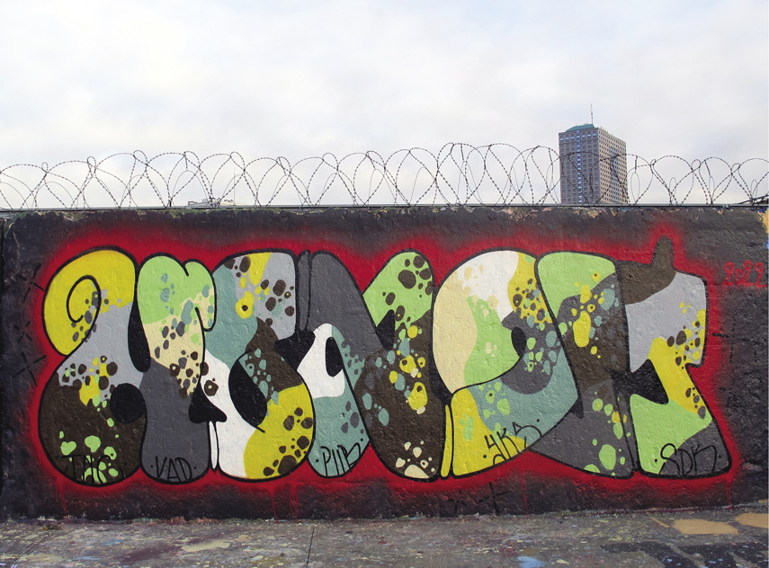
FIGURE 2.22
Honet, Paris, 2022. Courtesy of the artist.
Complexity thus morphs between these poles, between the games of ornamental density and compositional intricacy. Both approaches, however, work to generate the “pleasurable frustration,” as Gell termed it, through which we become “drawn into the pattern and held inside it, impaled, as it were, on its bristling hooks and spines” (Gell 1998: 80). Both harness the frustration in which we are unable to “follow the sequence of steps in the artist's ‘performance,’” an inability to untangle the image that forms a “delay, or lag” in their visual comprehension (p. 81). The rotating of angles and axes, the intersection of figure and ground, or the baffling intermixing of forms can thus come to form an uneven exchange, an “unfinished business” in which the viewer is forever entangled in the “cognitive resistance” of pattern (pp. 81–82). It can create a feeling in which an object is “never fully possessed” but always “in the process of becoming possessed” (p. 81). In this way, then, the complex graffiti image comes to function through what Grabar terms a “monoptic” style, a writing whose reading is “complex and time-consuming” and involves “rotating the object or being rotated around it” (Grabar 1992: 103). Like the classical maze patterns Gell also discusses, complexity thus creates “obstacles” or “sticking points” in which our eyes are caught, “impassable frontier[s]” in which we become trapped (Gell 1998: 90). It creates a captivating optical blockage that we fight to turn back into flow.
Whether taking on simple or complex approaches, however, graffiti often adopts a further animative quality too, that of the captivative power of ambiguity. Here the image pushes into a space of almost (and often) total indecipherability. Here, whether embracing the gestural purity of the line or the ornamental complexity of the convoluted, the ambiguous creates a work that almost entirely resists its own apprehension. As seen in Delta's pieces in figures 2.23 and 2.24, for example, here the graffiti image seems to reject the primary rule of the graffiti aesthetic itself, that of its participation in the fundamental game of visibility. Something is being revealed and concealed simultaneously. We see the piece but the name is hidden, veiled.

FIGURE 2.23
Boris Tellegen/Delta, Untitled (Freight Project), 2017, Amsterdam Westpoort. Courtesy of the artist.

FIGURE 2.24
Boris Tellegen/Delta, Untitled (Freight Project), 2019, Amsterdam Westpoort. Courtesy of the artist.
While much of this urge toward the illegible can be seen to have arisen from a classic subcultural desire to restrict accessibility for the sake of purity, to produce work that could be seen but not read by outsiders, the level of visual erudition developed by insiders means that aficionados will often be able to recognize an artist's style regardless even of the existence of visible letters themselves. Delta's three-dimensional puzzles may thus contain a level of graphic distortion, refusing a status as either text or image, confounding categories and shattering their own name, yet this mode of ambiguity must in fact be understood to function as not merely a tool of obfuscation but one of attraction, a mode of constitutive ambiguity that makes us look. Here, then, we become attracted not via what is written but by the sensation that an encounter with the writing itself provides. As Anthony Forge wrote regarding the art of the Abelam people of Papua New Guinea, what we find is the creative ambiguity of “poetry, not the lack of clarity of poorly written prose” (Forge 2017: 104). What captivates is hence not the inability to see but the feeling that there is more contained in the image than can ever be seen in itself. As Ludovic Coupaye has argued through his own ethnographic research with the Abelam, the power of ambiguity emerges from the particular mode of engagement that the equivocal image enforces, an agency that comes not only from the “aesthetic effects” these images produce but from the “interpretation processes they demand” (Coupaye 2017: 252). An image with clear content and materiality can thus become all too easy for us to digest and cognize, and hence become literally unremarkable, slipping down with dangerously silky ease.12 The ambiguous image, however, traps us through its resistance to both evaluation and comprehension, through a need to interpret we can never come to fulfill.13 It forces us to attend to it. The common disparagement of graffiti as “incomprehensible” can thus be seen as a fundamental power rather than failing of the style. Ambiguity, as Jakub Stejskal has likewise explained in a critical appraisal of Forge's work, forms “a referential instability that creates an aura of mystery around the objects” (Stejskal 2016: 90), a “striking visibility” that comes to increase the object's “authoritative presence” (p. 85). Like the pleasurable feeling of clarity engendered by the witnessing of simplicity, like the bodily convolution engendered by complexity, the ambiguous image creates a sensation through which we become struck by or sucked into the image. It creates a visible virtuosity activated by the density of an image's animation, a captivation inherent within the graphic qualities of the form itself.
DISTRIBUTION TO SATURATION OR THE MACRO-OBJECT
Graffiti can hence be considered as the signature that stands and acts for the self (that contains both identity and intention), that captivates us through its relational density (the intermediary conjoining producer, artifact, and viewer), and as an animative image captivating via simplicity, complexity, and ambiguity. Yet more than perhaps any other form of art, graffiti also functions through distribution and mass, not through the singularity of the single tag but through its disseminated multiplicity. As I hope should now be clear, the fundamental aim of graffiti style is to spread one's signature-signature throughout the social and spatial milieu. And distribution spreads the primary artifactual attachment of personhood over both time and space, forming a set of objects “indexing a distributed person” (Gell 1998: 232), a set of finished works produced in different places and at different times that together circulate and multiply the self. Take figure 2.25, then, a screenshot of a few of the tens of thousands of graffiti works produced by the writer 10Foot.14 The disseminated graffiti signature we see defies the physical restrictions of the artist's body through the production of artifacts that act as disposable, separable parts of the artist themselves. The painted surface can thus be considered as a “physically detached fragment” of the artist distributed “beyond the body-boundary” (Gell 1998: 104). The dispersed objects we leave within the world multiply the self and enable an expansion outside our brute corporeal limits. In this way, then, the graffiti signature becomes a distributed part of the self that, like the “tombs” or “memorials” of the Western canon, extends individuals “beyond the confines of biological life” (Gell 1998: 223). Graffiti thus creates a body materially distributed in both time and space. It creates a body of work functioning through scale, accumulation, magnitude.

FIGURE 2.25
Ten Feet of Mass. Screenshot by author of the search term “10Foot” on Flickr. March 31, 2023.
This concept of distribution pushes us toward an understanding of art in which totality rather than singularity becomes key, and hence connects us straightforwardly with the notion of the artistic oeuvre prevalent within Western art. As a concept in which it is the total works of an artist that are significant—the set, as Gell says, of “early works, middle-period works, late works” that are “disseminated in various collections” (Gell 1998: 232)—the oeuvre helps us to situate the innately cumulative nature of graffiti. The single tag, in this understanding, never simply stands for itself but forms part of the opus that is the entire body of one's output. The image a writer produces can hence together be understood, as Gell continues, as “an independent chunk of space-time, which can be accessed via each work individually, each standing, indexically, for all of them and the historical-biographical context of their production” (p. 232). As such, a graffiti writer's distributed pieces—whether collated in photographs hidden in shoeboxes or still visible on the street, whether accessed via the digital reproduction of a now destroyed work or a physical encounter with a piece so fresh it still smells—together come to form a “macro-object or temporal object” that “evolves over time” and further expands an artist's personhood (p. 233). They create an oeuvre in which the various artifacts exist not as a “collection of separate objects, but just one object with many parts distributed in many different places” (p. 167). Graffiti can thus never be understood through the singular image, the single signature alone. It is mass that defines it, quantum. Proliferation is hence as crucial a part of graffiti style as innovation, extending the self and showing prowess through the capacity for self-extension itself. Just one image is never enough (as Fatso, here Fatzoo and Fatsoo, shows in figure 2.26). One image may show quality, but without mass it shows no reach or extension, no quantifiable dedication. Captivation thus emerges here through the raw power of abundance, style emergent through the enchantment of scale and the scale of enchantment (Gell 1992).
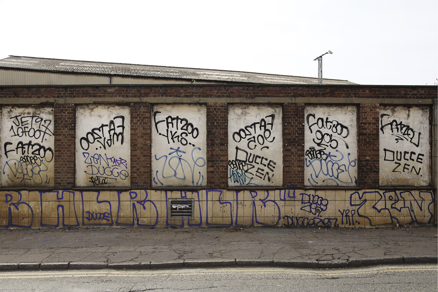
FIGURE 2.26
Fatso/10Foot/Jet97, 2022, East London. Photo: Alex Ellison.
Beyond the relationally potent appearance of the signature alone and the animative potency of its design, distribution thus facilitates the stylistic prerequisite of saturation within graffiti, the technique emergent through making the name known. And being that the knowing of the name can only emerge through its bodily reproduction, stylistic saturation captivates through the bodily commitment that this diffusion necessitates. It emerges through the knowledge of the energy and intensity it takes to successfully produce this macro-object, through the risk and fearlessness that inundation requires. It emerges through an awareness of the performative process that remains sensible in every work of art, that remains “present and accountable in the object, yet abstracted from view” (Küchler and Carroll 2021: 88). The stylistic captivation of distribution can thus be seen to emerge through two specific routes (both developed further in chapter 5). In the first case, as a duty that only a committed body can truly achieve—a body willing to commit to the time and drive necessary to saturate, to write all night every night (and then a little bit more)—saturation captivates through the sheer torrent of images, creating a sense of bewilderment in the mind of the viewer, through the inconceivable temporal commitment that has been made. In the second case, however, as a task that only committed action can produce—the action of a body scaling up and over walls, below and through tunnels, a body placed literally at the edge—captivation surfaces from the abstracted witnessing of a body willing to take risks to achieve its task. Positioning images in sites that garner attention through an architectural audacity, the success of an artist's output comes to be judged far beyond its animative style alone. Physical daring thus gives a piece as much stylistic force as any graphic flair. Skill here becomes entrenched in the image through the invisible yet still discernible trace of a practitioner successfully completing their task. As such, a purposeful spareness, as seen in the grouping of tags and throw-ups displaying 10Foot and Tox in figure 2.27, reveals a stylistic minimalism in which visibility (and virtuosity) emerges through spatial techniques, through location and saturation both.15 Style in graffiti can thus never be separated from medium or location, is as innately related to its surface as it is site-specifically attached. Style must be understood as a corporeal as much as an artifactual property, virtuosity residing in the conjunction of image, medium, and body rather than in the image itself alone.

FIGURE 2.27
10Foot, 2022, North West London. Photo: Alex Ellison.
While the single graffiti signature affirms and commits, the macro-object thus cannot lie. Saturation proves authenticity and sincerity. Efficacy and captivation increase in direct correlation with stake. The various levels of bodily commitment revealed within the graffiti image thus become a fundamental warranty of allegiance and faith: “I write to show that I write come what may,” each work announces, “I write to prove my fidelity without doubt.” The spatiotemporally scattered macro-object thus captivates due to both its physical prowess as much as its cognitive inconceivability. The halo effect of technical enchantment (Gell 1992) in graffiti thus emerges due to the impossibility of imagining how works such as these could come into being. How could the artist have produced this? How could an individual have committed to this? The “source of the power such objects have over us,” as Gell argues, emerges through “the way an art object is construed as having come into the world,” through “their becoming rather than their being” (Gell 1992: 46). It is hence not just the what but the how that is crucial to style here, not simply the “look” of an image as would be conventionally understood in terms of its composition or graphical animation, but rather the knowledge of what the productive process itself necessitates. Distribution hence comes to captivate through the witnessing of the material control necessary to produce the graffiti oeuvre; through the witnessing of the way in which an expert ritual actor masters their tools, their bodies, their surroundings; through the way they master the extrinsic and intrinsic dangers in order that the macro-object be disseminated in the world. Style here thus develops far beyond the pure instantiation of the name, far beyond even its animation. It becomes about the production of an image that may not be monumental in size but is monumental in scale. It becomes about a human dimension in which bodily commitment is revealed, a macro-object captivating its viewer through its mode of becoming rather than its being alone.
CONCLUSION OR VIRTUOSITY TO FAME
This, then, is the “what” of graffiti. The “what” of its graphic qualities and their consequences, of its distributive characteristics and their effects in the world. This is the canonical structure of the signature-signature, the patterned signature and the signature pattern that attracts in multiple, intersecting ways. The signature thus carries a captivating personhood. Yet the pattern carries that personhood too. The signature captivates through its graphic animation. Yet the pattern is graphically animative too. As the material attachment attaching the body to the wall and the image to the body, as the circulating ornament captivating through its palpable commitment and tangible risk, the signature, as seen in the numerous tags present in figure 2.28, becomes a dense visual trap. Whether through its engagement of scale or oeuvre, its reduction to purity, the intricacy of its becoming or its elaborate abstraction, it is the entrapment of a viewer that is graffiti's stylistic goal.

FIGURE 2.28
Twins (Em1/Wombat et al.), 2023. New York City. Photo: Rafael Schacter.
Beyond mere beauty, then, style in graffiti can best be understood through the concept of “efficacy,” through a work's ability to capture our attention and its “capacity to accomplish tasks” (Gell 1998: 94). Evaluating an image through what Nicholas Thomas has called “judgements of what is strong and weak” (Thomas 2001: 3), through an image's ability to create a visceral response, can thus provide us with a much more effective way of comprehending how graffiti functions than through ideas of the “beautiful” or the “ugly.” “Ugliness” can here be considered “beautiful” if a necessity for a work's effectiveness, the “unsightly” considered “pleasing” if successful in fulfilling the basic desire for visibility (through pushing to the maximum extent of its anthropometric scale, through pushing against the traditional limits of an image's material life span). “Beauty” thus arises through efficacy, virtuosity emerging not only through the calligraphic animation discussed above—from an image's visually gratifying or surprising movements—but through a “beauty” in which “damage” can be aesthetically treasured as a route toward visibility. Beauty in graffiti thus emerges through quantity and quality but likewise through the visible revelation of a practitioner holding complete mastery over their tools, their medium, their task. It emerges through the skilled revelation of an act in which visibility is the ultimate aim.
The renown of the name is thus entirely critical to style, the fame of the graffiti writer a result of this fundamental desire for perceptibility. Fame thus means success. Fame means that one's material and bodily techniques—one's style—have captured the eyes of one's viewers. As rooted in the Greek term fama (meaning not only fame but rumor, report, or reputation) as well as linked to the term kleos (meaning renown or glory), fame is hence created through what others hear about you, through heroic acts that places one's name in the mouths and minds of others. As such, while this open desire for fame is commonly used to disparage graffiti from those outside the subculture, a critique denigrating fame as a childish desire, as antithetical to “true” art, the need for renown is the stylistic glue that holds graffiti together. Without fame—as argued by Nancy Munn in her classic ethnography exploring value creation among the Gawan society in Melanesia—an individual's “influence would, as it were, go nowhere: successful acts would in effect remain locked within themselves” (Munn 1986: 117). Without fame, style becomes stuck. The fame that emerges (via what Munn suggestively calls the “circulation of names”) thus enables a participant's “virtual influence” to spread in the world (p. 117), enables a person to enter “in the mind of another who may then know of him and positively evaluate him irrespective of whether he has ever seen him or not” (p. 115). The writer whose “name is known in distant communities,” as Gell continues in a discussion of Munn's work, thus becomes “more than a merely incarnate man,” becomes an “expanded and disseminated being, present here, there, and everywhere because his name is attached to circulating objects” (Gell 1998: 230). Fame, in this reading, is visibility in quantitative and qualitative terms.
Yet fame not only gives freedom to the image (and the person) but also, as Munn continues, enables a community to become “the agent of its own value creation” (Munn 1986: 20). It lets communities create their own self-sustaining and self-regulating forms of significance. As likewise seen in graffiti, then, fame places power into the hands of those who, by dint of age, of race, or of class, are otherwise unable to accrue normative social value (or simply reject it for this more substantive value form). It creates a world in which value is not economic but aesthetic (and in which commitment is the most important currency of all). Furthermore, fame must here be understood to be about the social just as much as the individual. In the Melanesian context that Munn explored, for example, fame created a site from which egalitarian and individualistic desires could be balanced, in which the tensions between “hierarchizing and equality” and “autonomy and social encompassment” were publicly resolved (p. 20). Fame thus not only lets one come to know themself “as someone that is known by others,” reflecting the “influential acts of the actor back to himself” (p. 117), but helps to form a “generative potency” for the wider community (p. 118). It enlarges the social as much as the singular body, the “climbing fame” of each individual constituting a “sign of the positive value state of the community and its internal transactive potentialities” (p. 118). The question of how idiosyncrasy and the canonical are stabilized within graffiti, how innovation and tradition do not tear the culture apart, is here brought to the fore. Yet rather, as in Munn's case, fame being collectively contained by the negative value (and fear) of witchcraft, here it is the negative value (and fear) of co-optation, of “selling out” to perceived instrumental values that, I argue, acts as the boundary point ensuring members remain bound to one another. Selling out is the ultimate cultural depravity. Selling out means one is committing purely to oneself rather than to one's collective or one's (sub)culture. This is why writing one's own name alone is never enough. This is the why one's crew name must be put up, why deceased writers’ names must be proclaimed (as we will see in the next chapter).16 It is the “fame of graffiti” as much as the fame of the self that is desired. Graffiti, in this way, becomes an ornament not just of the city and of the letter but of the individual and culture too. It becomes, as Munn described in the Gawan case, a “metaphorical body décor” (p. 111) or “cosmetic adornment” (p. 105). It becomes a virtual beautification constructed by the power of the name.
Unlike the institutional monument, then, the monument in which the agency of the maker is largely invisible and instead housed within the individual(s) depicted (in either the figurative monument or the mass memorial), here the graffiti monument is a monument to the personhood of the producer themself. Unlike the institutional monument that captivates through its size and expense, through its references to the ancient stylistic archetypes that dominate the formal conceptions of monument, here the graffiti monument captivates through animation and distribution. Unlike the monumental singularity of the institutional monument, here the graffiti monument captivates through a monumental oeuvre, a macro-object that engages both quality and quantity alike. As with the kula decorations discussed by Munn (1986) and the tattoos considered by Gell (1992), the graffiti image must be understood to speak to notions of both the individual and the social, to form a set of images that commemorate and circulate their producers—that speak of names, times, relationships—as much as commemorating and circulating their canonical grounds—proclaiming lineages, denominations, techniques. What we thus have is a set of ornamental forms that embellish the self and the society, that attach the self to the society and the society to the world. And much like the kula, then, much like the tattoo, graffiti can be understood not only as a quintessentially public form (only existing through its circulation within the public as people and place), not only as a quintessentially artistic form (as something “difficult to make, difficult to ‘think,’ difficult to transact” [Gell 1998: 23]), but so too as the quintessentially monumental one: a visual reminder of the committed practitioners who produced it, and a monument to the social environment from where it is formed.
The tag, the tattoo, the kula may each be minor, marginal, mobile artifacts and remain formally other to the conception of the monumental within Western public art, yet they each stylistically intertwine the person with both the culture and environmental milieu. Canonical graffiti is thus not only a monumental aesthetic achievement and a form of visual culture that has become monumentally revered by adherents across the world, but a monument singing out the expanding fame of the individual and the intensifying renown of their collectives both. It is a monument emergent not through centrality (as seen in chapter 1) nor through permanence (as will be seen in chapter 3) but rather through the decorative creation of an ornamental attachment; through the agentive import of personhood and identity; through the animative techniques of simplicity, complexity, ambiguity; and through the distributive circulation of a monumental macro-object emergent via a relational, animative, and distributive signature form.