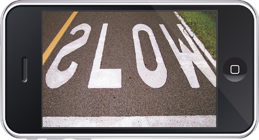
Impatient, distracted, clumsy, fickle, incurious, and uneducated. It's not exactly the description of an ideal dinner guest. But iPhone users aren't stupid, and neither are you. Chances are, when you're tapping away at your favorite device, you fit many of these descriptions yourself. We all have better things to do than scratch our heads over an iPhone screen. Our preoccupied iPhone habits flow naturally from the very concept of mobile apps—getting stuff done on the go—and those behaviors are only reinforced by a device that's so deceptively easy to use that we can allow ourselves to be careless.
So why bother? If most people never pay conscious attention to your design, if they neither notice it nor think about it, then does the design even matter? Why sweat the details for users who routinely stumble past them? If users (like you and me) are so careless, then the answer must be a dumbed-down interface, right?
Here's the thing: careless ≠ dumb.
People don't want dumb from your app; they want simplicity and ease. We're all just trying to use our iPhones to work, to play, to learn, to communicate. The best apps get out of our way to let us do that; they become invisible. Great apps don't make us think—at least not about their interfaces. They embrace complicated tasks but shield us from all the complexity under the hood, making it effortless for us to glide through and accomplish our goals. Tap the Fly button to fly the plane, tap the Land button to bring it to earth.
Simple is hard, and effortless takes lots of work. But those adjectives are the hallmarks of great design. While users will, unfortunately, rarely exclaim over your app's elegance, they will always gripe about its inelegance. They feel the bumps, and the small screen only magnifies interface missteps. So yes, you really do have to sweat the details. Your mission in designing the user experience is to make sure that every screen and every action delivers delight, efficiency, and results. Every element of your app has to be tapworthy.
