Josh: It was important that we make it as stupid-simple as possible to pull out your phone, launch the app, and check in where you are. That's the core experience we had to optimize—to make it as fast as possible. It has to be extraordinarily simple to choose your location and then actually check in. I'm a big fan of the "BFB" [Big F—kin' Button] and I think you always want to make it almost painfully obvious what people are supposed to do next. So on the detail view for a check-in spot, we've got a big orange check-in button. You can't miss it.
But before version 2, every time you launched the app, you got the Passport screen, the dashboard of where you've been instead of a view of what's going on right now. That was a problem. We wanted to put more emphasis on making it easier to help you check in, or to find where your friends are. So we made the Activity screen the first screen.
The Passport screen still has some problems. The screen displays the number of stamps and pins you've earned. If you tap that number, it takes you to a view that shows all those stamps or pins, but the problem is that it's not plainly obvious that you can actually tap that number. I'd like to improve the design so that we keep that data there, but make it more obvious that this is something that you can interact with.
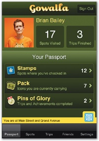
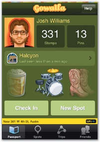
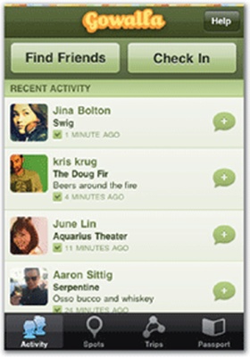
Figure 2-8. In its original version, Gowalla's main Passport view (left) put an emphasis on stats without even hinting at a check-in option. A later version (middle) replaced those stats with a chunky check-in button and an inviting display of your icon collection. In version 2.0, however, the Passport screen was demoted to the end of the tab bar, and the Activity screen became the first screen (right), emphasizing what's happening right now instead of your past history.