The Guinness world record for "most multifunctional" pocket knife belongs to Wenger, the company behind the storied Swiss Army knife. The company says the knife's 87 gadgets (including a laser pointer, cigar cutter, and golf reamer) can be used for no fewer than 141 functions. The $1400 gadget is a nifty feat of Swiss ingenuity and—who knew!—Swiss humor, too. Alas, weighed down by its three pounds of gizmos, this "most multifunctional" knife has no practical function at all, a pocket knife that doesn't fit in your pocket. This slice-n-dice Goliath was, of course, never really designed to be used. It was a novelty created for the company's 100th anniversary, a whimsical project to bring together every gadget the company ever included in its knives. At a certain point, as Wenger's craftsmen added more and more tools, the knife suddenly stopped being a knife, and it just became a doorstop.
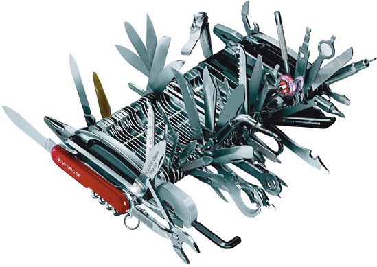
In geekspeak, you might call this a crowded interface. While the knife is obviously (and intentionally) ridiculous, it's a winking reminder that somewhere in the reptile part of our brains, a misguided instinct tells us that more is always better. More features, more preferences, more flexibility—the gizmo that does the most is always the best. In the end, of course, the best gizmo is the thing that lets us do what we need to do with the greatest ease. In mobile devices—whether it's a Swiss Army knife or an iPhone—that almost always means removing features and chrome, the buttons, icons, and other controls that often crowd an interface.
The last chapter encouraged you to trim your app's functions in the planning stage, whittling the app to a sharp focus on the most important features. Apply the same tapworthy filter to every onscreen element, too. Include controls only if they're likely to be used most of the time by most of your audience. Be ruthless when you consider every button and icon: Does this element invite attention? Is it clear what it does? Does it deliver something meaningful? Every tool should be tightly related to the primary task at hand, and auxiliary tools and content should be dispatched to a secondary screen or sliced out altogether. Text labels should be terse and words shouldn't be repeated.
It might seem harmless to add just one more icon, but every onscreen element comes with a cognitive cost for your users. It takes longer to scan the screen, longer to absorb the possible options, longer to figure out what you're supposed to do. Don't make 'em think. When every pixel is precious, your app doesn't have room for question marks that will snag users as they hustle through. It's like the pocket knife: it's easy to choose a blade to use when there's only one of them, but it takes forever when there are 87.
Just as you saw in the AccuWeather.com app, you don't have to show every last scrap of information all at once. Consider whether second-tier content and controls might be dumped entirely and, if not, nudge them over to a separate view in your app. The built-in Contacts app does this, for example, when you add or edit a contact. The main screen is a no-scroll view of the most common contact info; the app doesn't pester you about less frequent fields and instead provides an "add field" button at the bottom of the screen. From there, you can choose from among 12 additional fields to round out your contact info when the standard fields don't do the trick.
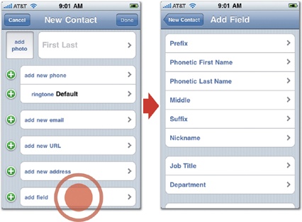
Figure 3-26. When you add a new contact, the Contacts app displays only a few primary fields (left). Tap the "add fields" button at screen bottom to go to a secondary screen (right), which offers 12 less common fields.
Apple is particularly clever about doing more with less. The company's software has a well-deserved reputation for both elegance and ease of use. It looks great, works intuitively, and drips with good taste. Like all good editors, Apple's designers do this in part by removing distractions and plucking out features that aren't relevant to mainstream users in order to focus more screen real estate and polish on the features that matter to the most people. What's not included in Apple's built-in iPhone apps is as important as what is.