National newspaper USA Today is known for its compact approach to news and its colorful graphic design. While other news outfits offer more depth, USA Today emphasizes efficiency, aiming to be the news source for business travelers and others looking for a quick-scan update about what's happening in the world. The newspaper's iPhone app reflects this priority on get-it-quick news with a design that cleverly packs lots of content into every view while also maintaining the newspaper's brand identity throughout.
USA Today turned to Mercury Intermedia to create the app. As vice president of creative development for Mercury, Rusty Mitchell was creative director for the project. Rusty shared his experiences wrestling with the challenge of making a content-rich app compact yet easy to explore.
Rusty Mitchell: USA Today is known for being more bold and colorful than traditional newspapers. Large color photos, graphics, and diagrams along with shorter news articles define the USA Today news experience. Its summarized approach to news delivery works especially well in a mobile context where people often only have a few minutes broken up throughout the day to skim and quickly find out what's going on in the world. We view mobile users as information snackers who often use their iPhones and other mobile devices to fill small gaps in their day—waiting in line at the grocery store, waiting for a friend at lunch. When we were developing the app, it was very important to us that its information load quickly and efficiently and be easily accessible with as few actions as possible.
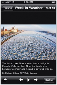
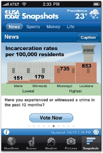
Figure 3-31. USA Today pioneered the use of colorful infographics in the news industry, and the newspaper's brand is as much about graphics as text. As a result, the app puts graphical content like photos, infographics, and weather on the same footing as more traditional news. The app's primary tab-bar navigation organizes content into five sections: Headlines (news), Scores (sports), Weather, Pictures, and Snapshots (infographics and polls).


