Your app's ever-flexible table views can bend to your audience's will, too. The standard table view has an optional editing mode to allow people to add, delete, or shuffle list items. Flip this option on when you want to let people manage or reorder a collection of personal content, like emails, to-do tasks, or other fleeting data that's just passing through. Most apps advertise this editing option with the familiar Edit button (page 148). Tapping the button reveals the standard deletion control and/or reordering control for each cell. (Behind the scenes, you decide which items you'll allow users to delete or move, and the controls appear only for those cells.)
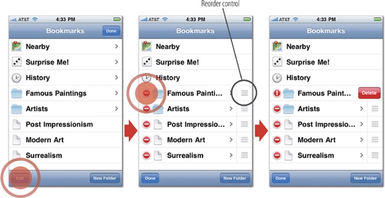
Figure 5-19. The Articles app for browsing Wikipedia uses standard editing controls in the table view for its Bookmarks screen. Tapping the Edit button (left) reveals the deletion and reordering controls (middle). Here, users may edit only some of the items in the list, while "Nearby," "Surprise Me!" and "History" are permanent fixtures with no edit controls. To delete an item, tap the red deletion control at left to reveal the cell's Delete button (right). To move an item instead, tap and drag the reorder control, the gripped handle located at the cell's right edge.
In this common setup, deleting a list item is a three-tap process: Edit button, deletion control, Delete button. This combo of standard controls makes for some clever defensive design by Apple, with enough taps to make accidental deletion unlikely, but not so many that it's a huge chore either. For even more flexibility, table views can also turn on the swipe-to-delete gesture for cells, letting users swipe from left to right across a list item to reveal its Delete button. While this requires just two steps instead of the tap-tap-tap dance of the Edit button, the swipe gesture is likewise difficult to do accidentally, another good example of defensive design. You'll learn more about this kind of gestural jujitsu for preventing mistaps in Awkwardness for Self Defense.
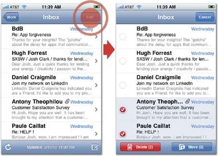
These built-in controls are tuned for letting people remove just one item at a time. That's swell for the occasional deletion, but if your app has people frequently striking batches of items at once, all that defensive design soon swamps people in repetitive swipe-and-tap combos. In that case, it's a good idea to develop custom controls to select multiple items at once, and then delete them all in one fell swoop. When you tap the Edit button in the Mail app, for example, a set of custom controls—round checkboxes—appear in place of the standard deletion control. You tap each item you want to select, and then tap Delete (or Move) to send all of them on their way. To make selection as easy as possible, Mail also makes the entire cell tappable; instead of tapping directly on the checkbox, you can tap anywhere in the item to check or uncheck it, a good practice. Wherever you can, always make tap targets big and forgiving.