People trust luxury. Right or wrong, if it looks good—if it looks expensive—it must be valuable. No matter what's going on under the hood of your app, its perceived value goes up when it looks opulent. Luxury brands have a perceived value that outstrips the cost of their basic materials, construction, or function. So it goes with iPhone apps: make it swank, make a customer. This isn't cynical marketing (well, maybe a little bit). It goes back to making the emotional connection that's so important for iPhone apps. The same sumptuous materials of beloved personal totems—a leather-bound notebook, a glossy gadget, a retro timepiece—can likewise be put to good use in your interface to conjure the same attachment. Of course, the luxury materials in this case are just pixels, and the cost of adding that coveted texture and gloss to your app is simply the talent of a good designer.
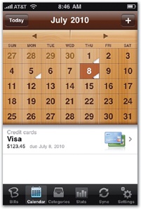
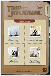
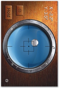
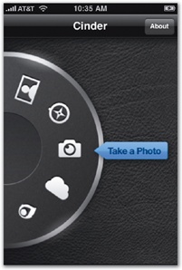
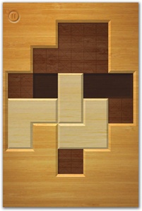
Figure 6-4. Organic textures add a sense of luxury to the design. Top: Bills on Your Table, iHandy Carpenter, and Cross Fingers. Bottom: Trip Journal, Cinder, and Jumsoft Money.
The warmth of wood or cork, the flat sheen of glass, the organic appeal of paper or fabric, the cold sophistication of metal—all of these real-world textures have associations that can bolster your app's visual identity. But your textures have to be good, and the light and shading have to be just so, or the luxury spell is broken. Unconvincing textures backfire with a cheap appearance, like pressboard imitating mahogany or plastic masquerading as metal. To work the luxury angle, your design sleight of hand has to be convincingly real.