GOOD CHEMISTRY with an app works a lot like it does with a person: much is decided in the first few moments. To draw people in and put them at ease, your app should be attractive, trustworthy, and approachable from the get-go. Elements that you might consider mere accessories—the app icon, launch image, and introductory screen—turn out to be essential to the first impression. When you don't get those things right, it's like showing up on a first date with dirty fingernails. It might not put you out of the running, but it doesn't exactly make you irresistible. A bad icon can dissuade people from even trying your app, and an unhelpful welcome for first-timers can leave them frustrated and nonplussed. Run a comb through your hair, and put on something pretty: this chapter describes how to design your app for love at first sight.
Business cards create expectations. When you hand someone a card, you give them information that goes beyond simple contact details. Heavy card stock? Printed on the inkjet at home? Flashy design? Color? Conservative font? Groovy image on the back? All these presentation decisions create an impression not only of the card's design but of the person handing it out. Your card has to be crisply informational while communicating your professional personality (or at least your company's). For people meeting you for the first time, that flimsy scrap of paper is one of the few things they use to form an opinion. The same goes for your app's icon in the App Store and on the iPhone Home screen.
Your icon is the first thing people see when they encounter your app. It's the primary element of your listing in App Store search results, pulling even more visual weight than the app's name. (When you browse App Store listings, the only info you get is the icon, name, and price. Even when you visit an app's detail screen, the icon is featured well above the screenshots that show what your app does.) Quality and polish in an icon suggest the same in the app itself and reassures customers considering a download. For such a tiny collection of pixels, the icon has disproportionate weight in the marketing and perception of your app. Give it disproportionate design attention. If you're not a designer yourself, consider hiring one for at least this one aspect of your app. It's important.
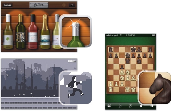
Icons are constantly shoulder to shoulder with other icons, and your icon design has to stand out in a lineup—it should have a look of its own. Color is a good place to start: fields of blue or green are all too common for icons, and choosing something different is immediately helpful. Draw from your app's interface for inspiration. If your app has an unusual design metaphor, color scheme, or personality, consider how those might be reflected in the icon, too. When the app delivers on the expectation created by your icon, you create trust and confidence, and making your app borrow directly from the interface is one way to do that.
Figure 7-2. Borrow color, style, and texture directly from an app interface to create recognition and fidelity. Clockwise from top left: Cellar, Deep Green, and Canabalt.
Make your icon colorful, make it memorable, make it fun, but whatever you do, don't make it mysterious. The app icon is fundamentally an advertisement, and like any good ad, it has to be clear what it's selling. The icon should picture, in a very direct way, something tapworthy and intimately related to your app. This can be a visual description of its function, its interface, its name, or its brand. As always in the mobile environment, don't make people think too hard or take a second look. Think of the icon as a packaging label—it's great if it's pretty, but it's even more important that it be descriptive and identifiable at a glance, for both branding and usability. Avoid cryptic or inscrutable imagery, and don't be overly clever with the visual metaphors. More commerce, less art.
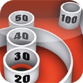
The Iconfactory learned this lesson the hard way with Ramp Champ, the company's gorgeously atmospheric Skee-Ball-style iPhone game. A handsome but obscure icon combined with an ambiguous name to confuse App Store shoppers. In hindsight, the developers believe the icon reduced sales. "While the icon itself is unique and stands out in the App Store, it's still cryptic, and people didn't understand it," says Iconfactory principal Craig Hockenberry. "They didn't get it, and they weren't enticed to click beyond it. One of the things we learned from Ramp Champ is that icons need to be more literal even when that's not always the best looking design."
Figure 7-3. The Ramp Champ icon (left) has a bold and unique design, but the blandly descriptive icon for a similar game, Skee-Ball from Freeverse (right), is more effective.
There are several ways for well-designed icons to be descriptively literal. As you've already seen, icons for apps with distinctive designs can visually quote that design, creating a kind of preview of the app itself. While that approach might hint at the function of the app, the focus is on emphasizing the app's look and feel, a good approach when the app's design merits it. A more direct route focuses on the function of the app and what it does for you. Like a reliable road sign, this style of icon uses an explanatory symbol to show you where you're headed. The challenge here is to be descriptive without being generic so that the icon maintains a unique personality. Beware of crowded categories and iconography by herd: with few exceptions, nearly all of the iPhone's jillion to-do list apps use a checkmark for their icon, and developers of photography apps can't seem to resist the image of a camera lens. Be descriptive, not duplicative. Some successful examples:
Figure 7-4. Some icons focus on function. From left: Cha-Ching, an expense tracker; Kineo, a flipbook app; cab4me, a taxi locator; Cocktails+, a cocktail recipe app; Lose It!, a calorie tracker; and Delivery Status Touch, a package tracker.
Some apps tackle jobs that are too abstract to be easily described by a simple pictogram. A fallback in that case is to make an icon that instead illustrates the app's name, in effect building a visual brand around the title itself. This route can be risky since the icon offers little clue about what the app does or what it looks like, making it even more important that the icon bear enough interest, design quality, or personality to reassure (or at least intrigue) potential customers. The advantage, though, is that this approach often yields icons that stand out from those around them:
Figure 7-5. Some icons focus on name. From left: Aardvark Mobile, RedLaser, Birdhouse, MoneyBook, Ego, and Cellar Rat.
This self-referential approach is particularly effective when your app is for a brand that's already well-established with your audience. In that case, lean on your logo, since it's already loaded with instant meaning for your customers:
Figure 7-6. Logo-inspired icons from left: Yellow Pages, FedEx, Twitterrific, myStarbucks, Flickr, and NASA.
For brands that are exceptionally well-established with their audience, a simple logotype of just a letter or two cuts a clean, easily identified profile. You might've already heard, though: there's just a limited number of letters in the alphabet. That means the letter gambit can collide with other icons. The approach is most effective for brands with an established text logo and a readily recognized typeface:
Figure 7-7. Logotype icons from left: New York Times, Facebook, GQ, PayPal, Skype, and Wall Street Journal.
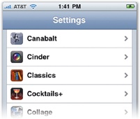
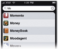
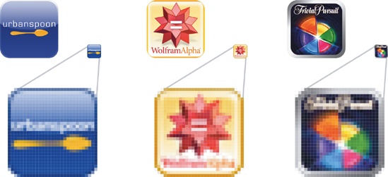
Don't go overboard with text in your icon. One or two letters look great, and if you have a well-known logotype (like FedEx, Yelp, or NPR), that works, too. Apart from those examples, avoid stamping your app's name on your icon or, worse, adding several words of descriptive text. The best icons rely on visual descriptions; if you're resorting to a text label, you probably haven't explored all the options. Remember, too, that your icon is always accompanied by a text label—the app's name—in the App Store and on the iPhone Home screen, and there's no need to spray it across the icon itself. More crucially, text adds too much visual detail to the icon and doesn't reduce well for the tiny version displayed in the iPhone's Spotlight search results and Settings app: when quickly scanning a screenful of icons, the eye already reads icon text as noise; in the miniature search version, it's just an illegible scribble.
Figure 7-8. Top: The Settings app (left) and Spotlight screen (right) display miniature versions of your icon.
Figure 7-9. Bottom: Even at full size, the text in these icons isn't easy to read. In the small format of the Settings app and Spotlight screen, it's impossible.
See, text muddies the overall silhouette of the icon. The best icons emphasize a single overall shape. You can and should use subtle detail to create lustrous light effects, rich textures, and 3-D realism, but it's the outline of the primary image that's most important. The foundation of your design should be a simple shape that can be identified at a glance. You know you're off to a good start if you can flip on your desk lamp and reproduce your icon's shape as a shadow puppet. Avoid making the image too busy or complicating it with multiple figures. If your icon absolutely has to juggle more than one shape, handle them carefully, making sure that they're all visually distinct and their interaction is clear. Although you can afford more artistic license in app icons than toolbar icons (page 194), the fundamental rule is the same: clarity of meaning is the priority.
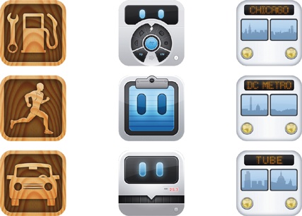
The importance of a clean silhouette has always been a staple of good logo design, and your app's icon is exactly that: a logo for your app. In concert with the interface design, your icon creates your app's visual brand. Thinking more broadly, if you have a suite of apps, it's worth considering how you might build a coherent brand around all of them. Tapbots and App Cubby are two development shops with apps featuring a complementary interface style (retro machinery for Tapbots, a wood-grain theme for App Cubby), and their icons are similarly consistent across all their apps. App developer iTrans likewise uses nearly identical icons for its city transit apps, mixing it up by changing the city name and skyline reflected in the icon's windshield.
