Depending on the interface you're flipping, the actual code to support screen rotation can actually be quite simple. Under the hood, the operating system essentially lets programmers flip a switch that says, "this screen can rotate." From there, the system handles the rest, animating the screen rotation and reflowing the content to fit the new orientation. For fairly simple layouts like basic lists or a big chunk of text, that may be all that you need to do, case closed. With more complex designs, however, adding a landscape view boils down to creating an entirely new layout and even pruning features.
Consider Twitterrific's screen for composing new messages. It's a carefully composed portrait layout with tabs to switch among different types of tweets, making it easy to choose whether you're tweeting a new update, a reply, or a direct message. Tapping the eyeball-shaped "peek" button slides away the keyboard to show you the tweet you're replying to, handy for checking details. Great, but how do you reformat all that twittery goodness into a landscape view? "It's one of the reasons we haven't done a horizontal layout," says Gedeon Maheux, one of the app's designers. "None of us are willing to sacrifice the ease of those tabs, but if you keep them in a horizontal layout, you'd see only one or two lines of the tweet, and that's no good. You'd also have to lose the peek feature, so it would be a totally different thing—a whole new interface. It's not an easy thing to figure out." Changing orientation in Twitterrific's case, in other words, would mean not only a redesign, but very likely some lost features in that view, too. That kind of trade off isn't unusual, and it's important to consider whether the benefits of a landscape view remain even after some of the bells and whistles fall away.
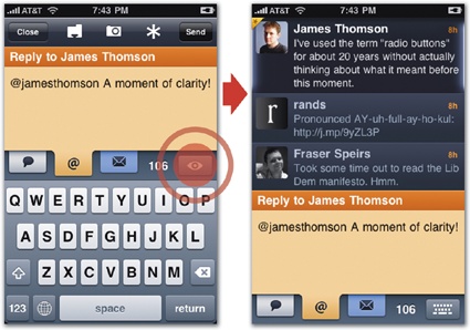
Figure 9-6. Twitterrific's screen for writing new tweets offers more tools than can easily squeeze into a landscape view. Its colored tabs let you choose whether you're posting a new tweet, reply, or direct message. Tapping the eyeball-shaped "peek" button (left) slides away the keyboard to let you refer to your Twitter stream (right).
The question grows more complicated when the features that go missing also affect the user's content. The PCalc scientific calculator app, for example, supports hexadecimal math in some landscape layouts but not some portrait layouts. What to do if someone is merrily doing their fancy hex math and then rotates to a layout that doesn't know about hexadecimal numbers? "What I ended up doing was switching back to regular decimal numbers in the portrait layout, but the app remembers the settings separately for each orientation," says developer James Thomson. "So when the user switched back to landscape again, it would remember and go back to hexidecimal." Supporting different landscape and portrait layouts in this case is almost like supporting two different apps, each with their own parallel settings.
There's often a lot more to it than just tipping your design sideways. Even for relatively simple layouts, there are still a few factors to keep in mind when designing your landscape version.
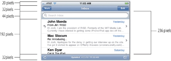
Navigation bars and toolbars get squished. In landscape orientation, vertical space is at a premium, and the iPhone OS buys you a few extra pixels by squeezing its toolbars. The navigation bar and toolbar both shrink from 44 pixels tall to just 32 pixels (search bars meanwhile hold steady at 44 pixels). Plan ahead to make sure that any custom toolbar icons and buttons fit under these low ceilings. You'll be in good shape if you design buttons according to the specs described back in Designing Custom Toolbar Icons: toolbar and navigation-bar icons should be 20 × 20 pixels.
Start in portrait. Your app should always launch itself in portrait orientation. This matches both the iPhone Home-screen orientation and, presumably, your launch image, too. Once your app loads, it should check the device's orientation and rotate to landscape if necessary. (This doesn't apply, of course, to apps that are landscape-only; they should launch directly into landscape.)
Mind your animation. The iPhone handles the fancy rotation effect automatically, and it takes care of you just fine when you're using essentially the same design for both landscape and portrait. For more complex layout changes, though, a little extra help makes the transition go more smoothly. Add a custom animation—a cross-fade, for example—to make one layout dissolve into the other, or use animations to move controls and other interface elements that vary between the two orientations. Don't go too heavy on the razzle dazzle, though. The goal should be to make the mechanical aspect of the rotation itself as inconspicuous as possible, not call attention to it.
Go every which way. Make sure you handle rotation when you go either clockwise and counterclockwise—possibly even upside down, too, if that suits your content and audience. The built-in Voice Memos app, for example, rotates into place when you flip the device on its head, letting you hold the device so that the phone's microphone is more conveniently accessible at the top.
All or nothing. Offering both landscape and portrait orientations is an all-in game. If you add landscape to one screen, add it to all of them. Otherwise, you're asking people to guess through trial and error which screens flip and which don't. Worse, landscape-lovers will have to flip from their preferred orientation for screens that offer only a portrait view and then back again for screens that offer landscape. Go easy on their wrists and support both orientations for every screen. As always, exceptions, exceptions—follow this rule except when you shouldn't. Video and other rigidly formatted media can (and often should) be landscape-only, and it's okay to force people to rotate for that. Similarly, other screens just don't fit landscape orientation in either design or purpose. In those cases, forcing them into landscape complicates the user experience even more than blocking rotation in the first place.