Always use your quiet voice. Alerts let people know something's not right, but they should also reassure, and the best way to do that is to use language that is calm, crisp, and descriptive. That goes for all the copywriting in your app, but it's doubly important to keep a cool demeanor in alerts. (You already know, right, that exclamation marks and all-caps text make you seem a little hysterical?) Take a breath. Fashion your alert messages with care, describing the situation clearly, directly, and with just enough information that people understand their options where appropriate.
Alerts are composed of three elements: title, message text, and buttons. Take care not to repeat yourself in those elements or waste space with instructions that are obvious from context ("tap the Settings button to change your settings"). You can often strike the message text completely, relying only on the alert's title to deliver the message, with button labels giving enough context to decide which button to tap. A common approach for that is to make the message title a question, with buttons as the answers. Message text or no, just keep it short. You'll start to lose people with more than a sentence or two—or worse, long messages get clipped and require scrolling. Balance your brevity with clarity, though, and avoid blandly nondescript titles like "Error."

Just because alert messages should themselves be short, that doesn't mean you can't use them to offer a fast track to more information. User experience guru Kathy Sierra often advocates the use of a WTF?!? button, a panic button that you offer when things aren't working the way your audience might expect or understand—the same context as an alert box. A WTF button reassures people that they're not dumb, acknowledges that they've entered a trouble zone, and offers a way to get further help or explanation. Our friend Emily Post might question the etiquette of slapping the WTF label on a button, and of course you should, too. WTF describes your audience's state of mind, not the actual text you should use. "Help," "More Info," or "What Now?" are all good options for moments when you anticipate people might have a WTF moment.
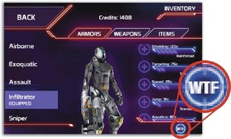
Figure 10-3. The game Eliminate Pro actually does include a WTF button on some screens to explain some of the app's more esoteric settings. (The game's developers coyly suggest WTF stands for "where to find it.")
Whatever buttons you include in an alert, be careful choosing not only their text labels, but also their placement and color, which together hint at the app's recommended option—the default button. Alert buttons come in two shades, light or dark, and the default button should always be light-colored, appearing at the right side of a two-button alert. For these two-button ditties, favor active verbs like Cancel, View, or Allow. (In single-button alerts, the button typically signals acceptance; OK is the standard label there, and it's always light-colored.)
For an alert warning about a potentially risky or destructive action, the Cancel button should be the default. For an alert suggesting a harmless recommended action, that action's button should be the default, and Cancel should take the back seat, over to the left. Alert messages should be calm and collected, and that means their default buttons should always favor the safest path.