LIME stands for Local Interpretable Model-Agnostic Explanations. LIME can explain the predictions of any machine learning classifier, not just deep learning models. It works by making small changes to the input for each instance and trying to map the local decision boundary for that instance. By doing so, it can see which variable has the most influence for that instance. It is explained in the following paper: Ribeiro, Marco Tulio, Sameer Singh, and Carlos Guestrin. Why should I trust you?: Explaining the predictions of any classifier. Proceedings of the 22nd ACM SIGKDD international conference on knowledge discovery and data mining. ACM, 2016.
Let's look at using LIME to analyze the model from the previous section. We have to set up some boilerplate code to interface the MXNet and LIME structures, and then we can create LIME objects based on our training data:
# apply LIME to MXNet deep learning model
model_type.MXFeedForwardModel <- function(x, ...) {return("classification")}
predict_model.MXFeedForwardModel <- function(m, newdata, ...)
{
  pred <- predict(m, as.matrix(newdata),array.layout="rowmajor")
  pred <- as.data.frame(t(pred))
  colnames(pred) <- c("No","Yes")
  return(pred)
}
explain <- lime(dfData[train, predictorCols], model, bin_continuous = FALSE)
We then can pass in the first 10 records in the test set and create a plot to show feature importance:
val_first_10 <- validate[1:10]

explaination <- lime::explain(dfData[val_first_10, predictorCols],explainer=explain,
                              n_labels=1,n_features=3)
plot_features(explaination) + labs(title="Churn Model - variable explanation")
This will produce the following plot, which shows the features that were most influential in the model predictions:

Note how, in each case, the bad_var variable is the most important variable and its scale is much larger than the other features. This matches what we saw in Figure 6.6. The following graph shows the heatmap visualization for feature combinations for the 10 test cases:
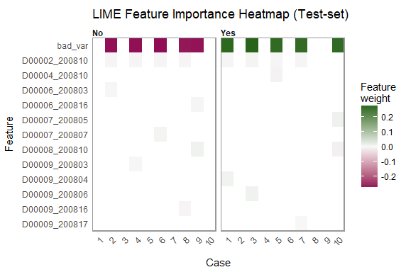
This example shows how to apply LIME to an existing deep learning model trained with MXNet to visualize which features were the most important for some of the predictions using the model. We can see in Figures 6.7 and 6.8 that a single feature was almost completely responsible for predicting the y variable, which is an indication that there is an issue with different data distributions and/or data leakage problems. In practice, such a variable should be excluded from the model.
As a comparison, if we train a model without this field, and plot the feature importance again, we see that one feature does not dominate:

There is not one feature that is a number 1 feature, the explanation fit is 0.05 compared to 0.18 in Figure 6.7, and the significance bars for the three variables are on a similar scale. The following graph shows the feature heatmap using LIME:
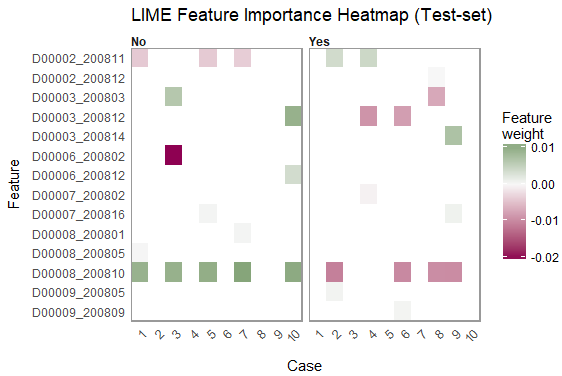
Again, this plot shows us that more than one feature is being used. We can see that the scale of legend for the feature weights in the preceding graph is from 0.01 - 0.02. In Figure 6.8, the scale of legend for the feature weights was -0.2 - 0.2, indicating that some features (just one, actually) are dominating the model.