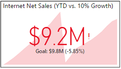
The standard Key Performance Indicator (KPI) visual in Power BI Desktop compares an indicator measure relative to a Target measure. The variance between the indicator and the target is displayed in the visual and is used to drive the color formatting (for example, red = bad; green = good). For many measures, a corresponding target measure may need to be created that applies some calculation logic to an existing measure. The following measure is simply 10% greater than the previous year's year-to-date net sales:
Target: 10% Above PY YTD Internet Sales = [Internet Net Sales (PY YTD)] * 1.10
In a standard KPI visual, the target measure is displayed as the goal and used to calculate the variance percentage between the indicator and the target. In the following example, a $9.2M indicator value Internet Net Sales (YTD) is 5.8% below the 10% growth target measure of $9.8M:

Several other common visuals in Power BI benefit from target measures, including the bullet chart and the gauge visual. Several of these visuals can use multiple target measures to define alternative thresholds, such as the min and max values displayed.
The LOOKUPVALUE() function is particularly useful because it ignores the current filter context. As shown in the examples in the following section, the LOOKUPVALUE() function can be relied on to provide the same input value to other measures, such as a date or a number referring to specific date rows, regardless of any filters applied in the report.