An initial step in the visualization selection process is to determine whether a table, a chart, or a combination of both is most appropriate. Power BI's table visual provides simple row groups of dimension values and measures, and the matrix visual supports both an X and a Y-axis field like a pivot table in Excel. Both the table and the matrix visuals are superior to charts in enabling users to look up specific data points. However, despite conditional formatting options available to table and matrix visuals, charts are superior to table and matrix visuals in displaying trends, comparisons, and large volumes of distinct data points.
The following matrix visual breaks down the AdWorks Net Sales measure by two product dimension columns and two promotion dimension columns:
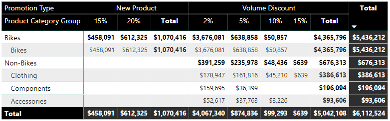
The product hierarchy created in Chapter 9, Designing Import and DirectQuery Data Models is used as the rows' input and a promotion table hierarchy is used as the columns' input. Via the expand all down feature for both the rows and the columns, the matrix provides easy access to specific data points, including subtotals by both product categories and promotion types. Although it's clearly possible to visualize the same data with a chart, a matrix visual (or a table visual) makes it easy to locate individual values and to display the exact values with no rounding.
Additionally, if a table or matrix is needed to reference individual values but less precision is required, the field formatting card in the formatting pane allows the report author to define the display units (for example, thousands (K), millions (M)) and the number of decimal places for the measure. The same two formatting properties (display units and value decimal places) are also accessible for chart visuals via the data labels formatting card in the formatting pane.
The following line chart visual breaks down the AdWorks Net Sales measure by the calendar year week:
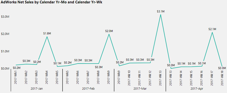
With 18 different data points displayed, the periodic spikes of the line help to identify the specific weeks with relatively higher net sales. In this example, the AdWorks Net Sales measure is highest in the fourth or last week of the month and is especially higher at the end of March—the first quarter. The drawback or tradeoff of this visual relative to the prior matrix visual is the lack of subtotals and the loss of precision given the rounding to one decimal place.
Line charts are uniquely advantaged to call out patterns, trends, and exceptions in measures across time. More generally, chart visualizations (for example, bar, column, scatter) are recommended over table and matrix visuals when the shape or position of the data, such as trends, comparisons, correlations, and exceptions, is more valuable than the individual values.