Line, column, and bar charts are the most common chart visualization types given their advantages in visual perception, as explained in the Visualization best practices section. Power BI includes clustered and stacked versions of column and bar charts in addition to two combination charts that display both a line and either a clustered or stacked column.
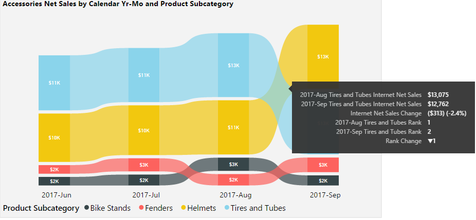
The ribbon chart visualization was added to Power BI Desktop in September 2017 and represents a variation of the stacked column chart. Unlike the stacked column chart, the ribbon chart sorts the category items within each column based on their values and connects the items across columns with a ribbon.
In the following example of a ribbon chart, four product subcategories are displayed across months by their net sales:

Helmets subcategory overtook the Tires and Tubes category in September 2017 to become the top-selling product subcategory in the visual. Per the tooltip included in the preceding image, hovering over the curved ribbon connecting the months on the X-axis displays the values for each month, the variance and percentage change between the months, and the change in rank for the given category (for example, from first to second for Tires and Tubes). Insights into the rankings of categories and their changes across periods wouldn't be as easily identified in a standard stacked column chart.