A critical use case for many reports is mobile access via the Power BI mobile applications for iOS, Android, and Windows platforms. A report that is perfectly designed for a laptop or PC monitor may be difficult to use on a tablet or mobile device. To account for multiple form factors, including both small and largescreen phones, report authors can create mobile-optimized reports via the Phone Layout view in Power BI Desktop.
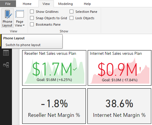
In the following example, the Phone Layout of a report page in Power BI Desktop is accessed via the View tab:
From the Phone Layout view, the visuals created and formatted for the report page can be arranged and sized on a mobile layout grid. In the following example, the two KPI and card visuals included in the preceding image from the Report View, as well as a line chart, are arranged on the phone canvas:
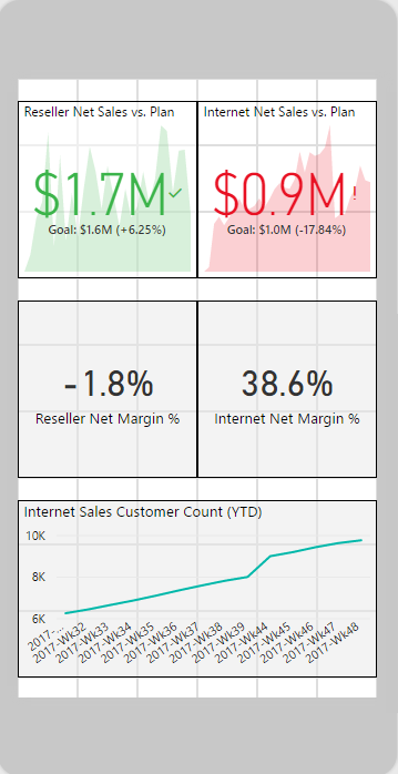
The size and position of visuals can be adjusted by dragging visual icons along the phone layout grid. A mobile-optimized layout can be defined for each report page or any number of the pages contained in a report. The formatting and filter context of report visuals is always aligned between the Phone Layout and the default Report View. For example, to change the format or filter for a visual accessed via the Phone Layout, the visual can be modified from the standard Desktop Layout view.
When a report page is accessed from the Power BI mobile application, the Phone Layout created in Power BI Desktop will be rendered by default in the phone report mode. If a phone-optimized layout doesn't exist, the report opens in landscape view.