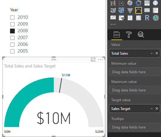
The Gauge visual displays a single value within a circular arc and its progress towards a goal or target value that we specify. The Target Value is represented by a line within the arc. With our current data set, we do not have a measure that we can use to illustrate an accurate business goal, so we will have to create it. Before we set up this visual, we will need to create a new calculated measure.
Let's look at, setting up the example:
- We will be using the Total Sales measure as our value in the Gauge visual. Our target will be 10% more than the previous year's total sales, so we need to use DAX to create this measure.
- Right-click the Internet Sales table and select the New Measure option, which would bring us to the formula bar.
- Name the measure Sales Target, and use the following DAX formula to get our target:
Sales Target = [Prior Year Sales] * 0.1
Now that we have all the measures we need, lets set up the gauge visual and create our first KPI.
Let's look at, setting up the visual:
- Select the Gauge visual and move/resize it as you see fit.
- For the Value section, select the Total Sales measure.
- Select our newly created Sales Target measure for the Target Value area. Upon selecting this measure, it will not automatically be populated for the Target Value, so you will need to move it.
Using a Slicer visual alongside this KPI will be really helpful with our data set. Go ahead and add the Slicer visual using the Year field for the value. If you choose the year 2008, you will see that the value changes along with the target, as seen in Figure 5-18. With our dataset, the year 2008 is where we have our most recent transactions, and because of this visual, we can see that we have still not met our goal. If you look at any of the other previous years, we can validate that we were able to surpass our target every time:
