As of the November 2017 release, Power BI currently provides four map visuals including the bubble map, filled map, shape map (in preview), and the ArcGIS Map. The bubble map plots location points over a world map and varies the size of the bubbles based on a value. The points on bubble maps can also be broken out across a dimension to provide additional context. The filled map and shape map visuals are forms of heat maps that use color and color intensity to distinguish specific areas of a map by a value, such as postal codes by population.
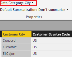
Per the Data category section in Chapter 9, Designing Import and DirectQuery Data Models, it's important to assign geographic data categories to columns. This information aids the map visuals in plotting the correct location when a value is associated with multiple locations (ambiguous locations). The following image from the Data view highlights the city category for a column:
Additionally, for bubble and filled map visuals, hierarchies can be added to the location field well to avoid ambiguous results. For example, by adding the following hierarchy to the Location field well, the map visuals will only use the locations associated with their parent values, such as only the states of Australia.
