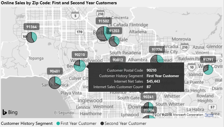
Bubble maps are particularly useful when embedding an additional dimension column or category to the legend input. When a geographic boundary column, such as country or postal code, is used as the location input, the added dimension converts the bubbles to pie charts of varying sizes. Larger pie charts reflect the measure used for the Size input field and the components of each pie are color-coded to a value from the legend column providing even greater context.
The following bubble map example uses the postal code as the location input, the Internet Net Sales measure as the size input, and the Customer History Segment column as the legend input:

For this map, the Grayscale theme is applied from the Map styles formatting card and the auto-zoom property under the Map controls card has been disabled. These two settings, along with a bubble size of 15% via the Bubbles card, makes it easy for users to analyze the data associated with postal codes north of Los Angeles.
See the Customer history column section of Chapter 8, Connecting to Sources and Transforming Data with M for details on creating a history segment column within an M query.