Up to this point, you have spent some time importing data and modeling it to your specifications. In this chapter, we will take that hard work and begin to visualize the data in efficient and effective ways. The most common association with Power BI for consumers is the ability to create very impactful visualizations of data, and there are many options available to do this. In this chapter, we will look at all the various options that are available to you within the Power BI Desktop application. Additionally, we will take a brief glimpse at the additional visualization options that are available through the Custom Visuals Marketplace. The topics detailed in this chapter are as follows:
- Data visualization basics
- Visuals for filtering
- Visualizing tabular data
- Visualizing categorical data
- Visualizing trend data
- Visualizing KPI data
- Visualizing geographical data
- Leveraging Power BI custom visuals
- Data visualization tips and tricks
At the time of this book's publication, there are 30 readily available visuals in the Power BI Desktop application; this includes the Shape map visual that is in the preview options. We will be exploring most of them and how they best work with certain types of data sets to bring the model we have worked on until this point to life!
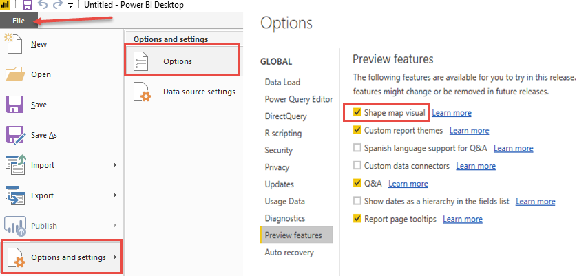
How to turn on Preview Features can be seen here:
