At the start of Chapter 8, Create a Single-Page App Using Angular’s Router, you saw a mock-up of the customer detail view. We’re going to build this page now to learn about the true power of Bootstrap—its grid. We’ll also examine some of Bootstrap’s many components, which will allow us to create a polished and visually appealing user interface.
We’ll tackle this topic in three parts. First, I provide some background on grid-based design. This will help you understand why Bootstrap is based on a grid, and how you can break down any UI into grids to make your work easier. Next, you’ll lay out the customer detail screen I hinted at in the previous chapter, using Bootstrap’s grid to make it easy. Finally, you’ll use various Bootstrap components, such as panels and labels, to polish up our UI. By the end of the chapter you’ll have a solid foundation in building user interfaces with Bootstrap, and even a bit of confidence in designing them yourself. You’ll still be a far cry from being a “real” web designer, but you’ll be able to do common, simple tasks on your own.
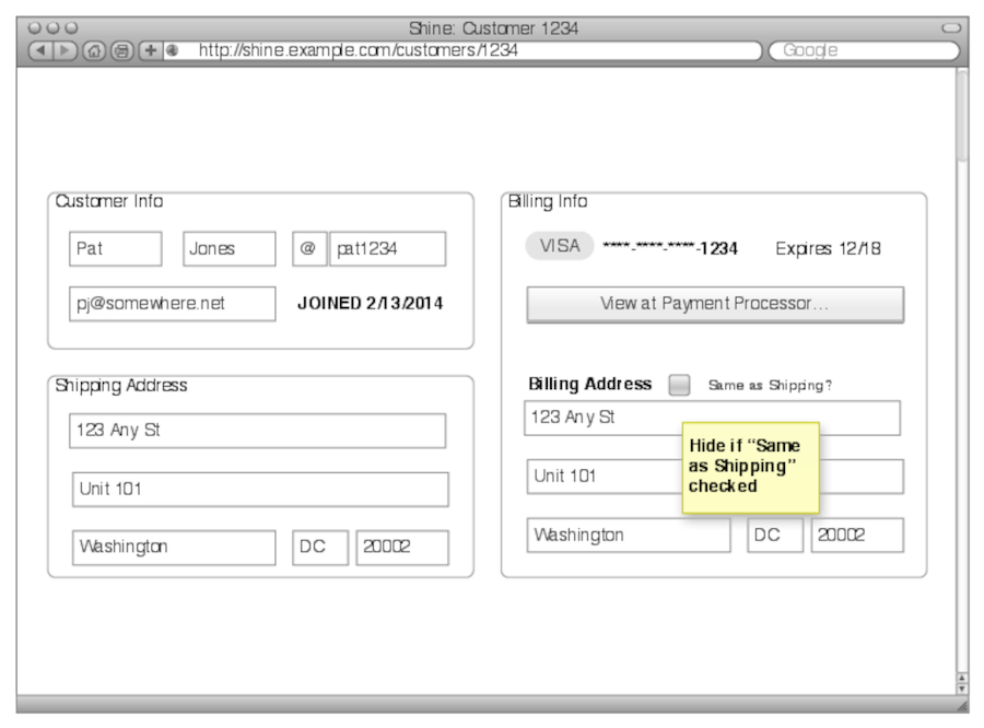
You saw the mock-up in the previous chapter, but here it is again, in a slightly expanded form, so you know where we’re headed:
Now, let’s learn about the grid and how it helps create user interfaces.