
Bootstrap’s grid is quite powerful, especially if you’ve never used one before. In this section, we’ll build the layout for our view using Bootstrap’s grid. As we saw in the previous section, our layout starts with two equal-sized grid cells: one that holds the customer information and shipping address, and the other that holds the billing information.
First, we’ll create these cells, which will demonstrate the various CSS classes needed to enable Bootstrap’s grid. Then, we’ll see how the grid can nest within itself to lay out the customer information and shipping address as a grid-within-a-grid.
The most obvious grid in our design is one that holds the two main columns, each taking half the available space. To do this, we’ll create two nested div tags inside a parent div, giving each the appropriate CSS class—provided by Bootstrap—to lay it all out in a grid (see here for some details on why we’re using divs).
The outer div has the class row, which tells Bootstrap we’re going to place columns inside it. The divs inside the row have class col-md-X, where X is the number of columns, out of 12, that this particular column should take up. Because we want two equal-sized columns, we want each of our columns to take up six of Bootstrap’s. Thus, each div will get the class col-md-6 (see Chapter 13, Dig Deeper for what the -md- means).
We can add this markup to app/javascript/CustomerDetailsComponent/template.html, replacing the bare-bones markup we had there from the last section.
| | <section class="customer-details" *ngIf="customer"> |
| | <form><div class="row"> |
| | <div class="col-md-6"> |
| | <h1>Customer</h1> |
| | </div> |
| | <div class="col-md-6"> |
| | <h1>Billing Info</h1> |
| | </div> |
| | </div></form> |
| | </section> |
If you bring this up in your browser, you’ll see that our two headings are shown side by side:
Now, let’s tackle the content inside these columns. As we saw earlier, we can think of each section of our page as having a nested grid inside this one. Bootstrap’s grid works exactly this way.
Bootstrap’s grid is not a fixed width, so whenever you write <div class="row">, Bootstrap will divide up the grid in that row based on the available space. This is a powerful feature of the grid system. Much like how we decompose complex objects into smaller ones to make our code easier to understand, we can decompose larger views into smaller ones using the grid.
By thinking of each page’s component as a grid, we can design that component without worrying about where it is on the page. Bootstrap’s grid components will make sure it works.
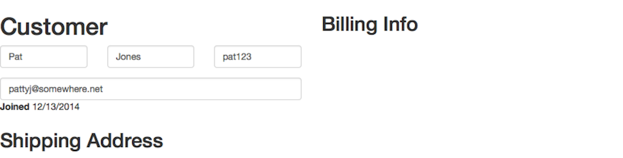
Let’s style the customer information section using the grid. We can see from our mock-up that we have three rows, and the first row has three columns. Since the second and third rows just have one column that takes up the entire row, we don’t need to use the grid markup for them. So, we just need to create a grid for the first row.
We’ll be using the form classes we saw in Chapter 2, Create a Great-Looking Login with Bootstrap and Devise, so hopefully this will look familiar. The first name, last name, and username are all about the same size data-wise, so we can create three equal-sized columns for them. Because Bootstrap’s grid is 12 columns, we want each of our columns to take up four of Bootstrap’s columns, so we’ll use the class col-md-4 on each div.
| | <section class="customer-details" *ngIf="customer"> |
| | <form><div class="row"> |
| | <div class="col-md-6"> |
| | <h1>Customer</h1> |
| » | <div class="row"> |
| » | <div class="col-md-4"> |
| | <div class="form-group"> |
| | <label class="sr-only" for="first-name">First Name</label> |
| | <input type="text" class="form-control" |
| | name="first-name" value="Bob"> |
| | </div> |
| | </div> |
| » | <div class="col-md-4"> |
| | <div class="form-group"> |
| | <label class="sr-only" for="last-name">Last Name</label> |
| | <input type="text" class="form-control" |
| | name="last-name" value="Jones"> |
| | </div> |
| | </div> |
| » | <div class="col-md-4"> |
| | <div class="form-group"> |
| | <label class="sr-only" for="username">Username</label> |
| | <input type="text" class="form-control" |
| | name="username" value="bobert123"> |
| | </div> |
| | </div> |
| » | </div> |
| | <div class="form-group"> |
| | <label class="sr-only" for="email">Email</label> |
| | <input type="text" class="form-control" |
| | name="email" value="bobbyj@somewhere.net"> |
| | </div> |
| | <label for="joined">Joined</label> 12/13/2014 |
| | <h2>Shipping Address</h2> |
Note that we used form-group on a different element as col-md-4. This isn’t technically required but is commonly done to separate concerns. Generally, you want classes used for your grid to be separate from classes used for styling so that you can be sure your grid doesn’t get messed up by styling classes. Also, we can add more styling later without worrying about how the grid will affect it. Take a look at what we’ve done in our browser (see the following figure), and you can see that it looks pretty good!
Up to now, we’ve created grid cells that are all the same size. Let’s lay out the shipping address part of our page, which requires that some of the grid cells be larger than others.
The main columns of our view, as well as the user information, all used grid cells of the same size. That won’t work for the address views, since the city, state, and zip code are all different sizes. It also won’t work for the credit card information view, because the card number and type can be quite long, but we still need room for the button that will (eventually) take the user to the payment processor’s page for the customer’s card.
In this section, we’ll style both of these views using different grid sizes. The result will be a cohesive, well-laid-out page, even though the grid cells aren’t the same size.
First, we’ll start with the addresses.
In a typical U.S. address, the state code is short—two characters—and the zip code is typically five or nine characters. So, let’s make a column for the city—which is usually longer—that takes up half the available space. In the remaining half, we’ll give the zip code two-thirds of the remaining space, leaving the last third for the state code.
That works out to six columns for the city, two for the state code (since 6 ÷ 3 is 2), and the remaining four for the zip code (the two street address lines can use up an entire row each, so we don’t need the grid markup for them).
| | <h2>Shipping Address</h2> |
| | <div class="form-group"> |
| | <label class="sr-only" for="street-address"> |
| | Street Address |
| | </label> |
| | <input type="text" class="form-control" |
| | name="street-address" value="123 Any St"> |
| | </div> |
| | <div class="form-group"> |
| | <label class="sr-only" for="street-address-extra"> |
| | Street Address Extra |
| | </label> |
| | <input type="text" class="form-control" |
| | name="street-address-extra" value="Unit 101"> |
| | </div> |
| » | <div class="row"> |
| » | <div class="col-md-6"> |
| | <div class="form-group"> |
| | <label class="sr-only" for="city">City</label> |
| | <input type="text" class="form-control" |
| | name="city" value="Washington"> |
| | </div> |
| | </div> |
| » | <div class="col-md-2"> |
| | <div class="form-group"> |
| | <label class="sr-only" for="state">State</label> |
| | <input type="text" class="form-control" |
| | name="state" value="DC"> |
| | </div> |
| | </div> |
| » | <div class="col-md-4"> |
| | <div class="form-group"> |
| | <label class="sr-only" for="zip">Zip</label> |
| | <input type="text" class="form-control" |
| | name="zip" value="20001"> |
| | </div> |
| | </div> |
| | </div> |
You can repeat this markup for the billing address, which just leaves us the credit card information section to style.
The credit card area has two distinct parts: the card information itself, and the button that will link the user to the payment processor’s page for that card. We’ll give the card information seven of the twelve columns, and use the remaining five for the button (these values might seem somewhat magic, and they were arrived at experimentally—feel free to change them and see how it affects the layout, making sure everything in the row adds up to 12).
| | <div class="col-md-6"> |
| | <h2>Billing Info</h2> |
| » | <div class="row"> |
| » | <div class="col-md-7"> |
| | <p> |
| | ****-****-****-1234 |
| | VISA |
| | </p> |
| | <p> |
| | <label>Expires:</label> 04/19 |
| | </p> |
| | </div> |
| » | <div class="col-md-5 text-right"> |
| | <button class="btn btn-lg btn-default"> |
| | View Details… |
| | </button> |
| | </div> |
| | </div> |
| | <h3>Billing Address <input type="checkbox"> Same as shipping? </h3> |
| | <!-- Same markup as used for the shipping address --> |
Note that we’ve used the helper class text-right on the button so that it aligns to the right side of the grid, and thus stands apart from the card info. Previously, we used pull-right to achieve this in our search results. Thinking back now, you might have more success using a grid for each result, rather than using floats. Fortunately, it’s easy enough to try on your own!
Now that we’ve placed everything in a grid, you can see in the following figure that the page is really starting to come together.

Bootstrap’s grid is probably its single most useful feature. Before I knew about grids as design tools, and before I’d used one like Bootstrap’s for creating them in CSS, a design like this would’ve taken me a long time to create. Depending on the time pressure I was under, I might’ve opted for a different, less optimal design that was easier to build, simply because my ability to create the right view was hampered by my lack of knowledge and lack of tools.
Now that the layout is solid, let’s go through our view and polish up a few of the rough edges.