Our view looks pretty good—certainly better than what we might achieve in the same amount of time without Bootstrap—but it could be better. For example, the header text is a bit too large, no clear distinction exists between the three sections of the view, and the credit card information is a bit jumbled, since all the text uses the same size and weight font.
We’d like to distinguish parts of the view to make it easier for the user to visually navigate. If you look through Bootstrap’s documentation, you can get some inspiration as to how we can do this. The trick with complex forms is to allow users to navigate all the data with their eyes. We can get a long way with the panel component, which is a box surrounding our content along with a header and footer.
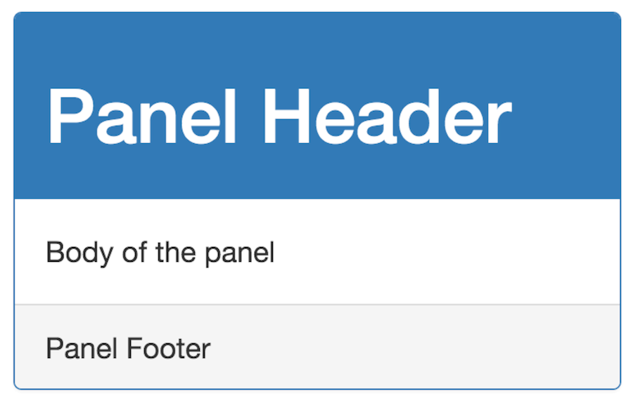
A panel looks like so:
It can be created with Bootstrap with markup like this:
| | <article class="panel panel-primary"> |
| | <header class="panel-heading"> |
| | <h1>Panel Header</h1> |
| | </header> |
| | <section class="panel-body"> |
| | Body of the panel |
| | </section> |
| | <footer class="panel-footer"> |
| | Panel Footer |
| | </footer> |
| | </article> |
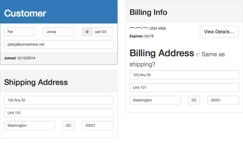
Let’s put each of the three sections of our screen inside its own panel. Panels can be given different styles, so let’s make the customer information panel styled differently from the other two so it stands out more clearly. Each panel requires two classes: panel and then a second one that determines its style.
We’ll use panel-primary for the customer info, which will use an inverse color scheme for the header, and panel-default for the other two. Finally, we’ll move the joined field inside the customer panel’s footer. As we’ll see, this value won’t be editable by the user, so moving it to the footer will reinforce this fact.
As shown in the following screen, the result looks pretty nice.
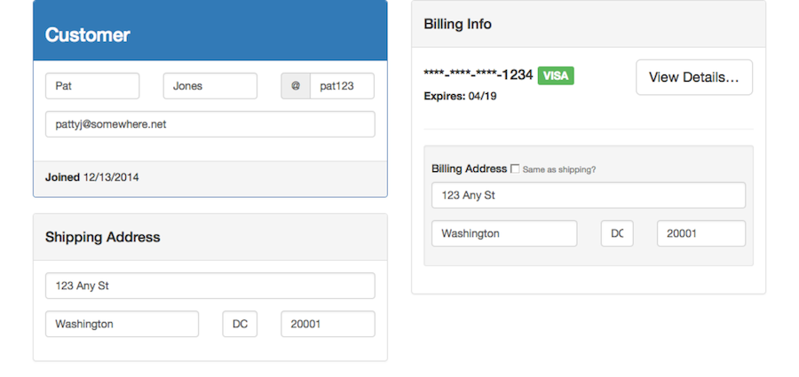
Next, let’s improve the credit card information section. If we could have the card type more distinct from the card number and expiration, that would help users quickly distinguish this information. We can do that using labels.
A label is a Bootstrap component that renders text inside a colored box with an inverse color scheme (not to be confused with the HTML element label, which is used to label fields in a form). In lieu of finding and downloading images for each credit card type, we can put the credit card type inside a label, and it’ll stand out.
Labels, like panels, take two classes: a label class, and a decorative one that controls the color. We’ll use label-success, which will create a green label.
| | <div class="col-md-7"> |
| | <p> |
| | ****-****-****-1234 |
| » | <span class="label label-success">VISA</span> |
| | </p> |
| | <p> |
| | <label>Expires:</label> 04/19 |
| | </p> |
| | </div> |
With just this markup, the credit card type stands out pretty well:

Last, we’ll make a few adjustments to the typography—the headers are a bit too large.
The headers in our view are all a bit too large, and although our markup is semantically correct, some subheadings are larger than others. Further, the masked credit card number is a bit too small.
You can use the h classes provided by Bootstrap to manage the size of our headings (it may seem strange, but these classes allow us to keep the semantically correct element without inheriting their visual size). You can also use them on the p tag surrounding the credit card number to make it stand out a bit.
You’ll see the entire markup in a moment, but here’s an example of what I’m talking about:
| | <article class="panel panel-default"> |
| | <header class="panel-heading"> |
| » | <h2 class="h4"> |
| » | Billing Info |
| » | </h2> |
| | </header> |
| | <!-- ... --> |
| » | <p class="h4"> |
| | ****-****-****-1234 |
| | <span class="label label-success">VISA</span> |
| | </p> |
This sort of thing is more art than science, so the values I’ve chosen here represent what looks right to me. The great thing about Bootstrap is that it’s easy to play around with this stuff, and whatever you do will end up looking pretty decent, thanks to the horizontal grid that underlies all of the type.
One last bit of polish I’d like to add is to distinguish the username from the first and last names in the Customer Information section. As you’ll notice on our mock-up, the username was preceded with an @ symbol. Bootstrap makes this easy using form add-ons.
Often, a symbol prepended (or appended) to a value can give it enough context for users to understand what it means, without using a label. This can be handy on dense pages like our customer detail view. Because the first row of the customer information section is just three equal-sized strings, it might not be clear what they mean.
If we prepend the username with @ (similar to what Twitter does for mentioning someone in a tweet), that can be enough context for users to know that the third field is the username, and the first two are the first and last names, respectively.
Bootstrap provides the class input-group-addon that will do this in a pleasing way. We just surround the form element with an input-group and create an inner div with the class input-group-addon that contains the text we’d like prepended (you can place that div after the element to append it instead).
| | <div class="input-group"> |
| | <div class="input-group-addon">@</div> |
| | <input type="text" class="form-control" |
| | name="username" value="bobert123"> |
| | </div> |
With all of these tweaks in place, the rendered form looks polished and professional (as shown in the screen that follows), embodying the spirit of the mock-up.
HTML markup is quite verbose (especially because you have to heavily wrap it to fit the margins in this book), so you’ve only seen bits and pieces. The entire screen’s markup can be seen in Appendix 1, Full Listing of Customer Detail Page HTML, although it will be easier to examine it by downloading the sample code.[65]
Note that you still haven’t written any CSS. We were able to create a highly complex form that displays a lot of data in a clean and easy-to-read way, using just a few simple classes, coupled with Bootstrap’s grid system.
In this chapter, you saw several new features of Bootstrap, notably its grid system, but also some UI components that allowed us to polish our UI quickly and easily. What you should take away from this is what I mentioned at the start of the section: these are tools that allow you to design and build in the browser.
This eliminates much of the friction in getting started on a new user interface. Armed with just Bootstrap, you can create complex interfaces quickly, and iterate on them as you find the most optimal design.