Chapter 8
Extracting Information from Options Prices
The strong form of the efficient market hypothesis suggests that asset prices reflect all available information in the marketplace. Under this interpretation, we can think of the capital markets not as a venue of asset prices but as a setting for the pricing of information. New information continuously enters the market, causing prices to change endlessly. This information flow takes many forms. The most obvious and direct information flow comes from news releases by companies. These news releases typically discuss past financial performance in their regulatory filing and press releases. Earnings conference calls are another avenue in which management disseminates information such as business strategies they might pursue going forward. The government collects a myriad of macro economic and industry data with the intent of sharing it so people understand the status of a particular industry or the economy as a whole. Political representatives also use it as the foundation for establishing government policy and regulation. There are private-sector organizations that collect, analyze, and publish information as well. Journalists and the media interview senior management of leading companies, consultants, and industry specialists to inform their viewership about what is taking place in both the political and economic landscape. Brokerage firms employ teams of analysts who examine industry-specific factors and individual companies to publish reports and establish a basis for making forecasts and valuation estimates in pursuit of investment recommendations distributed to their clients. Consultants perform many of these same tasks as they advise corporations on business strategy, mergers, acquisitions and divestitures, competitive threats, and capital investment opportunities just to name a few.
If the information flow has positive implications, investors will bid up the price of the affected asset or security to a point where that news is fully captured in the asset's price. If, on the other hand, the information has negative implications, investors will sell the affected asset or security, pushing its price down until it reaches a point where price fully reflects the consequences of that news. This process tends to be fairly transparent to market participants. News reports are released to the public for all to see and investors react accordingly.
Market prices also incorporate information that may not be well distributed and therefore less transparent to the marketplace. Individual investors and institutional investment firms seek out information that is unknown to the marketplace by performing their own proprietary analysis. They do not publish the results of their work. Instead they monetize their work by making the appropriate investment decisions, which impacts the value of the securities traded. If their efforts suggest the current market price of an asset or security is less than their valuation estimate, they will buy the security pushing its price up. Information wants to be free, and it eventually comes out. Transactions occurring in the marketplace are one way that information is released, albeit with limited transparency. Some investors make their decisions based on what other “smart money” investors are doing. These folks buy the affected security over time until its price reflects all available information. Once that objective is met, early investors who made decisions based on their proprietary work sell their asset and look for other opportunities. If their efforts suggest that the market price of the security is too high, they will sell the security if they have it in inventory. More aggressive investors, such as hedge funds, will sell the asset short and cover the position when the market price falls to their estimated valuation level. Investors who are uninformed are often confused by what appears to be random price movements or extreme price levels. There are many times when the price of a stock, currency, commodity, or bond rises or falls for no apparent reason. But it's important to recognize that asset price behavior reflects the actions of large investors who are acting on the proprietary information they have uncovered or analysis they have performed.
There are other reasons why asset prices fluctuate on a continuous basis. The investment public as a whole, or any particular investor, might change the way they interpret information that is already captured in market prices. While bullish news might push the price of the security up, investors might come to the conclusion that prices have been pushed too far based on a closer examination of the data. When this occurs, prices will fall a bit, reflecting the reevaluation of information that is already captured in asset prices. It is important to remember that price is subjective. Some investors will value assets higher or lower than others based on their view of the economy, monetary policy, government action, management performance, and other factors. These differences might be driven by different risk tolerances, methods of valuing assets, or ways of thinking about information already captured in the marketplace.
Experienced market professionals know that people go through waves of optimism and pessimism. When people are optimistic, they will tend to view news through rose-colored glasses. They will see good news and act accordingly, but are prone to pushing prices up too high. Investor optimism tends to show itself with the release of bad news. Under normal circumstances, we would think that negative news would result in a fall in price. But when investors as a group are optimistic, they tend to shrug off bad news with the expectation that good news is just around the corner, or that bad news will catalyze the government or the central banks to act in a way that is bullish for asset prices. Waves of optimism can last just a few days or extend for years. When people are pessimistic, they tend to take a darker view of the news. When bad news about a company or the economy hits the market, investors tend to sell assets more aggressively than they otherwise might under other circumstances. Furthermore, when investors are emotionally pessimistic, they tend to discount good news. While good news might cause an asset's price to increase, it usually does so less than it would under a more optimistic environment or the blip in prices may quickly reverse.
Since asset prices capture all information available to the marketplace, the proprietary work of expert investors, and the mood of people as a whole, it is very difficult to look at an asset's current price or its price action to gain an edge. The efficient market hypothesis indeed suggests that since all available information is captured in market prices, future price action is dependent upon future news flow. Since few people can predict the future with consistent accuracy, price action is random. Thus, the efficient market hypothesis argues few investors can beat the returns of the market averages through actively trading individual assets or securities over the long run. As with most things in life, there are exceptions to the rule and there are a small handful of professional investors that consistently beat the market averages over time.
Options are leveraged instruments on asset prices. Consider a $20 stock, whose price increases by $2. This represents a 10 percent increase in price. A $2 option on that stock with a 50 delta will move by approximately $1 under these circumstances. This represents a 50 percent move in the price of the option. Since options are leveraged financial instruments that limit downside risk, you can see why an investor who has a strong view based on proprietary information or analysis might use the options market to capitalize on that view. Instead of risking $20, the investor only has to risk $2 to take advantage of his work. If, for some reason, the investor's analysis is incorrect or new information hits the market that overwhelms the implications of past work, the price of the stock price could fall 10, 20, or 30 percent. If the investor were to express his views by purchasing the underlying stock, he could lose $2, $4, or $6 on his $20 investment. The option buyer on the other hand, limits her loss to just the premium paid, or $2 in this example.
As a result, investors in general and institutional investors in particular, such as hedge funds, often use the options market to express their investment views. If they get it right, they can earn multiples of their capital commitment, while limiting their loss to a fraction of the value of the underlying instrument. Since the options market is small relative to the underlying instrument, the actions of large sophisticated and informed investors leave a footprint exposing what they are doing. This footprint may not tell you why they are doing what they are doing, but there is value in simply knowing that significant levered investments are taking place. If an individual investor is bullish on a particular stock, it's important to look at activity in the options market, because if large sophisticated investors are taking bearish positions with put options for example, they might know something that you do not. This should give individual investors pause, and they might want to either rethink their thesis or do more investigation before acting on their analysis.
The theory of option pricing is dependent on a number of factors, the most important being the price of the underlying security and implied volatility. As a valuation model, option prices are dependent on a probability distribution of potential outcomes. Those outcomes are dependent, at least in part, on a company's strategic plan, financial performance, dividend policy, and the cost of borrowing stock, in addition to the level of interest rates. Given the variety of factors that affect options prices, we can look at each of those factors to glean some insight into what important market participants are thinking, and what outcomes they expect to occur. In the balance of this chapter, we will discuss a number of methods that an investor can use to extract information from option prices quoted in the public markets. The first technique we will explore is a method designed to uncover where investors in the option market believe the price of the underlying security is likely to go. We will do this by looking at the option-implied distribution of future prices.
Option-Implied Distribution of Expected Future Price
The efficient market hypothesis, and indeed option pricing theory, suggests that the best estimator for the price of an asset tomorrow is its price today. It draws this conclusion because it assumes that the current price of an asset reflects all relevant information about the asset. Therefore, it is fairly priced. Information coming into the market is random and it is just as likely to have bullish implications as bearish ones. Putting aside a moment the fact that prices will drift, depending on market rates of interest and the company's dividend policy, it is just as likely for the price of an asset to rise in the future as it is to fall. Therefore, the efficient market hypothesis submits that prices in the near future will have a random normal distribution. This is the bell-shaped curve you may have learned about in statistics class in school. Bullish option traders believe that price is more likely to rise than fall at the margin. Bearish option traders on the other hand, hold the belief that price is more likely to fall than it is to rise. To the degree in which there are more bullish or bearish market participants, we should expect the options market to exhibit skew in the distribution of potential future prices relative to the standard normal distribution. We might also expect the same if a limited number of well-capitalized investors are more confident in their expectation of future price. If these investors express their view by trading options, they will have an influence on the price of the available series of options outstanding. Savvy options investors recognize this phenomenon and use option-pricing theory to uncover the market's expectation for the distribution of expected future asset prices.
To estimate the probability that an asset's price will rise or fall to some level or beyond it is useful to employ zeta. Recall from Chapter 2 that zeta tells us the probability that a particular option will expire in the money. To estimate the probability that an asset will be in a certain price range at expiration, we simply take the difference between zeta for two options with differing strike prices and the same time to expiration.
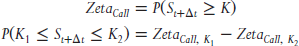
or

Consider a stock trading at $25.00 a share. What is the probability that its price will trade between $29.00 and $30.00 a share in three months? See Exhibit 8.1.
| Call #1 | Call #2 | Call #3 | #1-2 | #2-3 | |
| Share Price | $25.00 | ||||
| Strike Price | $29.00 | $30.00 | $31.00 | $1.00 | $1.00 |
| Dividend Yield | 2.00% | ||||
| Risk-free Rate | 1.00% | ||||
| Time to Expiration | 0.25 | ||||
| Implied Volatility | 35.0% | ||||
| Priced of Option | $0.530 | $0.376 | $0.263 | $0.154 | $0.113 |
| Zeta | 17.8% | 13.2% | 9.6% | 4.6% | |
| Implied Zeta | 15.4% | 11.3% | 4.1% |
Exhibit 8.1 Probability Price in Three Months Is Between $29.00 and $30.00
The best and most direct way to calculate the probability that an asset will trade within a specific range at expiration is to compute zeta for options with strike prices of $29.00 and $30.00. The probability the share prices will trade between $29.00 and $30.00 is simply the difference between the two zetas. In this example, the probability that the price of the stock will trade between $29.00 and $30.00 at expiration is 4.6 percent (17.8% − 13.2%).
We do not necessarily have to use the Greeks and higher math of option-pricing theory to estimate this probability. By observing the price of a call spread in the marketplace, we can make a “back of the matchbook” approximation of zeta. In the example above, we see that a 30/29 call spread has a price of $0.154. If the price of the stock at expiration is $29 or higher, this call spread will have value that falls somewhere between $0.00 and $1.00 (the difference between the two strikes). Since the window between $29.00 and $30.00 is small, relative to a window of $29.00 and above, the expected value of the spread is very close to but somewhat less than $1.00, if the spread is in the money at expiration. (The exact figure is $0.862 in this case.) As a result, we can say there is at least a 15.4 percent (0.154/1.00) chance the stock will trade above $29.00. If we repeat this process, we find the value of a 30/31 call spread is $0.113. This implies that there is a 11.3 percent chance the share price will be $30.00 or higher at expiration. If we take the difference between these two figures, we find the probability that the share price will be in the $29.00 to $30.00 range at expiration is 4.1 percent (15.4% − 11.3%), which is very close to the more precise probability estimate determined by zeta.
Experienced option traders will recognize the difference between the two call spreads as a call butterfly. In a call butterfly, a trader is long a call with strike  , and long one with a strike of
  , while being short two calls with strike Y. The value of a call butterfly is directly related to the probability that the asset price will be between Y and X at expiration.
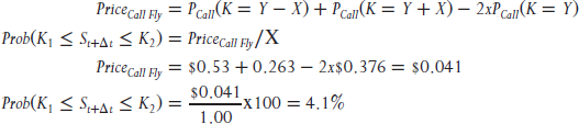
In short, it is most accurate to use zeta to compute the probability that the price of the underlying asset will be at some level or within a range on a certain date. Barring the computing power needed to make this calculation, we can use prices observed in the marketplace to get a first-order approximation. Bear in mind that the accuracy of this “back of the matchbook” method will improve as the difference between the strike prices on the options selected decreases.
The value of this analysis does not end here. If we compute zeta across a strip of strike prices, we can produce a chart that displays the distribution of potential outcomes implied by prices in the options market. This is very powerful analysis, as we can see if option traders have a bullish or bearish bias, anticipating an explosive move up or down, or simply anticipating stagnant price action. This bias is revealed when the market implied distribution is compared to the theoretical distribution of future prices based on the efficient market hypothesis.
Exhibit 8.2 continues the example started above and compares the distribution of future prices derived from option prices with one derived by the efficient market hypothesis. The gray dotted line shows a lognormal distribution of future prices assuming the stock in our example has a current price of $25.00 and an expected volatility of returns of 35 percent. This is a distribution pattern that is consistent with the efficient market hypothesis, which states that future prices are unknowable with precision, but will fall somewhere above or below the current price adjusted for the cost of carry. We would expect an outcome within this distribution if we did not have any special knowledge that would improve our ability to predict the future price of the stock. The dark black line is a distribution of expected future prices implied by the options market. We can draw four conclusions with a close look at this chart:
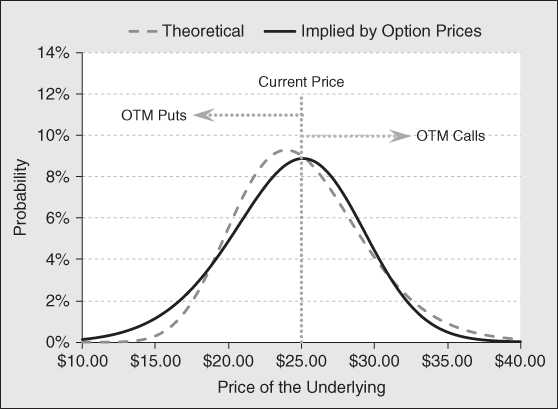
Exhibit 8.2 Option Implied Price Distribution
- Investors are putting a higher probability on a crash in price than the efficient market suggests.
- At the same time, investors are putting a higher probability of a mild increase in price as compared to a random walk.
- Investors are putting a lower probability on a mild decrease in price than a random walk predicts.
- Investors believe the probability of a huge rally in price is close to but somewhat less than the probability suggested by a random walk.
A skew chart is directly related to a distribution of potential outcomes. When the market prices downside options with a higher implied volatility than at-the-money options, the left-hand tail of the distribution becomes fat, for example. As a result, when examining a skew chart, one is looking at parameters that drive the distribution chart. Exhibit 8.3 shows the volatility skew captured in the analysis above.
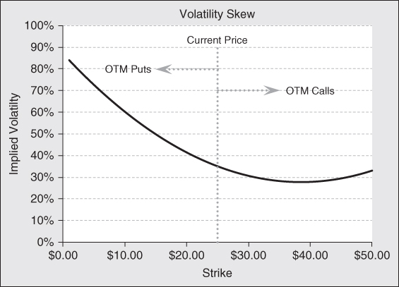
Exhibit 8.3 Volatility Skew
In this example, out-of-the-money put options are priced with an implied volatility that is significantly higher than those puts with strikes that are either at or in of the money. Option traders take this stance when they believe there is significant downside risk in the price of the underlying instrument, which exceeds the risk implied by the efficient market hypothesis. In a case like this, put buyers are willing to pay a higher premium to protect the value of their asset for an extreme downside event, while sellers of insurance are demanding a higher price to compensate for crash risk.
The beauty of distribution analysis is that it gives the investor an excellent way of understanding what other investors are doing and how they are pricing risk. There will be times when the implied distribution has very fat tails. This might occur for a biotech company awaiting approval on a new drug. At an extreme, it could even be bimodal. Other times, the distribution may have a bigger peak in the middle, suggesting the option traders expect low volatility and no trend in price action. In short, examining the implied distribution of expected future prices tells us something about market expectations in general, and potentially what large investors believe is a more likely outcome.
The previous analysis is a snapshot of the distribution of the market's price expectation at a particular point in time. In this case, the focus is on an investment horizon of three months. It is natural to assume that market expectations could differ across different time horizons. Investors might believe prices will be stable for a period of time and get more volatility later on, or vice-versa. They might expect near-term headwinds in price, but expect a greater upward price movement as a new factory comes online, or a potential acquisition is made. Higher earnings might lead investors to expect a change in dividend policy sometime in the future, or a large share buyback to take place at a specific point in time. All these factors and more can affect the volatility surface and how the market prices near-dated options versus long-dated ones.
Another way to apply the expected distribution of forward price analysis is to examine how the expected distribution of future prices morphs over time. To do this, we would repeat this process at each of the option expiration dates available, which generally go out 9 to 12 months. For those issues that have LEAPS (Long-term Equity AnticiPation Securities) outstanding, data might be available to look out as long as two or three years. To put this data in a usable form, we can chart price in terms of standard deviation away from the forward price relative to time. This creates an envelope of potential outcomes. This analysis reveals how the distribution is expected to change as the investment horizon increases.
Exhibit 8.4 shows a two-dimensional representation of the expected future share prices over differing investment horizons. The solid black line shows the expected futures price. (With short-term interest rates near zero and a moderate dividend yield, the drift in forward prices is close to zero.) The gray dashed lines, above the black line show the expected forward price given a one and two standard deviation upward move, respectively. The gray dotted/dashed lines below the black line shows the expected forward price for a one and two standard deviation drop in price, respectively. Notice that in the near-term, the price envelope widens quite rapidly, but then it flattens out. Since volatility increases with the square root of time, we would expect the envelope to widen monotonically as the investment horizon increases, only the rate of increase would slow down as the investment horizon increases. However, after about 0.6 years in this example, the envelope of potential prices becomes extremely contained. As the investment horizon lengthens beyond this point, the distribution of potential prices no longer widens. This is a unique result. This analysis indicates option traders expect prices to be volatile short terms and more confined longer term. We might expect this pattern to emerge when the term structure of volatility is inverted.
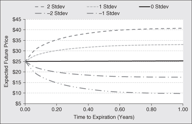
Exhibit 8.4 Envelope of Option Implied Expected Price Distributions
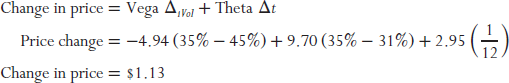
When viewed in this manner, we can uncover an optimal trading strategy. With a rapidly widening envelope short term and a flat envelope long term, we should consider buying a calendar spread, which entails buying a long-term option and selling a short-dated one. Both options should use the same strike price, and it does not matter if a put or call is used. The delta of a calendar spread using the same strikes is very close to zero. Since this envelope is abnormally tight, any reversion to a random walk creates an opportunity to capitalize on that shift. This process will manifest itself by a normalization of the volatility surface. Specifically, short-dated volatility is more likely to fall than rise, and long-dated volatility is more likely to rise than fall. We have discussed at length that calendar spreads enjoy positive theta, and in this case this phenomenon is compounded by the term structure inversion. The high volatility driving the price of short-term options will result in price decay at a far faster rate than the long-term option. With this positive yield, there are two ways to win. Either the term structure normalizes for a capital gain, or time passes producing income yield. Exhibit 8.5 shows the specifics of an appropriate trade using call options.
| Sell | Buy | Net Debit | |
| Number of Options | 1 | 1 | |
| Strike | $25 | $25 | |
| Risk-free Rate | 2.00% | 2.00% | |
| Dividend | 1.00% | 1.00% | |
| Time to Expiration (yrs) | 0.25 | 1.00 | |
| Volatility | 45% | 31% | |
| Call Price | $2.26 | $3.16 | $0.90 |
| Delta | 0.55 | 0.57 | 0.02 |
| Gamma | 0.07 | 0.05 | −0.02 |
| Vega | 4.94 | 9.70 | 4.77 |
| Theta | −4.53 | −1.58 | 2.95 |
Exhibit 8.5 Long Calendar Call Spread
Exhibit 8.5 shows an example of a long calendar call spread when the terms structure of volatility is inverted. This spread costs $0.90 and is essentially delta neutral. This is desirable because the trade is designed to capitalize on a normalization of iVol term structure over time, not a shift in the price of the underlying asset. The structure does have negative gamma, so delta will increase as the price of the underlying falls and fall when the price of the underlying rises. As a result, the structure will have to be rebalanced should price trend in one direction or the other. Notice that the structure is vega positive. This tells us that the spread will increase in value if there is an upward shift in the term structure of volatility. Since this trade is short, short-term volatility and long, long-term volatility, the trade will also increase in value as the term structure normalizes to an upward slope from an inverted one. It does not matter if long-term volatility rises or short-term volatility falls, a capital gain will follow.
To gain greater appreciation concerning the performance of this structure over time, it is useful to examine a total return analysis. This will uncover where the returns come from, and how much we might expect to earn. In addition, it will show where the risk is found. Exhibit 8.6 provides this analysis.
 |
|||||||
| Underlying | $17.50 | $20.00 | $22.50 | $25.00 | $27.50 | $30.00 | $32.50 |
| % Change | −30% | −20% | −10% | 0% | 10% | 20% | 30% |
| Price | $0.304 | $0.558 | $0.781 | $0.896 | $0.890 | $0.795 | $0.657 |
| % Change (%) | −66 | −38 | −13 | 0 | −1 | −11 | −27 |
| Leverage | 2.202 | 1.886 | 1.288 | N/A | −0.071 | −0.567 | −0.891 |
| Delta | 0.094 | 0.102 | 0.071 | 0.021 | −0.023 | −0.050 | −0.058 |
| Gamma | 0.011 | −0.005 | −0.018 | −0.020 | −0.014 | −0.007 | −0.001 |
| Vega | 3.150 | 4.125 | 4.565 | 4.766 | 4.900 | 4.913 | 4.709 |
| Theta | 0.393 | 1.385 | 2.435 | 2.952 | 2.774 | 2.144 | 1.399 |
Exhibit 8.6 Profit/Loss on Short Calendar Spread
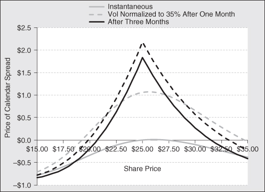
The solid gray line in Exhibit 8.6 shows the total return characteristics of this calendar spread, given an instantaneous shift in the time price of the underlying security. Calendar spreads are typically gamma negative. In this case, it is −0.02. Consequently, the total return pattern takes an upside-down U shape. The absolute value of gamma is relatively small, so the downside risk is small compared to the upside potential. The dashed gray line shows the payoff pattern of the spread over a one-month time horizon if the term structure of volatility flattens to 35 percent across all expirations. The flattening of the curve adds a significant kick to returns as volatility falls on the short-dated option sold, and volatility rises on the long-dated option purchased. We can estimate the return attribution by taking a close look at the Greeks for a scenario where the price of the underlying does not change:
The solid black line shows the payoff pattern of the spread on the expiration date of the short dated, three-month option. All of the returns are attributable to price decay less the returns driven by gamma. Since the spread is negative gamma, we see that the shift in the price of the underlying asset causes the spread to lose value. If the shift is large enough, an absolute loss can occur. The black dotted line shows the return pattern at the end of three months, including the effect of a flattening of the volatility term structure to 35 percent for all expirations. This reversion to the mean adds returns across the spectrum of share prices.
It is important to remember that options of various strikes and expirations discount different volatilities. But at the end of the day, the underlying asset will realize a single unique volatility. This suggests that over time the yield surface will normalize or “revert to the mean.” Taking advantage of a temporary dislocation in the yield surface should produce alpha over time. In this example, there is just a 28 percent chance the value of the underlying will trade above or below the breakeven points. Even if it does, the total return chart in Exhibit 8.6 above suggests the loss will be less than $0.90. Said another way, there is a 72 percent chance this trade will be a winner. If it is a winner, the trade is likely to make a profit of about $1.10. As a result, there is an expectation for a “statistical” arbitrage of  .
.
There are two potential risks of this strategy. First, there is a risk that volatility could fall sharply across the board, resulting in a mark-to-market loss on the spread. That loss, however, is likely to be temporary as it becomes even less likely the price of the underlying will trade outside the breakeven points at expiration. With price decay working in favor of the position, the yield on the structure will offset at least some of the loss and potentially result in a gain. That gain will simply be smaller than originally expected. The second risk is that the volatility curve continues to invert. This will also result in a mark-to-market loss and a higher probability that the price of the underlying will trade outside the breakeven bands. Offsetting this drag on returns is the opportunity to place the trade again at expiration, this time at even better prices and a higher yield. In other words, the statistical arbitrage for the second swing of the bat is even greater than the first. If we simply repeat this trade enough times, the gains are almost assured and substantial. In the final analysis, when the envelope of option-implied expected price distribution is flat, there is a clear opportunity to make outsized gains with moderate risk.
Implied Borrowing Cost on the Underlying Security
In earlier chapters we discussed the important issue of borrowing costs on the valuation of puts and calls. Specifically, as the cost of borrowing the underlying security increases, the value of call options falls, and the value of put options increases. Under most circumstances, there is little or no cost of borrowing a stock. Brokers usually have ready access to shares they can lend to short sellers and those who need them to hedge option positions. Because of this dynamic, it is important to know if borrowing costs are affecting the price of an option the investor wants to trade. Furthermore, if borrowing costs are high enough, it becomes advantageous for institutional call buyers to exercise early, take delivery, and lend the shares out and collect lending income. Fortunately, finding stocks that are expensive to borrow is relatively simple. We should only expect stocks with high short interest ratios or very small floats to have high borrowing costs.
A strong clue that a stock is expensive to borrow is revealed by an examination of put–call parity. If the price of a call is depressed and the price of a put is heightened by borrowing costs, options prices will appear to violate put–call parity. When we run across such a situation, we should look to borrowing costs to explain the discrepancy. But how can we find out what the borrowing costs are for an underlying issue? Self-clearing broker/dealers have their own lending desks that actively lend out the firm's inventory for either funding and/or income-generating reasons. At the same time, they are responsible for borrowing securities when the firm's traders need them to hedge their option or other proprietary/market-making positions. Under these circumstances, traders can find out the cost of borrowing a security by contacting their lending department. Hedge funds that want to sell a security short as part of their investment strategy get the details from their prime brokers. They regularly provide their customers with quotes on the cost of borrowing securities, how many shares might be available, and the term over which those shares are available.
Most individual investors do not enjoy such luxuries. Individual investors must contact their broker, who may or may not be able to provide this information on a timely basis. But all is not lost. Since the prices of puts and calls are impacted by the cost of borrowing the underlying security, investors can use option prices to determine an implied borrowing cost. If option prices do not reflect the cost of borrowing the underlying security, then all is well and good. But if the options market indicates significant borrowing costs, individual investors might need to modify their investment strategy accordingly. Since borrowing costs push down the price of calls and push up the price of puts, they would want to implement strategies that make them a seller of puts or a buyers of calls, all other things equal. This will allow retail investors to capture returns at the margin as if they were lending out the securities from their portfolio. (Retail investors do not earn income from lending fees on the securities they own. The brokerage firm keeps these revenues as part of their business model and compensation for providing securities safekeeping services.)
In addition to the price action of the underlying security, there is an additional danger in selling calls when borrowing costs are rising. As borrowing costs rise, the time premium on a call option falls. Should borrowing costs drive option premiums on in-the-money calls down to or below the intrinsic value, the buyer of that option has a financial incentive to exercise the option early. If option writers sold naked calls, they will have to deliver stock, which they do not own. At this point, option writers have two choices. The first choice is to go into the market, buy the stock, and deliver it against their call. The second is that the call writers can borrow shares from their broker and deliver them. This is possible of course only if the broker has access to shares, which it can lend to the option writer for delivery to the option buyer. If the broker is able to borrow stock, the call writer is short common stock. Under these circumstances, the investor has to pay borrowing costs on those shares, as long as the short position is outstanding. Needless to say, borrowing for an extended period of time can become quite expensive if the borrowing rate is high. The only good scenario that can occur is that the price of the shares fall over time by an amount greater than or equal to the borrowing cost. The one-time call writer who is now short shares profits on the decline of the stock, and is able to repurchase the stock at a lower price and return it to the stock lender.
Short sellers can borrow stock in one of two ways. They can borrow stock overnight and pay the cost of borrowing for just one day. This process continues day after day until the short seller voluntarily covers his position. Short sellers who borrow stock on a spot basis run the risk that the stock gets called back. This might occur because the lenders have sold their shares, which are needed for delivery to the new owner. Alternatively, lenders might decide they no longer want to lend their shares at the going overnight rate and prefer to retain physical possession of the stock certificate unless they can get a higher rate.
To eliminate this risk, a borrower might contract with a lender to borrow shares for a specific period of time. This is known as term borrowing. Term borrowing has advantages for both the borrower and lender. From the borrower's perspective, contracting with a lender to borrow shares for a specific period of time guarantees that the borrower will have access to those shares. The borrower does not have to worry about the shares being called in before they want to cover the short. From the standpoint of the lender, there is a guaranteed stream of income for a specified period of time. Term lending is less work, as the lender does not have to find a borrower day after day and continually negotiate a borrowing rate.
Computing the option's implied borrowing cost is relatively straightforward. To do this, we go back to the fundamental relationship between puts, calls, the underlying asset, and cash defined in Chapter 1 known as put–call parity. Put–call parity tells us that purchasing calls, selling puts, and holding an appropriate amount of cash replicates the price performance of stock. With this relationship, we can compare the cost of synthetic stock with the price of real stock. The difference will tell us the borrowing cost implied by option prices. The following is an example of how to use put–call parity to extract the term borrowing costs implied by option prices.
| Call | |
| Price of Stock (S) | $25.00 |
| Strike Price (K) | $25.00 |
| Risk-free Rate (r) | 2.00% |
| Dividend Yield (d) | 1.00% |
| Borrowing Cost (b) | 12.00% |
Implied Volatility  |
35.0% |
| Price Call (C) | $1.395 |
| Price Put (P) | $2.069 |
| Without Borrowing Costs | |
| Price Call (C) | $1.767 |
| Price Put (P) | $1.705 |
The example above continues the example started in Chapter 2. Recall that the price of the call is $1.767 and the price of the put is $1.705 in the absence of borrowing costs. Assume for a moment that the borrowing cost of 12 percent is known with certainty. If we incorporate that cost into the B–S–M option-pricing model, we find the price of a call is $1.395 and the value of a put is $2.069. The borrowing cost drives the cost of a call down $0.372 and pushes the value of a put up $0.364 relative to the no-borrowing-cost scenario. (Note: Using the B–S–M option-pricing model to determine the implied borrowing rate is challenging exercise because we must solve for both implied volatility and borrowing costs at the same time.)
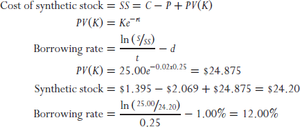
Now assume the only information we have is the prices we observe in the market place. Given these prices, we can create the underlying stock synthetically by applying put–call parity. Using these three-month at-the-money options we find that the price of synthetic stock trades at $24.20, which is a $0.80 discount to the quoted price of the stock observed in the marketplace. Now we can buy stock synthetically for $24.20 instead of real stock for $25.00. This discount will produce a continuously compounded yield of 13 percent rate of return. The owner of this synthetic stock does not have rights to the dividend, only a shareholder has this right. To determine the borrowing cost, we must subtract the dividend yield from the return provided by the discount associated with the synthetic stock. This return less the dividend yield not received tells us that the borrowing cost is 12 percent.
We can create stock synthetically using options of any expiration. The beauty of the method described above is that it is useful in determining the borrowing rates for any term, at any point in time. There is no reason for borrowing rates to be the same for differing tenors. Consequently, there is information in knowing how term borrowing costs differs over various time horizons. Borrowing costs might rise, fall, or remain flat, depending on the demand for shares by arbitrageurs who are attempting to capture price discrepancies or hedge other positions. To glean more precise information from term borrowing rates, it is useful to extract the forward borrowing rates from the term borrowing rates. The concept of term structure of borrowing rates is similar to the term structure of interest rates that fixed income investors use to help make valuation assessments and duration decisions. The forward spot rate curve reveals the exact point in the future where borrowing costs hit an inflection point. Exhibit 8.7 is an example of the term structure and associated monthly forward rates extracted from the data.
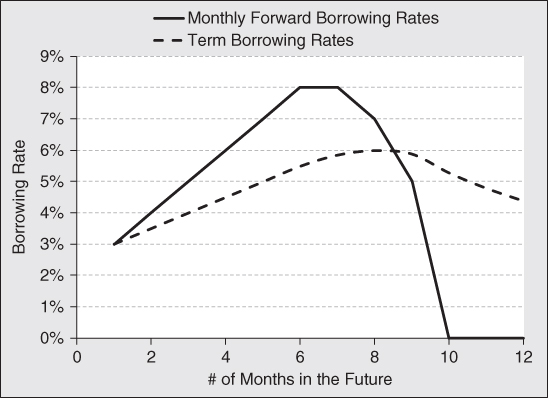
Exhibit 8.7 Term Structure and Forward Spot Rate Curves
The dashed black line in Exhibit 8.7 shows the term structure of borrowing costs for a stock that is in demand by short sellers. These rates are extracted from call/put option pairs with different times to expiration just like the example computation above. The solid black line represents the monthly forward rates extracted by decomposing the term-structure curve into a series of forward rates. As the cost of borrowing rises, the monthly forward rates rise even faster. In this example, those rates eventually peak in months 6 and 7. This provide investors with a clue that short sellers are positioning their portfolios for some event expected to occur six to seven months out into the future. With this information investors are directed to focus on what is likely to happen at that time.
One example could be the announcement of earnings for a company domiciled outside the United States, where companies are only required to report semi-annually. If a hedge fund, for example, expects a disastrous earnings report, it might sell short shares now under a term borrowing arrangement with the expectation that prices will fall due to a preannouncement before the official earnings date. At the same time, it has the ability to maintain a short position with a known cost until the company provides its earnings report.
Examining forward borrowing rates is useful in handicapping the approval date of an important new drug by the FDA. Hedge funds employ PhDs to assess the probability the FDA will approve a drug. Furthermore, they make assessments of market size and market share for the drug. With this information, along with the cost of producing and marketing the drug, they will have a solid estimate of its profitability should it be approved. Alternatively, preliminary data may suggest the drug is more likely to be a failure. Either way, biotech hedge funds often take large positions in either the company's stock or options to capitalize on their work and expertise. The term structure of borrowing costs provides a clue to investors who do not have access to pharmaceutical experts. If, as in this case, the term structure of borrowing costs is a hint that big money is betting against approval along with an estimate of when that realization will be delivered to the market.
A third example could be a company takeover. When company A announces a stock tender offer for company B, risk arbitrageurs buy the shares of company B and sell those of company A. Their goal is to profit from the price differential between the shares of the two companies. If the risk-arbs believe the transaction will go through, they will put on a convergence trade with a great deal of leverage. This entails taking a large short position in company A. If the borrowing costs on company A are high, it indicates the smart money believes the deal will probably go through. The peak in the forward rate curve tells investors when the deal is likely to close. If, on the other hand, borrowing rates are modest, the option market is signaling that the deal will probably not go through in its current form. It might be telling investors that a higher offer might be forthcoming from another suitor or white knight, or the deal will fall apart altogether.
In the final analysis, it is important to monitor the implied borrowing rate before making an investment decision to take a position in a company's stock or its associated options. Furthermore, do not be fooled by a depressed price of a call option. It just might be option traders handicapping an event the retail investor is not aware of or an event that is unappreciated by the market as a whole.
Put/Call Ratio
Just as it is important to find information in option prices and activity, it is important to avoid methods that do not provide clear and precise information. The put/call ratio is such a statistic. The put/call ratio is a technical indicator used by many individual and professional investors alike. It is computed by taking all the put open interest and dividing by the call open interest. Some people calculate it on a trading volume basis. They divide the volume of puts traded by the volume of calls traded. When applied to the overall market, many see it as a gauge of market sentiment. When applied to an individual asset, many believe it is both a sentiment indicator and a time-to-event indicator by examining the put and call activity parsed by expiration dates. When puts or calls are bought or sold outright, professional and individual investors are taking a position in anticipation of a directional change in the price of the underlying security. If this was all options were used for, the put/call ratio might be a useful market-timing tool. However, people trade and hold options for reasons other than making directional bets.
When combined with the underlying asset on a delta-neutral basis, option investing turns from a directional bet to a volatility bet. Volatility traders are usually expecting a change in implied or realized volatility. They buy volatility if they think realized volatility will be higher than implied volatility. They sell volatility if they believe the opposite will manifest.
Option trading can facilitate income-generation strategies. An investor who owns an asset can sell a call option against it and collect a premium for doing so. If the asset price does not rise above the strike price of the option written, the option expires worthless and the investor can repeat the process. The investor can also write cash-covered puts to generate income. In this strategy, interest is earned on the cash held and additional income comes from the premium collected. If the price of the asset stays above the strike price of the put written, it expires worthless and the investor can repeat the process all over again. This is functionally equivalent to buying an asset and selling a call.
Herein lies the problem with trying to glean information from open interest and trading activity in the options markets. We do not know why trades are taking place. If calls trade on the offered side, someone is stepping up to buy. If puts trade on the bid side of the market, someone is stepping up to sell. In either case, someone is probably making a bullish bet. Likewise, if calls trade on the bid side, someone is stepping up to sell. If puts trade on the offered side of the market, someone is stepping up to buy. In either case, someone is probably making a bearish bet. At the end of the day, to properly interpret outright trading activity, we need to know if the transactions take place on the bid or offered side of the quoted market. This tells us the intention of the more aggressive participant.
Investors use options to manage volatility. They can sell calls and buy the underlying stock as a means of selling volatility. Alternatively, they can sell puts and sell the underlying asset. In either case, the investors are not making a directional bet. They are attempting to profit from a drop in implied or realized volatility. To buy volatility, they can buy calls and sell the underlying asset. Alternatively, they can buy puts and buy the underlying asset. In this way, investors will profit if implied or realized volatility increases. Since either puts or calls can be used to create a long or short position in volatility, there is no directional information to be gleaned from simply looking at trading activity or open interest.
In the final analysis, call trading can be either bullish or bearish, depending on the intent of the originating investor. The same can be said for trading in options. Furthermore, trading activity in either puts or calls can have nothing to do with directional expectations by market participants. We think it is important to leave the put/call ratio out of one's toolkit. Without a strong fundamental argument backed up by statistical analysis of historical experience, this indicator of market action does not have the chops to systemically and repeatedly improve one's trading activity. Exhibit 8.8 should convince you that the theory about information provided by the put/call ratio is not necessarily backed up by market experience. In it we find a graph of the price performance of SPY. SPY is the SPDR ETF Trust designed to track the performance of the S&P500. Below is a chart of the put/call ratio based on the open interest of options on SPY.

Exhibit 8.8 Total Returns of S&P 500 versus Put/Call Ratio
Notice that in Exhibit 8.8 the S&P 500 increases steadily from March 2009 through October 2013. There was very little if any relationship between the performance of large-cap stocks and the put/call ratio. Interestingly, the put/call ratio was depressed for most of 2009. Market folklore suggests this means market participants are complacent, so we might expect share prices to fall. But share prices rose instead. Notice that if this indicator is low or high, rising or falling, share prices seem to simply march higher. This suggests to us that there was little information, if any, conveyed by the put/call ratio over this five-plus-year time period. This is not just an issue with this index of large-cap stocks. We see the same thing with gold.
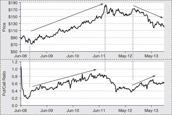
In the third quarter of 2008, the put/call ratio became depressed in the second half of 2008 as the price of GLD had fallen by about 25 percent during the financial turmoil experienced from 2007 to 2009. From the low, it rose steadily until mid-2011. Concurrently, the put/call ratio rose and it peaked at the same time the price of gold did. While the shine came off the price of gold, it did not enter a bear market. But the put/call ratio fell sharply. In the third quarter of 2013, the put/call ratio was, suggesting complacency. One might have thought the price of gold would rise. Instead, it fell sharply. This time, the price of gold fell into a downtrend as the put/call ratio entered an uptrend. This conflicts with the relationship experienced earlier. Once again, the put/call ratio was of little use in helping investors determine the next move in the price of the associated asset. The most important lesson from this analysis is that you must always verify theories with historical data. If historical data does not back up theory, the theory must be changed or discarded altogether.
Final Thought
Option pricing models give us a way of pricing options given market conditions. Since it provides a discipline about how options are priced in the marketplace, we can combine market observations with mathematical models to expose information that is hidden with in the data. Since options are levered financial instruments and tend to be less liquid than the cash equity counterparts, institutional investors tend to leave noticeable footprints in the marketplace. Clever analysts and option traders can use option-pricing theory to extract information from the markets that is not available to the casual observer. With this information, investors who use options can find trading ideas and adjust their strategies accordingly.
The markets provide all kinds of time series data and technical indicators that investors often use to help make decisions. It is important to back test any indicator you might use to time your entry and exit decisions. The objective of back testing is to verify one's theory with data. A good indicator will point you in the right direction most if not all of the time and improve the odds of exceptional returns. A poor indicator will appear to work sometimes and not work at other times. One should stick to a discipline that produces repeatable results. Otherwise, one is really just flipping a coin when the trader believes they are making an informed decision. Such a method is sure to end in tears.