ARCHITECTURE WITH ATTITUDE
The last decade has seen a rapid increase in the construction of amazing buildings throughout the world. Despite doom-and-gloom forecasts for the global economy, adventurous architects have been let loose on our towns and cities with a free rein to make their wildest ideas a reality – regardless of the cost – and in many cases the results are nothing short of spectacular.
You only have to look at Dubai for evidence of this. As recently as 1990 it was a dusty desert city in the middle of nowhere, but today it’s a showcase for some of the world’s most lavish constructions. The Burj Al Arab, the world’s tallest hotel at 321m (1,053ft) high, resembles a giant sail and stands on an artificial island in the sea. Yet already it is overshadowed by the Burj Dubai, which will be the world’s tallest building at possibly 818m (2,684ft) when it is finished – though the final height is still under wraps at the time of writing.
Such is the scale of work in Dubai, it’s said that up to one-fifth of all the world’s cranes are currently there, and there are more construction workers than citizens.
But Dubai isn’t the only place to find exciting and extravagant architecture. Valencia, on the east coast of Spain, is home to the City of Arts and Science, a stunning development of buildings, bridges and monuments that has to be seen to be believed. Head north to Bilbao and you will find Frank Gehry’s Guggenheim Museum, a radically sculpted building covered in titanium panels, while the new Madrid Barajas Airport created by London-based architect Sir Richard Rogers continues the space-age trend.
And let’s not forget London itself, where more of the wondrous work of Richard Rogers can be seen in the form of the Lloyds Building, still amazing two decades after it was completed. There is also the ill-fated Millennium Dome and the Leadenhall Building. Number 30 St Mary Axe, fondly referred to as the Gherkin, is another must-see, along with City Hall and the London Eye on the south bank of the Thames.
I would never describe myself as an architectural photographer, but when I am faced with subject matter such as this I find it difficult to resist. Modern architecture is a form of art, and the best architects create buildings that are not only functional but visually stunning, unique works of art built for all to admire.


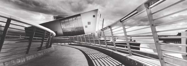
THE SAGE, GATESHEAD, TYNE AND WEAR, ENGLAND
Set on the banks of the River Tyne at the heart of Newcastle and Gateshead Quayside, the Sage was designed by Sir Norman Foster and completed in 2004. Day or night it makes a spectacular sight and offers enormous photographic potential. The main panoramic image was taken at dusk and shows the building in profile. What appears to be an image projected on the curvaceous shell of the building is actually the illuminated interior visible through glazed panels. The smaller black and white shot was taken from a similar angle using an infrared-modified digital SLR.
CAMERA: FUJI GX617 AND CANON EOS 20D INFRARED/LENS: 180MM ON FUJI, 16-35MM ON CANON/FILM: FUJICHROME VELVIA 50 IN FUJI
Location, location, location
Getting the best photographs from modern architecture is dependent on a number of factors.
At the top of the list is its location. Some buildings are so hemmed in by others that your only option is to shoot from close range. The Selfridges Building in Birmingham is a typical example. Set in the busy heart of Birmingham’s retail sector, it’s surrounded by other buildings on all sides and there is no angle available where you can get a clear view of the whole structure – at least not one that really shows off its amazing shape. The solution? Get in close with a wide-angle lens to exaggerate the building’s fluid curves and keep other buildings out of the frame. Or home in on details, of which there are many.
Tall buildings are easier in this respect because they stand head and shoulders above their neighbours. The downside is that if you shoot from close range you inevitably have to look up to include the top of the building and this leads to converging verticals.
One way to avoid them is by backing off and finding a more distant, high viewpoint so you’re looking across rather than up. In crowded cities this is often the best option, and if you shoot from a distance with a telephoto lens you can also compress perspective so the surrounding buildings appear much closer together. Alternatively, use your telephoto lens from close range and again concentrate on details.
 PHOTO ADVENTURES
For me, the most exciting thing about shooting modern architecture is that the buildings themselves encourage a more imaginative and adventurous photographic approach. When an architect has created such a spectacular structure, how can you treat it like any old subject? Consequently, I find myself experimenting with unusual techniques, shooting from alternative angles, using different cameras and generally trying to push the boundaries of creativity in an attempt to do the building justice.
Cross-processing film, digital infrared, ultra wide-angle lenses, black and white, panoramic cameras – I’ve tried them all and more, though technique is merely a means to an end. The most important consideration has to be that the final image does the building justice.

LLOYDS BUILDING, LONDON, ENGLAND
This towering tubular structure was one of the first futuristic buildings to appear in London and despite being over 20 years old still appears ahead of its time. Twilight is the prime time to shoot, when artificial illumination brings it to life.
CAMERA: NIKON F5/LENS: 80-200MM/FILM: FUJICHROME VELVIA 50

CHARLES DE GAULLE AIRPORT, PARIS, FRANCE
Modern airports are at the cutting edge of architectural design, and Charles de Gaulle – especially Terminal 2E with its daring design and wide-open spaces – is no exception. I had several hours to kill in the terminal while waiting for a connection back to Edinburgh after a trip to Cuba, so I used the time to wander around the terminal and take snapshots with a Holga toy camera. The symmetry in this scene caught my eye, and I love the soft blur across most of the image, which gives it an abstract feel. The strong green colour cast is a side-effect of cross-processing outdated colour slide film in C41 chemistry.
CAMERA: HOLGA 120GN/LENS: FIXED 60MM/FILM: FUJI PROVIA 400F
THE DEEP, HULL, ENGLAND
Housing a state-of-the-art aquarium, this fantastic building has been described as ‘a geological metaphor, rising out of the ground like a crystalline rock formation’. Designed by architect Terry Farrell, it offers many different faces – a leaping robotic fish from one side, a futuristic installation from another. I decided to play on its space-age characteristics when I took this shot, using the sweeping metallic rails and concrete walkways to lead the eye into the scene. Careful dodging and burning of the image during printing completed the look and created an image that did the building justice.
CAMERA: HASSELBLAD XPAN/LENS: 30MM/FILTERS: 0.45 CENTRE ND AND RED/FILM: ILFORD FP4+
Light fantastic
The quality of light is another major factor because it defines how a building appears. It would have been given serious consideration by the architect when the building was being designed.
More often than not, extravagant modern architecture looks its best once the sun has gone down. After sunset, there is no direct light striking the building. Instead, the sky acts like a huge diffuse light source and, because the majority of modern buildings are covered in acres of glass and steel, the colours and clouds in the sky are reflected. Whatever colour the sky is – red, orange, blue, purple – the building also takes on that colour. As a result, it changes day to day depending on the weather.
As natural light levels begin to fade during twilight, man-made illumination takes over. The appearance of modern architecture changes yet again with colourful spotlighting and illuminated panels. The Lloyds Building in London is a classic example. By day it looks rather drab, despite its stunning design, but by night, glowing green and blue, it comes to life.
The best time to take night shots of buildings is during the crossover period between day and night when the effects of artificial illumination are clearly seen but there’s still colour in the sky (usually a deep blue). Once the sky appears black to the naked eye it’s time to call it a day because contrast will be too high and black sky has no visual appeal.
If you can manage an early start after your late finish, dawn is worth trying too. Before dawn the effect is similar to dusk. With the sky providing all the light rather than the sun, reflective exteriors are enveloped in colour. Whichever angle you shoot the building from the effect is the same.
During the daytime the light isn’t as effective. When the sun is low in the sky and the light has a golden touch you can take great detail shots. However, the shadows of adjacent buildings are often a problem because they throw large areas of the subject building into shadow. Contrast becomes too exaggerrated and wide shots are out of the question.
If you’re forced to take daytime shots, the middle of the day is often the best time. With the sun overhead, shadows are short and dense so they don’t pose a problem. Also, the intensity of the light in clear, sunny weather suits the boldness of modern architecture and will help you produce strong, graphic images.
ON THE ROAD
Though London is the heart of architectural excellence in the UK, there are many marvellous modern buildings in other towns and cities. Here are ten that are worth investigating:
• Selfridges Building, Birmingham
• The Deep, Hull
• The Scottish Parliament Building, Edinburgh
• Millennium Library, Norwich
• The Sage, Newcastle Quayside
• The Clyde Auditorium, Glasgow
• Salford Quays, Manchester
• The Planetarium, Bristol
• Millennium Stadium, Cardiff
• Princes Dock, Liverpool
• Sheffield Winter Garden
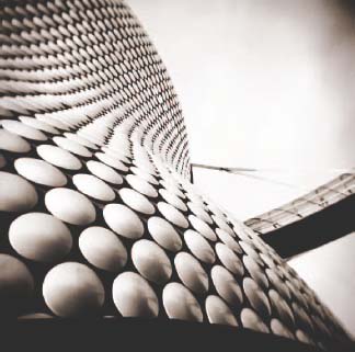
SELFRIDGES BUILDING, BIRMINGHAM
The three-dimensional curvaceous form of this magnificent building is covered in a skin of some 15,000 aluminium discs. Surrounded by other more period properties, including an old church, it looks like something that has dropped from space and landed in the middle of a traditional English city. After exploring it from all angles I deduced that photographically this one was the most effective, showing off the curves of the building and those amazing metallic discs. I also chose to shoot in black and white to make the image simple and graphic.
CAMERA: HOLGA 120GN/LENS: FIXED 60MM/FILM: ILFORD XP2 SUPER
BLUR, BLUR, BLUR
Question: Do photographs always have to be sharply focused and sharply rendered, or is this whole sharpness thing vastly overrated?
For a long time I worked to the belief that sharpness was the ultimate objective, so I used slow, fine-grained film and the best lenses I could possibly afford to achieve optimum image quality, a tripod to keep the camera steady and small apertures to maximize depth-of-field.
Then one day I had one of those happy accidents that changed everything. I grabbed a shot – assuming my lens was set to autofocus – but it wasn’t and the image that resulted was completely out of focus. But the strange thing was that I liked it. It stopped me in my tracks and made me take a second look to work out what was going on. From that point on, blur has played an active role in my photography and I’ve since experimented with various ways of creating and recording it.
Focus pocus
Intentional defocusing works best with SLR cameras that offer through-the-lens viewing because, despite it looking accidental, you really need to be able to see what you’re doing so that you can control the effect. Then it’s a case of adjusting the focus so that your subject is increasingly out of focus. When the effect looks right, take the picture. Stick to simple, bold subjects that will still be identifiable even though they’re blurred, such as flowers, people or monuments, for example. Shots taken against a bright background work well because the main subject will stand out strongly.
Slow it down
Another way to create blur is to keep the camera steady while shooting a moving subject using a slow shutter speed. This way, only subject movement registers and the background stays sharp. This works on any moving subject, from commuters rushing off a train to a flag fluttering in the breeze.
The shutter speed you use will depend on how quickly your subject is moving and how much blur you want. A speeding car will blur at 1/30sec and barely register at all on 1/2sec, whereas a person walking would appear sharp at 1/30sec and only just begin to blur obviously at 1/2sec. The key is to experiment. If you’re shooting digitally you can check a shot, and then adjust your technique if it’s too sharp or too blurred. However, gauging that will be down to personal preference.
Shake it all about
A third option is to move the camera while taking a photograph so that everything in the scene blurs whether it’s moving or not. This is a fun technique to try because it’s totally unpredictable. Just set your camera to auto exposure (I use aperture priority). Stop the aperture right down to f/16 or f/22 so the camera sets a slow shutter speed, and then get shaking.
If you’re indoors and light levels are low, the exposure will last several seconds. You’ll get lots of blur and any bright points of light will record as colourful streaks. Outdoors, exposure times will be briefer, but even 1/15 or 1/8sec will allow you to record blur if you move the camera quickly while tripping the shutter.
The effect you get will depend on how the camera is moved. If you shake it around in a random fashion then the blur will be random. If you move it in one direction – up, down, left, right – the blurring will also register in one direction. Experiment and see what happens. If nothing else you’ll enjoy yourself.
Pan the camera
Tracking a moving subject with the camera and tripping the shutter at the same time is a great technique to use when you want to inject a sense of motion into a picture. It’s widely used by sports photographers and when done properly, the main subject will remain pin sharp while the background records as blurred streaks.
It’s actually a difficult technique to master, and whenever I try it, not only does the background blur but the subject as well. Far from being frustrated by this, however, I embrace it. I intentionally over-pan using shutter speeds that are far too slow (anything from 1/15sec to one second or more depending on the subject) to introduce lots of blur and create graceful, impressionistic images.

This set of pictures demonstrates all of the techniques discussed, from defocusing and using slow shutter speeds to moving the camera during exposure and panning. Hopefully they will convince you that blur can be a creative tool and that sharpness is overrated.
CAMERA: NIKON F5 AND NIKON F90X/LENS: 28MM, 50MM AND 80-200MM/FILM: FUJICHROME VELVIA 50
COAT YOUR OWN
Coating paper, fabric and other materials with light-sensitive liquid emulsion has been a popular darkroom technique for decades. It allows photographers to create unique pieces of work with a wonderful hand-made feel. Serious practitioners even go as far as making their own emulsions, using recipes that date back to Victorian times.
But what if you use a computer and inkjet printer to make prints, instead of a traditional darkroom? Luckily, there is an inkjet equivalent to liquid emulsion, known as InkAID, and in creative hands it is capable of stunning results.

PEBBLES, TARANSAY, OUTER HEBRIDES, SCOTLAND
Heavyweight watercolour paper and handmade paper are ideal for hand-coating with inkjet precoats. The resulting prints have a high-quality, fine-art feel about them. Despite the natural texture of the paper, they are capable of great resolving power. I prefer the Matte White precoat for use on white paper.
CAMERA: HOLGA 120GN/LENS: FIXED 60MM/FILM: ILFORD XP2 SUPER
As well as paper in its many shapes and forms, glass, metal, fabric and anything else that can be safely fed through an inkjet printer can be treated with the InkAID precoats, so you can print both colour and black and white images onto them. The materials don’t have to be plain or blank, either. Photographs can be printed on paper containing text, such as pages from books or old scripts, or you can create mixed-media artworks by combining photographic images with paintings. The options are almost limitless.
A sample pack which allows you to experiment with a range of different precoats (see panel, page 18), is available. That way, if you prefer certain ones, you can buy them individually in larger quantities.
No instructions are supplied with the sample pack, but they’re posted by the maker, Ottowa Speciality Coatings Corporation, at www.inkaid.com. Using them is very straightforward. Unlike liquid photographic emulsion, which is light-sensitive, InkAID products can be handled and applied in daylight. It’s simply a case of paint-on, air dry, flatten and print.
Any inkjet printer can be used to print images on materials coated with InkAID precoats. I use an Epson Stylus 4800, which is an A2+ (17in) model. However, smaller-format printers are equally suitable. If your printer has a straight or flat-feed system, you can also print on rigid materials, such as plexiglass or plywood. If not, you will have to stick with paper and flexible materials, such as fabric.
Not that paper is limiting in any way because there are so many different types. You can choose from textured art papers, plain paper, colour paper and card, parchment, handmade paper – the list goes on. I also removed the endpapers from some old books that were falling apart. They had developed a wonderful antique look over time, making a perfect background for warm-toned prints.
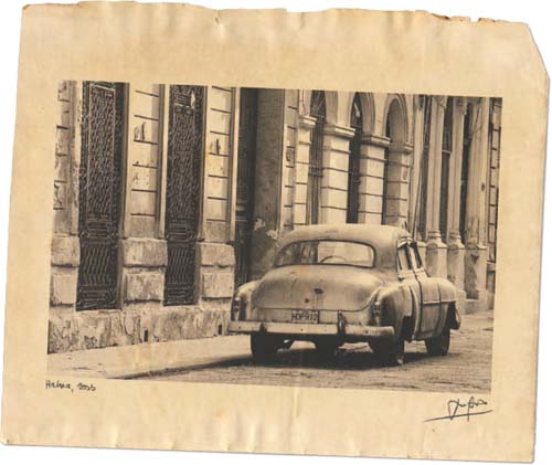
OLD AMERICAN CAR, HAVANA, CUBA
For this print I applied two coats of Clear Semi-Matte precoat to the old, yellowing endpaper of an antiquated book discovered in my loft. It suited the subject matter well and the natural colour of the paper has given the image an attractive warm tone.
CAMERA: NIKON F5/LENS: 80-200MM/ FILM: ILFORD XP2 SUPER
Applying the precoats
The on-line instructions for InkAID say that the precoats can be applied using a brush. For a smoother finish, though, they recommend sponge brushes over bristles. Glass rods can also be used to spread the liquids, which have a consistency similar to PVA glue, in a thin and even coat. I use a Japanese Jaiban brush that I purchased originally in order to apply liquid photographic emulsion to art paper. Bristle brushes can leave brush strokes in the surface of the applied coat, but I quite like that effect because it gives the prints more of a handmade look.
The precoat you choose depends your material and the type of effect you hope to achieve. For example, Clear Semi-Gloss, Clear Gloss, Matte White and Iridescent Gold are designed for use on such porous surfaces as paper, wood and fabric. For non-porous surfaces, like plexiglass and metal, an adhesive is applied first to create a key for any of the other precoats mentioned above.
Matte White precoat dries white so, while it’s a good choice for use on white paper or card, it may look a little odd on non-white papers. The Semi-Gloss and Gloss precoats dry clear, so you can use them to coat any colour. The original colour of the material will show through, making Semi-Gloss and Gloss precoats ideal for old paper, parchment and so on.
The Iridescent Gold precoat supplied with the sample kit has a faint gold tint to it and also has a slightly metallic look. It can be used on both white and off-white papers.
One thing to remember when coating colour or tinted materials with the clear precoats is that the highlight value in the printed photograph will be determined by the base colour of the paper. This means the darker it is, the flatter the image will appear, giving rise to a need for some experimentation when it comes to determining correct image density for printing.
You will need a wipe-clean work surface and a clean plastic dish, though any spills or splashes are easy to wipe up. Give the bottle of precoat a good shake, then open it and pour a small amount into the dish.
Coating the paper is child’s play. All you do is paint it on, but try to avoid getting hairs, dust or other visible debris trapped in the emulsion. Make sure the precoat is applied in an even layer. That said, if you intentionally want to see brush strokes and texture in the precoat you can apply a thicker layer and be more random with your strokes.
Once the precoat has been applied, leave it to one side to dry thoroughly. Then apply a second coat, ideally brushing at 90° to the direction of the first coat to achieve an even finish.
The instructions suggest hanging the sheets of paper on a line while drying to avoid them curling, rather like drying fibre-based photographic paper. However, I just let them dry on a desktop and they show little sign of curling.
Once two coats have been applied and each sheet is fully dry, place them between the pages of a big book. Weigh the book down with anything heavy, and then leave everything overnight. By the next morning the sheets will be flat and ready for you to use.
The printer settings that are required to achieve the best results really depend upon the type of printer you have, the material you are printing on, the precoat you are using and the type of image you want to create, so be prepared to experiment.
Try a media setting such as Archival Matte paper or Watercolour Paper initially and a printer resolution of 720dpi (anything higher is unlikely to make a difference). Any high-speed printer setting can be switched off.
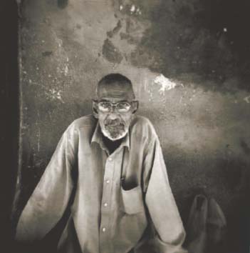
PORTRAIT, STONE TOWN, ZANZIBAR
Even detailed images like this portrait reproduce well on precoated paper and the results are every bit as good as you would expect from off-the-shelf inkjet papers. This portrait was printed on Fabriano 5 paper coated with two applications of Matte White precoat.
CAMERA: HOLGA 120GN/LENS: FIXED 60MM/FILM: ILFORD XP2 SUPER
INKAID PRECOATS
The InkAID sample pack is all you need to get started. It contains six 118ml (4fl oz) bottles of precoat, including Clear Semi-Gloss, Clear Gloss, White Matte, Iridescent Gold, Clear Gloss Type II (with adhesive) and a separate adhesive precoat for use with the Clear Gloss precoat. Each bottle contains enough precoat to prepare a dozen or more sheets of A4 (letter) paper. Later, you can purchase larger quantities of individual precoats of your choice. For more information go to www.inkaid.com.

Here’s the InkAID sample pack with a Japanese Jaiban brush I use to apply the precoats.
I find the Clear Semi-Gloss precoat to be the best choice for old, coloured or off-white paper while the Matte White precoat is the best choice for white textured paper. The images are rendered crisp and sharp, so fine detail can be recorded with great clarity, while the white base of the precoat records a wide tonal range. I’ve used both Fabriano 5 paper and basic watercolour paper from an artist’s pad. However, any heavyweight art paper would be suitable.
If you’re going to put the prints into a portfolio, it’s a good idea to give them a protective coating using a product such as Lyson Print Guard or Hahnemühle Lumijet Protective Spray. Not only will the delicate surface be protected from dirt, fingerprints and moisture, but also from harmful ultraviolet rays that cause prints to fade over the years.

NOAH, NORTHUMBERLAND, ENGLAND
Printing images on hand-coated paper allows you not only to choose a paper that will enhance the image, but also to make the paper itself a crucial part of the finished work, adding depth, texture and mood. Here I used the yellowed page from an old book, which I had coated with Clear Matte precoat.
CAMERA: HOLGA 120GN/LENS: FIXED 60MM/FILM: ILFORD XP2 SUPER
COLOUR CODED
Think back to when you were a child and, armed with some pots of poster paints, you set about creating a masterpiece for your mother to stick on the fridge door. There was no delicate brushwork in pastel hues; no intricate detail. It was all big, brash splodges of primary colour slapped on the back of an old roll of wallpaper. Reds, yellows, blues, greens – the brighter and bolder the better. Houses were drawn as squares with triangles on top. You depicted your parents as lollipops with sticks for arms and legs, an over-sized smile and big, round eyes.
At the time you probably had no idea what you were doing, other than having fun and making a mess. Subconsciously, however, you were paring everything down to the simplest form, rejecting all the details that didn’t matter and concentrating instead on just the shapes and colours that formed your subject.
Before long, we lose this innocent view of the world. We become unable to look at things in such simplistic terms, and details become more important than the bigger picture. A toddler is happy with a dozen oversized building blocks to make his space ship, yet within just a few years this will be replaced by a complicated Lego set with hundreds of tiny pieces.
However, there’s a lot to be said for photographers taking a step back and trying to see things through a child’s eyes. More often than not, the colour and form make a picture work more than the smaller details. By stripping things back to these two elements, powerful pictures are guaranteed.
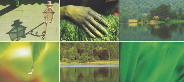
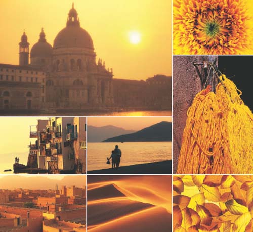
One at a time
A great way to increase your appreciation of colour and also improve your eye for a picture is by shooting sets of images that make use of a single colour. This could be red, blue, orange or yellow, or any colour that you like.
Make this a project for the day. Head out with your camera and a couple of zoom lenses and go in search of your chosen colour. Ignore everything else and really focus your mind on seeking out a single colour. You may get off to a slow start, but once you’ve got one or two shots in the bag and your vision begins to sharpen, others will soon follow.
Urban locations are ideal for finding colour because towns and cities are busy, bustling places where traffic, street furniture, roadworks, building sites, shops, offices and even passersby can be the source of endless images. Look out for interesting signs, posters, hoardings and shop window displays.
Markets are another great hunting ground. Or try a harbour, where boats, nets, even lobster pots, all provide opportunities.
The thing about isolating colour is that it can be done on any scale, large or small. One minute you could be photographing the side of building with a wide-angle zoom, the next a box of apples outside a greengrocers with a telephoto. Maybe you could capture a close-up of a vibrant flower using a macro lens. Anything goes, and the more variety you manage to cram into your colour collection, the more interesting it will be.
CAMERA/NIKON F5 AND F90X/LENS: 20MM, 28MM, 50MM, 105MM MACRO, 80-200MM/FILM: FUJICHROME VELVIA 50
Coloured light
Light can work in your favour, adding or creating a colour all of its own. Shoot at sunrise or sunset and often your pictures will take on a distinct yellow hue because of the warmth of the light. It’s the same when shooting under tungsten lighting.
At the other extreme, shots taken at twilight or in bad weather may come out with a strong blue cast because the colour temperature of the light is high.
The way to compensate for these effects is to add colour using filters. The strongly coloured filters used in black and white photography will overwhelm any natural colour in a picture, while the orange 85 series filters can be used to create a yellow/orange cast. The blue 80 series filters will cool everything down.
The symbolism of colour
While you’re searching for subjects, also consider the symbolic power that colour has. All colours convey particular moods and messages. We use them as visual codes to emphasize our thoughts, just as advertisers use them to influence our emotional response to the products they’re promoting.
• Red is a very dominant, advancing colour that symbolizes blood, danger, passion and urgency. Think of the phrases ‘red with rage’, or ‘like a red rag to a bull’. Red is the colour used to warn us, so pictures containing lots of red create tension. Red is also the loudest and most obvious colour. Even a tiny amount is powerful enough to stand out, such as a single red poppy in a field of wheat.
• Blue is a tranquil, serene, reassuring colour, symbolizing authority, truth, hope, freshness, the sky, the sea and wide open spaces. It can also represent loneliness, depression, loss and sadness. Think of ‘feeling blue’. It is also associated with cold, as in ‘blue with cold’.
• Green symbolizes life, health, freshness, nature and purity. It reminds us of the landscape (green fields and rolling hills) so it’s refreshing to look at. Be warned, though; it can also look rather sickly when used to add a strong colour cast with filters unless the natural colours in the scene are predominantly green anyway.
• Yellow is the colour of the sun, gold, corn and lemons. It’s a powerful colour, symbolic of joy, happiness and richness and, like red, it advances to produce images that leap from the page. If you fill the frame with yellow subjects, such as a field of rape in flower, a crate of lemons or a detail of a painted door, use a yellow filter for added impact.


CAMERA/NIKON F5 AND F90X/LENS: 20MM, 28MM, 50MM, 105MM MACRO, 80-200MM/FILM: FUJICHROME VELVIA 50
DAWN CHORUS
Beep, beep. BEEP BEEP. In the midst of a pleasant dream involving Claudia Schiffer and a fridge full of exotic fruits/Russell Crowe and a bucket of yoghurt (delete as appropriate), you’re shocked into dazed reality by the ear-shattering sound of an over-sized alarm clock and fall out of bed into the remains of last night’s pizza.
It’s 4am, the world is silent and outside streetlights are creating ghostly yellow haloes in the misty gloom before dawn. Fumbling around in the darkness, you pull on a pair of jeans that feel damp they’re so cold, and then slowly crawl downstairs to prepare a pot of industrial-strength coffee to jumpstart your body into life.
Is this some nightmare scene from a war zone, or an extract from the diary of an Arctic explorer? Unfortunately, no. This is the tortuous routine of rising with the larks in order to capture the first – and best– light of the day.
Actually, 4am is a lie-in. In June 2008, I spent a week on the Isle of Lewis in Scotland’s Outer Hebrides running a photo workshop with fellow photographer Duncan McEwan. There are few places more northerly in the UK than Lewis. Consequently, if you want to shoot a summer sunrise, especially in late June around the summer solstice, you need to set your alarm clock nice and early.
How early? How does 2.50am sound? That’s right, 2.50am! To most sane folk, that’s still the middle of the night, a time to be tucked up in bed and sound asleep. But when the sun rises at 4.15am, the location you want to shoot is at least 20 minutes’ drive away and the predawn glow could start at least an hour before sun-up, there’s no time for hanging around. Or sleeping.
As it happened, we only managed three early starts – cloud and rain on the other mornings made it pointless heading out. But we still set our alarm clocks for 2.50am, just to be sure. It’s easy to crawl back into bed and doze off again at that time of day if the weather’s foul, or catch up on your sleep later if conditions do look promising. But determining if there’s going to be a decent dawn is impossible if you never bother to get out of bed in the first place.
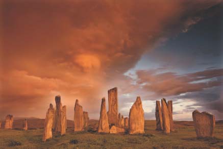

CALLANISH, ISLE OF LEWIS, OUTER HEBRIDES, SCOTLAND
These two photographs show how the quality of light can change dramatically in the space of a few minutes at dawn. The smaller image was taken at 4.33am, just as the sun was rising and bathing the stones in soft light. The second image was captured 12 minutes later at 4.45am, looking toward the rising sun.
CAMERA: CANON EOS 1DS MKIII/LENS: 16-35MM/FILTER: 0.6ND HARD GRAD ON FIRST SHOT, NONE ON SECOND
All change
What I can tell you is that when the conditions are right, rising for dawn is worth every second of lost sleep. The light can be truly magical, and the experience of witnessing and recording it utterly unforgettable.
In clear, cloudless weather, a deep yellow/orange glow often appears over the eastern horizon as much as an hour before the sun is due to show. This predawn glow can be more beautiful than the sunrise itself, which is why you need to be on location well in advance. In fact, in clear weather, sunrise itself tends to be a non-event because, when the sun does finally peep over the horizon, the light is so intense that you literally have seconds to shoot before flare ruins your images.
The way around this is to hide the sun behind something, such as a tree. Or, you can turn around and photograph the scenery bathed in the first light of day, rather than shooting into the sun.
When I’m planning dawn shoots, I try to give myself a choice of locations, for example, one shooting towards the sunrise, one shooting the first light. Then I wait until I get up the next morning and assess the weather before deciding which one to head for.
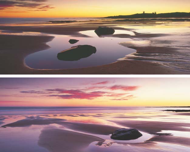
Here’s another pair of photographs taken at the same location on the same morning. Conditions couldn’t have been better. The tide was receding, leaving virgin wet sand and rock pools to reflect the vivid blue of the overhead sky while the eastern horizon was on fire with yellows and oranges. This intense colour contrast (seen in the top image) lasted perhaps 30 minutes before broken cloud drifted in and picked up a red glow from the sun. This softened the colours and changed the mood of the scene, creating yet more fantastic photo opportunities. I couldn’t have predicted such an amazing morning. It was possibly the best dawn I have ever photographed, and I’m just so pleased I managed to drag myself out of bed.
CAMERA: FUJI GX617 PANORAMIC/LENS: 90MM/FILTERS: 0.9ND HARD GRAD AND 0.3 CENTRE ND/FILM: FUJICHROME VELVIA 50
This is where intimate knowledge of an area comes into its own. I live on the coast of north Northumberland, and I know it well enough to decide instantly where to go for sunrise, based on prevailing weather conditions, when I crawl out of bed.
The ideal is a location where you can start shooting towards the eastern sky, then if the sun starts to flare out when it rises, you can swing 90–180° and photograph the light on the scene, or vice versa. Lochs and lakes are ideal in this respect because you can move around the shoreline as the light changes. The same applies with coastal views. In fact, this applies to any location close to water because its reflective qualities help to maximize the colour of the light.
The magical thing about dawn is you really never know what you’re going to get until you’re there and it’s unfolding before you. No two mornings are ever the same, especially in regions where the weather is unpredictable and changeable. I’ve photographed locations on Britain’s north-east coast, such as Bamburgh Castle, dozens of times at dawn. I can honestly say that no two shots have ever been the same.
The light can change minute by minute – literally. All it takes is for a few clouds to drift into the eastern sky and be up-lit by the rising sun, or a dense cloud bank that was snuffing out the sunrise to suddenly start clearing. An unpromising morning suddenly turns into a magical photo opportunity.
I’ve sat in my car many times watching rain roll down the windscreen, wondering why I ever bothered to get out of bed. Then suddenly a small hole appears in the sky, colour begins to bleed through – and there’s a shot. Even drab grey weather can produce successful images at dawn if you’re in the right location because the low light necessitates long exposures, which causes reciprocity failure and often results in weird and wonderful colour casts. If you’re shooting a coastal view the long exposure will also record motion in the sea, which itself can look amazing (see pages 136–141).

BRYCE CANYON, UTAH, USA
I recced this view of Thor’s Hammer in Bryce Canyon on the previous evening and realized that if the morning were clear, the light would be spectacular. The limestone from which the canyon is created has a soft pink/orange hue even on a cloudy day, so when bathed in the first golden light of the day it could be out of this world. By 6am the next day my tripod was set up and ready and, as hoped, the weather stayed clear long enough for the light to perform its magic. This is the result. Minutes later, cloud drifted in, the sun disappeared and I didn’t take a single shot all that day, or the next.
CAMERA: MAMIYA 7II/LENS: 43MM/FILTER: 0.6ND HARD GRAD/FILM: FUJICHROME VELVIA 50
Season by season
Of course, it’s not only the weather that makes a difference to the nature of the light and the appearance of a scene at dawn, it’s also the time of year. During the spring and summer months, the sun rises much further to the north than it does in autumn and winter. This means that a location bathed in glorious side-lighting at sunrise in May will be backlit by the rising sun in November.
This is another factor that must be considered because it changes the whole dynamic of the shot and where you need to take it from. If you’re returning to a familiar location, you’ll know that, but if it’s somewhere new, you could easily make a bad call and be in the wrong place. You’ll only do it once, though, so the worst-case scenario is that you have to return the next day.
Dawn photography is for serious photographers. It’s hardcore stuff, especially from late spring to late summer when the sun rises at an ungodly hour. Shooting at dusk is a doddle in comparison becuase you’re already up and awake. Dawn is different. It takes a concerted effort because you have to fight against your body’s natural instinct to sleep.
I hate getting up in the middle of the night. It’s an inhuman form of self-torture. But the pain only lasts a matter of minutes, and once you’re out there, filling your lungs with sweet fresh air and anticipating things to come, it makes the effort worthwhile. Dawn is a magical time of day – not only to take photographs, but simply to be alive. Even if I return empty-handed because things didn’t go quite to plan, I have no regrets. I also know that breakfast is going to taste just that much better.
GRADUAL SUCCESS
Contrast tends to be very high at dawn because the sky is bright but there’s no direct light falling on the landscape. This makes ND grad filters essential for holding back the sky if you want to record detail in the shadows without blowing out the highlights.
I find that a 0.9 density hard ND grad is the most effective when shooting towards the eastern sky. Anything weaker and you’ll block the shadows or blow the highlights. Shooting digitally, you may even find that you need to use a 0.3 or 0.6 grad with the 0.9 as digital sensors don’t seem to handle extreme contrast as well as film.
Contrast is lower when shooting a scene bathed in first light, so you don’t need to be so excessive with your use of grads. This means that a 0.6ND hard grad will usually be strong enough to balance sky and foreground.
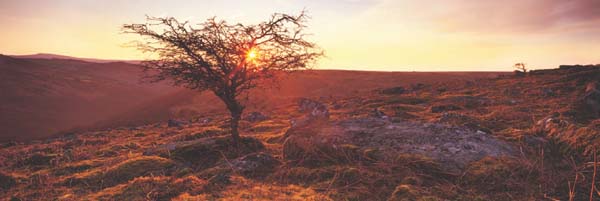
DARTMOOR, DEVON, ENGLAND
The sky was a little clearer than I’d hoped on this particular morning and I knew that by the time the sun appeared over the distant hill, the light would be intense and flare unavoidable. Noticing a small tree nearby, I changed position and hid the sun behind it, hoping that would give me a few minutes. It worked. I was able to capture golden light kissing the moorland in front of me. The sun bursting through the branches actually adds to the final image rather than detracting from it.
CAMERA: FUJI GX617 PANORAMIC/LENS: 90MM/FILTERS: 0.75ND HARD GRAD AND 0.3 CENTRE ND/FILM: FUJICHROME VELVIA 50
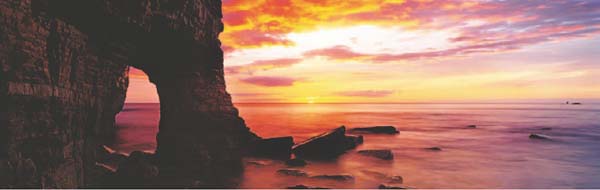
MARSDEN BAY, TYNE AND WEAR, ENGLAND
This photograph was taken on my very first dawn visit to Marsden Bay. I had visited the location before and could see potential for great sunrise shots, but never expected to witness such an amazing one on the first attempt. The tide was coming in fast so, with my backpack set high on a rock out of harm’s way and me balanced precariously to avoid wet feet, I set about recording the scene. Using an ND grad was tricky because the top half of the cliff face and rock arch would have ended up black. I made two exposures, one to record some detail in the limestone and a second to get the sky right. The two transparencies were then scanned to high resolution and merged in Photoshop.
CAMERA: FUJI GX617 PANORAMIC/LENS: 90MM/FILTER: 0.3 CENTRE ND/FILM: FUJICHROME VELVIA 50
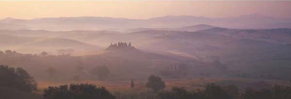
VAL D’ORCIA, TUSCANY, ITALY
Seasonal variations can make a huge difference to the mood of a scene. In Tuscany in May, for example, it’s relatively common to find mist filling the valleys at dawn (5am). As the sun rises, the mist slowly burns away, leaving behind a delicate palette of colours that looks absolutely stunning. I’ve photographed this view many times, but I never cease to be moved by it. You couldn’t dream up such a heavenly scene. Best of all, it’s a two-minute walk from the hotel. You can almost smell the coffee and freshly baked pastries.
CAMERA: FUJI GX617 PANORAMIC/LENS: 180MM/FILTER: 0.6ND HARD GRAD/FILM: FUJICHROME VELVIA 50