Chapter 12
Interpreting Data and Graphs
In This Chapter
![]() Crunching numbers with basic statistics
Crunching numbers with basic statistics
![]() Picking details out of tables
Picking details out of tables
![]() Making sense of graphs
Making sense of graphs
Regardless of your subject area of choice in grad school, you need a general understanding of a few concepts in statistics and the ability to make sense of data presented in tables and on graphs. The folks who developed the GRE are well aware of this fact, so they include several questions in the Math sections of the exam to test your skills in data analysis.
This chapter gets you up to speed on the basics of understanding graphs and different kinds of data. In this chapter, you wrap your brain around the concepts of median, mode, range, mean, and standard deviation; figure out how to read tables and answer questions about the data they contain; and sharpen your ability to extract and analyze data from graphs.
Brushing Up on Basic Stats
The mere mention of statistics makes some people’s brains swirl, but most statistic questions on the GRE are fairly basic. If you can master a few basic concepts, you can solve any statistics problem on the GRE. In this section, I cover the concepts of median, mode, range, mean, and standard deviation you need to know.
 The only trap you’re likely to see in the statistics questions is in the wording of the answer choices. The questions themselves are quite straightforward, but the answer choices may trick you if you tend to mix up the terms. For example, one answer choice to a median question may in fact be the mean (the average). One answer choice to a range question may be the mode. To keep from falling for this trap, be sure to note the word in the question that tells you what you’re looking for — median, mode, range, mean, or standard deviation.
Defining the median
The median is the middle number when all the terms are arranged in order. Think of the median strip in the middle of a road. Be sure to arrange the numbers in order (increasing or decreasing, it makes no difference) before you find the median.

Find the median of –3, 18, –4,  , 11.
, 11.
A –3
B 18
C –4
D 
E 11
Put the numbers in order: –4, –3,  , 11, 18. The one in the middle,
  , is the median. Finding
the median is as simple as that. Correct answer: Choice (D).
 If the list has an even number of terms, put them in order and find the middle two. Then find the average of those two terms.
Find the median of 5, 0, –3, –5, 1, 2, 8, 6.
A 0
B 1
C 1.5
D 2
E 5
Put the numbers in order: –5, –3, 0, 1, 2, 5, 6, 8. The middle two terms are 1 and 2, and their
average is  . That’s it. Correct answer: Choice (C).
Don’t confuse median (middle) with mean. A mean is simply the average, as explained later in the section “Finding the mean.”
Understanding mode
The mode is the most frequent number. Think mode = more = most. Put the numbers in order again, and the one that shows up the most often is the mode.
Find the mode of 11, 18, 29, 17, 18, –4, 0, 19, 0, 11, 18.
A 11
B 17
C 18
D 19
E 29
The list of terms contains three 18s but no more than two of any other number. Correct answer: Choice (C).
 If the list has two or more numbers that appear the most, then the list has more than one mode, and you count each one.
Find the modes of 6, 7, 8, 8, 8, 9, 10, 10, 11, 11, 11, 12, 15. Choose more than one answer choice if necessary.
A 6
B 8
C 10
D 11
E 12
F 15
The list of terms contains three 8s and three 11s, so it has two modes. Correct answers: Choices (B) and (D).
If the list has an even number of values, calculate the median by averaging the two middle numbers. If the list has two modes, count them both.
Establishing the range
The range is the distance from the largest to the smallest. In other words, take the largest term and subtract the smallest term. Your answer is the range.
Find the range of the numbers 11, 18, 29, 17, 18, –4, 0, 19, 0, 11, 18.
A 33
B 29
C 19
D 0
E –4
To find the range, subtract the smallest number from the largest: 29 – (–4) = 29 + 4 = 33. Correct answer: Choice (A).
Finding the mean
Mean is another word for average. To calculate the mean, sum up all the values and divide by the number of values.
Suppose you have a data set consisting of the numbers 1, 6, 8, 10, 12, and 17. To calculate the mean, do the following:
1. Sum up all the values.
1 + 6 + 8 + 10 + 12 + 17 = 54
2. Divide this sum by the number of values.

And the mean is 9.
Calculating the standard deviation
Standard deviation is the average distance from the mean for a set of numbers. Outside the GRE, standard deviation can be very complicated, but for the purpose of the GRE, a general understanding is sufficient. Fortunately, on the GRE, you calculate the standard deviation only on a simple set of data, which makes the calculations much easier and simpler.
Begin with the same data set used in the preceding section: 1, 6, 8, 10, 12, and 17.
1. Find the average.

2. Find the distance of each value from the mean.
This distance is always positive.
In this example, the first value, 1, has a distance of 8 from the mean (9 – 1 = 8). The second value, 6, has a distance of 3 (9 – 6 = 3). The third value, 8, has a distance of 1; 10 has a distance of 1; 12 has a distance of 3; and 17 has a distance of 8.
The actual method of calculating standard deviation is much more complicated than this, with a slightly different result. However, this method is fine for any standard deviation question you may encounter on the GRE. The test will never ask you to name a standard deviation, but it may ask you which set of data has a greater or lesser standard deviation. If it does, this method is perfect to use.
3. To find the standard deviation, take the average of these distances.
And the standard deviation for this set of data is 4.
Analyzing Data in Tables
Tables display data in rows and columns to make it more easily accessible. You’ve probably used tables without even knowing it, such as when you look in the TV listings to find programs to watch or look at a scoreboard. On the GRE, however, tables do more than merely help you find pieces of data; they often contain details for analyzing that data.
A table is different from a graph. A graph, which I discuss in greater detail later in this chapter, is a drawing that shows the relationship between the data and how the data changes. A table, discussed in this section, organizes the data into a matrix.
To handle the table questions that you’re likely to encounter on the test, you need an eye for detail and a knack for drawing information from the data. In other words, the GRE challenges you to determine the significance of the data that’s in the table. Take the following approach to answering any question that contains a table:
1. Cover the question and answer choices.
2. Read and understand the title, column headings, and units of measure in order to get the gist of the data presented.
3. Carefully read the question and understand exactly what it’s asking.
4. Return to the table and collect only the data necessary to answer the question.
5. Determine your answer to the question before looking at the answer choices.
6. Compare the answer choices to your answer to find the best match.
Distribution of Video Rentals by Category for 2010 and 2011
|
Category |
2010 |
2011 |
|
Action |
15.2% |
13.7% |
|
Comedy |
18.9% |
19.1% |
|
Drama |
7.4% |
10.5% |
|
Family |
22.0% |
19.2% |
|
Foreign |
4.8% |
7.2% |
|
Independent |
5.6% |
9.3% |
|
Romance |
8.1% |
5.2% |
|
Sci-Fi |
5.3% |
4.0% |
|
Thriller |
12.7% |
11.8% |
|
Total |
100.0% |
100.0% |
|
Total video rentals |
3,225 |
4,189 |
Based on the information in the table, which of the following three statements is true? Select all that are true.
A In each of the years 2010 and 2011, video rentals in the Action, Drama, and Thriller categories accounted for more than 35% of all video rentals.
B The total number of Sci-Fi rentals increased from 2010 to 2011.
C From 2010 to 2011, the total number of video rentals increased by more than 25%.
For Choice (A), add the percentages in the Action, Drama, and Thriller categories for each year: 15.2 + 7.4 + 12.7 = 35.3% and 13.7 + 10.5 + 11.8 = 36%, so Choice (A) is true. For Choice (B), multiply the Sci-Fi percentage by the total number of video rentals for each year and compare the numbers: 0.053 × 3,225 = 171 for 2010 and 0.04 × 4,189 = 168 for 2011, so Choice (B) is false — the number of Sci-Fi rentals actually decreased slightly. For Choice (C), subtract 2010’s total video rentals from 2011’s total video rentals to determine how many more videos were rented in 2011, and then divide by 2010’s total video rentals [(4,189 – 3,225) ÷ 3,225] × 100% = 29% (the percentage change formula from Chapter 8), so Choice (C) is true. The correct answers are Choices (A) and (C).
Analyzing Data in Graphs
You’ll likely see a few graphs on the GRE, each of which is followed by one or more questions. You need to first figure out the question that is being asked and then be able to extract the essential data from the graph and crunch some numbers to answer each question. To accomplish this effectively and efficiently, you need to know how to make sense of data presented on different types of graphs.
The following sections reveal the most common graph types you’re likely to encounter, provide you with some practice questions to test your graph-reading ability, and reveal a quicker method for estimating graph totals.
The graphs are always drawn to scale, so you can rely on them as accurate visual representations of the data.
Reading different graph types
To make sense of data presented in a graph, familiarize yourself with the different graph types, as described in the following sections.
Line graphs
Line graphs consist of two or three axes with data points connected by a line, sort of like a connect-the-dots exercise. How data points are plotted on the graph depends on the graph type:
 Two axes: A typical line graph consists of an x- (horizontal) and y- (vertical) axis, each of which represents a different unit of measure. For example, the x-axis may represent years, while the y-axis represents profits in millions of dollars. In this example, each data point represents the profit for a specific year, and connecting the dots forms a line (hence the name line graph).

Three axes: A graph with three axes contains a second y-axis on the right. As in this example, the left axis represents the minutes per day spent exercising, whereas the right axis represents the pounds lost per month. You read the points on a three-axes graph the same way you do on a two-axes graph, but make sure to look at the correct y-axis, depending on what the question asks you to determine. Here’s an example of a three-axes line graph.

Bar graphs
A bar graph has vertical or horizontal bars that may represent actual numbers or percentages. Although they look significantly different from line graphs, bar graphs are very similar. The only difference is that instead of a point, the top or right side of the bar, depending on the bar’s orientation (vertical or horizontal), represents the data point. See the following example.
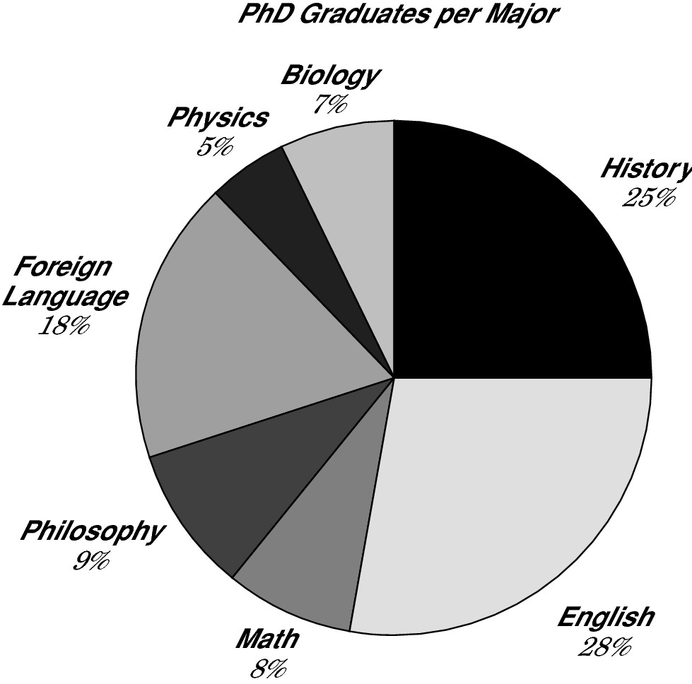
Circle or pie graphs
Each circle or pie graph represents 100 percent or 360 degrees, while slices of the pie represent percentages or degrees of that whole. To read a circle graph, first make a mental note of what the whole pie represents, so you know what each slice of the pie represents. For example, below a circle graph, you may be told that in 2001, 5,000 students graduated with PhDs. Because the graph shows a 25% segment on the circle graph is labeled “History,” you know
that the number of PhDs in history is 25% or  of 5,000, or 5,000 ÷ 4 = 1,250. Check out this example of a pie circle graph.
Logarithmic graphs
A logarithmic graph is a graph with an axis scale that changes by multiples of 10. The axis isn’t labeled with consecutive numbers (1, 2, 3, 4) or a pattern (5, 10, 15, 20), instead, each increment is equal to the previous increment multiplied by 10 (1, 10, 100, 1,000, and so on).
Each increment on a logarithmic graph is separated by nine tick marks, each of which indicates the amount of change equal to the increment below it. Between 1 and 10, each tick mark indicates a change of 1. Between 10 and 100, each tick mark indicates a change of 10. Between 10,000 and 100,000, each tick mark indicates a change of 10,000.
The logarithmic graph is useful for tracking small changes with small numbers but ignoring small changes with large numbers. Suppose, for example, you were to measure the populations of a handful of small Pacific islands. If Island A’s population of 6 were to increase by 2, this significant change would clearly show on the logarithmic graph. However, if Island D’s population of 2,134 were to increase by 2, this insignificant change would be obscured in the logarithmic graph.
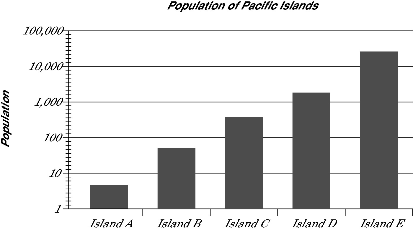
The graph on the GRE may not have the data labels like this graph does (inside the gray bars), but the GRE may ask you whether Island D has more than three times the population of Island C. Just looking at the bars, the initial answer appears to be no. However, with a grasp of how the logarithmic graph works, you know that the first tick mark after 1,000 indicates 2,000, so the answer is yes.
Scatter plots
Scatter plots are useful for spotting trends and making predictions. They’re similar to line graphs in that they use horizontal and vertical axes to display the values of the points plotted on them. With a scatter plot, however, instead of connecting the dots, you may draw a line through the data to predict where the future data points are likely to fall.
The following two terms are important in interpreting scatter plots:
Best-fit line: The line that passes as closely as possible through the middle of the scattered points.
Correlation: Correlation specifies the direction of the best-fit line and how closely the two variables correspond:
• Positive correlation: The best-fit line has a positive slope; that is, the line rises from left to right.
• Negative correlation: The best-fit line has a negative slope; that is, the line runs downhill from left to right.
• No correlation: If the points are scattered all over the graph like buckshot, or if the best-fit line is horizontal or forms a U or upside-down U, the variables have no correlation to one another.
• Strong or weak correlation: The closer the points are to the best-fit line, the stronger the correlation. The farther they are from the line, the weaker the correlation.
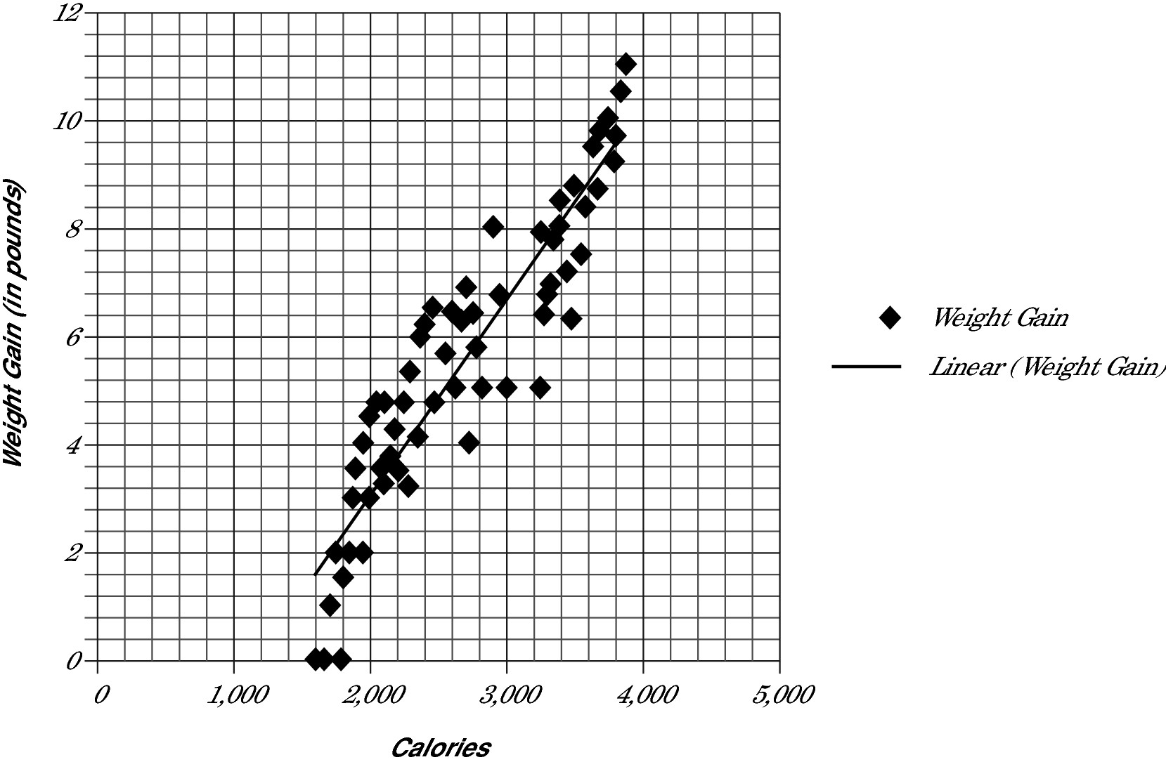
Based on the data in this scatter plot, about how many calories would need to be consumed to result in a 12-pound gain?
A 3,000
B 3,500
C 4,000
D 4,500
E 5,000
Lay a pencil on top of the best-fit line to see where it intersects the graph at 12 pounds, follow the nearest vertical line down, and you have your answer. Extending the best-fit line to the top of the graph intersects the 12-pound line at about 4,500, which is the answer. Correct answer: Choice (D).
Answering questions with two graphs
Some graph questions on the GRE contain two graphs, each of which is usually a different type. To answer a question, you may need to extract data from one or both graphs.
Here’s an example.
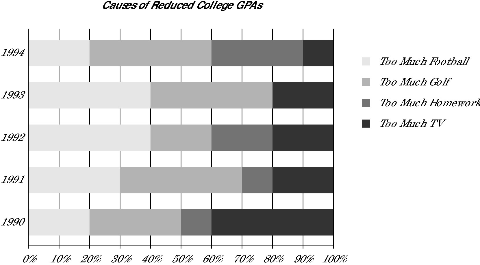
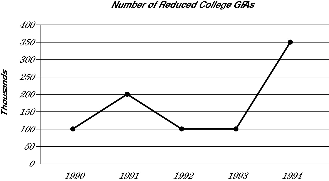
The two graphs here must be read in conjunction. The first graph is a bar graph that ranges from 0 to 100 percent. For this specific graph, calculate the impact of a cause of reduced GPAs by calculating the range of the cause. For example, in 1990, the Too Much Golf category (as a cause of reduced GPAs) began at 20 and rose to 50, a difference of 30 percent. If you say that Too Much Golf rose 50 percent, you’re falling for a trap. In 1993, the Too Much TV category rose from 80 to 100, meaning TV caused 20 percent of reduced GPAs.
The second graph gives you the actual number of reduced GPAs in thousands. Be sure to look at the labels of the axes. For example, in 1990, the GPAs of 100,000 participants, not 100, in the study went down.
Now, use the graphs together to find out the number of students whose GPAs were reduced by a specific cause (or causes). For example, in 1991, 200,000 students have reduced GPAs. Also in 1991, too much homework caused 10 percent of these reduced GPAs (from 70 to 80 percent). Multiply 10% or 0.10 × 200,000 to get 20,000 students who had reduced GPAs due to Too Much Homework.
Ready to try some practice questions? Here you go:
Which of the following represents the total number of college students from 1990 to 1994 inclusive?
A 850
B 8,500
C 85,000
D 850,000
E It cannot be determined from the information given.
Did you fall for the trap and pick Choice (D)? Because the graphs give you only the number of reduced GPAs (look at the titles of the graphs), you have no way to determine the total number of college students. Correct answer: Choice (E).
The number of GPAs in 1994 that declined due to too much golf was what percent greater than the number of GPAs in 1992 that declined due to too much homework?
A 700%
B 600%
C 500%
D 120%
E 7%
In 1994, too much golf (TMG) accounted for 40 percent of reduced college GPAs (from 20 to 60). Because 350,000 GPAs declined in 1994, multiply 0.40 × 350,000 = 140,000 TMG. In 1992, too much homework (TMH) accounted for 20 percent of reduced college GPAs (60 to 80). That same year, 100,000 GPAs declined. Multiply 0.20 × 100,000 = 20,000. Find the percent change between them by reducing the zeros and multiplying by 100%:
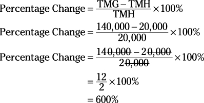
Correct answer: Choice (B).
Estimating graph totals quickly
When choosing from five answer choices that are far apart, consider rounding as you perform your calculations, especially if you’re working with really big numbers. Here’s an example:

If the average cost of broadband was $43 per month in 2010, which of the following is closest to the gross earnings for U.S. broadband companies in 2010?
A 111,000,000
B 946,000,000
C 11,000,000,000
D 94,600,000,000
E 946,000,000,000
To estimate the gross earnings for U.S. broadband companies in 2010, you have to multiply the monthly 2010 amount of $43 by the number of 2010 households with broadband, approximately 18 million as shown on the graph, and multiply by 12 to account for the 12 months of the year.
Now you’re looking at something like this:
(43)(18)(106)(12)
Look at the answer choices: they’re far apart. To ease the math task, you can round the numbers to the nearest tens place:
(40)(20)(106)(10)
Because you rounded two numbers down, and one number up, you know your answer is slightly shy of the actual answer. Multiply everything out for:
8,000 × 106 = 8,000,000,000
You don’t actually need to multiply 8,000 × 106, as long as you know that raising 10 to the sixth power gives you 1 with 6 zeros after it (a million), so six zeros plus the three zeros after the 8 gives you 8,000,000,000. (By the way, 109 gives you 1 with nine zeros after it, which is one billion.)
Because you rounded more numbers down than up, look for an answer that’s slightly higher than your result. The 11,000,000,000 answer is the closest answer choice. Correct answer: Choice (C).
Because the GRE provides a calculator, you can always just punch in the numbers. However, you’re less likely to make a mistake by rounding and multiplying on paper than by entering all these numbers into the calculator.