Chapter Six
LANDSCAPE BASICS
I’ve made landscape the last topic to explore in detail because it’s probably the most ambitious, bringing together many of the elements we’ve looked at so far in this book.
Never forget that the world is three-dimensional and that your eyes see it as such. When we commit a view of the world on to a flat surface such as paper, we have to employ techniques to give the illusion of depth, distance and spaciousness. We shall start this section by looking at how perspective works and how you can use it in your landscapes.
When tackling a landscape the artist’s first task is to select a view, to decide on how much of that view to show, and from which angle. When you survey a landscape full of trees, bushes and grass, take time to look at each area of vegetation carefully and note the immense variety of textures and colour that exist in just one view. Before choosing your landscape, decide how much detail you want to include and how much of a feeling of space you want to give it. Adjust your viewpoint to achieve this, by lowering it to get closer, or lifting it to create a greater sense of distance. In this chapter you will find examples of how to explore an area and choose your viewpoint, as well as practical tips such as using a landscape frame or taking photographs to use at home.
Enjoy the qualities of the natural world when you are drawing in the countryside or in a local garden or park. Don’t worry if the piece doesn’t always go right. The fun is in finding out how to do it in practice and, eventually, you reach the stage when you just draw the whole thing by eye and you can forget about the science.

Perspective
Before starting any larger landscape scene, it is useful to have an understanding of the laws of perspective. This is the technique of making a two-dimensional drawing – with length and breadth – appear to have a third dimension – that of depth.
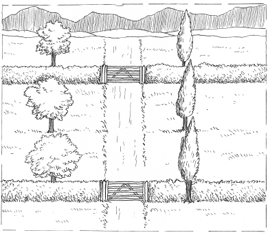

In very simple terms, you can see the difference between the two pictures shown above, one drawn without much attention to perspective, and the other based on the system of single point perspective, which tricks the eye into thinking that it is seeing depth and space.
Note how the trees and gateways are all the same size in the first picture, whether they are close to the viewer or far away. Also, look at how the road stays the same width even as far as the horizon; nor is there much difference between the texture of the nearest trees and hedges and those further off. The result is the effect of a rather flat landscape.
The second version shows what happens when you devise a method of interpreting the same landscape seen in terms of space. The nearest objects are both larger and more textured than those further away, and already this gives a sense of depth to the picture. The road appears to narrow as it recedes into the distance, eventually disappearing to a single point far off on the horizon. Although this is a fairly simple drawing the effect is immediate.
So, how do you achieve it?
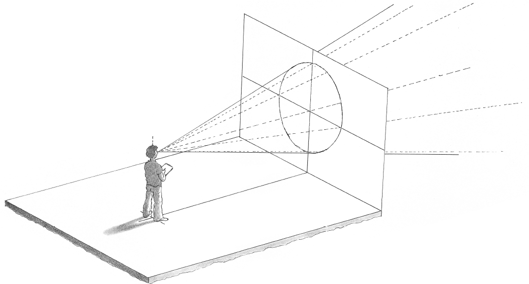
The cone of vision
When we look at any view, there is a field of vision surrounding us that can be divided into the area where we see things clearly and – at the periphery – another area where we can hardly define anything at all. The overall effect is to create a ‘cone’ of vision, within which we can see objects clearly, and outside which we are aware of nothing except light and darkness.
In the diagram, a figure is standing at a point in space called the ‘station point’. From this point, the figure looks straight ahead at the centre line of vision. The horizon is naturally at eye level, and where the line of vision cuts across the horizon is the centre point of an area that includes everything one can see of the space in front. The circle of vision is that part of the cone of vision that meets with what is known as the ‘picture plane’. And this is the area upon which all your images are to be drawn. It is usually perpendicular to the ground plane of the surface on which you stand. The picture plane covers an area containing all that could go into your picture. Of course, you might choose to crop down your picture area, but it is possible to draw anything within the focus of this space.
When you come to compose a picture based on this theory of vision, in a way you reverse the process and construct a series of shapes based on the centre point, which becomes the ‘vanishing point’. Overleaf I explain how to create this one-point perspective.
One-point Perspective
The most simple and obvious type of perspective is one-point perspective, where all the lines of the landscape will appear to diminish to a single point (the vanishing point) right in front of your view on the far horizon. You only get this type of perspective when the objects between you and the horizon are fairly uniformly distributed and any buildings are not too obvious.
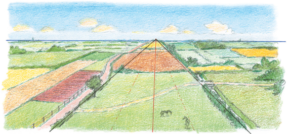
Draw a horizon line from one side of the paper to the other, then mark the central vanishing point. The structural lines of your landscape (you might see straight lines in field boundaries or roads) can be drawn with a ruler and must all lead to the vanishing point.
You will find that in landscape drawing the perspective structure is not always immediately obvious as the shapes of nature are not based on straight lines. This view of a path leading through vegetation is more typical of a scene you might draw. Here, the vanishing point is obscured by the trees and there are no straight lines to speak of, however, an understanding of one-point perspective can help you to show how the path recedes into the distance.
Two-point Perspective
This type of perspective usually only comes in use when you are drawing buildings or straightedged objects and it is unlikely that you will need to employ it in nature drawing. However I’ve included it here in the event that you want to draw a scene with a building, such as the cottage below. Two-point perspective uses two vanishing points, one at each end of the horizon line.

In this diagram, you can see how the horizontal lines of the cottage recede from the near corner to their respective vanishing points on the far left and right of the landscape. Mostly the vanishing points will be too far out on your horizon line to enable you to plot the converging lines precisely with a ruler. However, if you practise using blocks of buildings using two vanishing points you will soon be able to estimate the converging lines correctly.
Aerial Perspective
This is the name given to perspective as seen through tone and colour. The principle is that if an object is closer to you it will appear more distinct, more textured and with more intense colour than if separated by distance.
Technically, the volume of air, with its accompanying moisture, between you and the object of perception creates a mist of refracted light, and produces the effect that you notice when looking at distant mountains: they always appear more blue than elements of the landscape closer to you. Not only that, their texture is smoothed out and the edges of objects seem less distinct.
So when you produce a landscape, like the two examples here, you can give a greater effect of distance by varying the intensity of the colour and the clarity of the outline.
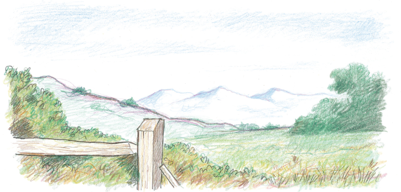
In the first example, the distant mountains are drawn in blue without very much detail on the surface. As the eye travels towards the foreground, it notices more intense and warmer colour and more distinct detail, as in the fence post and the close-up grass and bushes.

In the second example, a similar effect is produced and this time it is much clearer that the colours of the landscape and building close to the observer are not only more distinct and detailed in texture, but their colours are generally much warmer in tone, using yellows and reds to give a more immediate effect to their position in space. Blue shades, which are cool, tend to recede and red shades, which are warm, tend to advance – or, at least, give the impression of doing so. You can observe this effect for yourself when looking at a large landscape, especially on a damp day. So when you think of perspective, don’t forget that colour usage will also enhance the effects of distance and proximity in your picture. Include lots of detail and warmer colours in the foreground, and less detail and cooler colours for the middle and background. Put in the farthest distance features only in blues and greys.
Artist’s Tip
The effect of the source of light on the appearance of distance is also key. If your source of light is behind your main features it has the effect of showing them in silhouette, which tends to make them look closer than they are. So if you wish to retain the effect of distance, make sure that the shadowed parts of your objects are shown in as much tonal detail as possible, to ensure that they don‘t become a silhouette.
The Structure of Landscape
Before you start to draw a larger and more complicated landscape from life, it’s advisable to consider how it can be approached schematically. The first point to realize is that in any large open landscape, there’s an area of sky with the background immediately below it, then the middle ground and finally the foreground. The horizon line is the edge of the background against the sky.

As in my example, parts of the foreground and middle ground will sometimes project into the areas behind, like the large tree in the middle ground that reaches up into the sky.

In this next version of a landscape we’re also aware that the background area is very faint and without detail or much texture – in fact in places it’s almost as light as the sky. The middle ground has a little more definition and texture, but still not much detail. The foreground has the greatest definition and the most texture and intensity of detail. This is a result of aerial perspective (see pages 178–9).
Using a Landscape Frame
When you are exploring a location to find a view to draw, a landscape frame can be very useful – not the sort that finished artworks are placed in, but a simple piece of card with a window cut out of it, which corresponds to the shape of the picture that you wish to produce.

Hold up the frame in front of the landscape you are about to draw, in order to decide which part of the view you really want to work on. You always need some way of limiting the parameters, so that the final picture doesn’t become too broad for your drawing base.
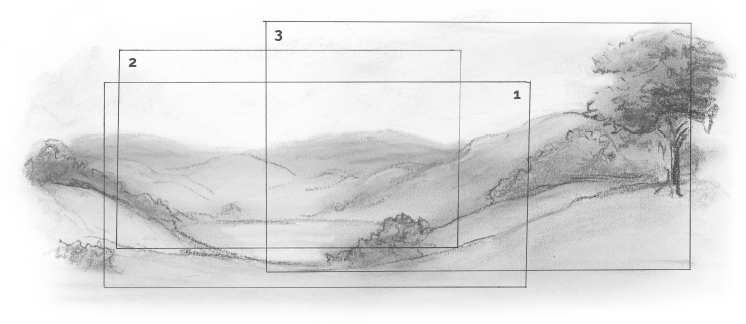
In the large picture below, there are three outlines superimposed on the general landscape, and you might decide to use one, two or three in your final composition. Each has possibilities but you can choose for yourself the one that is most satisfying to your aesthetic sense.

2. A more concentrated version

3. A view to bring in closer landscape details.
Landscape Variety
Here are a few examples of how you might approach various scenes.

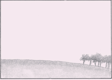
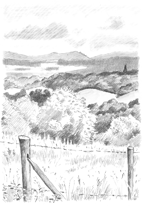
In this view, the landscape takes up almost the whole area of the picture, leaving only a small strip of sky at the top. This is a typical high-horizon view, and eliminates very much interest in the heavens. It is the way that you tend to view a landscape when you are in an elevated position. Because you can see more, you will want to draw more. It may create a mild sense of claustrophobia, but can also lead to a detailed and interesting landscape.
This view is quite the opposite, because the observer occupies a relatively low position and the horizon is therefore also very low. This brings the sky into the picture, and you might find it more interesting when there are some good cloudscapes to draw, rather than on a totally clear day. What this view gives is a great sensation of space.
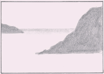
The next one is an interesting mix of fairly high horizon level and lots of open space in the shape of the sea. The two headlands are the main features of the landscape, but it is the sea that really forms the picture. The noticeable depth in this view has everything to do with the perceived distance between the two headlands. This sort of landscape also gives you a chance to work on the representation of water.
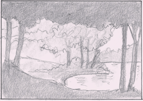
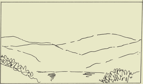
This landscape is enclosed by the grouping of trees around a stretch of water. The viewpoint is from beneath the trees on the bank. The other trees across the small inlet obscure any horizon line. This composition is almost a vignette because of the frame created by the closest trees.
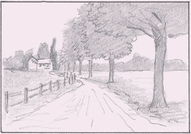
This is a classic case of the path or roadway pulling the viewer deep into the picture. The fence emphasizes this movement, as does the row of trees alongside the road. They naturally draw attention to the little group of cottages at the end of the path. This is a very popular device used by landscapes artist to encourage viewers to engage with the scene.
Exploring a Location
To show that you do not have to travel vast distances to gain plenty of good landscape experience, the next drawings were made within a few hundred yards of the same location, situated within a small area of the county of Surrey, England.

The first landscape view is full of trees and fields that recede towards the misty hills on the horizon. Notice how high the horizon line is, because of the elevated vantage point from which the drawing is done.

The next picture is similar in concept but quite different in texture and depth. The fact that the view is directly down a fairly steep hill helps to give something else to the scene.

The next one is still in the same area but now the light has changed. The closer hills, topped with trees, are almost silhouettes against the skyline and you seem to be able to look around a corner of the high ground to other hillsides beyond. This is quite a gentle landscape, but can be interpreted dramatically depending on the time of day. The little groups of buildings, seen in the middle ground, act as focal points.
The last drawing is of a place about one hundred yards from where the previous drawings were done. However, it looks very different due to the inclusion of part of a wire fence situated close to the onlooker, and also due to an alteration in format, from landscape (horizontal) to portrait (vertical). In this picture the sky becomes more important.
Finding a Viewpoint
You must consider the viewpoint from which you will draw your landscape, because it won’t necessarily occur to you by happy accident. As we saw on page 182, you can take a landscape frame with you to help decide on a composition.

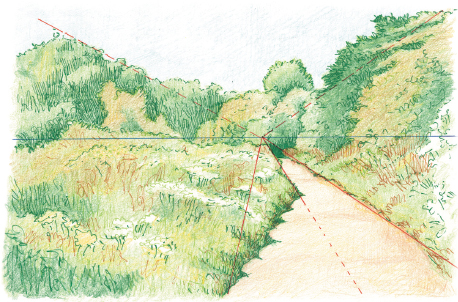
Sometimes you might be seeking a more gentle or intimate landscape. It is a good idea to position yourself beside a road or river, even a ditch, making use of some extended feature that will draw your eye into the picture. In fact, any device which helps the eye to respond to your drawing, by tempting it to explore your composition, is a good thing. So look for a focal point somewhere in the scene before you.
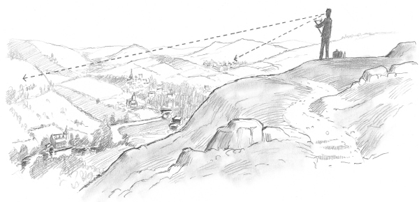
A high spot is a good choice, where you can get a good overall view. But then you will have to decide which direction to face and how much of the landscape to include. The dotted lines in this diagram indicate the amount of scope that you may have from a high vantage point.
Using Photographs
Although drawing outside is very good practice, when the weather is cold or wet it’s not easy to do. At times like these it’s useful to take photographs of the scene that you wish to draw and use these to work from. Take several shots of the same scene from slightly different angles; not only does this give you more information, it often helps to revive your memory of a place, which usually means you get a better drawing.

Here are some landscapes that I drew up for a set of paintings. I took two or three photographs of lakes in parkland on the outskirts of London and as it was winter, and rather cold and wet, I was glad to be able to do this instead of sitting down with an easel and drawing from life.

As you can see, I put the pictures together to form the basis for my drawing, melding the two scenes so that they became one continuous panorama of parkland that gave me more space to play with in the final picture. This was not difficult as the shots I had taken were close together.

Then I went off to the towpath alongside the River Thames near Hampton Court and took two more photographs of the river and the bank close by. In order to get the two pictures to join together I had to draw a bit of the towpath from memory, but that wasn’t a problem. The joining of the two pictures made quite a strong composition.


Next I travelled further afield to a part of Surrey where there’s a nice stretch of river with an old ruined church nearby. This time I took four shots with the camera and placed them together to form my landscape. This was easily done as there was plenty of information in the photographs and the landscape wasn’t very complicated.
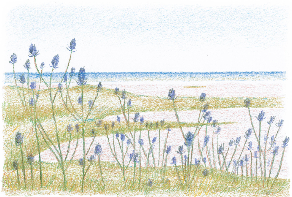
The final drawing came from one photograph only, of a wildlife sanctuary on the south coast, where I found a vast growth of teasels along the edge of a path, with a pebble beach landscape in the background. So as you can see, if the situation isn’t very good for outdoor drawing you can always use your own photographs as sketchbook information and then draw the final result in the comfort of your home.
A Landscape Project in Steps
Over the next few pages I have shown the stages of a landscape composition, from deciding on a location, to making initial sketches and then working up a final scene. Follow my example or, better still, find your own location and apply the same process.
Choose a location
The first step towards drawing a landscape is deciding on a location. Sometimes this is easy, because you happen to be in a place of great natural beauty and you have your sketchbook – the decision is made for you. However, often the reverse is true; you feel like drawing a landscape but don’t have a particular one in mind. So how do you go about setting up a scene?
For this exercise, my first intention was to see how I could work up various sketches that I had done in France and Italy into a more considered composition. I began by drawing up a view of Claude Monet’s famous garden at Giverny, in northern France, but finally decided that I wanted something a little less tamed.

So then I looked at some sketches from Italy and worked up a view across a river, with trees in the foreground. However, I eventually felt that I wanted to start afresh with a landscape to draw from real life, so I put away my previous sketches and went out to beautiful Richmond Park, near my home.
This area is of great interest to me because of the variety in its landscape, with lakes, streams, hills and, most notably, magnificent trees. Although it’s not wild countryside, it does have a breadth and range that lends itself to exploitation by the landscape artist.

Sketching on location
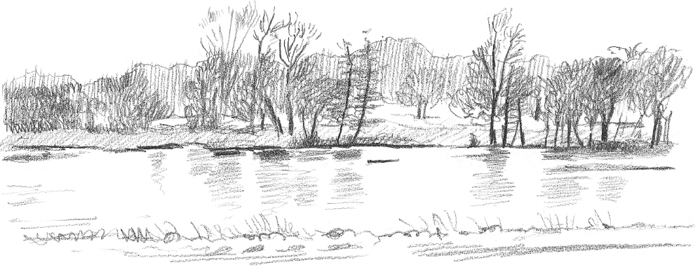
I went on a long walk with my sketchbook, stopping every now and then to draw what I saw in front of me. The first pause was to draw this view of one of the lakes seen through some large trees. As it was winter there wasn’t much foliage, but the bare branches of the taller trees were very attractive things to draw.


Then I moved on to a more open area where a hillside swept up to some woods in the distance. I quickly made a sketch of this and then noticed a large tree that had fallen and was gently rotting away. I made a drawing of this from one side and then moved nearer and around to the other side to make a more detailed drawing – a great thing to use in the foreground of any landscape.
I then drew another glimpse of the lake from a distance, without any trees in front of it. This might come in handy for a background feature. So as you can see, I was beginning to compose a possible landscape picture already, without finalizing my decision yet.
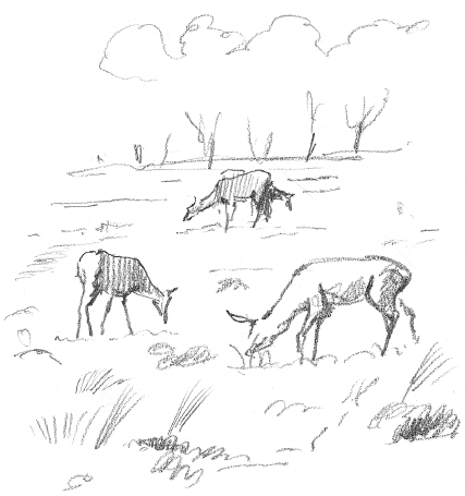
I noticed in the distance a small group of the deer that live in this park and sketched them. It wasn’t possible to get very close to them, but they could well be a focal point in a final picture.

I then moved down the hill towards a stream, drawing an attractive tree on the way and then part of a reflection in the stream. I didn’t take this very far, because I was realizing that I had now decided what and where I was going to draw.

On top of a hill I drew another log, a man resting on the ground, and a wooden bench. Nearby was a marvellous old dead tree-trunk, split and twisted, making a beautiful sculptural shape, that might be a feature for a foreground.


My proposed landscape was to be a view up a hillside, with the large dying tree trunk lying across the path in the foreground. I also thought a couple of deer could appear somewhere in the picture – that is to say, my landscape would be a composite of several views. I made a rough sketch to see how it might look.

Step 2
Feeling that it would work well, I proceeded to draw it up in line only, at which point I could sort out any difficulties of composition and drawing.

Once I had made all the corrections I needed to I could now begin to put in the texture and tone to give the picture more body. At this stage I kept the tone even and at its lightest, just in case I needed to change anything.

Then came the final push to build up the depth and feeling of space that I wanted to see in the drawing. The deer almost disappear on the hillside, but they do work as a muted focal point in the composition. The path going up the hill helps to draw the eye into the picture and the undulating horizon of the hillside draws the eye around the picture to the dead tree standing on the left.
A Landscape in Watercolour
The medium of watercolour is time-honoured and beloved of many landscape artists, largely because it enables the right effect to be created quickly and easily. It also allows you to cover large areas quickly and brings a nice organic feel to the creative process.
If you are going to tackle a landscape in watercolours, ensure you use watercolour paper or board, the thicker the better. A watercolour sketchbook is well worth taking on expeditions. Ideally you will have two pots for water; one to wash the brush and one to use as fresh liquid for a new colour.

Step 1
First, you need studies of trees to get some idea of what you want your landscape to look like. Here (right) I have made studies of groups of trees and bushes and also a staked wire fence (below). These two elements will both appear in my scene.


What I really need is an impressive tree that could be an item by itself. So having found one and made a sketch (right) and a more detailed study (below), I can now assess how to compose my picture.
Artist’s Tip
A good way of getting your colours to flow easily in watercolour is to wet the whole area of the paper before you start. This allows you to flood on colours quite easily without leaving any edges or stains in the middle of your wash. Be sure to let it dry fully before you start putting in the more detailed shapes.

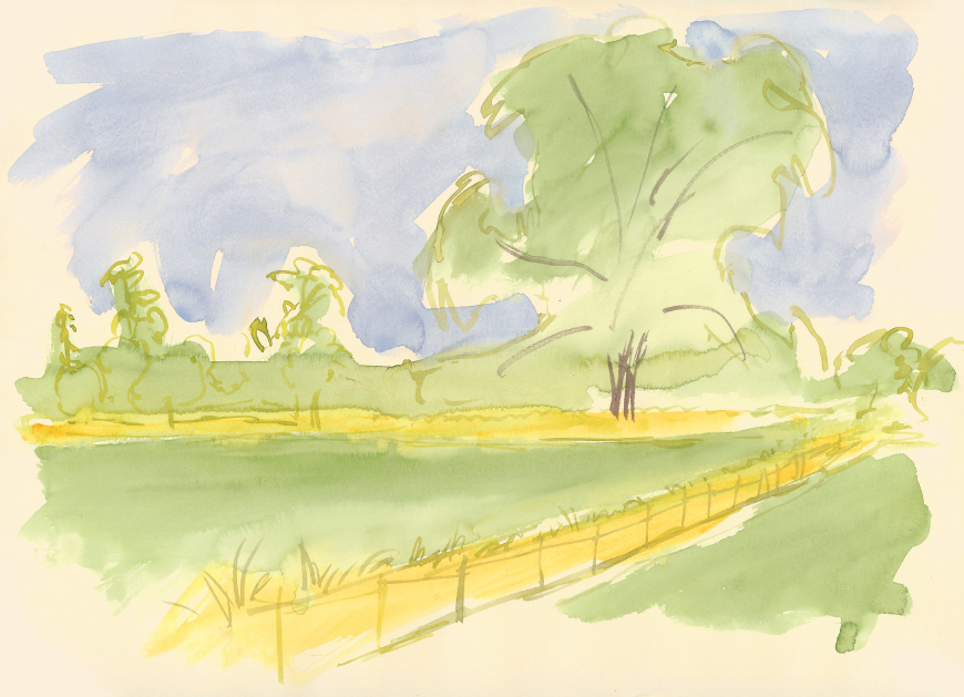
A quick design gives me an idea of how I shall allow the eye to be led up to the main tree by the line of the fence. This helps to give depth in the picture and acts as a natural indicator to the big tree.

Now I can go ahead and produce my scene, giving it a summery look with a blue sky, and making sure the dry, yellow grasses play their part in bringing the attention to the main tree. All the other trees should be much more distant or otherwise insignificant.
Different Media and Effects
Here we consider the variety of techniques you can employ in your landscapes, from brush and wash to mixed media.

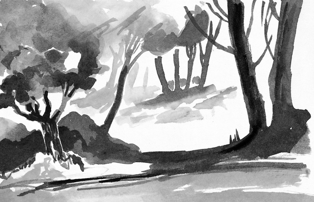
In these two brush and wash landscapes, a similar technique has been used to achieve very different effects. In the image opposite an open, spreading landscape is laid out beneath a cloudy sky that takes up two-thirds of the composition. The effect is one of freedom and space. In the landscape below, the sky is notably absent and the scene is set beneath the tree canopy; the mood is one of an ancient, mysterious and darkly shaded woodland.
Next up is a small view along the River Thames, done in mixed media.
First I sketched the outline of the whole scene lightly in pencil and then proceeded to work from the top downwards. All the area above the foreground wall was done with brush and wash, with a few pen and ink marks to indicate the boats gathered by the side of the river. I carefully built up a texture in pencil over the vegetation growing over the wall, and put in some similar marks to indicate the brickwork on the wall and grass on the lawn.
Then I covered the area of the wall and its shadow on the grass using a watercolour wash, making the shadow slightly darker than the wall.
Finally I scrawled in the wall vegetation with a charcoal pencil in order to give it a coarser texture than that of all the other vegetation, smudging it slightly with my thumb.

A Landscape in Coloured Pens
This is a drawing I made in Waterperry Gardens in Oxfordshire, England, using fine-liner pens and felt-tip pens. You can achieve a great intensity of colour and varied textural effects with coloured inks.

Step 1
I started by mapping out the trees and gardens with fine ink lines in green and grey. I used grey to indicate the cloud masses in the sky and green for all the vegetation.

Then I put in some larger areas of colour with various felt-tip pens. Using a wide-nibbed felt-tip pen, I added the greyer, shadowed areas of the cumulus clouds. For the grass and vegetation I used a range of colours, layering yellow and light green pen for the grass and lighter foliage. For the darkest areas, I added a touch of purple to dark green to denote deep shadow. I kept the marks sketchy, concentrating on the overall effect rather than precise detail.
The scribble marks I put over some trees convey the effect of thick leafy masses. As you can see you can get a reasonable look of space and vegetation even with these rather less subtle mediums.

Having built up the basic shapes and colour areas with felttips, I then began to use the fine-liner pens vigorously across the surface. In the sky, I used light horizontal lines for the blue areas and dotted grey for the cloud shadows, leaving the cloud tops white to show the overall formation. On the vegetation and grassland I used a combination of brown, purple, green, red and yellow pens. There were several clumps of flowering shrub in reds and pinks.