SOCIETY OF ILLUSTRATORS 54
BOOK JURY

ILLUSTRATOR
Born in Alabama and raised in Massachusetts, Wesley Bedrosian is an editorial illustrator whose work has appeared in numerous magazines and newspapers, including The New York Times, The Wall Street Journal, TIME, Vanity Fair, Billboard magazine, and New York magazine. He has received awards from Communication Arts and American Illustration. In addition to illustrating, he has also art directed at The New York Times and taught at the School of Visual Arts. He currently lives and works in Montclair, New Jersey. His work can be seen at www. wesleybedrosian.com.

ILLUSTRATOR
Zelda Devon is one half of an illustration duo from Brooklyn, New York. Working together for about five years, the partners bring a darkly whimsical edge to storytelling, concept art, and advertising. She can be found at teeteringbulb.com.

LOUISE FILI LTD.
Louise Fili is principal of Louise Fili Ltd, specializing in food packaging and restaurant identities. Formerly senior designer for Herb Lubalin, Louise was, from 1978 to 1989, art director of Pantheon Books, where she designed close to 2,000 book jackets. She is co-author, with Steven Heller, of Italian Art Deco, Dutch Moderne, Streamline, Cover Story, British Modern, Deco Espana, German Modern, French Modern, Typology, Design Connoisseur, Counter Culture, Stylepedia, Euro Deco, and Scripts. She has also written and designed A Civilized Shopper’s Guide to Florence and Italianissimo. A monograph of her work, Elegantissima, was published in September 2012.

ART DIRECTOR, TOR BOOKS
Irene Gallo has been the art director for Tor Books since 1994 and a founding director of Tor.com, a science fiction and fantasy blog and magazine, since 2008. She serves on the board of directors of the Society of Illustrators, is on the advisory board for Spectrum Fantastic Art, and is a faculty member of the Illustration Master Class at Amherst. For the Society, Irene has also previously hosted a painting demo series with Daniel Dos Santos, “Art Out Loud,” and an annual charity auction of miniature science fiction and fantasy paintings called “MicroVisions.”

ILLUSTRATOR
Ross MacDonald is an author, designer, letter-press printer, and illustrator. His illustrations have appeared in many publications, including Vanity Fair, The New Yorker, The New York Times, and Rolling Stone, and his work was the subject of a one-man retrospective at The New York Times. He has written and illustrated several children’s books, and, with co-author James Victore, the recent adult book In and Out with Dick and Jane, a Loving Parody. He has also worked on many movies as an illustrator, prop maker, and consultant on period design, printing, paper, and documents. He lives in Connecticut with his wife, two kids, two dogs, four cats, and a large collection of 19th-century type and printing equipment.

VICE PRESIDENT, SCHOLASTIC
David Saylor is a vice-president and creative director in the Scholastic Trade Publishing Group. In 2005, he founded Scholastic’s graphic novel imprint, Graphix. In addition to art directing the American editions of Harry Potter, many of the books David art directed have won awards and honors from the American Institute of Graphic Arts, the Society of Illustrators, The New York Times Book Review, the Bookbinder’s Guild of New York, and the American Library Association.
In 1999, David received an LMP Award honoring excellence in graphic design for his work in children’s books. He has worked at Random House; Farrar, Straus and Giroux, and was later an art director at HarperCollins Children’s Books, Ticknor and Fields Books for Young Readers, and Houghton Mifflin Children’s Books.

ILLUSTRATOR
A graduate of Art Center College of Design, Frank Stockton was nominated for the Eisner Comic Industry Award, and has received recognition for his work in Communication Arts, American Illustration, and the Society of Illustrators Student Scholarship Competition. Some of the exhibitions he’s participated in are: Nucleus Gallery Anniversary Show, Phil Hays Memorial Exhibition, and the Downright group show at the Pink Elephant Projects gallery. Frank’s long list of clients include: Boston magazine, Business Week, Esquire, Fantagraphics, Financial Planning, Forbes, GQ, Men’s Health, Mother Jones, New York magazine, The New Yorker, The New York Times, Outside Magazine, Philadelphia magazine, McCann-Erickson, Playboy, Penthouse, Popular Mechanics, Rolling Stone, Runner’s World, Sony Interactive, Texas Monthly, Topps, Tor/ Forge Books, Travel & Leisure, Velo News, The Wall Street Journal, and Zeit.

Art Director, W.W. Norton & Company
Albert Tang is based in New York and is currently the art director of the Norton Trade Paperback list, as well as the art director of the newly revived Liveright imprint. In his spare time he masquerades as a graphic designer. Some of his clients are Penguin Books; HarperCollins; Farrar, Straus and Giroux; Picador; and Random House. He has art directed Yuko Shimizu on a cover which won a Society of Illustrators Gold Medal in the book category.
ILLUSTRATOR
Thomas Woodruff is a conceptual artist who uses traditional figurative painting techniques, archetypal formats, and hybrid visual vocabularies from history to create contemporary “structures of contemplation” in the form of a series of elaborative paintings. These include: The Turning Heads, 2008; Freak Parade, 2000-2006; All Systems Go, 1999; Apple Canon, 1997; and The Secret Charts, 1995. With the P·P·O·W gallery since 1989, his work is in public and museum collections all over the world. He has worked as an artist, illustrator, educator, and curator. He has designed works for theatre, dance, opera, and television, and has worked as a tattoo artist. A chair at the School of Visual Arts for the past 12 years, he continues to inspire young artists with his eccentric, visually complex, and visionary paintings.

GOLD MEDAL WINNER
ANNA AND ELENA BALBUSSO
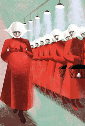
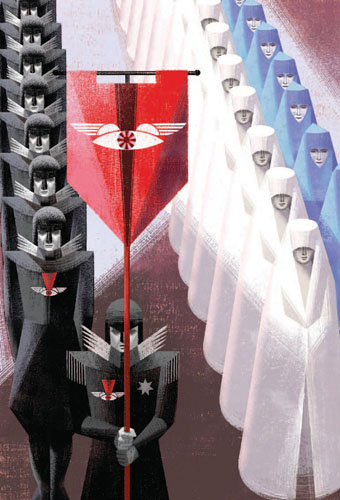
Pregnant
“One of them is vastly pregnant; her belly, under her loose garment, swells triumphantly … ”
The Handmaids Tale is a dystopian novel set in the near future in which a totalitarian theocracy has overthrown the United States government. It tells the story of Offred and her role as a handmaid. The handmaids are forced to provide children by proxy for the infertile wives of Commanders, women of a higher social status. The handmaidens undergo regular medical tests, and in many ways become invisible, the sum total of their biological parts. It explores themes of women in subjugation.
We really appreciate that Folio understood that this was a perfect book for us. The theme of a woman’s body appealed to our sensibility, and the story gave us the opportunity to create strong graphic images. To give a visionary interpretation and to create the right atmosphere for the story, we chose a futurist tone with accentuated perspectives and strong light. Our limited palette was predominantly red, black, and white. Our references were Futurism, Russian Constructivism, and fascist-period design. It was important to have a certain freedom of interpretation to better express what the writing suggests.
GOLD MEDAL WINNER
EDEL RODRIGUEZ
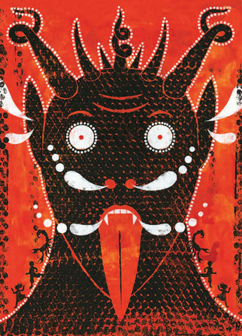

Krampus Painting for a book titled 21st Century Krampus, published by Last Gasp. The book’s theme is Krampus, the mythical creature that accompanies St. Nicholas during the Christmas season, warning and punishing bad children. The book was art directed, designed, and edited by Monte Beauchamp.
GOLD MEDAL WINNER
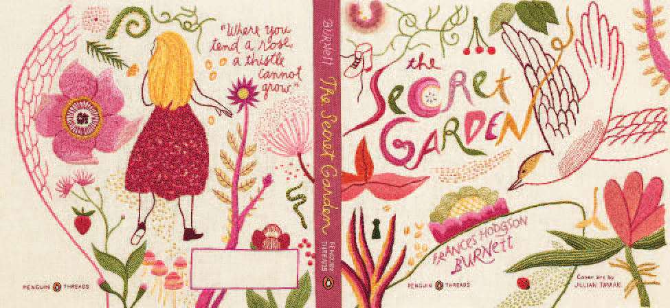
JILLIAN TAMAKI

Black Beauty
This piece is one of three that I produced for the Penguin Threads series, which redesigned classics in the medium of embroidery. Of the three, this one is my favorite. I think I learned how to draw by drawing horses, and they are a very powerful symbol for me. For this cover, I was going for something stark and direct, with punctuations of red to represent pain.

SILVER MEDAL WINNER
KADIR NELSON
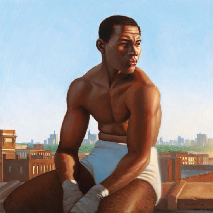

Joe Louis
My idea here was to show the legendary fighter not only at his physical prime, but at the beginning of his legendary rise to the top of the heavyweight division. What better setting than a Harlem rooftop overlooking the big city. I actually posed for the painting, although I had to use a bit of imagination to fill out his frame, as I was certainly not at my physical prime when I painted this. I’ve since burned the photographic evidence.
SILVER MEDAL WINNER
SAM WEBER
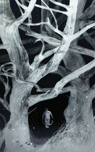
Woods
It was an incredible honor to work on this edition of Fahrenheit 451, especially knowing the time and care Folio puts into all the books they publish. This picture was the last in a series of interior illustrations made for Ray Bradbury’s wonderful novel. Working on a larger-scale project like this can always be a little daunting, especially when it comes to developing a theme or graphic device that can tie the image-making process together. So much of Montag’s discomfort revolves around his inability to articulate what is causing him so much unrest. He can’t explain the wrongness in his life, but feels it regardless, slowly eating away at him until it’s finally too much to bear. I wanted to use color to somehow communicate this, with intense hues signaling the artificial culture created in the absence of literature, and neutral colors dominating the rare moments of peace, like this one. The presence of water is such an important metaphor in the book—it cleanses Montag in the form of rain, and baptizes him, as he traverses the river towards his new life among the book people.
SILVER MEDAL WINNER
MARK ALAN STAMATY


Love Goes to Buildings on Fire
I was asked to illustrate a jacket for a book subtitled Five Years in New York That Changed Music Forever. I set out to represent some of the musicians written about in the book, as well as to put them in an environment that gave the feeling of New York City in the mid-1970s. This required a careful process of building a detailed composition piece-by-piece while creating an overall gestalt that conveyed the desired impact.
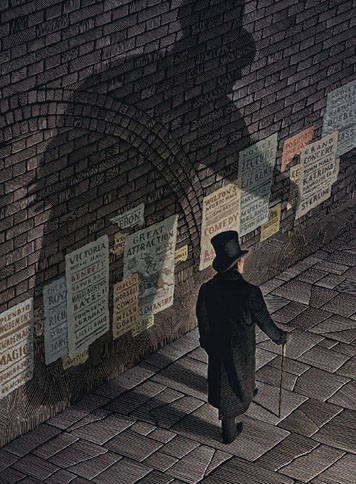
Go Home Now, Your Wife Has Already Got All She Asked For In this collection of Grimm Tales, I wanted to create illustrations that are more like theatre posters rather than very detailed book illustrations. I thought the visual language of posters would work here since these classic tales, which are burned into our collective consciousness, are so familiar I felt I had the creative freedom to apply a more minimalistic approach.
There They Found Snow White, Lying Still and Lifeless
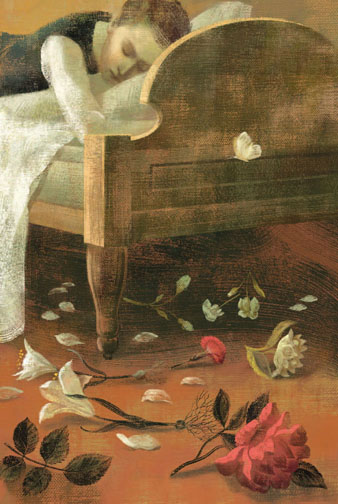
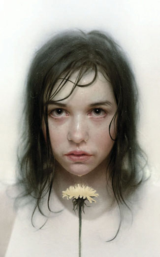
Flowers
“In one swoop all my Flowers were torn up by the roots and lay about me—scattered, broken, trampled … ”
From Ivan Turgenev’s novel First Love, for Sheri Gee of The Folio Society. The frame story opens with a brief scene in which three Russian gentlemen propose to amuse themselves by recounting the stories of their first loves. The protagonist, Vladimir, recounts the memory of his very unusual first love when he was 16 years old. In the narrative, Vladimir is very young and knows nothing about love. When he meets Zinaida, a beautiful 21-year-old woman, he is struck with her beauty and grace. She fails to reciprocate Vladimir’s love. The story has a tragic conclusion.
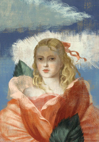
Zinaida
“From that day my ‘passion’ began … ”
We imagined Zinaida dressed with the petals of a rose. On its face there is the shadow of the cloud.
“Her face, too, was constantly changing. It, too, was always in play. It seemed at almost the same instant mocking, pensive and passionate. An infinite variety of feelings, light and swift, succeeded each other like shadows of clouds on a windy summer day, in her eyes and her lips.”
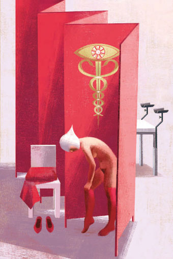
Examination
“I take off my clothes, behind the screen … ” From The Handmaids Tale.
Ceremony
“The twenty angels enter, newly returned from the fronts … ”
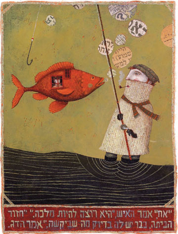
Fancy Boots
Cut & Paste
Richard Brereton had already invited me previously to collaborate on these sketchbooks and I was delighted to do it again. I really enjoy collage—the encounter between an object, an old piece of paper, and a drawn line; from the research and the gathering of elements to the creation of the collage piece.
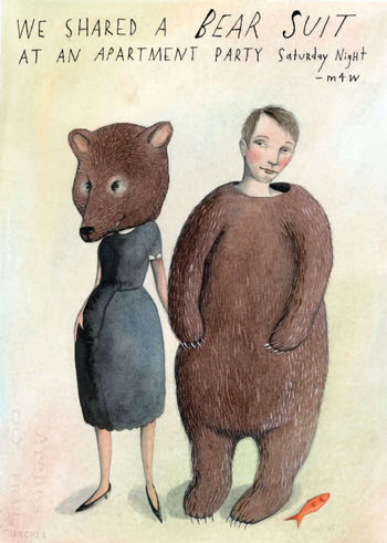
We Shared a Bear Suit
Missed Connections, Love, Lost and Found, began as a personal illustration project in the form of a blog. Every day for the past three years I have gleaned the Missed Connections section of Craigslist for the funny, strange, tender, sad and hopeful messages posted by lovelorn strangers, and turned them into drawings. Fifty or so have been gathered in a book, published by Workman in 2011.
The real fellow in “We Shared a Bear Suit” wrote to me after his friend stumbled on the blog and recognized him. He never found his bear-girl, but has since met someone equally delightful.
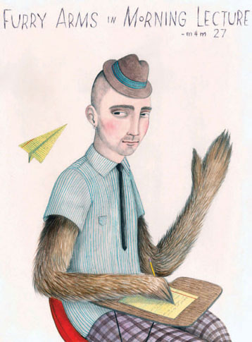
Furry Arms in Morning Lecture
When “Furry Arms in Morning Lecture” was on the blog, my favorite comment was, “I love how you drew the fur. My husband’s arms are just like that.”
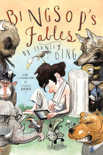
Bingsop’s Fables Cover
Bingsop’s Fables Back Cover
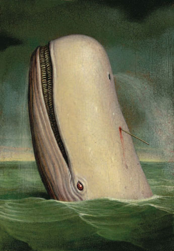
Moby Dick
Art for the Melville classic Moby Dick for Michael Osborne Design. Michael is a tremendous fan of the novel and collects images created for and inspired by it, so the bar was set pretty high for this piece. In the end, a scary white whale makes a great picture, no matter what you do!
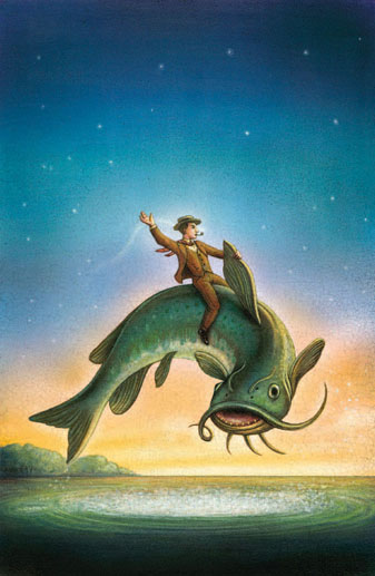
Big Fish
This novel is reminiscence of the author’s father and the mythic storytelling skills he used to entertain his family and friends. In peeling back the legend to get at the real man, the book takes on its own fantastic proportions. I sought to give this image of the key story in the book a mixture of the everyday and the magical—the real art in telling a whopper!
That Uncertain Feeling
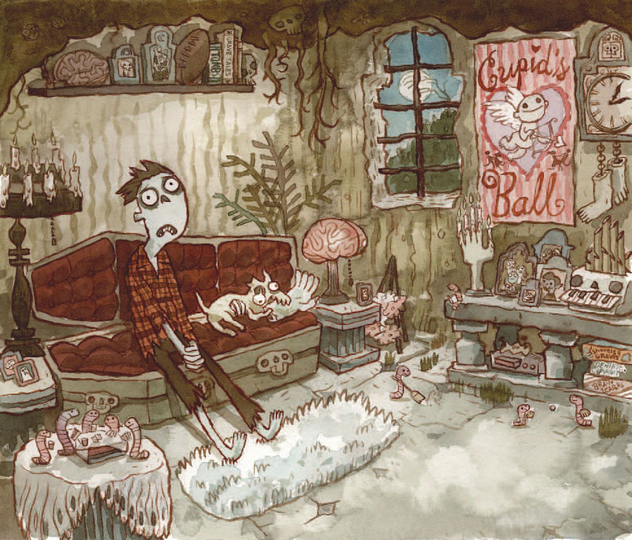
Zombie in Love
Mortimer is a zombie looking for love, and in this particular spread, he is feeling forlorn at home. I wanted to pack all kinds of little monster stuff in his house with him, and I felt that he needed a few pals to feel less lonely, so the worms are helping him around the house and enjoying themselves. I used a very earthy palette because Mortimer is a zombie and he lives in a grave made of earth.
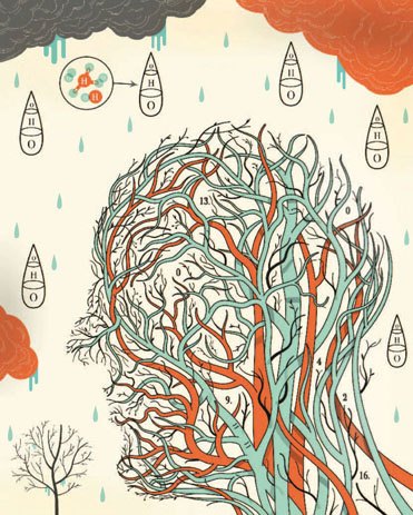
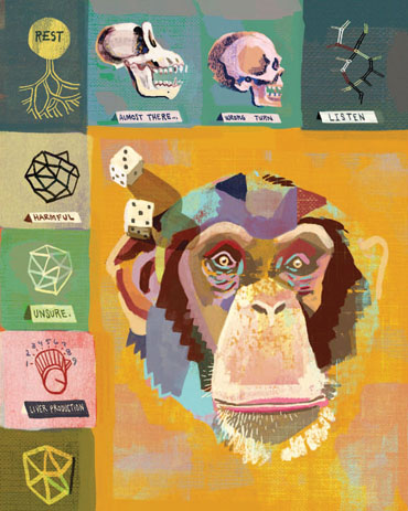
Structure of Water
This piece will be included in a Chronicle book, The Art of Science. Artists were given a random scientific theory and asked to illustrate it; mine was the “structure of water.” I tried a couple of ideas, including a head composed of hydrogen molecules, but in the end I decided to go this way and be a bit more oblique in my approach. We are all water, really, and I just loved drawing these veins.
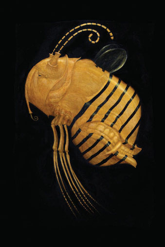
Beesbite
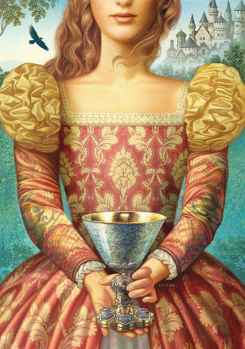
The Cup and the Crown
Easy Being Green It Is Not
Scrooge
Mr. Bounderby
White Trash Zombie
Wildwood Shops
This painting in gouache and ink was created as an early color sketch for the children’s novel, Wildwood, written by my husband, Colin Meloy. It was used, along with about 20 ink drawings, as a sample illustration in the proposal we presented to potential publishers. It’s the only illustration from that proposal that made its way into the finished product.
The Where, the Why and the How: 75 Artists Illustrate Wondrous Mysteries of Science
Kiss of Knowledge

Looking for Transwonderland, Adventures in Nigeria
A Boy Called Dickens, Warren’s Blacking
A Boy Called Dickens, The Market
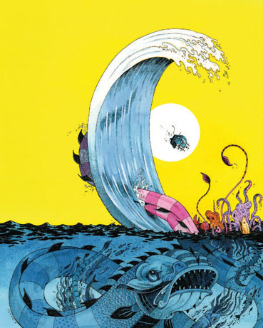
Rogue Waves
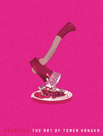
Overkill
Wooden Bones
This book cover was commissioned by Simon & Schuster for Wooden Bones, the untold story of Pinocchio, by Scott William Carter. It was my favorite assignment to date, as I was able to draw from many thrilling elements of the story. The most exciting part was figuring out how a puppet-turned-boy might look.
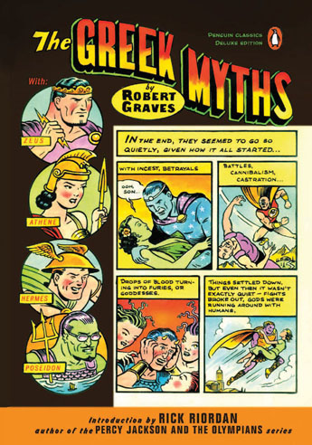
The Greek Myths
Dr. Jekyll and Mr. Hyde
Many cover illustrations for Robert Louis Stevenson’s famous novella (first published in 1886) feature one or the other of the iconic title characters. My top priority was to find a way to include both the respectable doctor and his dark alter ego, and to give them equal emphasis in the composition. I have rarely employed the old “contrast the figure and its cast shadow” device, but it seemed the perfect solution for this problem. The title type was centered over Hyde’s shadow.
Dakota, or What’s a Heaven For?
Brenda K. Marshall’s novel, Dakota, or What’s a Heaven For?, is set in 19th-century Dakota territory. The idea for the cover illustration was suggested by this evocative passage in the text: “The wagon turned off the road and directly into the prairie, setting out upon a land both solid and fluid, in which swell after swell of grass rhythmically lifted away from horizon and rolled toward another. The tall grass, parted by the horse and pressed down by the wheels, sprang up and closed behind the wagon, erasing its passage as thoroughly as waves forgot the passing of a ship.”
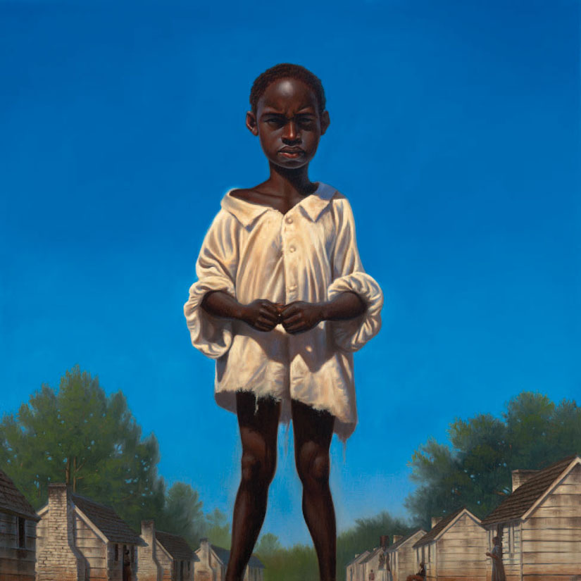
Young Pap
I aimed to create an image of a man-child. Although I pose for most of my work, I couldn’t very well do that for this assignment since I don’t have the bone structure of a young boy. Instead, I ran outside and found my neighbors’ children playing in their front yard. With their father’s permission, I had the younger son pose wearing my oversized tee shirt. Worked like a charm!
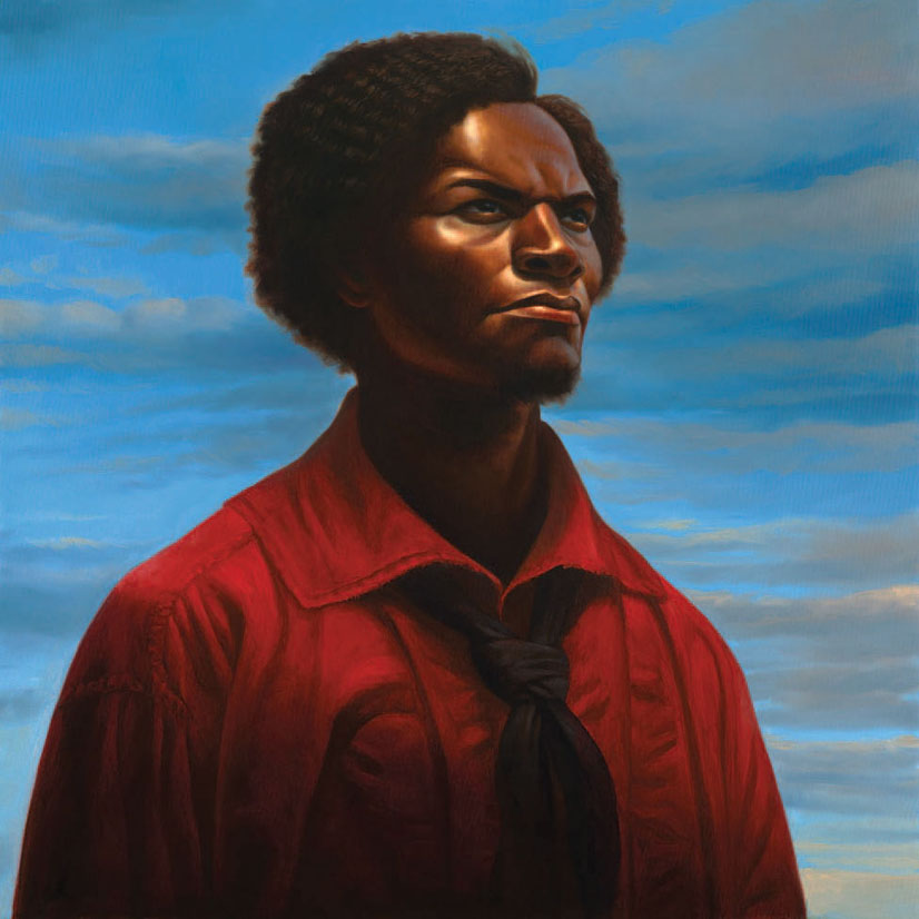
Frederick Douglass
Very rarely do we get to see an image of Frederick Douglass as a young man. I thought it would be a great opportunity to show the young Douglass just before he boarded a train to escape the antebellum South. I worked from several photos, including my own for lighting cues. To add a bit of drama, I added a dark shadow at the bottom to direct the focus toward the light on his face.
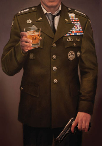
The Operators
Cover artwork for the new novel by Michael Hastings. It’s about the wild and terrifying inside story of America’s War in Afghanistan. The back cover is a similar painting but in Army fatigues.
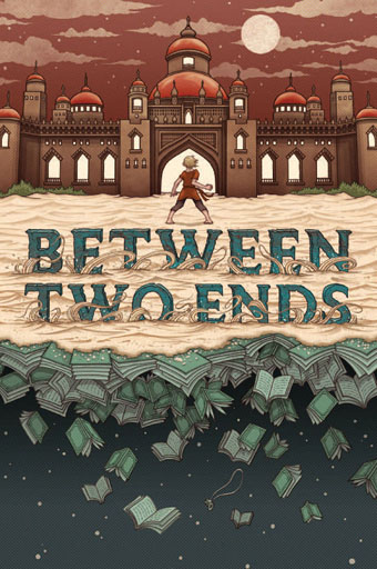
Between Two Ends
Cover illustration for David Ward’s novel, Between Two Ends. The book tells the adventurous story of a boy entering The Arabian Nights to rescue someone who has become lost in the book.
R is for Ruth
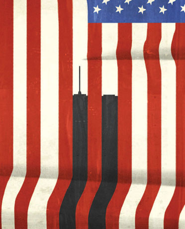
September 11
This piece represents the tenth anniversary of September 11. During the intervening years, many icons and images have been produced on what we could call the worse day of American history, and I wasn’t sure if there was a new angle from which I could approach it. So I went back to the minimal elements: the towers represent a dark piece of the flag, a missing piece of it.
In the Sea
I was commissioned by Random House/Doubleday to create a book cover for a new hardcover titled In the Sea There Are Crocodiles by Fabio Geda. The book is the true story of a boy’s treacherous journey from war torn Afghanistan to Italy.
Fables No. 109

Stovetop
Stovetop was created specifically for Work/Life 2, an international directory of illustration that was published by Uppercase Books. When approaching the challenge of interpreting the artist’s “work plus life” theme, I suddenly remembered a quote from David Sedaris: “One burner represents your family, one is your friends, the third is your health, and the fourth is your work.” Those words became the foundation for an image of an illustrator multi-tasking and juggling work and life.
The Unwritten Issue No. 31.5
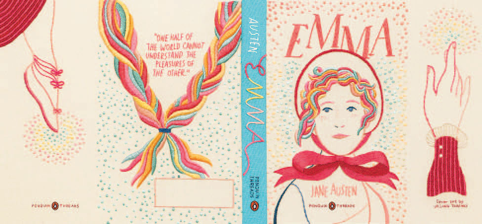
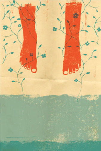
Emma
This piece is one of three that I produced for the Penguin Threads series, which redesigned classics in the medium of embroidery. I was aiming for a design that felt fresh and contemporary, yet still appropriate to Jane Austen. I simply wanted to capture Emma’s spirit and the comedy of the novel.
The Secret Garden
This cover was laborious but fun because I gave myself permission to be experimental with technique. I very much thought about the experience of handling the physical book while designing this cover. That each turn and unfolding of the French flaps would yield a small reward.
Passing and Glassing
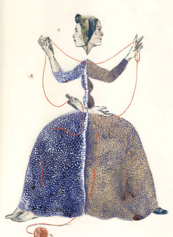
This is from a collection of poems by the English poet Christina Rossetti. Rossetti suffered from ill health for the majority of her life, and her work often deals with death, aging, and life cycles. In this poem, the looking glass reveals a young and old woman as one in the same.
Hollow-Sounding and Mysterious
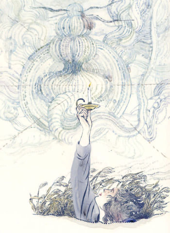
This is from a collection of poems by the English poet Christina Rossetti. In this poem, the author contemplates the wind, which never gives up its secrets. “We’ve no replying/Living or dying/To the Wind’s sighing.”

Along a Long Road
Why Do We Dream?
Clarisse
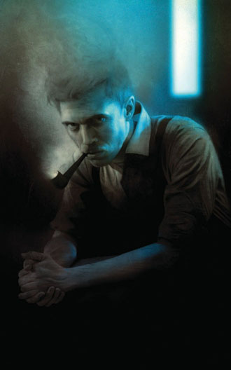
Captain Beatty